Writing an API for React components, part 5: just use composition
Writing API for React components, part 1: do not create conflicting props
We write API for React components, part 2: let's name the behavior, not the way of interaction
We write API for React components, part 3: the order of props is important
')
Writing an API for React components, part 4: beware of Apropacalypse!
Writing an API for React components, part 5: just use composition
We write API for React components, part 6: we create communication between components
We have an icon component:

<Badge count={12} /> You saw them in various applications, they show the number of objects as a number.
In cosmos Badge (icon) has several colors for each specific context (information, danger, etc.)
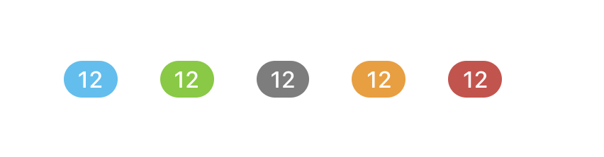
<Badge count={12} appearance="information" /> <Badge count={12} appearance="success" /> <Badge count={12} appearance="default" /> <Badge count={12} appearance="warning" /> <Badge count={12} appearance="danger" /> This user interface has another similar component - Label .
It also has several colors for each context:

<Label text="private" appearance="information" /> <Label text="private" appearance="success" /> <Label text="private" appearance="default" /> <Label text="private" appearance="warning" /> <Label text="private" appearance="danger" /> Look at these two components and say one good and one bad thing about their API (about their props)

<Badge count={12} appearance="information" /> <Label text="private" appearance="information" /> What well
Both components have the same prop for the appearance: appearance is great. Moreover, they have the same options for this prop! If you know how to use the appearance in the Badge , then you already know how to use appearance in the Label
Aim for consecutive props between components.
Tip # 2 from Writing an API for React Components, Part 2: Give Names to Behavior, Not to Means of Interaction
What is wrong
The way they take their values is different. They both have their own version.
Counting is count , it makes sense within the framework of the Badge component, but with all your other components taken into account, this is an additional API that your team and users (developers) will have to remember.
Let's improve this API
To be consistent, I will call this content prop, this is the most common name I could come up with - more general than just label, text or value.
<Badge content="12" appearance="information" /> <Label content="private" appearance="information" /> We lost some detail, but we got a lot of consistency. We can still set the value type with prop-types , so I think this is a good compromise.
But wait, in React there is already a multi-purpose content prop, it is called children - a child.
Do not reinventprops.children.
If you have defined props that accept arbitrary data that is not based on the data structure, it is probably best to use composition - Brent Jackson
Here is the advice of this article. When choosing between a composition and a props, choose a composition .
Let's refactor this API using children - child elements:
<Badge appearance="information">12 </Badge> <Label appearance="information">Private </Label> Looks great.
Bonus: when you use children instead of text , the developer using this component gains more flexibility without having to change the component.
For example, here , in it, I want to add an icon in front of the text.

Using children I can add an icon to this without returning to this component or changing it.
// - <Alert type="warning" icon="warning" text="This is an important message!" /> // <Alert type="warning"> <Icon name="warning" /> This is an important message! </Alert> Coincidentally, when I wrote this text, I saw Brad Frost's tweet :
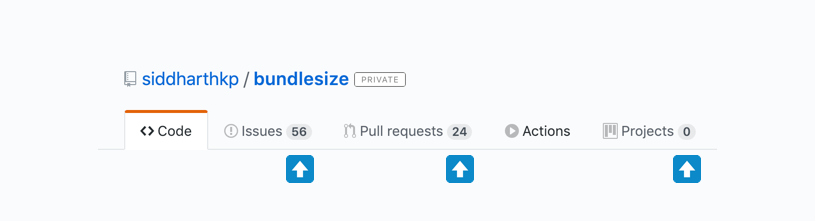
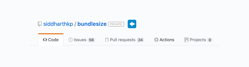
Hey, React friends, need a little help. I continue to encounter this pattern, where certain components (especially lists) can be divided into smaller components or managed by transferring an object. Which one is better?
Looks familiar?
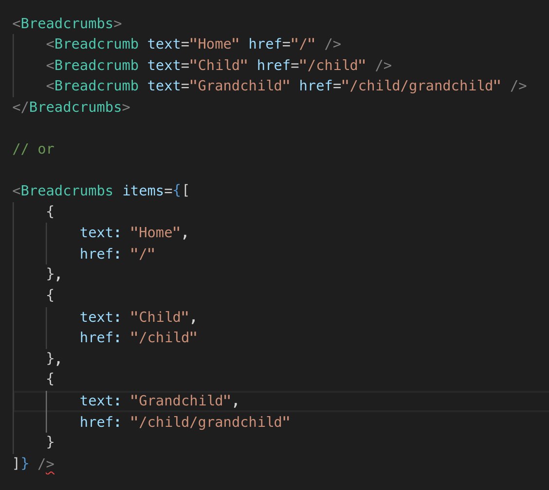
First of all, let's not use prop text and instead use children .
// : <Breadcrumb text="Home" href="/child" /> // : <Breadcrumb href="/child">Home</Breadcrumb> Now that we have dealt with this, let's talk about these two API options.
As it is not difficult to guess, I like the first one.
- You do not need to think about what is called prop -
text?label? It is justchildren. - You can add your
classNameortargetto it, if needed. For the second option, you need to make sure that it supports these properties or simply passes them to the base element. - This allows the child to be wrapped in a context or component of a higher level.
Exception to the rule:
What if Brad wants to prevent the developer from making any of the settings I mentioned above? Then giving the developer more flexibility, in his case, would be a mistake!
Here is my answer to Brad .
More examples
Here are some more examples of how this tip can improve your code, the last is my favorite.
Forms is a great example of use, we want to control the layout of the form, display errors, etc. But at the same time, we do not want to lose opportunities for expansion.
// #1 <FormTextInput type="text" label="Name" id="name-input" /> // id, // label input? // #2 <FormField> <Label>Field label</Label> <TextInput id="name-input" type="text" placeholder="What's your name?" /> </FormField> // #3 <FormField label="Field label"> <TextInput id="name-input" type="text" placeholder="What's your name?" /> </FormField> The last example is especially interesting.
Sometimes you need a component that will be used in very different situations. It’s not easy to make a component that is flexible and still have a simple API.
This is where inversion of control comes to the rescue - let the component user decide for himself what to render. In the world of React, this pattern is called the render prop pattern .
A component with render prop takes a function that returns a React element and calls it instead of implementing its own render.
from React documentation Props
One of the most popular examples of render props is the official Context API.
In the following example, the App component controls the data, but does not control its rendering, it passes this control to the Counter component (counter).
// const MyContext = React.createContext() // // function App() { return ( <MyContext.Provider value="5"> <Counter /> </MyContext.Provider> ) } // // function Counter() { return ( <MyContext.Consumer> {value => ( <div className="counter">the count is: {value}</div> )} </MyContext.Consumer> ) } Noticed anything interesting in this Consumer API?
Instead of creating a new API, he uses children to accept a function that tells him how to render!
// <Consumer render={value => ( <div className="counter">the count is: {value}</div> )} /> // <Consumer> {value => ( <div className="counter">the count is: {value}</div> )} </Consumer> Go back to your code and find the component that accepts any props, when it can easily use children .
Source: https://habr.com/ru/post/459416/
All Articles