We write API for React components, part 6: we create communication between components
Writing API for React components, part 1: do not create conflicting props
We write API for React components, part 2: let's name the behavior, not the way of interaction
We write API for React components, part 3: the order of props is important
')
Writing an API for React components, part 4: beware of Apropacalypse!
Writing an API for React components, part 5: just use composition
We write API for React components, part 6: we create communication between components
Let's talk about the forms.
Most likely you read a bunch of articles about managing state states in forms, but this is not one of those articles. Instead, I want to talk about how forms and their API are arranged.
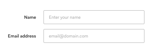
There is a lot going on here, take a look at the API
<Form layout="label-on-left"> <Form.Field label="Name"> <TextInput type="text" placeholder="Enter your name" /> </Form.Field> <Form.Field label="Email"> <TextInput type="email" placeholder="email@domain.com" /> </Form.Field> </Form> Let's look at each of the components and analyze them:
The form
It all starts with the Form component, which is a basic form element with an attached class. It will render everything you put into it.
function Form(props) { return <form className="form">{props.children}</form> } render(<Form layout="label-on-left">...</Form>) It also takes a prop layout , which is useful when you have little space.
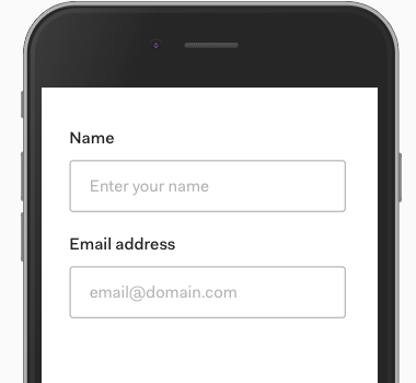
<Form layout="label-on-top">...</Form> This changes the way the labels are aligned (from right to left) and how the margin works.
The form does not control the width and margin its internal content. This is a concern for the input field itself inside this form.
So the Form component should report layout information below.
The easiest way would be to transfer the layout using props, but the form content is dynamic (determined by the developer who uses this form), we do not know exactly what the form will be.
This is where the contextual API will help.
/* */ const LayoutContext = React.createContext() function Form(props) { /* `Provider` */ return ( <form className="form"> <LayoutContext.Provider value={{ layout: props.layout }} > {props.children} </LayoutContext.Provider> </form> ) } export default Form export { LayoutContext } Now the form field can use this context and get the layout value.
Form field
The FormField component (form input field) adds a label to everything you put into it (for example, text input).
function Field(props) { return ( <div className="form-field"> <label {...props}>{props.label}</label> {props.children} </div> ) } In addition to this, it adds a class to layout — which comes from the context we created in the Form component.
/* layout */ import { LayoutContext } from './form' /* - API (Render Prop API) */ function Field(props) { return ( <LayoutContext.Consumer> {context => ( <div className={`form-field ${context.layout}`}> <label {...props}>{props.label}</label> {props.children} </div> )} </LayoutContext.Consumer> ) } The useContext from React 16.8+ makes understanding syntax easier
/* layout */ import { LayoutContext } from './form' function Field(props) { /* useContext */ const context = useContext(LayoutContext) return ( <div className={`form-field ${context.layout}`}> <label {...props}>{props.label}</label> {props.children} </div> ) } If you're interested, here is the css code:
.form-field.label-on-left { max-width: 625px; display: flex; align-items: center; /* */ } .form-field.label-on-left label { text-align: right; width: 175px; margin-right: 25px; } .form-field.label-on-top { width: 100%; display: block; /* flex*/ } .form-field.label-on-top label { text-align: left; /* right */ margin-bottom: 25px; /* margin-right */ } Form.Field?
The last detail I want to talk about is this strange syntax with dots on the components.
Since the Field (input field) is always used with the form, it makes sense to group them together.
One way to do this is to export it from the same file:
/* form.js */ import Field from './field' function Form(props) { /* ... */ } export default Form export { Field } And now users can import them together:
import Form, { Field } from 'components/form' render( <Form> <Field>...</Field> </Form> ) We can make a small improvement by attaching Field to the form component itself.
/* form.js */ import Field from './field' function Form(props) { /* ... */ } Form.Field = Field export default Form This code works because React components are javascript objects, and you can add additional keys to these objects.
For the user, this means that when he imports a Form , he receives a Field automatically.
import Form from 'components/form' render( <Form> <Form.Field>...</Form.Field> </Form> ) I really like this API, it makes the connection between Form and Form.Field obvious.
Note: you must move the context to another file to avoid circular dependency.
The combination of syntax with points and context makes our Form component smart, while maintaining its operability for compositions (composite).
Source: https://habr.com/ru/post/459422/
All Articles