How was the design of Yandex. Auto
Historically, not much attention was paid to the interfaces of the internal media systems of the car. The model range is updated, but the beginning of the 2000s is still felt on board. In recent years, many technologies have grown in the automotive world. There were tons of data, the possibilities of software have expanded, and in general there were cars on electricity and the first drones went. But the interfaces of the head units in the mass remained at the same level .
The lack of innovation in embedded multimedia in recent years has generated proposals from global media giants, and Yandex is no exception.
')
The idea to do something for the automotive industry did not grow from scratch. It’s impossible to stand aside when the company has Maps, Navigator, Music, Weather, Search, voice technology and more; If you combine all this - something useful can be born.
Searches for future product
What is required behind the wheel? How many people - so many opinions, but usually everyone needs navigation, music and advisory services. First of all, they wrote down scripts for accessing the system behind the wheel: they interviewed colleagues and acquaintances, collected features from users of the products and personal experience of the team. Then a huge pool of scenarios was systematized - and a scenario table of product knowledge turned out.
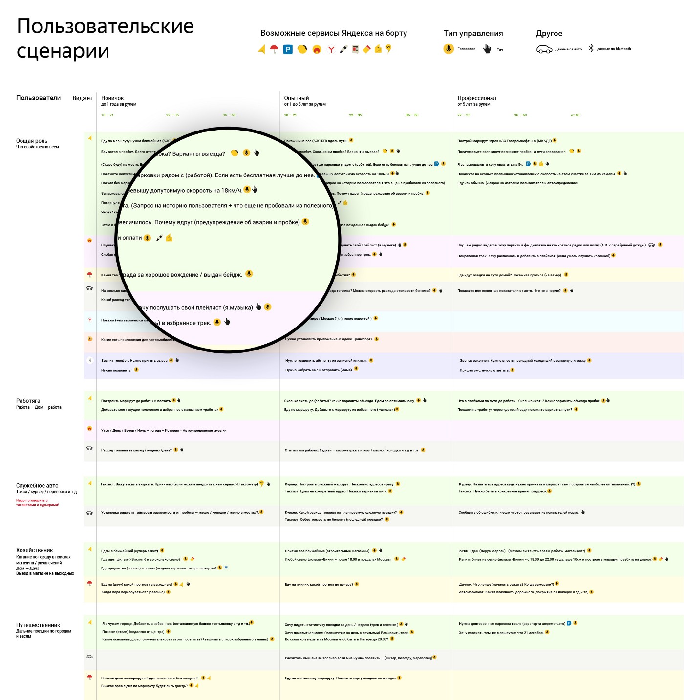
In each scenario, the services involved and their control types are indicated.
It is worth noting that all drivers can not be cut with one comb. One only sat behind the wheel, and the second considers himself a connoisseur of driving. Their requests while driving are quite different. All scenarios can be divided into several groups depending on driving experience:
- The newcomer (up to 1 year), because of the small experience, is rather constrained in interface requests and in general in freedom of action. He keeps a close eye on the wheel and the road, so it’s better not to disturb him.
- Experienced (from 1 to 5 years) has already mastered, the horizon of his interests is wider, but this is a trap. Allowing him everything is dangerous: the driver will be distracted from the road.
- A professional (from 5 years old) has already visited all the wrangles and knows the price of a mistake. It is difficult to surprise, hard to shake him, and over the years he has developed his interface habits.
What is a navigation and entertainment system? For a person who is driving, this is in fact a secondary entity that distracts from the trip.
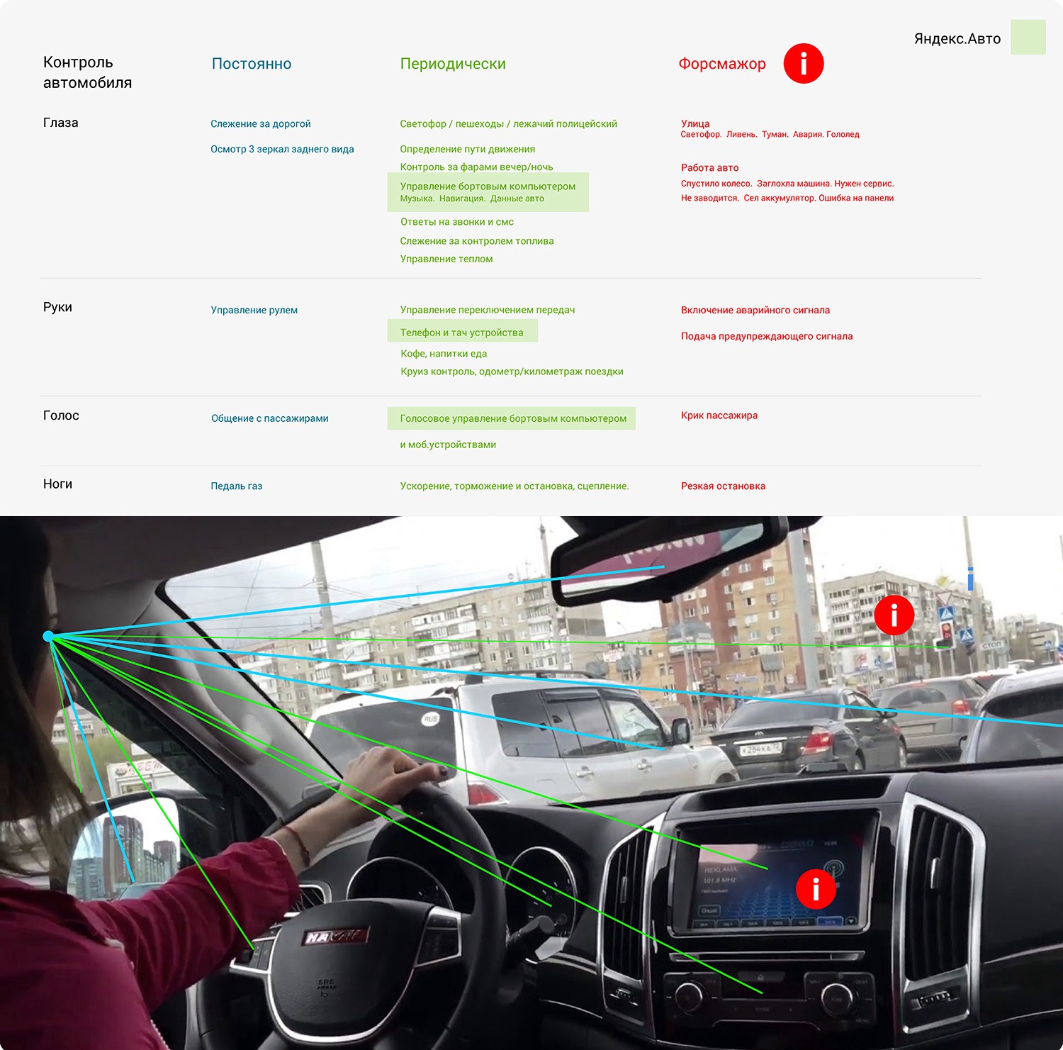
The place of the interface Y.Avto in driving
Almost all body parts at the same time are involved in driving: legs, eyes, ears, hands ...
The more experience, the calmer you act, the better you perceive the flow of information and you create your requests more boldly.
How to distinguish a novice from a professional? In this, we will eventually be helped by the experience of drivers who use the interface. After studying the frequent actions and scenarios, you can evaluate the person and adjust to him. In order not to get confused while designing, we first chose a simple way: we were guided by the novice scenario.
If you analyze the basic queries, the skeleton of the product can be built from three components:
- Navigation.
- Musical accompaniment.
- Auxiliary reference services.
Indeed, the car takes you first and foremost from point A to point B. Do you know the road or do you need a route - are you going, and at the same time there is a huge flow of dynamic information: maneuvers, signs, warnings, recommendations, traffic data ...
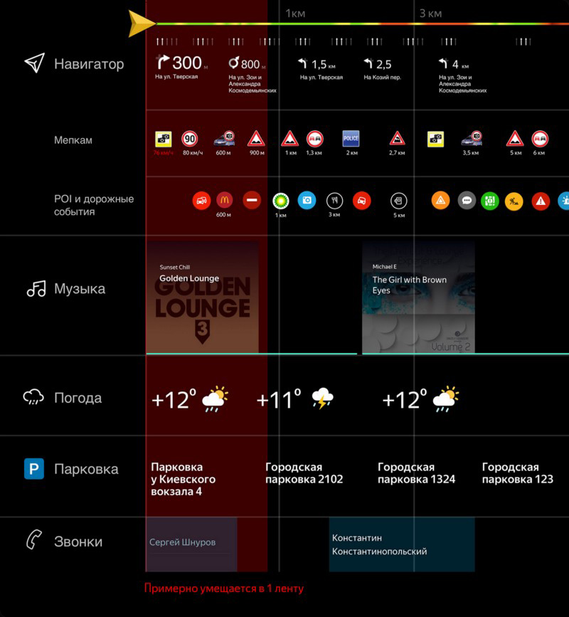
Dynamic data flow during the route
During the movement is very noisy. The rumble of other cars, the work of the engine, the friction of the wheels on the asphalt, the open window - everything merges into a monotonous stream, which sometimes depresses and even lulls them to sleep. Therefore, there is music on board the car since the appearance of the radio. Now the choice of music is quite large - so it's hard to please all the exquisite tastes. Therefore, speaking of music, we lay down the concept of a set of entities that reproduce it. FM radio, music from the browser, AUX, Bluetooth, USB flash drive, Yandex.Music and other sources, all together - a huge music processor that needs to be taken into account.
If almost everyone needs navigation and music, the rest of the services onboard can vary depending on the person. Someone likes to look at the statistics of the car and draw conclusions, someone can not live without a navigator or likes to run videos from the Internet in the browser. These are individual preferences, so they have a lower priority, since they are optional for travel.
If you make a trip to the components, the path from point A to point B in the architectural scenario of the interface will look like this:
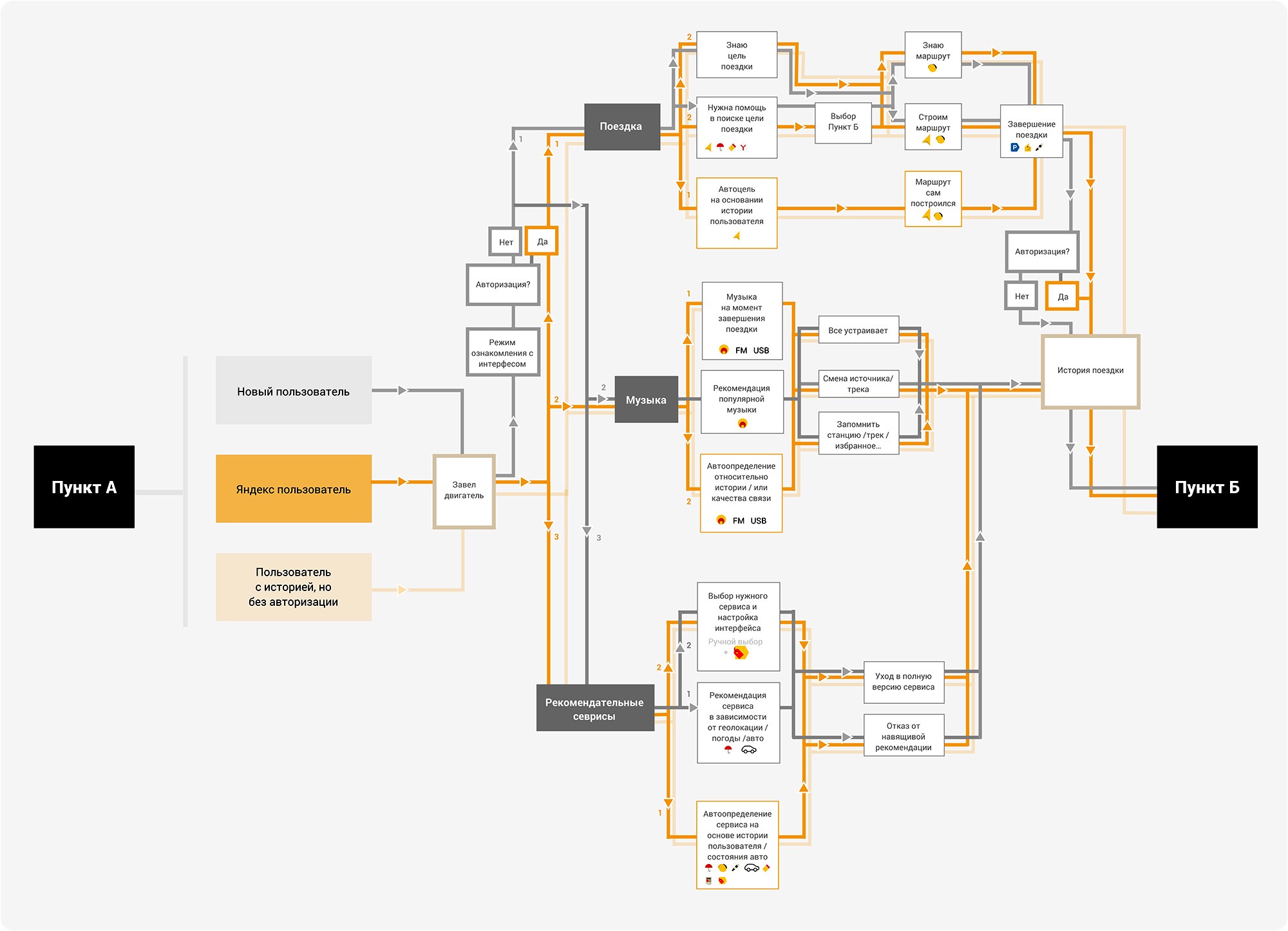
The interface path of the driver on the route
The birth of the concept
We gathered future opportunities and studied the ergonomics of using the interface - and the product picture became clearer. One thought did not go out of my head: the driver has too little time to be distracted by the system. He will have to hold the steering wheel with his left hand, and with his right finger reach for the screen. Making him choose only the necessary applications and then switching between them is no longer so easy. And if he wants to go along the route and change the music at the same time? And if, on the contrary, he knows the way, but he needs warnings about cameras and maneuvers, but he is also a music lover and he is tired of listening to FM radio? There are a lot of scenarios, and all of them are completely personal.
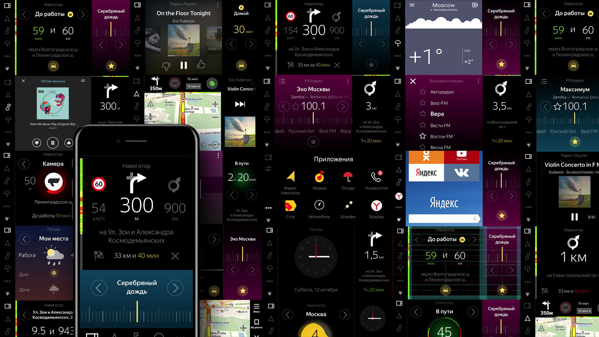
So the hypothesis of combining services was born. And if we take from the applications only what a person needs now, and we will display this information in widgets with different focus? If the information looks the same - it’s hard to concentrate on one thing. Something from the abundance of entities will always be needed right now. From here and two formats of widgets, which are inserted into tapes and turned over vertically in a circle.
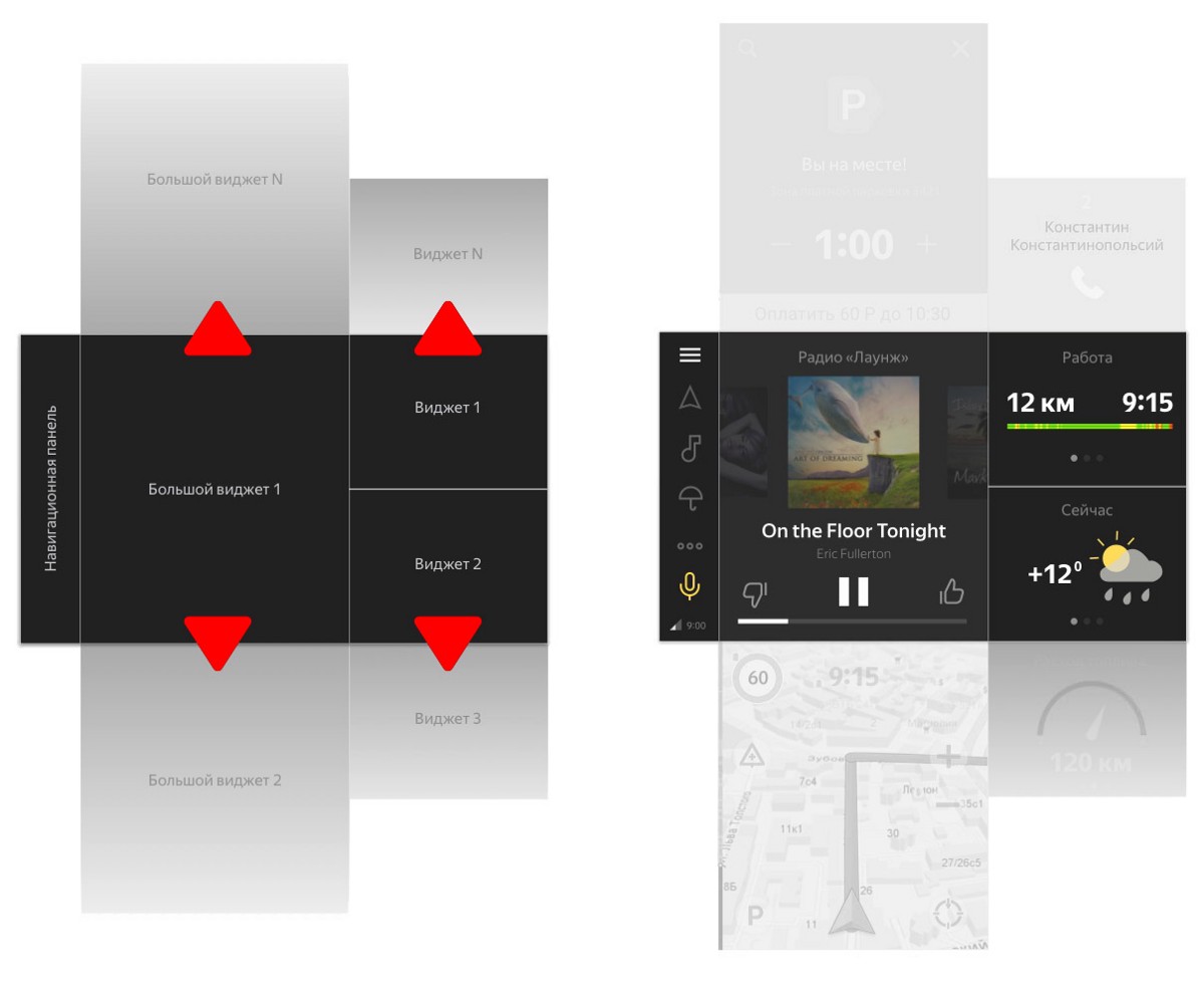
The principle of combining two widget tapes
- Large widget partially duplicates the functionality of the application and allows you to once again not go into it at all.
- Small contextual widget with simplified functionality and only the most important information from the application.
Combining the data of the main services on the screen, we get a flexible tool capable of arranging different drivers.
Further more. If you find out the frequent user actions and accumulate history, you can customize the widgets for each. Whether it is a repeated combination of widgets or content that interests you, it all depends on the person and the situation on the road. At the same time, if you do not want to combine services, then you can always go into full-screen mode of the widget or application.
Interface study
We decided on sensations and began to work closely with the interface. It was important to decide what and when to show. Grid, accents, dosing information, mechanics, restrictions - everything went in parallel. For such a design, important constraints were clearly set during development:
- The minimum area of pressing the screen (finger extended hand). This affected the minimum text size, the size of important buttons, the increased area of clicks and the air around the clickable interface elements and text.
- The dependence on the online and offline made it clear that you need to show and report to the user at such a moment so as not to be misled.
- The car is moving or not - it depends on whether the use of the interface is limited. It turned out that so far everything is relative - in the politics of the automakers, and in our attitude to the driver. On the one hand, it is possible to limit it during the movement, but is it moral in the right way? On the other hand, a bored passenger can sit in a car ... Time and research will prompt the right approach.
Quick prototype sketches of system states
One of the most important tasks is to understand the route navigation. The navigator already knows or will accumulate history over time. You can memorize frequent locations of the user and draw conclusions where he is. For example, the idea to collect a detailed summary of the place where you are and where you (possibly) plan to go. If it's Monday morning and you're home, it seems it's time to go to work. And if you're in Elatme on a day off - that's another story ...
At the same time, it is worthwhile to distinguish between scenarios when you are already traveling along an unfamiliar route and when the route is not needed. In one case, it is important to see the map with the road, in the other it is enough just to notify that it is ahead.
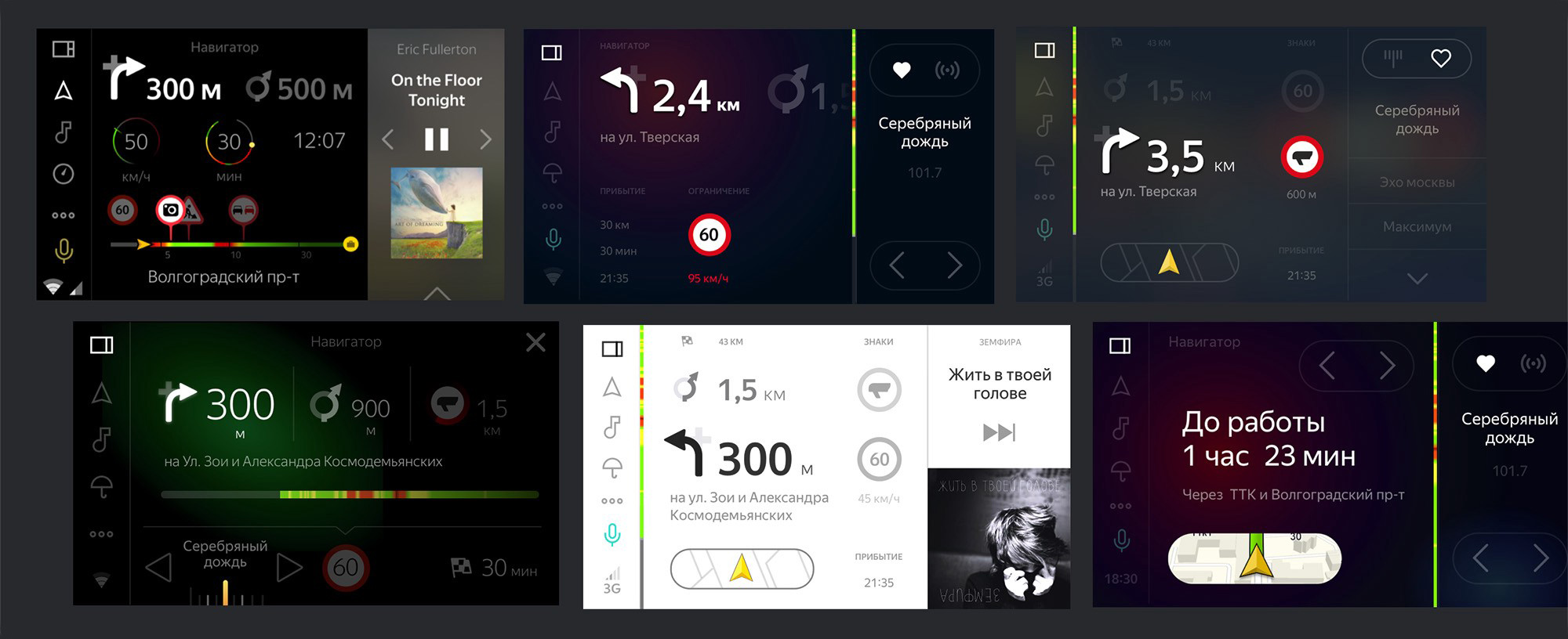
Approaches to Navigator Widgets
The multivariance of music entities has divided everything into two templates. One for FM radio with an evolutionary iteration of the radio station, the second with a beautiful cover that can be shown not only for Yandex.Music, but also for songs from a USB flash drive or a phone connected via Bluetooth. Enough the correct name of the artist and song to leave an online request to search for the cover.
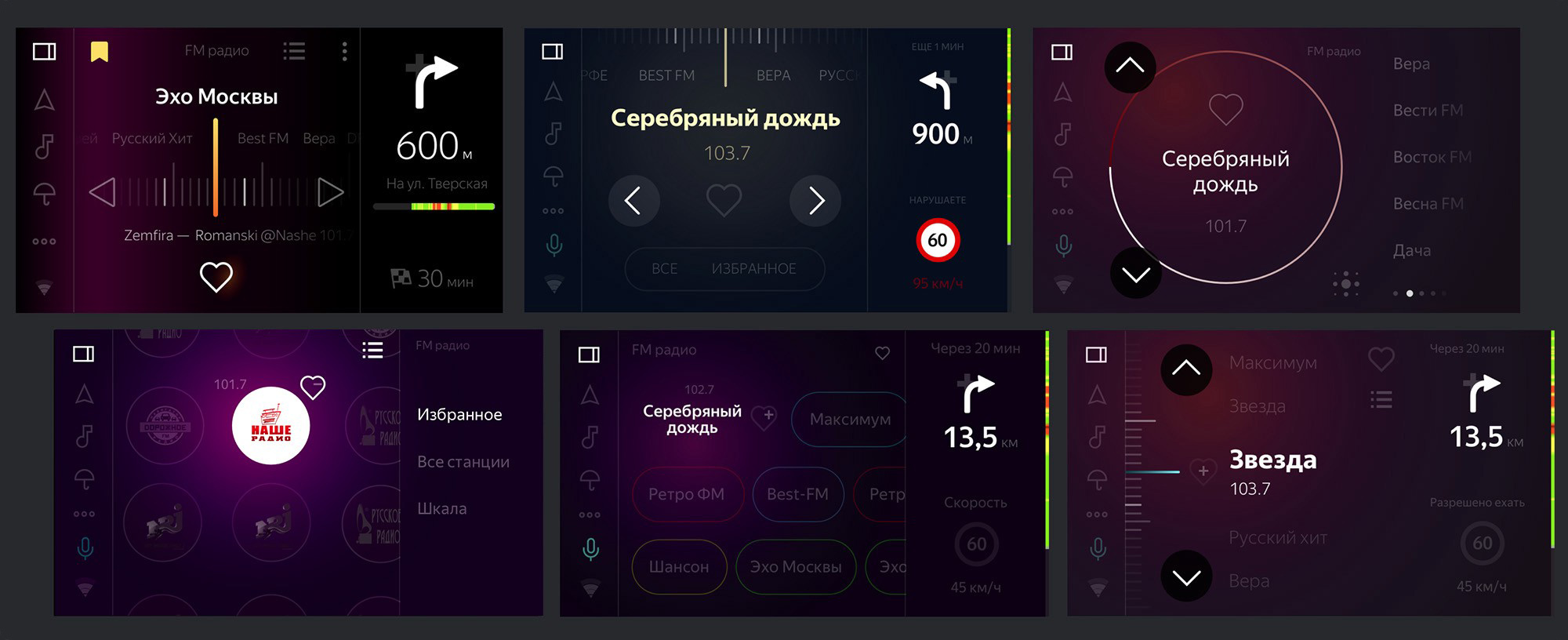
FM radio application searches
From concept to launch
Pre-concept has defined a basic set of applications on board. From scratch, you had to develop FM radio, calls, settings, and an application update system.
From Yandex taken Navigator, Radio, Weather, Browser and voice assistant. With these guys, Android mobile versions had to be adapted to the size of the screen of the head unit (1024 × 600 px) taking into account the rules regarding the clickability and readability of the elements.
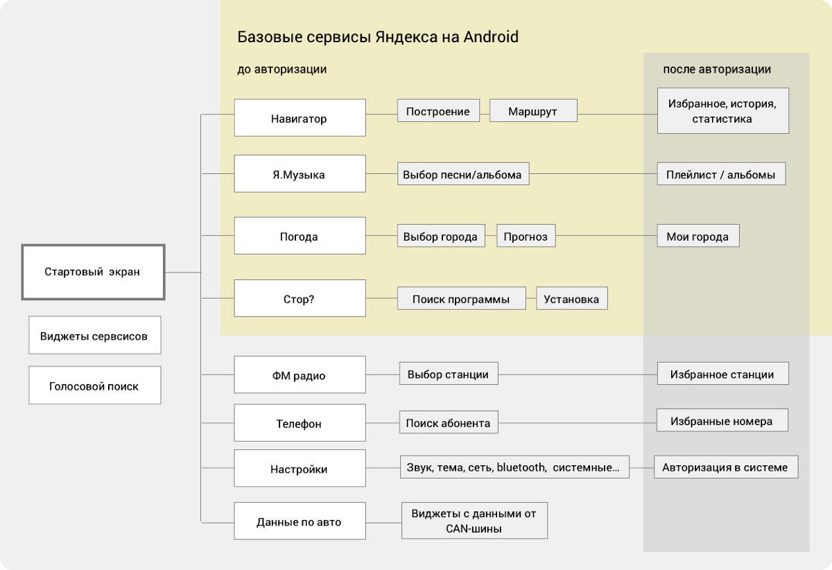
Preliminary composition of the system
It is worth noting that mobile applications are designed to work in the phone, and you hold it in your hands at a short distance from the eyes. In the car, the screen is two to three times further. Everything had to be bigger. In an ideal world, it was worth developing applications from scratch taking into account ergonomics and driver scenarios. But to launch a product is an impossible task. Such processing was left for the development of the system.
Scenarios
Next, we work with layouts, focusing on basic scenarios. Imagine the perfect picture of the world: there is a connection, our user with history. Tuesday morning, it's time to go to work. The engine starts, and the system knows:
- Places of travel (people on weekdays go to work, and on weekends - around the city).
- The latest music.
- Favorite points in the navigator.
- Data on fines and parking account.
The driver goes to work for the hundredth time and, most likely, knows the way even without a navigator. This means that it only needs to see the speed limits, the cameras on the way, the gradient of traffic jams and maneuvers, so as not to miss the turn. On the way, you may need to take a call, switch music, and in between cases look at the weather forecast for the evening. Near the work will need to park.
We pretend the simplest prototype that would reflect the basic actions:
One script is not enough. It is necessary to check users who need only a navigator, and even the whole screen, as well as those who like to watch movies in traffic, and those who need only music. It is important how the start screen looks before the start of the movement and what is combined on the screen.
Having traveled with the team with the first prototypes in the car, we make sure that the minimum on the way is a navigator (in the main zone) and a music player with a choice of source (on the right). Everything else is individual.
Voice assistant
It's time to lay the possibility of controlling the voice. The voice in the car is a promising interface control, while the hands are busy driving. "Let's go outside ..." or "Turn on the radio ..." - all this should work without taking your hands off the wheel and eyes from the road. It is important that the driver notices with peripheral vision and understands by the sound signal that the voice assistant is activated and you can ask.
An example of a game with Alice in the city
They formulated another principle of work: do not duplicate the text of the answers of the assistant, because it distracts from the road. It makes sense to display only driver commands so that you can check whether they are recognized correctly.
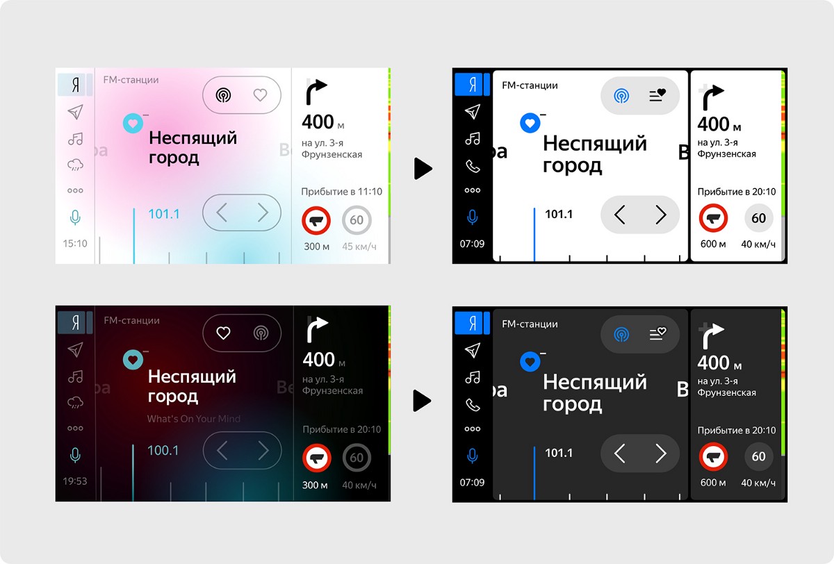
Day mode
If you look at the car's panel, the night mode looks more familiar, since torpedoes are usually black or dark. But the black screen during the day begins to reflect the light and becomes non-contrast, it is inconvenient to read the text on it. A glossy screen or frosted film diffusion, a weak initial brightness and screen contrast - all together they make the night mode unusable.
The layout of the night mode was originally developed in three colors (black, white and accent) with different states of transparency. The change of night and day was supposed to occur without further confusion. We bind to the finished mechanics of the substrate map in the navigator and get the automatic dependence of the interface theme from dawn and dusk.
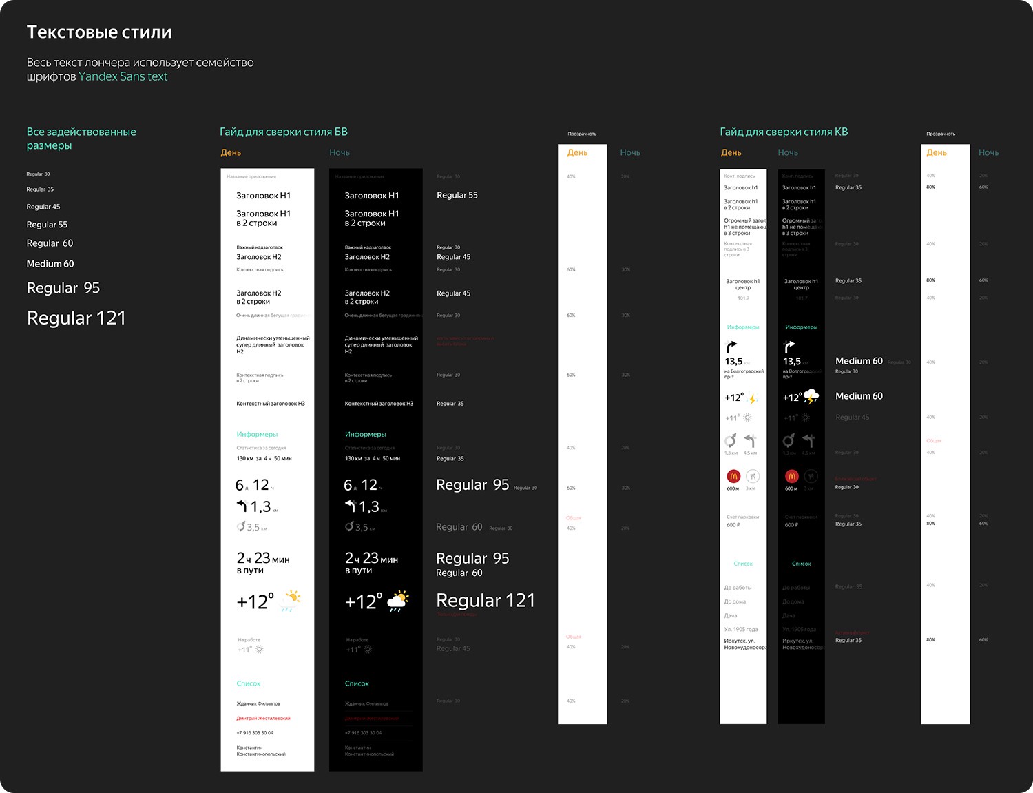
Text styles for day and night interface themes
Communication on board
The interface is completely dependent on the Internet data from the server and the GPS signal, so it had to deal with the states of the main screen widgets. The machine is not always in touch, the connection sometimes lags - and the state of the interface can be different.
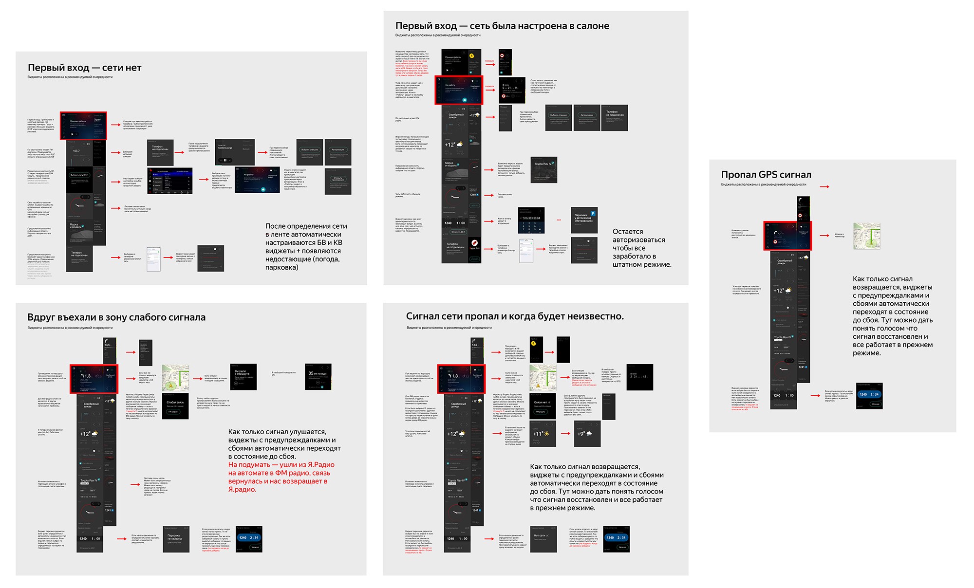
The dependence of widgets on network status
By the first serial launch with Toyota in September 2017, the interface, which is constantly corrected by live layout, looked more refined. Implemented a simple update system for future releases.
Video for the launch of Yandex. Auto
Project development
After the launch, new horizons of development have opened. It became clear where to go further, and the scope of work became even more endless. With the start of serial production and car sales, the first reviews appeared. Metric slowly began to draw a picture of what is happening. Further, in the nearest development program, there was a launch in Y.Drayve, new car brands, support for what is, and a large list of product products.
Customization
In working with auto brands, it was necessary to take into account customization for the manufacturer. When buying a car, we expect that every detail will reflect the brand. Dashboards, as a rule, try to maintain the charisma of the car with fonts, arrows, instruments. It is clear that to make an interface for each brand is problematic, but it’s quite realistic to find elements that could support the general character of the panel. Accent color, font of headings, icons, illustrations ...
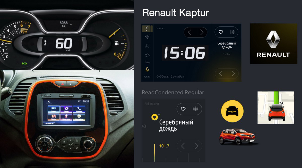
An example of the proposed customization for Renault
Run with Yandex.Drive
People use carsharing cars in a different way than personal cars. Basically, you need to quickly sit down and go from A to B, because every minute is worth the money. It became clear that in this case you should not give the full functionality of the original version. Initially, a set of applications was cut down and access to the full system settings. The first tasks in this direction were memorization of favorites and login, adding Alice's skills, improving day mode.
For more than a year, the carsharing version has become, in effect, a showcase with a constant number of users. A large flow of feedback and the introduction into operation of new head units made their adjustments.
For example, the daily theme in different cars in some places visually subsided due to the physical features of the screens. As a result, remade day mode. First of all, we tried to increase the boldness and font size, to abandon their translucent states.
The first approach to style change
According to the results of UX-studies, users of Yandex.Drayv decided to live as an experiment without the state of the main screen, where the central part was previously a zone of scrolling widgets. Since launch, the main screen mode has managed to play its role, and now it is being reworked. All described changes are already available in cars car sharing since May 2019.
Their devices
Over time, interest in the project began to grow, and the team had an idea to make a product for everyone. We selected head units for more than 14 models and began to adapt the product to them.
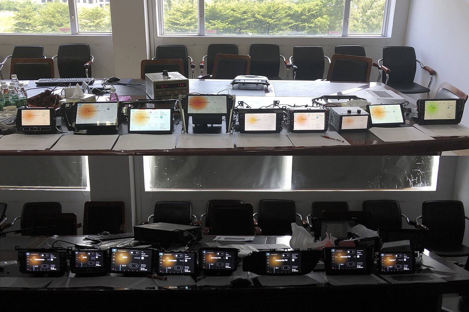
Acceptance of the quality of the head unit screens at the Caska factory in China
In this iteration, we modified the calls, advanced settings of the head unit, adapted the full Android version of Yandex.Music, improved the update system and interaction with Alice. For more information about what is already available for sale, it is written on the site Yandex. Auto.
It is important to note that this version can be considered a full-fledged system for a personal car, which will eventually be updated and developed. Support for new or updated applications, improvements in the interface - everything will come on board in a timely manner.
The current view of the interface GU on sale
Future
Thanks to the installations in cars, the launch of car sharing and their devices in the metrics are constantly added new users. There are a lot of ideas on how to improve the system and many new developments, so the plan is planned for years to come.
It is important that now in the world of cars and embedded media systems there is a healthy competitive environment in which there is a place for everyone who does something interesting.
Every week, information about this or that useful technology comes up, so we need to keep the bar. The data from the car and the support of its functions will eventually lead the product to a qualitatively new level of communication with the driver.
Subscribe to a telegram channel about design in Yandex t.me/yandexdesign
Source: https://habr.com/ru/post/459426/
All Articles