Cocos2d-x - UI components
From translator
Welcome back! We are continuing our translation cycle for Cocos2d-x documentation . By tradition, I should leave here a link to the previous article:
Cocos2d-x - Action Handling
We continue!
UI components
Looking at the many applications that you used, I bet that you will find UI widgets there, even without having an idea about them. Each application most likely uses several widgets. What does UI mean? What do UI widgets do? Oh, so many questions!
')
Widgets
UI is an abbreviation for user interface. This is all that is on the screen. This includes items such as: labels , buttons , menu items, and more. Cocos2d-x provides a set of widgets to easily add these controls to your projects. This may sound trivial, but a large number of operations are performed during the creation of a main class, such as a Label . Can you imagine that you need to write your own set of widgets? Do not worry, all this is quite realizable!
Label
Cocos2d-x provides a Label object that can create labels using true type , bitmap, or system fonts. This single class implements all the labels in the application.
Label BMFont
BMFont is a type of label that uses a bitmap font. Symbols in a raster font consist of a matrix of dots . It is very fast and easy to use, but not scalable, as it requires a separate font for each character size. Each character in the caption is a separate sprite. Thanks to this method, each character can be rotated, scaled or colored. They may have different reference points or other parameters.
Creating a BMFont label requires two files: a .fnt file and a graphical representation of each character in the .png format. If you use tools like Glyph Designer, these files will be created automatically. Creating a Label object using BMFont :
auto myLabel = Label::createWithBMFont("bitmapRed.fnt", "Your Text"); 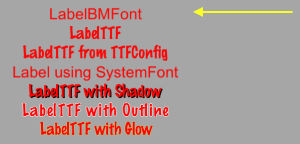
All characters specified in the parameter string must be found in the provided .fnt file, otherwise they will not be displayed. If you display a caption and there are no characters in it, make sure that they exist in your .fnt file.
LabelTTF
True Type Fonts is different from bitmap fonts about which we learned above. When using TTF , the font outline itself is rendered. This is convenient, since you no longer need to have separate font files for each size and color that you might want to use. Creating an inscription using TTF is simple. To create you need to specify the name of the .ttf file, a string of text and size. Unlike BMFont , TTF can display a resized size without having to have separate font files. TTF usage example:
auto myLabel = Label::createWithTTF("Your Text", "Marker Felt.ttf", 24); 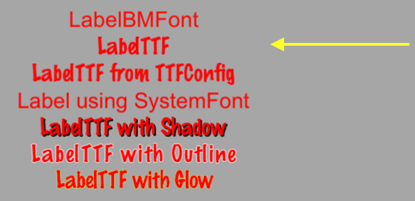
Although it is more flexible than the birmap font, TTF is slower to display, and changing parameters such as size is expensive.
If you need multiple Label objects that use TTF and have the same parameters, you can create a TTFConfig to manage them. TTFConfig allows you to set general properties that all your labels will have. You can think of this as a recipe where all your Label objects will use the same ingredients.
You can create a TTFConfig object in the following way:
// TTFConfig TTFConfig labelConfig; labelConfig.fontFilePath = "myFont.ttf"; labelConfig.fontSize = 16; labelConfig.glyphs = GlyphCollection::DYNAMIC; labelConfig.outlineSize = 0; labelConfig.customGlyphs = nullptr; labelConfig.distanceFieldEnabled = false; // TTF Label TTFConfig auto myLabel = Label::createWithTTF(labelConfig, "My Label Text"); 
TTFConfig can even be used to write Chinese, Japanese, and Korean characters.
Label SystemFont
SystemFont is an inscription type that uses a standard system font and its size. It is understood that the properties of this font can not be changed. Remember, system font is system rules . Creating a label with SystemFont:
auto myLabel = Label::createWithSystemFont("My Label Text", "Arial", 16); 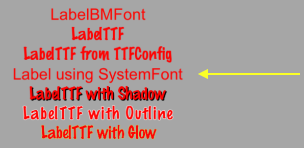
Label effects
Once you have Label objects on the screen, you may want to make them a little more beautiful. They may look flat or too simple. Fortunately, you do not need to create your own fonts for this. Not all Label objects support all effects. These include shadows , contours and highlights . You can add one or more effects without difficulty.
Label with shadow effect:
auto myLabel = Label::createWithTTF("myFont.ttf", "My Label Text", 16); // Label myLabel->enableShadow(); 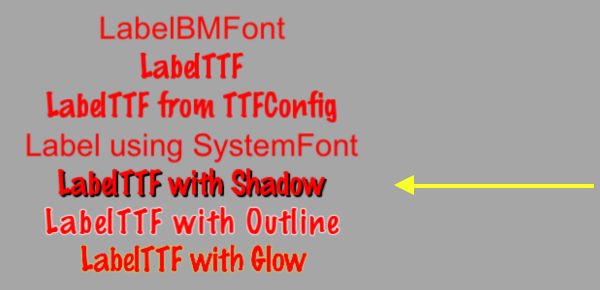
Label with a contour effect:
auto myLabel = Label::createWithTTF("myFont.ttf", "My Label Text", 16); // TTF, myLabel->enableOutline(Color4B::WHITE, 1)); 
Label with glitter effect:
auto myLabel = Label::createWithTTF("myFont.ttf", "My Label Text", 16); // TTF, myLabel->enableGlow(Color4B::YELLOW); 
Menu and its elements
We are all already familiar with the idea of the menu. We see them in every application used. In your game, you probably would use Menu objects to navigate in game settings. Menus often contain buttons like Play, Quit, Settings, or About, but may also contain other objects. The Menu object is a special type of node. You can create an empty Menu object as a place for your items:
auto myMenu = Menu::create(); As described above, Play, Quit, Settings and About are your menu items. A menu without elements forms a small scene. Cocos2d-x offers various ways to create your menu items, including the use of labels or specified images. Menu items, as a rule, have two possible states, normal ( normal ) and active ( selected ). When you click or click on a menu item, a function call is triggered. Imagine that this is a chain reaction. You click on the menu item and the code you specify is launched. A menu can have one or many items.
// // auto closeItem = MenuItemImage::create("CloseNormal.png", "CloseSelected.png", CC_CALLBACK_1(HelloWorld::menuCloseCallback, this)); auto menu = Menu::create(closeItem, NULL); this->addChild(menu, 1); A menu can also be created by using a vector of MenuItem objects:
// Vector<MenuItem*> MenuItems; auto closeItem = MenuItemImage::create("CloseNormal.png", "CloseSelected.png", CC_CALLBACK_1(HelloWorld::menuCloseCallback, this)); MenuItems.pushBack(closeItem); /* , , */ auto menu = Menu::createWithArray(MenuItems); this->addChild(menu, 1); A sample menu that consists of MenuItem objects using labels:

Lambda functions in MenuItem
Above we said that when you click on a menu item, the callback function is triggered. C ++ 11 offers lamda functions. Therefore, Cocos2d-x uses all their advantages! Lambda function is a function that you write inside your source code. Lambda functions are calculated at runtime, not at compile time.
Simple lambda function:
// lambda auto func = [] () { cout << "Hello World"; }; // func(); Using the lambda function in the MenuItem:
auto closeItem = MenuItemImage::create("CloseNormal.png", "CloseSelected.png", [&](Ref* sender){ // }); Button
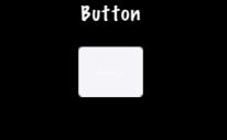
I doubt that we need a long talk about the buttons. We all know them, like the things that we click to call some event in your game. You can use the buttons to change the scene or add sprites to your game. The button intercepts the click event and calls the predefined callback function. The buttons have normal ( normal ) and active ( selected ) states. The appearance of the button may change, depending on the state. Creating a button and assigning it a function is simple:
#include "ui/CocosGUI.h" auto button = Button::create("normal_image.png", "selected_image.png", "disabled_image.png"); button->setTitleText("Button Text"); button->addTouchEventListener([&](Ref* sender, Widget::TouchEventType type){ switch (type) { case ui::Widget::TouchEventType::BEGAN: break; case ui::Widget::TouchEventType::ENDED: std::cout << "Button 1 clicked" << std::endl; break; default: break; } }); this->addChild(button); As you can see, in the example above, we specify .png images for each possible button state. The button consists of three images that may look like this:


On the screen, the button will look like this:
Checkbox
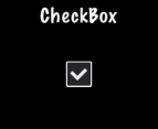
We are all used to filling out checkboxes on paper forms, such as job applications or rental contracts. You can also have these flags in your game. Perhaps you want to give the player the opportunity to make a simple choice, yes or no . You can also find the name of the binary choice (1 or 0). CheckBox allows you to make such a choice. There are 3 different CheckBox states: normal , selected and disabled . Creating a checkbox is simple:
#include "ui/CocosGUI.h" auto checkbox = CheckBox::create("check_box_normal.png", "check_box_normal_press.png", "check_box_active.png", "check_box_normal_disable.png", "check_box_active_disable.png"); checkbox->addTouchEventListener([&](Ref* sender, Widget::TouchEventType type){ switch (type) { case ui::Widget::TouchEventType::BEGAN: break; case ui::Widget::TouchEventType::ENDED: std::cout << "checkbox 1 clicked" << std::endl; break; default: break; } }); this->addChild(checkbox); As you can see in the example above, we set .png images for each CheckBox state. These are 5 images, one for each state, plus 2 more for the checkboxes themselves:


On the screen, the CheckBox will look like this:
Loadingbar
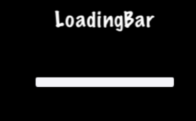
Have you ever had to wait for the game to download all the necessary content. You were probably shown a lane filled in as the download progressed. Quite a part of this is called the progress bar , status bar, or loading bar . Creating LoadingBar:
#include "ui/CocosGUI.h" auto loadingBar = LoadingBar::create("LoadingBarFile.png"); // loadingBar->setDirection(LoadingBar::Direction::RIGHT); this->addChild(loadingBar); In the example above, the LoadingBar was created and we set the direction for it to fill it. In this case, right. However, you will probably need to change the load percentage. This is easy to do:
#include "ui/CocosGUI.h" auto loadingBar = LoadingBar::create("LoadingBarFile.png"); loadingBar->setDirection(LoadingBar::Direction::RIGHT); // - , loadingBar->setPercent(25); // -, loadingBar->setPercent(35); this->addChild(loadingBar); As you can see in this example, the specified .png image as the loadingBar texture is:

On the LoadingBar screen, it might look like this:
Scrollview
Suppose you have a menu full of options for the player. You cannot put them all in one column on the screen. Will you get rid of them? Not! You are using ScrollView . You can create a scroll view to navigate horizontally or vertically. To create a ScrollView you need:
#include "ui/CocosGUI.h" auto scrollView = cocos2d::ui::ScrollView::create(); We created ScrollView . By default, ScrollView is positioned vertically. You can also scroll horizontally or in both directions. Example:
#include "ui/CocosGUI.h" // ScrollView auto scrollView = cocos2d::ui::ScrollView::create(); // , , // auto scrollView = cocos2d::ui::ScrollView::create(); scrollView->setDirection(cocos2d::ui::ScrollView::Direction::VERTICAL); Slider
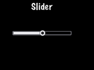
Sometimes it is necessary to slightly change a value. Perhaps you have a character, and you want to give the player the ability to customize the attack power of enemies. Slider allows you to set the value by moving the indicator. How to create a Slider :
#include "ui/CocosGUI.h" auto slider = Slider::create(); slider->loadBarTexture("Slider_Back.png"); // Slider slider->loadSlidBallTextures("SliderNode_Normal.png", "SliderNode_Press.png", "SliderNode_Disable.png"); slider->loadProgressBarTexture("Slider_PressBar.png"); slider->addTouchEventListener([&](Ref* sender, Widget::TouchEventType type){ switch (type) { case ui::Widget::TouchEventType::BEGAN: break; case ui::Widget::TouchEventType::ENDED: std::cout << "slider moved" << std::endl; break; default: break; } }); this->addChild(slider); As you can see, we set .png images for each possible state of the slider. Slider includes 5 images that may look like this:


On the screen, it looks like this:
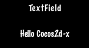
Textfield
What if you want to give the player the opportunity to type the name of the main character? Where would you do it? Of course in the text box. TextField is used to insert text. It supports touch input, focus, percentage positioning and percentage size. Creating a TextField:
#include "ui/CocosGUI.h" auto textField = TextField::create("","Arial",30); textField->addTouchEventListener([&](Ref* sender, Widget::TouchEventType type){ std::cout << "editing a TextField" << std::endl; }); this->addChild(textField); This example creates a TextField and sets the callback function.
TextField objects are versatile and can meet all your needs. Do you want a user to enter a secret password? Do you need to limit the number of characters that a user can enter? All this is built into TextField and even more! Let's take a look at an example:
#include "ui/CocosGUI.h" auto textField = TextField::create("","Arial",30); // TextField textField->setPasswordEnabled(true); // , textField->setMaxLength(10); textField->addTouchEventListener([&](Ref* sender, Widget::TouchEventType type){ std::cout << "editing a TextField" << std::endl; }); this->addChild(textField); On the screen, it looks like this:
When you edit TextField, the on-screen keyboard appears:

Next article: Cocos2d-x - Scenes and special types of nodes
Source: https://habr.com/ru/post/340354/
All Articles