Geospatial types in SQL Server Reporting Services reports
The Geometry and Geography types have been available in SQL Server since version 2008. The Map control that uses them based on the Dundas control of the same name appeared in SQL Server Reporting Services 2008R2. Other innovations in reporting services 2008R2 described in posts
blogs.technet.com/b/isv_team/archive/2010/03/27/3321575.aspx ,
blogs.technet.com/b/isv_team/archive/2010/03/28/3321598.aspx ,
blogs.technet.com/b/isv_team/archive/2010/03/29/3321661.aspx ,
blogs.technet.com/b/isv_team/archive/2010/04/04/3322989.aspx ,
blogs.technet.com/b/isv_team/archive/2010/04/06/3323367.aspx ,
blogs.technet.com/b/isv_team/archive/2010/04/15/3325155.aspx .
Open in SQL Server Data Tools (SSDT) a project of type Report Server Project:
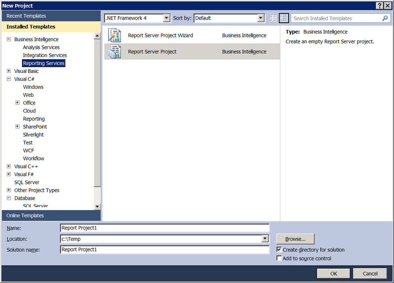
Pic.1
')
Just in case, let me remind you that reporting services are part of the free version of SQL Server Express (you need to take the Express with Advanced Services option). About the limitations of free reporting is written here . SSDT, by definition, are free, taken here . Instead of Report Server Project in SSDT, anyone can use Report Builder - it is also free.
In the table created in the previous post with the maps of the subjects of the Russian Federation, I will add columns that will contain the population according to the last census , as well as the percentage of the male population. Please do not discern in this gender chauvinism, just why keep at the same time a percentage of both sexes? Ok, let's get female. As a result, the table takes the following form:
Pic2
Add a new data source to the reporting project in SSDT

Pic.3
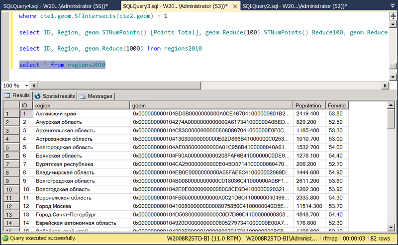
in which we set the connection string to SQL Server. In the folder below, we will create a new dataset based on this source, which will contain the results of the query
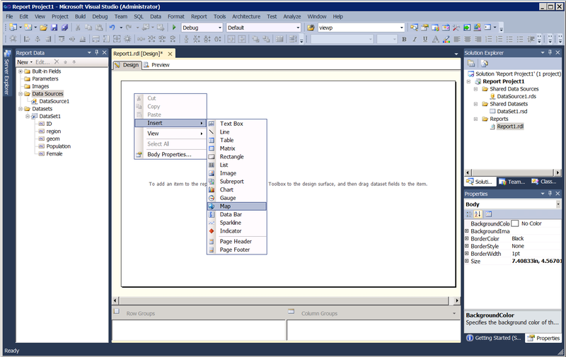
Pic.4
You will be prompted to select the source for the map. Map Gallery are maps that come with Reporting Services. They refer to the USA and to us in this case without interest. The second source can be a shapefile, but we have already tightened it in the past post it into the SQL Server table. Select the third type of source - SQL Server spatial query and specify DataSet1 for it. Further it will be offered to select in it a field of type Geometry / Geography. In this case, there is one such field in the dataset, and it is already automatically entered in the combo box. I plan to color the polygons depending on the values of another field from the dataset, therefore, I choose Color Analytical Map as the map visualization method:

Pic.5
If the field, on the basis of which the coloring will be made, was in another dataset, here it would be possible to link it with the first one, but in our case everything is simple, therefore Choose an existing dataset. The next screen prompts you to choose a color scheme. The field on which the coloring will be made is the population size (Population). I want the color to be thicker than the larger population, so I choose the Light - Dark shading rule.
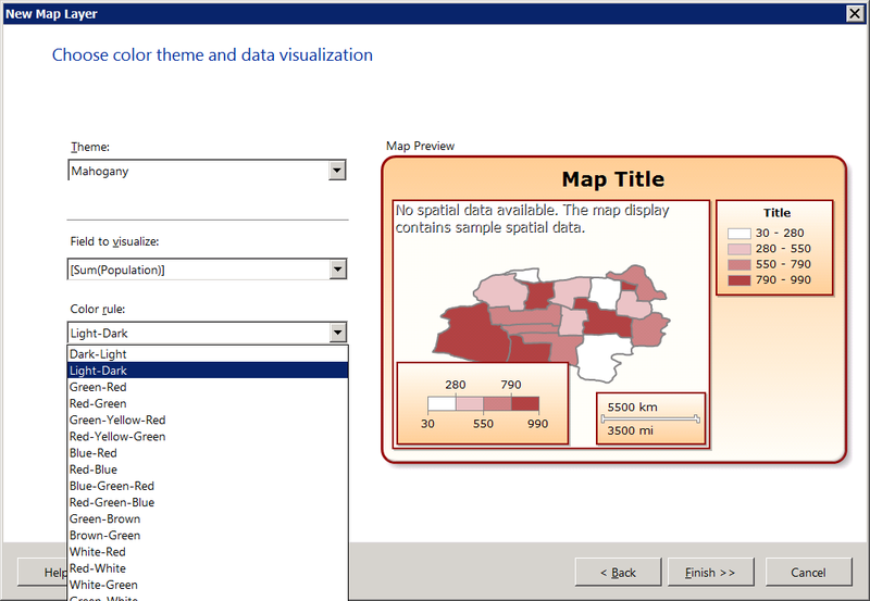
Pic.6
Go to the Preview tab to see what happened. It turned out sucks - instead of a card void. This happens because the map expects the Geography type by default, and in our case the geom column has the Geometry type. Go back to the Design tab, right-click on the image, select Viewport Properties:

Pic.7
and fix the wait on Coordinate system = Planar (X, Y):
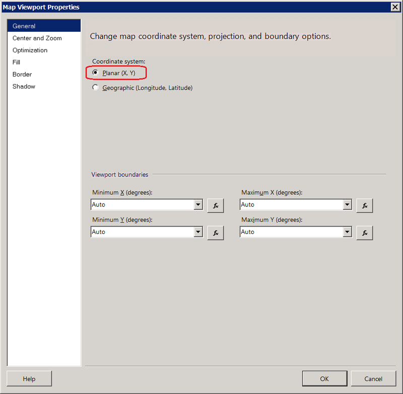
Fig.8
Now the map will be displayed normally:

Fig.9
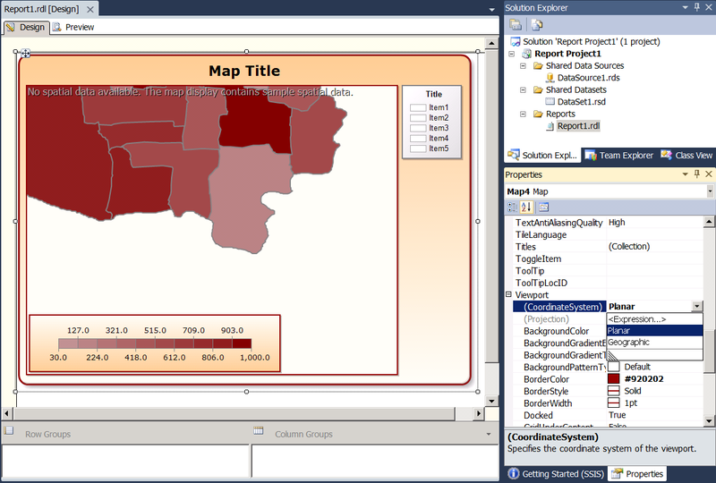
Return to the Design tab. You can also correct Viewport properties in the Properties panel by selecting it directly on the working surface of the report or by selecting the Map control as a child:
Pic.10
Delete the Title rectangle in the upper right to make more space under the map. Or a rectangle with a scale at the bottom left - without a difference. Just in case, you can restore the dead from the Map context menu: Add Legend and Show Color Scale respectively.

Figure 11
By default, the size of the legend is set to Auto, which does not allow to change the size of the rectangle, only to carry it over the surface of the map. This behavior is easy to correct if you set Auto = False in the Size property. Graphically, resizing, pulling the corner, it will still be impossible, but there is an opportunity in the properties to drive Height and Width with your hands. Similar behavior came across indicators or some other elements inherited from Dundas. The overall length of the rectangle is influenced by the size and format of the font labels. I removed the extra decimal places in the LabelFormat property:
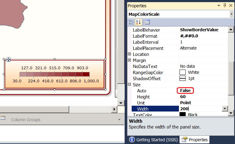
Fig.12
In the Map Layers list, which now consists of one layer, choose Polygon Color Rule in the context menu of this layer:
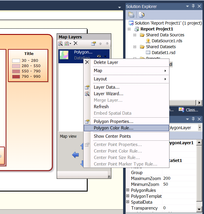
Fig.13
In the General section, you can re-select the dataset field, on the basis of which the coloring is made, for example, why do we need the SUM () function, which the wizard of map mapping has slipped in Fig.6? There is nothing to aggregate in the regions2010 table, there each line has its own subject. I would also divide the Population field by 1000 to make Labels, and, consequently, the length of the MapColorScale rectangle (see Figure 12) is shorter. The expression takes the form
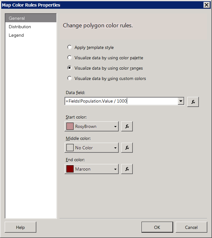
Fig.14
and in paragraph Distribution - the number of levels of graduation:

Pic.15
There are 4 options: Equal Interval, when the range from the minimum to the maximum values of the Data Field will be divided into Number of subranges of equal segments; Equal Distribution, when the lengths of the segments are selected so that approximately the same number of records fall into each; Optimal, when the tool solves itself, and Custom, when we explicitly set the initial and final boundaries of each interval.
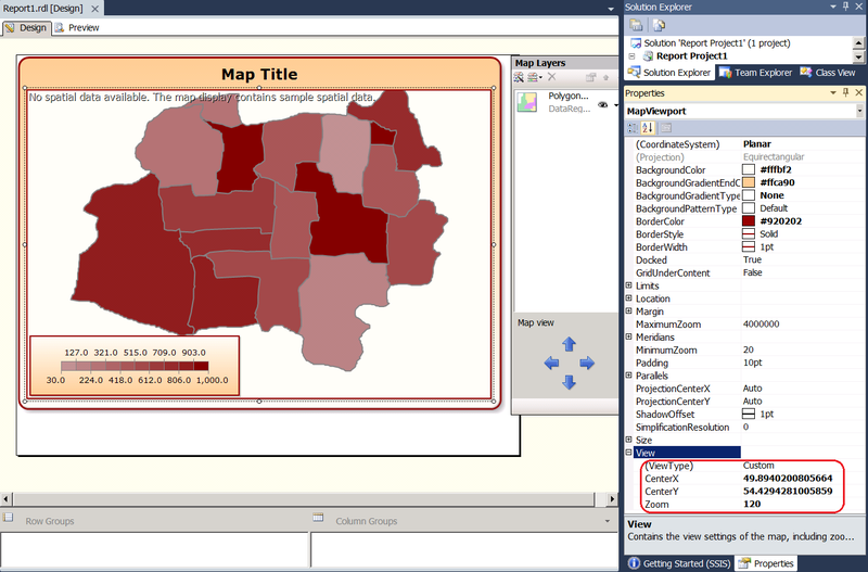
As in Fig.10, in the case of the Viewport property, layer properties are accessible from the property panel or through a hierarchy of objects, starting from the upper level Map, which has the Layers collection as a property:

Figure 16
or, if you carefully aim, you can select a layer directly in the map on the working surface of the report:

Pic.17
It remains to correct the location of the map and its size. This is done in Figure 8 in the Center and Zoom section or in the View property of the Viewport object in the Properties pane of Figure 10. You can move the Viewport inside the map with the mouse or using the blue arrows Map view or simply setting the coordinates of CenterX / CenterY. Zoom changes the size of the Viewport, not allowing to distort the ratio of width / length despite the fact that inside the Size property are sub-properties of Height and Width. In the properties panel, they are marked as inaccessible, but in the documentation about readonly nothing is said, so I changed them directly in rdl. Zero effect. Apparently, the spectacle of stretching the image was sacrificed in order to respect the proportions in geometry / geography.
Pic.18
Depending on the distribution chosen (Fig.15-17), the demographic situation in the country may look dim (equal interval scale):
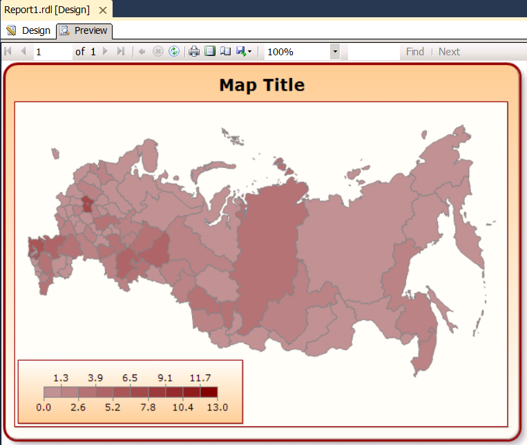
Figure 19
or in somewhat brighter tones (equidistributed scale):
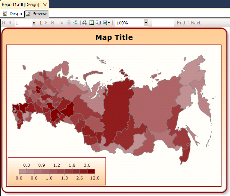
Pic.20
Homework. Build a similar report by mapping the population density = population in the subject / area of the subject. The area is counted as a geom. STArea () .
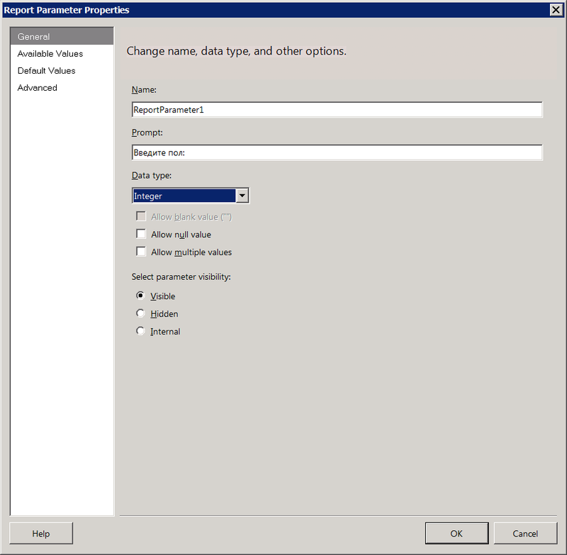
I will add a bit of interactivity to the report, so that depending on the chosen value of the parameter (Male, Female, Common), the map shows the male population, female or together - what we see now. In the Report Data panel (on the left - see Figure 4), right-click on the Parameters folder and say Add Parameter. In the General item, the name and type of the parameter are specified. The Allow blank value option differs from Allow null value in that it is available only when Allow multiple values is marked and means that the list may be empty. The hidden parameter is not shown in the user interface, but you can access it when you call the report via a URL or a subscription. Internal parameter is not lit out in any way.
Pic.21
The Available Values item indicates whether the user will enter the parameter value manually or select from the list of available values. The list can be specified as an explicit enumeration or dataset that needs to be created in the same way as we created it to draw a map. In this case, the available values will be only 3 known in advance - they are easy to list explicitly. Click the Add button three times, enter Label and Value. The user is shown the Label column, but the corresponding value from the Value column falls into the parameter value. The order in the case of an explicit task can be changed using the blue arrows buttons located in the Add / Delete buttons row.
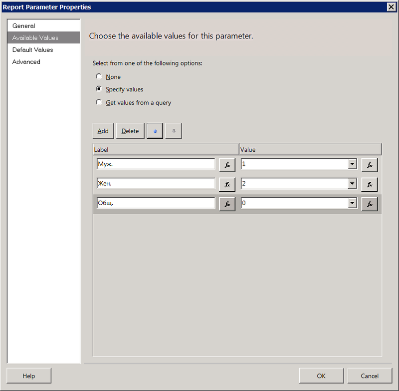
Fig.22
In the Default Values clause, the parameter value is set by default. In our case, it will be 0, i.e. the male and female population in the aggregate, as was in Figure 20. As a default, you can also specify a dataset column - its first entry will be considered.
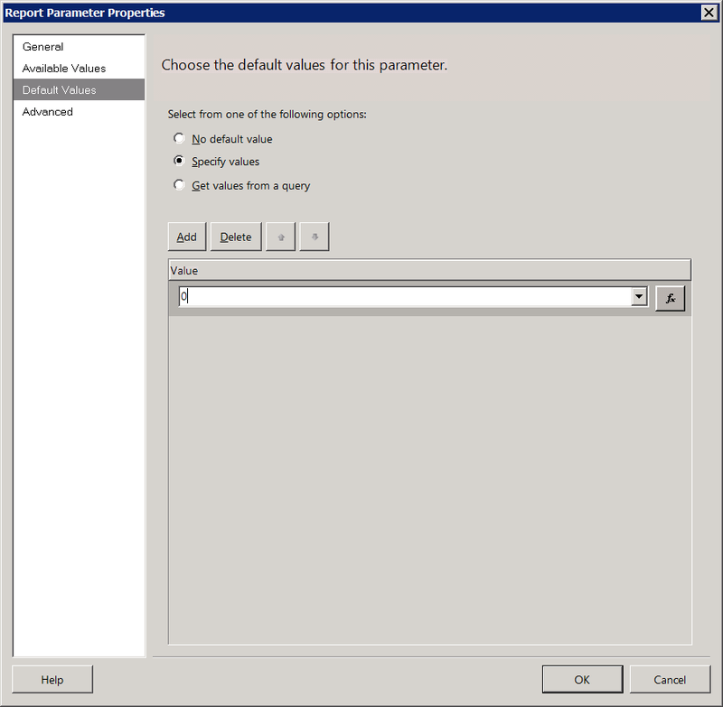
Fig.23
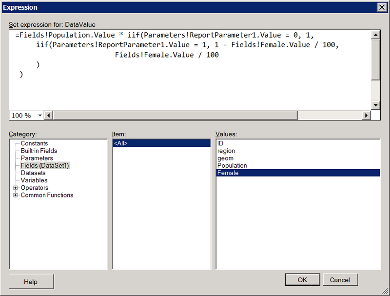
Now we return to Fig.14 and adjust the analytical field, on the basis of which the map is colored. Click the button with the function icon to the right of the input field and set the following expression:
Double clicking on the value in the Values list inserts it at the cursor position in the upper text box where the expression is being edited.
Pic.24
The expression means that if a parameter with a value of 0 is passed, you need to paint over the map based on the population size of the subject from the Population column. If 1 (me) - multiply the population by the percentage of the male population = Population * (1 - female), if 2 (jo) - multiply the population by the percentage of the female population. Run the report. Initially, he does not ask anything, because executed with the default parameter value (0). You can then select a gender from the parameter value list and click the View Report button. The map is redrawn based on the population of the indicated sex. There will be no major changes in the painting of the regions, because men and women everywhere about equally, but the meaning is clear.

Fig.25
blogs.technet.com/b/isv_team/archive/2010/03/27/3321575.aspx ,
blogs.technet.com/b/isv_team/archive/2010/03/28/3321598.aspx ,
blogs.technet.com/b/isv_team/archive/2010/03/29/3321661.aspx ,
blogs.technet.com/b/isv_team/archive/2010/04/04/3322989.aspx ,
blogs.technet.com/b/isv_team/archive/2010/04/06/3323367.aspx ,
blogs.technet.com/b/isv_team/archive/2010/04/15/3325155.aspx .
Open in SQL Server Data Tools (SSDT) a project of type Report Server Project:
Pic.1
')
Just in case, let me remind you that reporting services are part of the free version of SQL Server Express (you need to take the Express with Advanced Services option). About the limitations of free reporting is written here . SSDT, by definition, are free, taken here . Instead of Report Server Project in SSDT, anyone can use Report Builder - it is also free.
In the table created in the previous post with the maps of the subjects of the Russian Federation, I will add columns that will contain the population according to the last census , as well as the percentage of the male population. Please do not discern in this gender chauvinism, just why keep at the same time a percentage of both sexes? Ok, let's get female. As a result, the table takes the following form:
Pic2
Add a new data source to the reporting project in SSDT
Pic.3
in which we set the connection string to SQL Server. In the folder below, we will create a new dataset based on this source, which will contain the results of the query
SELECT ID, region, geom.Reduce(1000) as geom, Population, Female FROM regions2010 . Move down to the Reports folder below and create an empty report Add -> New Item -> Report in the project. In the Report Data panel, which is traditionally located on the left, right-click on the Data Sources folder and add a link to the newly created shared data source DataSource1. Similarly we will add the link to the general DataSet1. Increase the working surface of the report by sliding it out at the bottom right corner. Click on it with the right button and select Insert -> Map:Pic.4
You will be prompted to select the source for the map. Map Gallery are maps that come with Reporting Services. They refer to the USA and to us in this case without interest. The second source can be a shapefile, but we have already tightened it in the past post it into the SQL Server table. Select the third type of source - SQL Server spatial query and specify DataSet1 for it. Further it will be offered to select in it a field of type Geometry / Geography. In this case, there is one such field in the dataset, and it is already automatically entered in the combo box. I plan to color the polygons depending on the values of another field from the dataset, therefore, I choose Color Analytical Map as the map visualization method:
Pic.5
If the field, on the basis of which the coloring will be made, was in another dataset, here it would be possible to link it with the first one, but in our case everything is simple, therefore Choose an existing dataset. The next screen prompts you to choose a color scheme. The field on which the coloring will be made is the population size (Population). I want the color to be thicker than the larger population, so I choose the Light - Dark shading rule.
Pic.6
Go to the Preview tab to see what happened. It turned out sucks - instead of a card void. This happens because the map expects the Geography type by default, and in our case the geom column has the Geometry type. Go back to the Design tab, right-click on the image, select Viewport Properties:
Pic.7
and fix the wait on Coordinate system = Planar (X, Y):
Fig.8
Now the map will be displayed normally:
Fig.9
Return to the Design tab. You can also correct Viewport properties in the Properties panel by selecting it directly on the working surface of the report or by selecting the Map control as a child:
Pic.10
Delete the Title rectangle in the upper right to make more space under the map. Or a rectangle with a scale at the bottom left - without a difference. Just in case, you can restore the dead from the Map context menu: Add Legend and Show Color Scale respectively.
Figure 11
By default, the size of the legend is set to Auto, which does not allow to change the size of the rectangle, only to carry it over the surface of the map. This behavior is easy to correct if you set Auto = False in the Size property. Graphically, resizing, pulling the corner, it will still be impossible, but there is an opportunity in the properties to drive Height and Width with your hands. Similar behavior came across indicators or some other elements inherited from Dundas. The overall length of the rectangle is influenced by the size and format of the font labels. I removed the extra decimal places in the LabelFormat property:
Fig.12
In the Map Layers list, which now consists of one layer, choose Polygon Color Rule in the context menu of this layer:
Fig.13
In the General section, you can re-select the dataset field, on the basis of which the coloring is made, for example, why do we need the SUM () function, which the wizard of map mapping has slipped in Fig.6? There is nothing to aggregate in the regions2010 table, there each line has its own subject. I would also divide the Population field by 1000 to make Labels, and, consequently, the length of the MapColorScale rectangle (see Figure 12) is shorter. The expression takes the form
=Fields!Population.Value / 1000 . You can also adjust the starting and ending colors.Fig.14
and in paragraph Distribution - the number of levels of graduation:
Pic.15
There are 4 options: Equal Interval, when the range from the minimum to the maximum values of the Data Field will be divided into Number of subranges of equal segments; Equal Distribution, when the lengths of the segments are selected so that approximately the same number of records fall into each; Optimal, when the tool solves itself, and Custom, when we explicitly set the initial and final boundaries of each interval.
As in Fig.10, in the case of the Viewport property, layer properties are accessible from the property panel or through a hierarchy of objects, starting from the upper level Map, which has the Layers collection as a property:
Figure 16
or, if you carefully aim, you can select a layer directly in the map on the working surface of the report:
Pic.17
It remains to correct the location of the map and its size. This is done in Figure 8 in the Center and Zoom section or in the View property of the Viewport object in the Properties pane of Figure 10. You can move the Viewport inside the map with the mouse or using the blue arrows Map view or simply setting the coordinates of CenterX / CenterY. Zoom changes the size of the Viewport, not allowing to distort the ratio of width / length despite the fact that inside the Size property are sub-properties of Height and Width. In the properties panel, they are marked as inaccessible, but in the documentation about readonly nothing is said, so I changed them directly in rdl. Zero effect. Apparently, the spectacle of stretching the image was sacrificed in order to respect the proportions in geometry / geography.
Pic.18
Depending on the distribution chosen (Fig.15-17), the demographic situation in the country may look dim (equal interval scale):
Figure 19
or in somewhat brighter tones (equidistributed scale):
Pic.20
Homework. Build a similar report by mapping the population density = population in the subject / area of the subject. The area is counted as a geom. STArea () .
I will add a bit of interactivity to the report, so that depending on the chosen value of the parameter (Male, Female, Common), the map shows the male population, female or together - what we see now. In the Report Data panel (on the left - see Figure 4), right-click on the Parameters folder and say Add Parameter. In the General item, the name and type of the parameter are specified. The Allow blank value option differs from Allow null value in that it is available only when Allow multiple values is marked and means that the list may be empty. The hidden parameter is not shown in the user interface, but you can access it when you call the report via a URL or a subscription. Internal parameter is not lit out in any way.
Pic.21
The Available Values item indicates whether the user will enter the parameter value manually or select from the list of available values. The list can be specified as an explicit enumeration or dataset that needs to be created in the same way as we created it to draw a map. In this case, the available values will be only 3 known in advance - they are easy to list explicitly. Click the Add button three times, enter Label and Value. The user is shown the Label column, but the corresponding value from the Value column falls into the parameter value. The order in the case of an explicit task can be changed using the blue arrows buttons located in the Add / Delete buttons row.
Fig.22
In the Default Values clause, the parameter value is set by default. In our case, it will be 0, i.e. the male and female population in the aggregate, as was in Figure 20. As a default, you can also specify a dataset column - its first entry will be considered.
Fig.23
Now we return to Fig.14 and adjust the analytical field, on the basis of which the map is colored. Click the button with the function icon to the right of the input field and set the following expression:
=Fields!Population.Value * iif(Parameters!ReportParameter1.Value = 0, 1,
iif(Parameters!ReportParameter1.Value = 1, 1 - Fields!Female.Value / 100,
Fields!Female.Value / 100
)
)
=Fields!Population.Value * iif(Parameters!ReportParameter1.Value = 0, 1,
iif(Parameters!ReportParameter1.Value = 1, 1 - Fields!Female.Value / 100,
Fields!Female.Value / 100
)
)Double clicking on the value in the Values list inserts it at the cursor position in the upper text box where the expression is being edited.
Pic.24
The expression means that if a parameter with a value of 0 is passed, you need to paint over the map based on the population size of the subject from the Population column. If 1 (me) - multiply the population by the percentage of the male population = Population * (1 - female), if 2 (jo) - multiply the population by the percentage of the female population. Run the report. Initially, he does not ask anything, because executed with the default parameter value (0). You can then select a gender from the parameter value list and click the View Report button. The map is redrawn based on the population of the indicated sex. There will be no major changes in the painting of the regions, because men and women everywhere about equally, but the meaning is clear.
Fig.25
Source: https://habr.com/ru/post/144175/
All Articles