Data Analysis Using Python
The Python programming language has recently been increasingly used for data analysis, both in science and in the commercial field. This is facilitated by the simplicity of the language, as well as a wide variety of open libraries.
In this article we will analyze a simple example of research and data classification using some libraries in Python . For the study, we will need to select the data set we are interested in ( DataSet ). A variety of Datasets can be downloaded from the site . DataSet is usually a file with a table in JSON or CSV format. To demonstrate the possibilities, we examine a simple data set with information about UFO sightings . Our goal will not be to get comprehensive answers to the main question of life, the universe and all that, but to show the simplicity of processing a sufficiently large amount of data with Python tools. Actually, in place of a UFO could be any table.
And so, the table with observations has the following columns:
- datetime - the date the object appeared
- city - the city in which the object appeared
- state - state
- country - country
- duration (seconds) - the time at which the object appeared in seconds
- duration (hours / min) - the time at which the object appeared in hours / minutes
- shape - the shape of the object
- comments - comment
- date posted - date of publication
- latitude - latitude
- longitude
For those who want to try zero, prepare the workplace. I have Ubuntu on my home PC, so I'll show it for her. First you need to install the Python3 interpreter with libraries. In ubuntu like distribution, it will be:
sudo apt-get install python3 sudo apt-get install python3-pip pip is a package management system that is used to install and manage software packages written in Python. With its help we install the libraries that we will use:
sklearn is a library of machine learning algorithms, we will need it in the future to classify the data studied,
matplotlib - a library for plotting graphs,
pandas is a library for processing and analyzing data. We will use for primary data processing,
numpy is a mathematical library with support for multidimensional arrays,
yandex-translate - a library for translating text, via the yandex API (you need to get the API key in Yandex for use),
pycountry - the library that we will use to convert the country code into the full name of the country,
Using pip packages are simple:
pip3 install sklearn pip3 install matplotlib pip3 install pandas pip3 install numpy pip3 install yandex-translate pip3 install pycountry The DataSet file - scrubbed.csv must be located in the working directory where the program file is created.
So let's get started. We connect the modules that are used by our program. The module is connected using the instructions:
import < > If the name of the module is too long, and / or not liked for reasons of convenience or political convictions, then using the as keyword you can create an alias for it:
import < > as <> Then, to access a specific attribute that is defined in the module
< >.<> or
<>.<> To connect certain attributes of the module, use the from statement. For convenience, in order not to write the module name, when accessing an attribute, you can connect the desired attribute separately.
from < > import <> Connecting the modules we need:
import pandas as pd import numpy as np import pycountry import matplotlib.pyplot as plt from matplotlib import cm from mpl_toolkits.mplot3d import Axes3D from yandex_translate import YandexTranslate # YandexTranslate yandex_translate from yandex_translate import YandexTranslateException # YandexTranslateException yandex_translate In order to improve the visibility of graphs, we will write an auxiliary function for generating a color scheme. At the input, the function accepts the number of colors that need to be generated. The function returns a linked list with colors.
# PLOT_LABEL_FONT_SIZE = 14 # # def getColors(n): COLORS = [] cm = plt.cm.get_cmap('hsv', n) for i in np.arange(n): COLORS.append(cm(i)) return COLORS To translate some titles from English into Russian, create a function translate . And yes, we need the Internet to use the translator API from Yandex .
The function takes as input arguments:
- string - the string to translate,
- translator_obj - the object in which the translator is implemented, if it is None , the string is not translated.
and returns the string translated into Russian.
def translate(string, translator_obj=None): if translator_class == None: return string t = translator_class.translate(string, 'en-ru') return t['text'][0] The initialization of the translator object must be at the beginning of the code.
YANDEX_API_KEY = ' API !!!!!' try: translate_obj = YandexTranslate(YANDEX_API_KEY) except YandexTranslateException: translate_obj = None YANDEX_API_KEY is the Yandex API access key, it should be obtained in Yandex. If it is empty, then the translate_obj object is initialized to None and the translation will be ignored.
Let's write another helper function for sorting dict objects.
dict is a built-in Python type where data is stored as a key-value pair. The function sorts the dictionary by value in descending order and returns a sorted list of keys and a list of values corresponding to it in the order of the elements. This function will be useful when plotting histograms.
def dict_sort(my_dict): keys = [] values = [] my_dict = sorted(my_dict.items(), key=lambda x:x[1], reverse=True) for k, v in my_dict: keys.append(k) values.append(v) return (keys,values) We got to the data itself. To read the file with the table, use the read_csv module of the pd module. The input of the function is the name of the csv file, and to suppress warnings while reading the file, set the parameters escapechar and low_memory .
- escapechar - characters that should be ignored
- low_memory - setting file processing. Set False to read the file entirely, not in parts.
df = pd.read_csv('./scrubbed.csv', escapechar='`', low_memory=False) In some fields of the table there are fields with the value None . This built-in type indicates uncertainty; therefore, some analysis algorithms may not work correctly with this value, so we will replace None with the string 'unknown' in the fields of the table. This procedure is called imputation .
df = df.replace({'shape':None}, 'unknown') We will change the country codes to the names in Russian using the pycountry and yandex-translate library.
country_label_count = pd.value_counts(df['country'].values) # country for label in list(country_label_count.keys()): c = pycountry.countries.get(alpha_2=str(label).upper()) # t = translate(c.name, translate_obj) # df = df.replace({'country':str(label)}, t) Let's translate all names of types of objects in the sky into Russian.
shapes_label_count = pd.value_counts(df['shape'].values) for label in list(shapes_label_count.keys()): t = translate(str(label), translate_obj) # df = df.replace({'shape':str(label)}, t) Primary data processing is complete.
Let's build a schedule of observations by country. To build graphs, the pyplot library is used . Examples of building simple graphics can be found on the official website https://matplotlib.org/users/pyplot_tutorial.html . To construct a histogram, you can use the bar method.
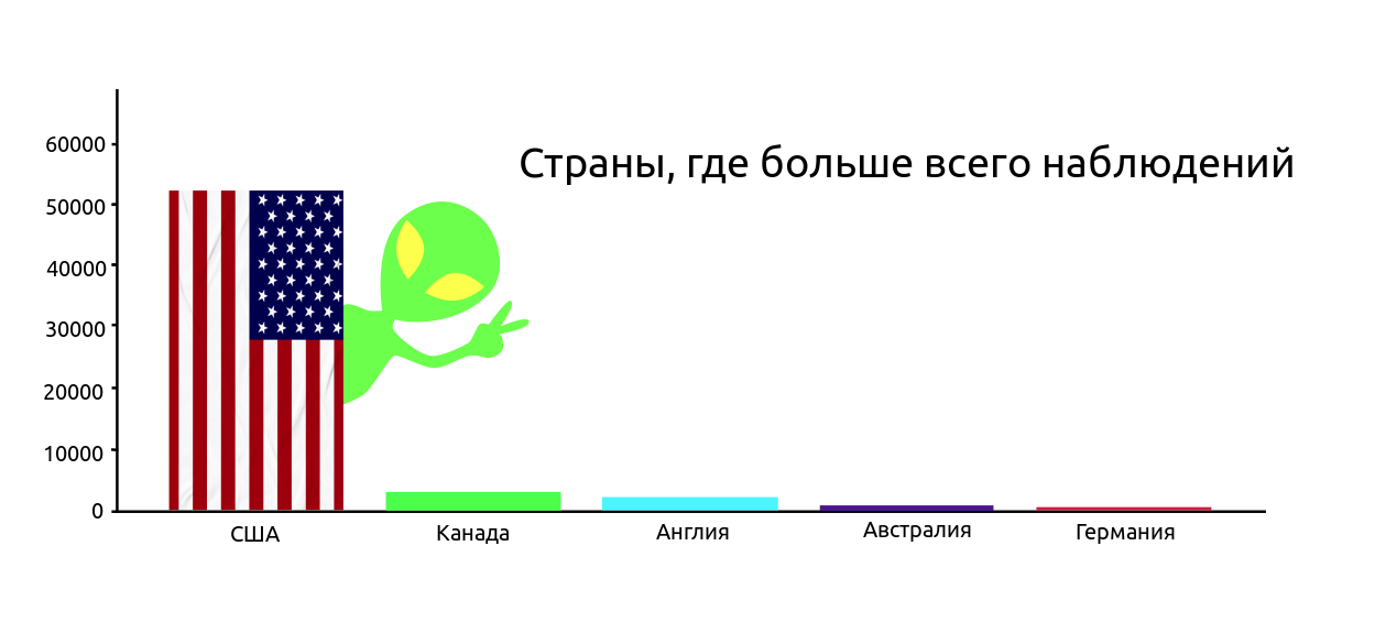
country_count = pd.value_counts(df['country'].values, sort=True) country_count_keys, country_count_values = dict_sort(dict(country_count)) TOP_COUNTRY = len(country_count_keys) plt.title(', ', fontsize=PLOT_LABEL_FONT_SIZE) plt.bar(np.arange(TOP_COUNTRY), country_count_values, color=getColors(TOP_COUNTRY)) plt.xticks(np.arange(TOP_COUNTRY), country_count_keys, rotation=0, fontsize=12) plt.yticks(fontsize=PLOT_LABEL_FONT_SIZE) plt.ylabel(' ', fontsize=PLOT_LABEL_FONT_SIZE) plt.show() 
Most of the observations naturally in the United States. Here, it’s like, all geeks who follow UFOs live in the USA (we’re keeping in mind the version that the table was compiled by US citizens). Judging by the number of American films most likely the second. From Cap: if the aliens really visited the earth in the open, it is unlikely they would be interested in one country, the message about UFOs would appear from different countries.
It is interesting to see what time of year observed the most objects. There is a reasonable assumption that there are most observations in springtime.
MONTH_COUNT = [0,0,0,0,0,0,0,0,0,0,0,0] MONTH_LABEL = ['', '', '', '', '', '', '', '', '' ,'' ,'' ,''] for i in df['datetime']: m,d,y_t = i.split('/') MONTH_COUNT[int(m)-1] = MONTH_COUNT[int(m)-1] + 1 plt.bar(np.arange(12), MONTH_COUNT, color=getColors(12)) plt.xticks(np.arange(12), MONTH_LABEL, rotation=90, fontsize=PLOT_LABEL_FONT_SIZE) plt.ylabel(' ', fontsize=PLOT_LABEL_FONT_SIZE) plt.yticks(fontsize=PLOT_LABEL_FONT_SIZE) plt.title(' ', fontsize=PLOT_LABEL_FONT_SIZE) plt.show() 
A spring aggravation was expected, but the assumption was not confirmed. It seems warm summer nights and the vacation period make themselves felt stronger.
Let's see what forms of objects in the sky have seen and how many times.
shapes_type_count = pd.value_counts(df['shape'].values) shapes_type_count_keys, shapes_count_values = dict_sort(dict(shapes_type_count)) OBJECT_COUNT = len(shapes_type_count_keys) plt.title(' ', fontsize=PLOT_LABEL_FONT_SIZE) bar = plt.bar(np.arange(OBJECT_COUNT), shapes_type_count_values, color=getColors(OBJECT_COUNT)) plt.xticks(np.arange(OBJECT_COUNT), shapes_type_count_keys, rotation=90, fontsize=PLOT_LABEL_FONT_SIZE) plt.yticks(fontsize=PLOT_LABEL_FONT_SIZE) plt.ylabel(' ', fontsize=PLOT_LABEL_FONT_SIZE) plt.show() 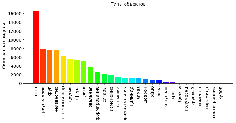
From the graph we see that most of the sky just saw the light, which in principle is not necessarily a UFO. This phenomenon has a clear explanation, for example, the night sky reflects light from searchlights, as in the movies about Batman. Also, this may well be the northern lights, which appears not only in the polar zone, but also in mid-latitudes, and occasionally even in the vicinity of the euvator. In general, the atmosphere of the earth is permeated with a multitude of radiations of various nature, electric and magnetic fields.
In general, the Earth’s atmosphere is permeated with a multitude of radiations of various nature, electric and magnetic fields.
For more information, see: https://www.nkj.ru/archive/articles/19196/ (Science and life, What glows in the sky?)
It is interesting to see the average time at which each of the objects appeared in the sky.
shapes_durations_dict = {} for i in shapes_type_count_keys: dfs = df[['duration (seconds)', 'shape']].loc[df['shape'] == i] shapes_durations_dict[i] = dfs['duration (seconds)'].mean(axis=0)/60.0/60.0 shapes_durations_dict_keys = [] shapes_durations_dict_values = [] for k in shapes_type_count_keys: shapes_durations_dict_keys.append(k) shapes_durations_dict_values.append(shapes_durations_dict[k]) plt.title(' ', fontsize=12) plt.bar(np.arange(OBJECT_COUNT), shapes_durations_dict_values, color=getColors(OBJECT_COUNT)) plt.xticks(np.arange(OBJECT_COUNT), shapes_durations_dict_keys, rotation=90, fontsize=16) plt.ylabel(' ', fontsize=12) plt.show() 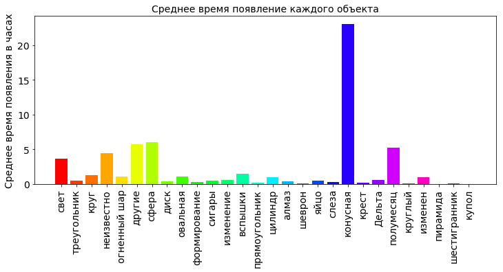
From the diagram we can see that the average cone hung the most in the sky (more than 20 hours). If you dig in the Internet, it is clear that the cones in the sky, it is also a glow, only in the form of a cone (unexpectedly, yes?). Most likely it is the light from the falling comets. The average time of more than 20 hours is some kind of unreal value. There is a wide variation in the data under study, and an error could have crept into it. Several very large, incorrect values of the time of appearance can significantly distort the calculation of the average value. Therefore, for large deviations, the median is considered not as an average value.
The median is a number characterizing the sample, one half in the sample is less than this number, the other is more. To calculate the median, use the median function.
Replace in the code above:
shapes_durations_dict[i] = dfs['duration (seconds)'].mean(axis=0)/60.0/60.0 on:
shapes_durations_dict[i] = dfs['duration (seconds)'].median(axis=0)/60.0/60.0 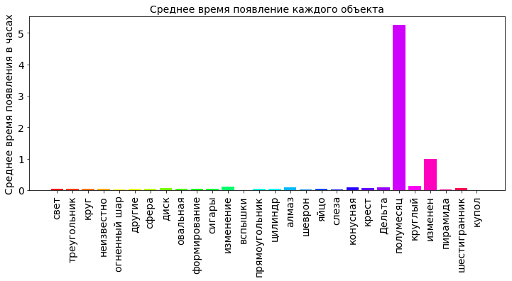
The crescent moon was seen in the sky a little more than 5 hours. Other objects are not flashed for a long time in the sky. This is the most reliable.
For the first acquaintance with the methodology of data processing in Python, I think it is enough. In the following publications we will deal with statistical analysis, and try to choose another no less relevant example.
Useful links:
Link to archive with Jupyter data and blot
Library for preprocessing data
Machine Learning Algorithm Library
Library for data visualization
')
Source: https://habr.com/ru/post/353050/
All Articles