Making a kaleidoscope on CSS + JS
 I somehow never thought about such a thing as a kaleidoscope on the page. Saw them somehow earlier, but did not pay special attention. And then I saw in Lebedev’s portfolio a kaleidoscope on a flash, I twisted it with my mouse, I understood the principle of work and thought “Christmas trees, it's not difficult!”.
Of course, one cannot say that it is really very simple. And you can not say that it turned out all that I wanted. But there is something to see, for which I invite under the cat.
UPD
In the post he added an improved version of the hablo man hlomzik , which does not work in IE, but with a smaller amount of code and with more correct behavior.
')
At the very beginning, I hoped that it would work absolutely everywhere and well. It didn't quite work out. As a result:
- Firefox / Safari / Chrome - Works perfect (who would doubt).
- IE8 - works, but only if the kaleidoscope is small (up to 300x300). If more - begins to seriously slow down.
- IE7 will work if you add a separate CSS for it in which to correct the positioning of the blocks.
- Opera - nicerta does not work. This is a separate song. Immediately appeal to the guys from the Opera, who will read it - look at the demo and issue it as a bugreport. In the “fastest browser on earth” © CSS-transform slows down so godlessly that it does not go into any gate. And again, the operatic eternal problem - a complete crap when using overflow: hidden and non-static-positioned elements. DO SOMETHING WITH THIS!
Immediately I will give a link to the working example, so that it is clear what it is all about: kaleidoscope.terion.name
So let's go.
Task 1: understand how to do it at all.
The kaleidoscope consists of 12 sectors assembled into a disk. Accordingly, the question arises: how to make a sector? Actually, it is very simple. We need 4 blocks and some CSS. It should look like this:
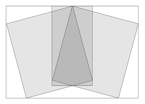
The block-container, one block turned by -15 °, inside the block turned by 30 °, inside another turned by -15 °.
The sector has a background image that we will shift.
Task 2: in fact, collect it all.
The code is accordingly very simple:
<div class = "sc s1" >
<div class = "rl" >
<div class = "rr" >
<div class = "sv" >
</div>
</div>
</div>
</div>
Yes, we immediately assume that there may be several kaleidoscopes on the page, so we only use classes.
An important condition : the size of the kaleidoscope should be changed by changing the size of the container only; accordingly, everything inside should be in percent.
Immediately, I note that the percentage values were selected by the method of scientific spearcasting, since my knowledge of trigonometry is not so deep as to calculate all this :)
- .scope_container .sc {
- width: 50%;
- height: 50%;
- -webkit-transform-origin: top center;
- -moz-transform-origin: top center;
- -o-transform-origin: top center;
- transform-origin: top center;
- position: absolute;
- top: 50%;
- left: 25%;
- z-index: -1;
- }
- .scope_container .sc div {
- overflow: hidden}
- .scope_container .rl {
- height: 110%;
- width: 60%;
- -webkit-transform: rotate (-15deg);
- -moz-transform: rotate (-15deg);
- -o-transform: rotate (-15deg);
- transform: rotate (-15deg);
- position: relative;
- top: 1.5%;
- left: 4.5%;
- }
- .scope_container .rr {
- height: 100%;
- width: 100%;
- -webkit-transform: rotate (30deg);
- -moz-transform: rotate (30deg);
- -o-transform: rotate (30deg);
- transform: rotate (30deg);
- position: relative;
- top: 7%;
- left: 51%;
- }
- .scope_container .sv {
- width: 105%;
- height: 105%;
- -webkit-transform: rotate (-15deg);
- -moz-transform: rotate (-15deg);
- -o-transform: rotate (-15deg);
- transform: rotate (-15deg);
- position: relative;
- top: -2%;
- left: -29%;
- }
So, we have code for the sector. Now these sectors should be 12 and should not be wrapped in 2 containers, because internal is used to position the elements, and external - to set the size and trim unnecessary.
As a result, the entire html-code will be:
- < div class = "parent" >
- < div class = "scope_container pattern" >
- < div class = "sc s1" > < div class = "rl" > < div class = "rr" > < div class = "sv" > </ div > </ div > </ div > </ div >
- < div class = "sc s2" > < div class = "rl" > < div class = "rr" > < div class = "sv" > </ div > </ div > </ div > </ div >
- < div class = "sc s3" > < div class = "rl" > < div class = "rr" > < div class = "sv" > </ div > </ div > </ div > </ div >
- < div class = "sc s4" > < div class = "rl" > < div class = "rr" > < div class = "sv" > </ div > </ div > </ div > </ div >
- < div class = "sc s5" > < div class = "rl" > < div class = "rr" > < div class = "sv" > </ div > </ div > </ div > </ div >
- < div class = "sc s6" > < div class = "rl" > < div class = "rr" > < div class = "sv" > </ div > </ div > </ div > </ div >
- < div class = "sc s7" > < div class = "rl" > < div class = "rr" > < div class = "sv" > </ div > </ div > </ div > </ div >
- < div class = "sc s8" > < div class = "rl" > < div class = "rr" > < div class = "sv" > </ div > </ div > </ div > </ div >
- < div class = "sc s9" > < div class = "rl" > < div class = "rr" > < div class = "sv" > </ div > </ div > </ div > </ div >
- < div class = "sc s10" > < div class = "rl" > < div class = "rr" > < div class = "sv" > </ div > </ div > </ div > </ div >
- < div class = "sc s11" > < div class = "rl" > < div class = "rr" > < div class = "sv" > </ div > </ div > </ div > </ div >
- < div class = "sc s12" > < div class = "rl" > < div class = "rr" > < div class = "sv" > </ div > </ div > </ div > </ div >
- </ div >
- </ div >
Classes s1 - s12 to determine the position of each sector.
The pattern class defines which picture will be used (thanks to eto_moy_nick for the pattern :))
Arrange the blocks in places:
And so on until the 12th in steps of 30 degrees.
- .scope_container .s1 {
- -webkit-transform: rotate (0deg);
- -moz-transform: rotate (0deg);
- -o-transform: rotate (0deg);
- transform: rotate (0deg);
- }
- .scope_container .s2 {
- -webkit-transform: rotate (30deg);
- -moz-transform: rotate (30deg);
- -o-transform: rotate (30deg);
- transform: rotate (30deg);
- }
In general, that's all.
But there is an IE who does not understand all this! But for IE there are filters : filter: progid: DXImageTransform. Microsoft. Matrix (...) .
Therefore, in the conditional comment [if IE 8] we add the following code:
As shown by experiments, with absolute positioning and the matrix at the IE trouble. Therefore it was necessary to fence such crutches.
- .scope_container .s1 {
- -webkit-transform: rotate (0deg);
- -moz-transform: rotate (0deg);
- -o-transform: rotate (0deg);
- transform: rotate (0deg);
- }
- .scope_container .s2 {
- -webkit-transform: rotate (30deg);
- -moz-transform: rotate (30deg);
- -o-transform: rotate (30deg);
- transform: rotate (30deg);
- }
Further:
Etc.
- .s2 {
- filter: progid: DXImageTransform.Microsoft.Matrix (M11 = 0.86602540, M12 = -0.50000000, M21 = 0.50000000, M22 = 0.86602540, SizingMethod = 'auto expand', FilterType = 'nearest neighbor');
- margin: -64.5% 0 0 -25%;
- }
- .s3 {
- filter: progid: DXImageTransform.Microsoft.Matrix (M11 = 0.50000000, M12 = -0.86602540, M21 = 0.86602540, M22 = 0.50000000, SizingMethod = 'auto expand', FilterType = 'nearest neighbor');
- margin: -60.5% 0 0 -32.8%;
- }
To my surprise, FilterType = 'nearest neighbor' did not work (without bicubic anti-aliasing, most likely there would be no such brakes).
For matrix calculations, I used this tool that just saved my life: www.boogdesign.com/examples/transforms/matrix-calculator.html
Margins were manually placed blocks. If there is a desire to make this all work in IE7, it is only necessary for him to rewrite these same margins.
Task 3: make it move
Javascript. You need to move the background of the sectors for the mouse. At the same time, we remember that the kaleidoscope on the page is not one. The code below, read the comments:
- <script type = "text / javascript" >
- // We use classes, but IE does not know how to choose them. We compensate for this disadvantage.
- if ( document .getElementsByClassName) {
- getElementsByClass = function (classList, node) {
- return (node || document ) .getElementsByClassName (classList)
- }
- } else {
- getElementsByClass = function (classList, node) {
- var node = node || document ,
- list = node.getElementsByTagName ( '*' ),
- length = list.length,
- classArray = classList.split (/ \ s + /),
- classes = classArray.length,
- result = [], i, j
- for (i = 0; i <length; i ++) {
- for (j = 0; j <classes; j ++) {
- if (list [i] .className.search ( '\\ b' + classArray [j] + '\\ b' )! = -1) {
- result.push (list [i])
- break
- }
- }
- }
- return result
- }
- }
- // Get the mouse coordinates
- function mousePageXY (e)
- {
- var x = 0, y = 0;
- if (! e) e = window. event ;
- if (e.pageX || e.pageY)
- {
- x = e.pageX;
- y = e.pageY;
- }
- else if (e.clientX || e.clientY)
- {
- x = e.clientX + ( document .documentElement.scrollLeft || document .body.scrollLeft) - document .documentElement.clientLeft;
- y = e.clientY + ( document .documentElement.scrollTop || document .body.scrollTop) - document .documentElement.clientTop;
- }
- return { "x" : x, "y" : y};
- }
- window.onload = function () {
- var scope_cont = getElementsByClass ( 'scope_container' , document );
- // There can be several kaleidoscopes, consider this.
- for (i = 0; i <scope_cont.length; i ++)
- {
- scope_cont [i] .onmouseover = function () {
- var sect = getElementsByClass ( 'sv' , this );
- var curscope = this ;
- this .onmousemove = function (e) {
- var mCur = mousePageXY (e);
- for (n = 0; n <sect.length; n ++)
- {
- // In even sectors, the background moves in one direction
- if (n% 2) {
- sect [n] .style.backgroundPosition = mCur.x + 'px' + mCur.y + 'px' ;
- }
- // Odd - to another
- else {
- sect [n] .style.backgroundPosition = mCur.x * (- 1) + 'px' + mCur.y + 'px'
- }
- }
- }
- }
- scope_cont [i] .onmouseout = function () {
- // We clean up after ourselves, so as not to overload the browser
- document .onmousemove = null ;
- }
- }
- }
- </ script>
In general, it is ready.
Opera:
If the block .pattern add overflow: hidden - ALL disappears. As a result, a blank page with scrolls into emptiness for the width of the "fan".
If overflow: hidden is removed, then in the “fastest browser on earth” © this construction is slower than in IE.
This is a complete failure.
I hope you were interested :)
UPD
And here is an improved version of the hablomelochka hlomzik :
quaint.su/for/habrahabr/kaleidoscope
The discussion in which it was born is: habrahabr.ru/blogs/css/99019/?reply_to=3057019#comment_3054307
Source: https://habr.com/ru/post/99019/
All Articles