The graphic style of the 1972 Olympics in Munich
 I would venture to suggest a post about graphic design. At first glance, it does not fully correspond to the subject of Habr, but it is only at first glance. I am sure that it will be interesting not only to designers.
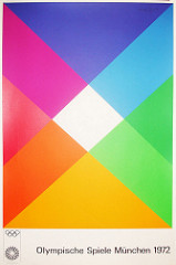
One day I saw a rather unusual poster. He looked very unusual, bribed a pleasant combination of colors and simplicity.
It turned out that this is one of the posters for the 1972 Summer Olympics in Munich . I was surprised at how fresh and modern is the work done almost 40 years ago. I decided to study the question about the style of this Olympiad more closely - I began to search on the Internet.
')
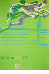
The first thing that caught my eye was far from the design. It turned out that this Olympiad is notorious because of the terrible terrorist attack . And then I found even more luxurious posters:


It became even more interesting to me. It turned out that the entire graphic style for the Olympics was invented by the German designer Otl Aicher . By the way, he also made the font Rotis, which I loved very much .

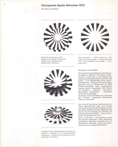
The logo of the Olympics in Munich also turned out to be very unusual:
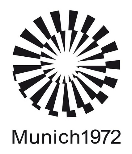
Some sources claim that this is the sun's rays. But in the original brief something similar to a cake is drawn:
Interestingly, when the logo was presented to the general public, it was greeted pretty cool. Many did not like this logo - it seems that this is the fate of all innovations in design. This is what people said:
- What does this have to do with sport? There are not even Olympic rings.
- Yes, I can draw it myself in 5 minutes!
- If this is supposed to symbolize Germany or Bavaria or even Munich, then this is a complete failure. Why do we have to pay for it?
- It looks like a child's doodle in a notebook.
- I do not see any connection of this logo with Munich, Germany or the Olympics.
- I venture to say the obvious thing (although it may be news for graphic designers) - Olympics are about Sport. I was hoping to see a logo that would reflect athleticism, grace, movement and the desire for high results.
- There are not even five colors from the Olympic flag.
- They will have to attach an explanatory note to each logo, otherwise no one will be able to understand what is what.
- I am a designer and can do this in 30 seconds.
With the mascot of the Olympics, things were simpler. The same Otl Aicher invented and drew a cute Waldi dachshund. There was almost no contradiction here - dachshunds are fast, hardy, strong and agile - therefore they are a good symbol for the Olympic Games.
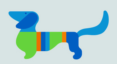
Dachshund is quite flexible in the graphic sense - it can be contour, monochrome or even voluminous.

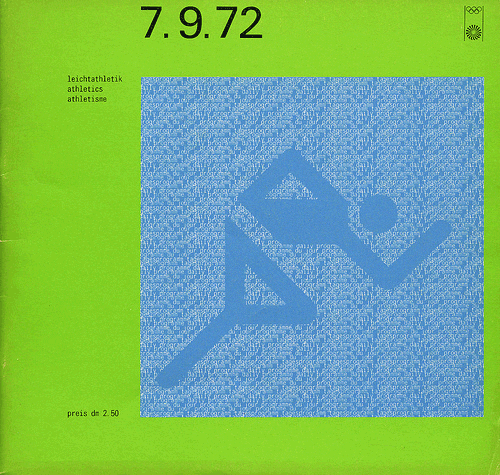
And, of course, I can't get past the pictograms for the Olympics. The basic idea is simplicity and unity of style. The designer managed to perfectly convey the dynamics of movement.

The pictograms surprisingly harmoniously fit into the overall graphic style of the Olympics.
This style is timeless. You can safely use some techniques from the style of the Olympic Games in modern design and the result will look very fresh and fashionable.
Source: https://habr.com/ru/post/97194/
All Articles