These could be the new icons for LiveJournal.
Surely, you heard about the competition for new icons for LiveJournal, which was announced by Artemy Lebedev . Today the results were announced. I will not hide, we in Turbomilka are unpleasantly surprised, with all due respect to the authors of the works chosen by Artemy.
These are the icons we suggested:
Under the cat a detailed story of how we painted these icons and why they should be like that.
A long time ago, three Samara designers met each other in LiveJournal and began to communicate - to show their work and discuss other people's. So Turbomilk company appeared. Therefore, when a contest for new icons for LiveJournal was announced, we became animated and got to work.
')
We thought a lot - what should be these newest icons. There was even an opinion that icons there are not needed at all - all management can be done through text links or context menus. (as done, for example, on flickr) Or you could make contour icons to make it strictly and simply.
But first we decided to analyze how icons are used in LiveJournal now. For example, it is necessary to take into account that many alternative schemes have been developed for LJ. Plus, there are already many service users who are used to icons and it would be wrong to force them to relearn. Well, the most important factor is the same competition and we will not have a chance for a “second iteration”, so we decided to draw what we can do best of all - traditional, but beautiful and juicy icons. (so that all bloggers posts are fun and positive)
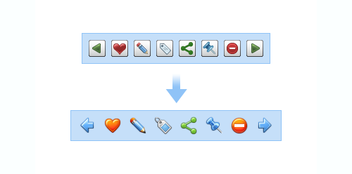
What did we decide to change? The most important thing is to abandon the buttons-substrates. What are they needed for? From them only visual noise. We assumed that the absolute majority of users already know how to use icons without buttons underneath them. But now we can make the icons a bit larger (24x24) and distinguishable. They are "in the plane of the page" and are part of it. Plus, we suggest adding a bit of “air” between the icons, since the toolbar is not very wide.
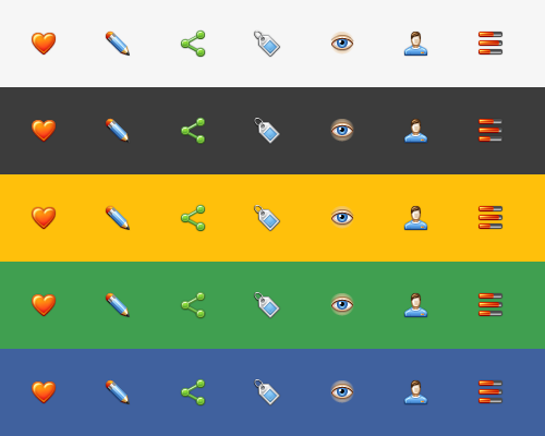
Do not worry that the icons will look bad on a background different from the standard blue color LJ. Here is the proof:
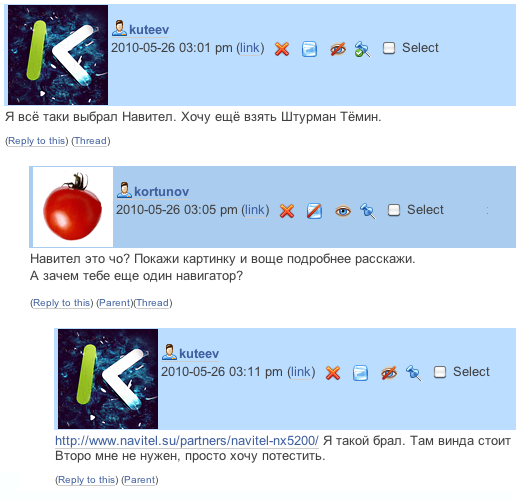
Now the same icons are used for the post toolbar and for comments. We suggest using smaller icons in the comments (16x16) so that they do not distract attention from the text. It also corresponds to the logical hierarchy: the post is more important than the comment.

And here is how a spontaneous conversation of two intelligent people will look like - much less visual noise:
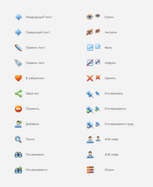
We also propose to slightly change the metaphors of standard icons. For example, it is not clear why the action “follow the post” is represented by a button. If we are to follow, then through binoculars! Or why LJ-user is bald? Let's make him a thick head of hair!

But all the new icons for LiveJournal with one picture:
Unfortunately, the organizers of the competition did not appreciate our efforts. Works of the winners can be viewed in LJ Artemy Lebedev. We will not hide, we are surprised.
These are the icons we suggested:
Under the cat a detailed story of how we painted these icons and why they should be like that.
A long time ago, three Samara designers met each other in LiveJournal and began to communicate - to show their work and discuss other people's. So Turbomilk company appeared. Therefore, when a contest for new icons for LiveJournal was announced, we became animated and got to work.
')
We thought a lot - what should be these newest icons. There was even an opinion that icons there are not needed at all - all management can be done through text links or context menus. (as done, for example, on flickr) Or you could make contour icons to make it strictly and simply.
But first we decided to analyze how icons are used in LiveJournal now. For example, it is necessary to take into account that many alternative schemes have been developed for LJ. Plus, there are already many service users who are used to icons and it would be wrong to force them to relearn. Well, the most important factor is the same competition and we will not have a chance for a “second iteration”, so we decided to draw what we can do best of all - traditional, but beautiful and juicy icons. (so that all bloggers posts are fun and positive)
What did we decide to change? The most important thing is to abandon the buttons-substrates. What are they needed for? From them only visual noise. We assumed that the absolute majority of users already know how to use icons without buttons underneath them. But now we can make the icons a bit larger (24x24) and distinguishable. They are "in the plane of the page" and are part of it. Plus, we suggest adding a bit of “air” between the icons, since the toolbar is not very wide.
Do not worry that the icons will look bad on a background different from the standard blue color LJ. Here is the proof:
Now the same icons are used for the post toolbar and for comments. We suggest using smaller icons in the comments (16x16) so that they do not distract attention from the text. It also corresponds to the logical hierarchy: the post is more important than the comment.
And here is how a spontaneous conversation of two intelligent people will look like - much less visual noise:
We also propose to slightly change the metaphors of standard icons. For example, it is not clear why the action “follow the post” is represented by a button. If we are to follow, then through binoculars! Or why LJ-user is bald? Let's make him a thick head of hair!
But all the new icons for LiveJournal with one picture:
Unfortunately, the organizers of the competition did not appreciate our efforts. Works of the winners can be viewed in LJ Artemy Lebedev. We will not hide, we are surprised.
Source: https://habr.com/ru/post/96253/
All Articles