Interface construction: description of the pattern “Active links” (Action links)

Links - is it easy or not at all easy?
They are found on websites, in programs, in interfaces to databases, and we all seem to be very familiar with them. Developers got used to it, and even the most inexperienced users soon realize that where the cursor became a “finger” you can click, and this is called a link. Is it worth raising and studying a seemingly so clear question?
We are talking about a good interface. And talk about it on a professional
language, looking towards the experience of Western experts. So, one primitive classification: a link or not a link (and, for example, a button), we will soon become lacking. The article describes one of a kind - links, called Active Links.
')
- Clicking on the link will create a backup? - this is the active link
- Fields of the form, filled with automatically-defined values? - this is an active link
- Or maybe something else ...
You have several commands that need to be displayed together, or visually highlight one of them.
What can be done?
To maintain the integrity of the page and for the least important commands, use the links.
When to use?
If there is a sidebar in your HTML document where it is convenient and logical to assemble basic commands, or you want to place commands near navigation links, then Active Links is an excellent choice, which is also suitable for application software. Links will also help in case you are limited in space.
At the same time, for a set of commands grouped according to a certain logical or hierarchical basis, it is better to use the Ribbon design pattern.
If you want to create a control panel, then the Button Groups pattern is recommended.
Links are a great way to provide access to secondary teams.
Why exactly?
Sometimes, for example in Web documents, the links look more organic, and for visual homogeneity of the document it is better to use them. They can be grouped together with traditional navigation links, while using the buttons in this case will break the visual integrity of the document.
Links take up less space, so if you are limited in space, or the command is long enough, it’s better to give preference to links rather than buttons.
Important: The only thing that causes concern when using links is that most people perceive links solely as a navigational, secure element. Therefore, it is necessary either to make a confirmation request for these commands, or to make sure that they are easily reversible (cancelable).
When you need to highlight certain commands, links are a great way to visually make a distinction in importance. Links - the text, they are mixed with the main content of the document, while focusing on the buttons.
How to do it?
Everything is quite simple - you just use the link instead of the button. Some database developers provide them with special link buttons or hyperlink buttons that provide the usual click event and the choice of team parameters.
To select and visualize a command, especially when it is in a number of other links, you can correlate it with the icon (it is not recommended to use it if you have placed the command in a number of links to minimize its importance).
Try to understand what the text is expressing, determine what action is behind the text and make sure that this action will not be confused with the navigation link. Formulate concise, but informative. The use of a verb usually implies an action. You can also use capital letters to separate a keyword from the rest of the text.
Separate commands that relate to some part of the user interface (the UI) should be placed visually next to the objects of impact.
Examples
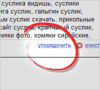
Yandex.Direct
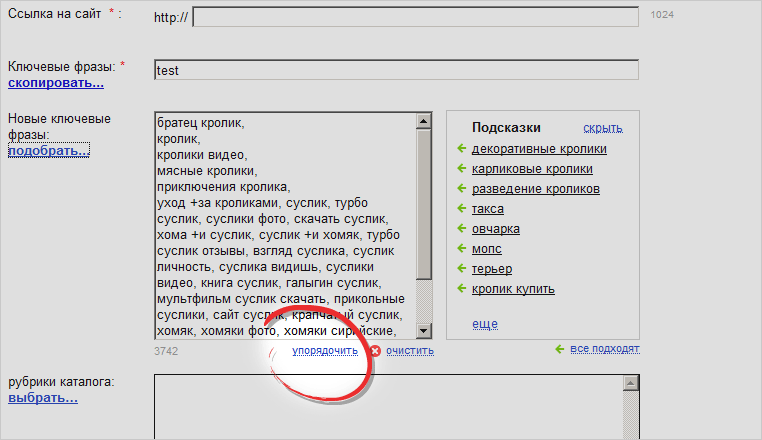
Yandex.Direct uses links to actions when creating a new ad. The “arrange” link will sort the keywords by rows. Pay attention to the design of the links. In this example, in our opinion, very correctly and unobtrusively Links to commands that do not lead to page reloading have been singled out in the form of pseudo links, making them intermittently underlined, not solid, as is done for navigation elements.
Link to an online example: direct.yandex.ru
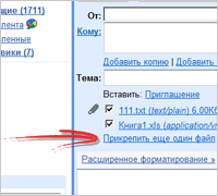
Google. Add file to email

Google is actively using this pattern. Using this pattern to attach an additional file to the outgoing letter, the visual integrity of the screen is preserved, the button in this case would stand out too much, tearing the page into two parts.
Link to an online example: gmail.com
Google. Add a reminder
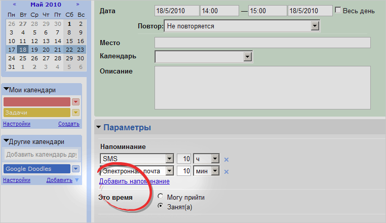
Another example we take from the calendar. The link "Add reminder" opens additional fields for notifications and is a typical example of a pattern.
Link to an online example: google.com/calendar
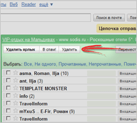
Google. Buttons - underscore only

In this example, we want to draw your attention to several elements at once. Google is actively using links, and only to create an emphasis on the weight of functions - makes them buttons. So the “Write a letter” command is framed as a link; clicking on it will not cause any harm and will not lead to significant changes that will be difficult to undo. At the same time, the commands “Delete”, “To Spam”, etc. are highlighted with buttons - as they can lead to information loss.
Link to an online example: gmail.com
Source: https://habr.com/ru/post/95164/
All Articles