Interface construction: description of the Active Filtering pattern
Filters - we face them all the time, they are on sites and in applications. Who, when searching for this or that information, didn’t have a thought: “Here the filter would not hinder”?
We suggest talking about filtering. Why is it needed? After all, who is looking for, he will always find? And analyze? Or not?
Suppose your site or application contains the necessary information for the user, and in large volume. Will the user contact you? Yes of course. In the worst case, a person will simply become entangled in the data volume, at best he will be able to independently select the necessary and go to reduce and analyze everything provided to him in separate documents and spreadsheets, which he will create on his own. Will he return to you, or will he go looking for a more convenient presentation of the data he needs? Rather, the second.
')
We offer you an article in which, based on the experience of leading developers, we consider why and when it makes sense to use filters, how to organize them, where to place them, and how to make the filters themselves understandable for the user, and the results obtained with their help.
Users have to sift out and sort through a huge amount of information in order to, after analyzing it, find something specific.
What can be done?
Allow users to change filters for large streams of information, and see actively updated results after performing corrective queries.
When to use?
Ideally, you need to be able to present information graphically. And although this method is usually used in the preparation of tables and lists, it is necessary to focus primarily on the user, because the method helps to present the requested information clearly.
Complex or volumetric information should at least contain one (and preferably several) filtering parameters. Usually, the filtering parameters include a whole set of aspects: numbers, data, logical values or other known values that the user can easily change using the slider / slider, checkbox, switch, drop-down list, etc. Using simple text input from the keyboard, based on the keyword, is less common.
The most common purpose of the presence of filters is to provide opportunities for analysis and research. The search for some specific information is a minor task.
Why exactly?
Originally called “dynamic queries”, the key discovery was that the visualization of the results obtained is “the most important part of active queries, as well as the direct control of the refinement parameters in them”. An instant or near-instant response is critical to a successful outcome, and visual inspection facilitates fine-tuning and adjusting filters. Remember that the key goal of this pattern is analysis and research, so the user will apply active filtering in order to help himself in the perception of search results and in finding interesting relationships in the flow of information. In fact, this pattern can be perceived as a tool for comparison.
An integral part of this pattern is different types of control over filters that are intuitive, easy to use, and, moreover, do not force the user to switch from simply pointing the mouse cursor (stylus) to keyboard input. To comply with the rules of this pattern, you should completely avoid entering data from the keyboard. Otherwise: imagine a user using a touch screen terminal, PDA, or mobile phone. It is extremely inconvenient if such users have to switch to keyboard input to find the desired one.
This method is much better than presenting multiple search forms with open criteria for executing queries or than using any language for queries, for two reasons: the user is comfortable with instant response and no need to enter data from the keyboard.
If you want to use this method to search for specific information, then the most suitable candidate for this would be faceted navigation, which is similar to this pattern, but, however, is more adapted to search than to study, analyze and / or compare. I would also like to note the following: if the criterion has a simple linear relationship with the data displayed in the form of a table, then it is better to look in the direction of such a pattern as the Tabular filter, since it is easier to execute and more understandable.
How to do it?
It will be necessary to divide the screen into 2 main zones: results and filters. Results can be visual (for example, in the form of a graph or a hierarchical tree) or even simply in the form of a list or a table. Which of the visualization methods is most suitable for current information is up to you, but you should prefer graphical as very important for analysis and research.
The filtration area should be located in an obvious place and be clearly defined. It should be easily associated with the results, so that there is not even the slightest ambiguity in what the filter is applied to. This is usually achieved through visual similarity - place it directly beside or above the results. Below is usually not the best option, unless the filters and results are still correlated with each other on the same screen.
Types of control, as noted in the "logical rationale", should be carried out using pointing devices (mouse cursor, stylus, human finger on the touch screen). For linear data search uses a two-button slider. For unambiguous numerical and temporal values, you can also use the slider. If the search criterion is visually understandable, then you can use the selector, but minimize it due to spatial constraints. Users do not have to scroll the page to view and configure filters. For sequential filters, conventional means are used - drop-down lists and the like.
Ideally, the result is updated as soon as the filter changes. For example, the slider slider should trigger an update of the results immediately as it moves. If the processing of the request takes too much time, then the best solution (second in importance after instant filtering) would be a method based either on easing the criteria or on a short time delay. In other words, the program interface may produce a short pause for the filter, after which the results will be updated. The least suitable filtering method is forcing the user (after using the filter parameters) to click a button to send a request. However, if the request processing takes more than two seconds, you can speed up the process by pressing manually, in order to facilitate the system task. But in this case, the value of active filtering is questionable.
Examples:
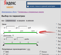
Yandex Market
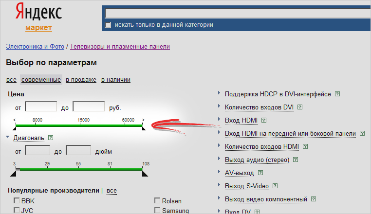
One of the most famous examples for this pattern is Yandex Market. It also uses a set of tools from the runner, checkboxes, etc. At the same time, the user is immediately notified of the number of selected models matching the specified parameters, and the result is displayed only after confirmation of the entered data.
Link to an online example: market.yandex.ru
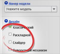
Nokia
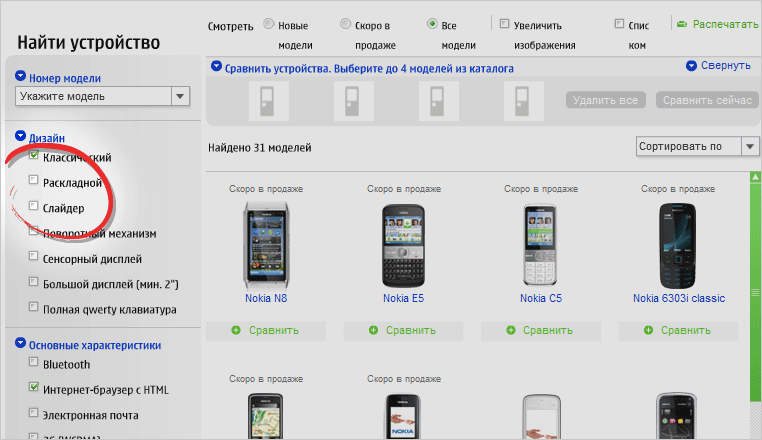
Nokia uses mainly checkboxes, the selection results are instantly displayed on the right side of the screen.
Link to an online example: www.nokia.ru/products/phones
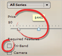
Demo Online Store (Flex)

In this example, both checkboxes, and a drop-down list, and a slider are used. The selection of elements on the right side of the screen is very convenient and beautiful.
Link to an online example: examples.adobe.com/flex2/inproduct/sdk/flexstore/flexstore.html
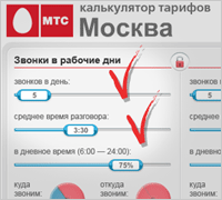
Mts. Tariff Calculator
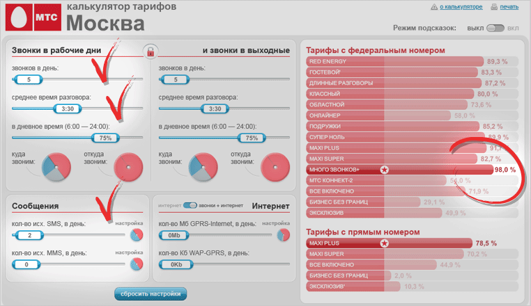
This is one of the most visible uses of the Active Filters pattern. As parameters are set in the left part of the screen, data on the most favorable tariffs appear on the right.
Link to an online example: www.tk.mts.ru/mskc
Source: https://habr.com/ru/post/95119/
All Articles