Gnuplot: build graphs from experimental data
Recently I had a task to build graphs based on readings from remote sensors. In particular, it was necessary to process the data of air temperature fluctuations over time. It looked like this. From a remote sensor, a signal with information is sent to a receiving device, then to a computer and then written to Mysql. And the next step was to process and generate graphs for reports. Charts were built of several types - daily, weekly, monthly.
The task is simple, only it was necessary to take into account a number of points. Thus, the interval between the "points" of measurements could vary. If in the test configuration, the sensor sent measurements every 2 minutes, then in the working configuration, measurements were taken with an interval of 15 minutes. Then the packets during transmission due to radio interference could be lost, respectively, there could be irregular gaps in the observations, therefore interpolation of values was required.
The whole process had to be automated; the tasks of scheduling were planned to be run on the crown on a special server (Ubuntu Server). As a graphing tool, I chose gnuplot. The program is very convenient and the main thing is able to work with scripts, it supports such graphic formats as PNG, EPS, SVG. In general - that is necessary.
')
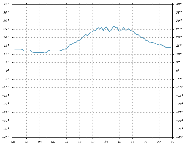
So, it was necessary to draw 2 axes, on “X” - to postpone the time coordinates (in hours), on “Y” - coordinates of temperature values (from -40 to 40). And then on this grid to set the measurement points connecting their curve.
As an example for analyzing how gnuplot works, here’s a script for plotting fluctuations in daily temperature, i.e. in 24 hours.
The data file — let's call it daily.dat, contains measurement readings for the required period of time, for a specific day. The first column indicates the date and time of the measurement, and the next one indicates the temperature.
The script with the instructions gnuplot we call daily.gnu
Well, in order to generate a graph, it remains only to run gnuplot with this script in the terminal.
And in the specified location "/var/graph/images/daily.png" a file should appear.
If you need to generate a vector file, for example in SVG - for this you need to change just a couple of lines:
In the working example, files with a script and data are formed with a skip on python, are formed and then run. In the script itself (daily.gnu), the line with the name of the chart - “daily_2010.05.12.png” changes every time, and daily.dat is updated to the new values each time.
Actually that's all.
For more details on gnuplot instructions, see the official site.
There is also excellent documentation PDF, 2Mb
Script source data can be downloaded from here.
Thank you for your attention and good coding!
The task is simple, only it was necessary to take into account a number of points. Thus, the interval between the "points" of measurements could vary. If in the test configuration, the sensor sent measurements every 2 minutes, then in the working configuration, measurements were taken with an interval of 15 minutes. Then the packets during transmission due to radio interference could be lost, respectively, there could be irregular gaps in the observations, therefore interpolation of values was required.
The whole process had to be automated; the tasks of scheduling were planned to be run on the crown on a special server (Ubuntu Server). As a graphing tool, I chose gnuplot. The program is very convenient and the main thing is able to work with scripts, it supports such graphic formats as PNG, EPS, SVG. In general - that is necessary.
')
So, it was necessary to draw 2 axes, on “X” - to postpone the time coordinates (in hours), on “Y” - coordinates of temperature values (from -40 to 40). And then on this grid to set the measurement points connecting their curve.
As an example for analyzing how gnuplot works, here’s a script for plotting fluctuations in daily temperature, i.e. in 24 hours.
The data file — let's call it daily.dat, contains measurement readings for the required period of time, for a specific day. The first column indicates the date and time of the measurement, and the next one indicates the temperature.
2010-05-12 00:38:11 13
2010-05-12 00:53:42 13
2010-05-12 01:09:13 13
2010-05-12 01:24:45 13
The script with the instructions gnuplot we call daily.gnu
* This source code was highlighted with Source Code Highlighter .
- #! / usr / bin / gnuplot -persist
- # set the output mode to file, PNG format
- # default font for couri.ttf, 8px,
- # background graphics are white, black font
- # graphics size 640x480px
- set term png enhanced font "/usr/share/fonts/truetype/msttcorefonts/couri.ttf,8" \
- xffffff x000000 size 640,480
- set output "/var/graph/images/daily.png" # specify the path and file name
- set encoding iso_8859_1 # set encoding
- set tmargin 1 # indent above
- set tics out # expose dash outside
- set size 1.0,1.0 # set the proportions of the chart
- set nokey # do not display header
- set grid # display grid
- set xzeroaxis lt -1 # draw the zero line
- set yzeroaxis
- # parameters on "X"
- set xdata time # set the data for “X” this time
- set timefmt "% Y-% m-% d% H:% M:% S" # time format
- set xtics 7200 # step 2 hours (60 * 60 * 2)
- set format x "% H" # only the hour value is displayed on the coordinate (hour)
- # parameters for "Y"
- set ytics 5 # step 5 degrees
- set yrange [-40: 40] # value range from -40 to 40
- set format y "{% g} ^ o" # on the coordinate we display the value and write a degree in degrees
- # parameters for "Y2"
- set y2range [-40: 40]
- set y2tics 5
- set format y2 "{% g} ^ o"
- # set the line style 1 (line 1)
- #linetype sets the line color (default values 1,2,3 ... can be used)
- # or specify your color - rgb "# 409ff1"
- #lw - linewidth, pt - pointtype, ps - pointsize
- set style line 1 lt rgb "# 409ff1" lw 2 pt 3 ps 0.5
- # draw a graph
- # specify where to get the data - daily.dat
- # what columns to watch - using 1: 3
- # say what interpolation method to use - smooth csplines
- # say what line style to use - linestyle 1
- plot "./daily.dat" using 1: 3 smooth csplines linestyle 1
Well, in order to generate a graph, it remains only to run gnuplot with this script in the terminal.
# gnuplot ./daily.gnuAnd in the specified location "/var/graph/images/daily.png" a file should appear.
If you need to generate a vector file, for example in SVG - for this you need to change just a couple of lines:
set term svg enhanced size 640,480 font "/usr/share/fonts/truetype/msttcorefonts/couri.ttf,8"
set output "var/graph/images/daily.svg"
In the working example, files with a script and data are formed with a skip on python, are formed and then run. In the script itself (daily.gnu), the line with the name of the chart - “daily_2010.05.12.png” changes every time, and daily.dat is updated to the new values each time.
Actually that's all.
For more details on gnuplot instructions, see the official site.
There is also excellent documentation PDF, 2Mb
Script source data can be downloaded from here.
Thank you for your attention and good coding!
Source: https://habr.com/ru/post/94025/
All Articles