Color selection interface
In the recently released Photoshop CS5, the so-called HUD Color Picker (3) was added to the Color and Swatches tabs (1) and the dialog (2 ) :
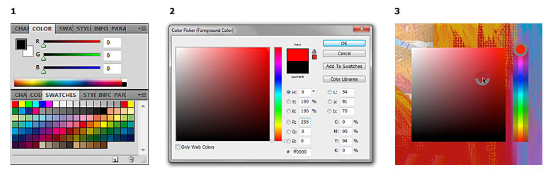
Externally, the new control turned out to be somewhat primitive and sloppy, although the developers are going in the right direction, trying to simplify the choice of color and make it faster and “transparent” for the user, not requiring unnecessary movements with the mouse.
')
Of course, there is something to work on. Actually, the presence of several different palettes / dialogs in Photoshop itself hints that not everything is smooth and thoughtful there. Below I want to show an example of the interface of working with color, which could largely replace all these separate controls and even introduce something new.
Here's what it looks like:
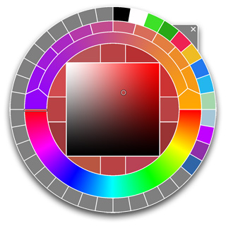
Below are the main areas of our “color wheel”:

Let's sort them in order.
1. Familiar to all the plane of choice of color for brightness (Brightness, vertical) and color saturation (Saturation, horizontally).
2. Also, the scale of the third component, customary to everyone, is color tone (Hue).
3. This zone is repeated four times, forming a “cross” around the square. In these cells, the currently selected color is displayed, which is then used as a reference when comparing it with different variations (see below).
4 and 5. The colors in which the Hue component differs from the current color by some fixed value (i.e. such a “plug”) are shown here. clicking on any of these areas will select that color as the current color. Thus, clicking on the area 4 or 5, you can walk in the color circle.
6 and 7. By analogy with 4 and 5, these two areas give a fork in brightness. Clicking on them will allow you to move in fixed steps up and down square 1.
8 and 9. By analogy with 4 and 5, these two areas give a fork in saturation, which allows you to move in fixed steps to the right-to-left square 1.
10 and 11. This fork gives the nearest “web-safe” colors relative to the current color.
12 and 13. These two colors serve to define the initial and final colors of the gradient 14 , which is represented by both a continuous scale (the inner part of the semicircle) and a fixed set of intermediate colors (its outer part).
15. Finally, the outer ring is a palette of custom colors (Swatches). The number of segments in this wheel can be dynamic, i.e. if the palette consists of just, say, 5 colors, there is no point in making it smaller - you can break the whole ring into 5 segments; with a large number of colors in the palette of such rings may be several.
The implication is that you can drag colors from any cells to a palette of custom colors, as well as cells 12 and 13.
What gives such a design?
Firstly, all colors (whether it is a full palette or custom colors) are at the user's hand.
Secondly, there is the possibility of convenient mixing colors (analogue of the physical palette and what I personally lack in Photoshop).
Third, you can choose colors by shifting to a certain fixed value in any of the three coordinates, which is also not enough in Photoshop (for this you have to set values from the keyboard).
Something like this. I hope that the above will encourage someone to further develop this idea or, perhaps, to implement it in some form in its applications.
Externally, the new control turned out to be somewhat primitive and sloppy, although the developers are going in the right direction, trying to simplify the choice of color and make it faster and “transparent” for the user, not requiring unnecessary movements with the mouse.
')
Of course, there is something to work on. Actually, the presence of several different palettes / dialogs in Photoshop itself hints that not everything is smooth and thoughtful there. Below I want to show an example of the interface of working with color, which could largely replace all these separate controls and even introduce something new.
Here's what it looks like:
Below are the main areas of our “color wheel”:
Let's sort them in order.
1. Familiar to all the plane of choice of color for brightness (Brightness, vertical) and color saturation (Saturation, horizontally).
2. Also, the scale of the third component, customary to everyone, is color tone (Hue).
3. This zone is repeated four times, forming a “cross” around the square. In these cells, the currently selected color is displayed, which is then used as a reference when comparing it with different variations (see below).
4 and 5. The colors in which the Hue component differs from the current color by some fixed value (i.e. such a “plug”) are shown here. clicking on any of these areas will select that color as the current color. Thus, clicking on the area 4 or 5, you can walk in the color circle.
6 and 7. By analogy with 4 and 5, these two areas give a fork in brightness. Clicking on them will allow you to move in fixed steps up and down square 1.
8 and 9. By analogy with 4 and 5, these two areas give a fork in saturation, which allows you to move in fixed steps to the right-to-left square 1.
10 and 11. This fork gives the nearest “web-safe” colors relative to the current color.
12 and 13. These two colors serve to define the initial and final colors of the gradient 14 , which is represented by both a continuous scale (the inner part of the semicircle) and a fixed set of intermediate colors (its outer part).
15. Finally, the outer ring is a palette of custom colors (Swatches). The number of segments in this wheel can be dynamic, i.e. if the palette consists of just, say, 5 colors, there is no point in making it smaller - you can break the whole ring into 5 segments; with a large number of colors in the palette of such rings may be several.
The implication is that you can drag colors from any cells to a palette of custom colors, as well as cells 12 and 13.
What gives such a design?
Firstly, all colors (whether it is a full palette or custom colors) are at the user's hand.
Secondly, there is the possibility of convenient mixing colors (analogue of the physical palette and what I personally lack in Photoshop).
Third, you can choose colors by shifting to a certain fixed value in any of the three coordinates, which is also not enough in Photoshop (for this you have to set values from the keyboard).
Something like this. I hope that the above will encourage someone to further develop this idea or, perhaps, to implement it in some form in its applications.
Source: https://habr.com/ru/post/92781/
All Articles