Window Indicators in Ubuntu
Translation of a post from Mark Shuttleworth's blog.
 The work on the Ayatana Indicators project gave us a clear understanding and grounds for the implementation of the indicators located in the panel. We decided exactly how they will look and what will be their behavior. We also decided that they would be located on the right side of the panel.
But why confine to the panel? Let's better put them at the disposal of applications - for those tasks where indicators can be especially useful:
')
We began work on window indicators, “windshields” (so funnier). Wind indicators are indicators that appear in the title bar and behave in exactly the same way as indicators in the panel: they have an icon showing the status, and clicking on the icon displays the menu. Applications can create, update, and delete window indicators using the appropriate API, much like it is done in the AppIndicator framework, which first appeared in 10.04 LTS.

Window indicators, they are also “winders” on the example of an application window.
We carefully placed all the indicators of the panel in its right part. We just as carefully pushed the window controls and its title to the left. Now we have a free space on the right. The standard will put there window indicators.
In Canonical, Cody Russell (Cody Russell) develops the technology for drawing the title and borders of the window. These elements form the so-called “client side window decorations”. We transfer the drawing of the window design to the application itself, so these parts are no longer drawn by the window manager and the application separately. This, in turn, simplifies something (but complicates something, of course).
One of the useful effects of introducing the client window design is that it will be easier for the application to draw something in the header (because the application itself draws it). And in this case it is all the more natural for the application to control what is happening on the right side of the header.
In our approach to design, I am guided by the principle “the less, the more”, and I, in particular, want to get rid of squandering space vertically. This is especially true for netbooks. At the same time, many applications have a status bar at the bottom, although the only reason for this is that it was introduced in Windows 3.1.
A typical application status bar contains:
We can replace the above with a combination of winders and pop-up status lines. I really like the way Chrome displays status messages, so praise them and thanks for the great idea. The gain from using these two mechanisms will be about 5% vertical space for something really useful.
If you like our idea, please subscribe to the Ayatana mailing list and participate in the discussion of implementation nuances. We want to develop basic principles that allow the use of the same icons and, if possible, the same menu items indicators for the same tasks in different applications. Of course, applications will be able to use these mechanisms for their specific needs.
It will simply be magical to see the implementation of some window indicators in Ubuntu 10.10. Please help us choose the most useful! At the moment in our list the following:
The main feature of all these indicators is that they relate exclusively to the application, and ideally make sense only for the window on which they are located.
From the point of view of visual design, the purpose of using indicators is the same symbolism. They should be implemented in the same style as the Ayatana indicators:
Last week I wrote about our decision to introduce a single global menu for all applications, located in the panel ( we are talking only about the Ubuntu Netbook Remix - approx. Transl. ). I also said that we will explore the possibility of placing the window title and its menu in a panel if the window is maximized. Of course, this means that window indicators should also be located there. They will appear on the right side of the panel, and at the same time they will be located to the left of the panel indicators. For example, here is the expanded application window (note the Ubuntu logo button in the upper left corner: this is the panel, not the window title):

In this configuration, “serving a single goal” is achieved: the entire screen is provided to one application, and at the same time, the elements of the Ayatan continue to perform their functions, both system (battery indicator) and application-specific.
Updated : we approach, we offer our ideas, do not be shy! I already started :)
Updated 2 : Mark responded to a critical comment (thanks to braintorch ):
The work on the Ayatana Indicators project gave us a clear understanding and grounds for the implementation of the indicators located in the panel. We decided exactly how they will look and what will be their behavior. We also decided that they would be located on the right side of the panel.But why confine to the panel? Let's better put them at the disposal of applications - for those tasks where indicators can be especially useful:
- Notification of any state, for example, whether the program is connected,
- Providing access to the indicator menu that allows this state to change.
')
We began work on window indicators, “windshields” (so funnier). Wind indicators are indicators that appear in the title bar and behave in exactly the same way as indicators in the panel: they have an icon showing the status, and clicking on the icon displays the menu. Applications can create, update, and delete window indicators using the appropriate API, much like it is done in the AppIndicator framework, which first appeared in 10.04 LTS.
Window indicators, they are also “winders” on the example of an application window.
We carefully placed all the indicators of the panel in its right part. We just as carefully pushed the window controls and its title to the left. Now we have a free space on the right. The standard will put there window indicators.
In Canonical, Cody Russell (Cody Russell) develops the technology for drawing the title and borders of the window. These elements form the so-called “client side window decorations”. We transfer the drawing of the window design to the application itself, so these parts are no longer drawn by the window manager and the application separately. This, in turn, simplifies something (but complicates something, of course).
One of the useful effects of introducing the client window design is that it will be easier for the application to draw something in the header (because the application itself draws it). And in this case it is all the more natural for the application to control what is happening on the right side of the header.
Less chrome, more good: drive out status bar
In our approach to design, I am guided by the principle “the less, the more”, and I, in particular, want to get rid of squandering space vertically. This is especially true for netbooks. At the same time, many applications have a status bar at the bottom, although the only reason for this is that it was introduced in Windows 3.1.
A typical application status bar contains:
- Status Icons (Connected)
- Some tools ("Yslow")
- Short-term status message ("Save file")
We can replace the above with a combination of winders and pop-up status lines. I really like the way Chrome displays status messages, so praise them and thanks for the great idea. The gain from using these two mechanisms will be about 5% vertical space for something really useful.
Sequence of implementation
If you like our idea, please subscribe to the Ayatana mailing list and participate in the discussion of implementation nuances. We want to develop basic principles that allow the use of the same icons and, if possible, the same menu items indicators for the same tasks in different applications. Of course, applications will be able to use these mechanisms for their specific needs.
Scheduled to 10.10
It will simply be magical to see the implementation of some window indicators in Ubuntu 10.10. Please help us choose the most useful! At the moment in our list the following:
- Online / offline status indicator and connection option for mail program, chat or Gwibber (applications for sending messages to various services).
- The “ file not saved ” indicator, indicating that the current file has been changed, and giving the option to save it and / or change the autosave options.
- Progress indicator, which shows that a certain operation is being performed, and, possibly, allowing to know its progress. The indicator menu can allow you to pause or cancel the operation, as well as set what will happen after its completion.
- A basket indicator indicating whether something has been selected for purchase.
- Sharing indicators that show whether the document is available to other people, as well as allow this access to be configured.
- Volume indicators that show the volume of the audio stream of the application and allow it to be changed for this application.
The main feature of all these indicators is that they relate exclusively to the application, and ideally make sense only for the window on which they are located.
Just like the panel lights ...
From the point of view of visual design, the purpose of using indicators is the same symbolism. They should be implemented in the same style as the Ayatana indicators:
- The default is monochrome, the shape indicates the function of the indicator.
- Semantic coloring: red means critical problems, orange means warnings, green means positive status changes, blue means informative states that differ from default or normal states.
Integration with Netbook Edition Smart Panel
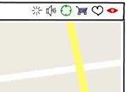
Last week I wrote about our decision to introduce a single global menu for all applications, located in the panel ( we are talking only about the Ubuntu Netbook Remix - approx. Transl. ). I also said that we will explore the possibility of placing the window title and its menu in a panel if the window is maximized. Of course, this means that window indicators should also be located there. They will appear on the right side of the panel, and at the same time they will be located to the left of the panel indicators. For example, here is the expanded application window (note the Ubuntu logo button in the upper left corner: this is the panel, not the window title):
In this configuration, “serving a single goal” is achieved: the entire screen is provided to one application, and at the same time, the elements of the Ayatan continue to perform their functions, both system (battery indicator) and application-specific.
Updated : we approach, we offer our ideas, do not be shy! I already started :)
Updated 2 : Mark responded to a critical comment (thanks to braintorch ):
Michael Hall:
What about the fact that instead of integrating winders into the client window decoration, provide DBus information in the way other indicators do? In this case, Metacity / Compiz will be able to determine how to use them: as winders, in the Gnome taskbar, in cairo-dock, awn, or even as in Windows7 “Jump List”.
Mark Shuttleworth:
Yes, you are right, this is the right approach. I did not put it very clearly, CSD gave us * the idea * that this free space can be given to the use of the application, but standard themes and window managers, of course, should support all this.
Source: https://habr.com/ru/post/92668/
All Articles