Fractals and GUI
Considering the various existing ways to build user interfaces, I suddenly had the idea that, in principle, the wrong path was chosen. People again chose the "square" model of displaying information, as in almost all other areas of their activities. I do not call for a revolution in the construction of user interfaces, but many people may find thoughts on fractals interesting.
For thousands of years, people have created various man-made objects, operating with just a few simplest geometric shapes and their combinations. The main objects were: a rectangle, a circle, a triangle, and their three-dimensional counterparts - a box, a ball, a pyramid. Examples are endless. but the easiest way to look at the buildings that surround us. Starting from the elements from which we create buildings:

And ending with the buildings themselves:
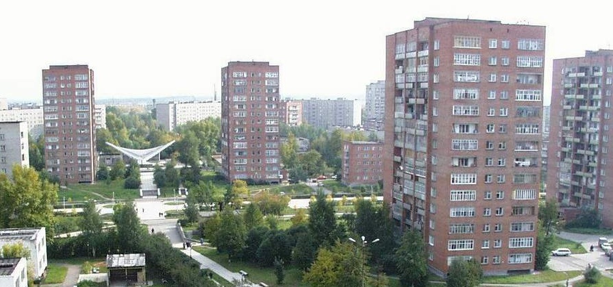
Perhaps our civilization can be called "square", or, if desired, "rectangular." It happened so for thousands of years of the development of society and will probably last, if not forever, then many hundreds or thousands of years. But the basic forms chosen by man are far from ideal and nature operates with a completely different class of objects - fractals.

')
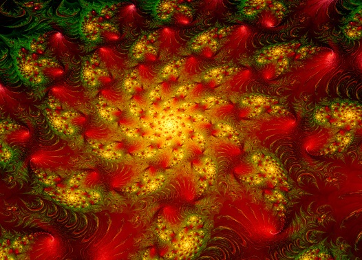
A fractal is an infinitely self-similar geometric shape, each fragment of which repeats with decreasing scale.
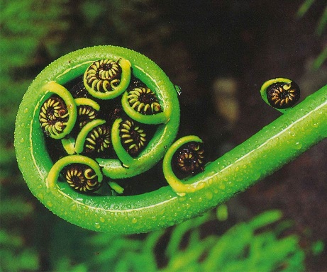
The fractal form is optimal for living objects and we can meet it everywhere. Man discovered this magnificence of forms quite recently. Since the publication of the work "The Fractal Geometry of Nature" by Benoit Mandelbrot in 1977, only a few decades have passed. A moment in comparing the cultural epochs of man. And it is not surprising that a person takes only small steps, trying to master the possibilities that the mathematics of fractals and new geometric forms give him.
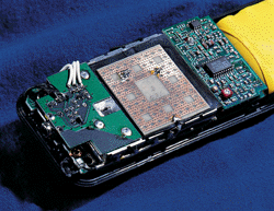
For example, the fractal device of the antenna allows it to receive a wide range of frequencies, and we actively use this fractality in cell phones.
And now I want to timidly hint at the idea of the possibility of using fractals in our communication with the computer. In the presentation of information and graphical interfaces. I am not ready to express a finished idea, but maybe I will prepare someone for this. :)
The graphical interfaces of many applications are ugly, if you look at them strictly. They are uncomfortable, forcing the eyes to slide along rows of buttons, looking for the desired element. They look awful when changing resolutions, font sizes. What I'm talking about is not so much about errors in the programs I have described here , but about the fundamental difficulty of creating a program that can adequately display itself on various devices. This problem grows with the increasing popularity of various portable devices - laptops, phones, digital cameras.
In order for one program to truly look beautiful on different gadgets, its interface needs to be modified each time for a specific device. Somewhere in a different location, somewhere to remove non-essential buttons. And all this is connected with the newly chosen ideology of "squareness". After all, if you look closely, the interface of a typical program consists of square elements:
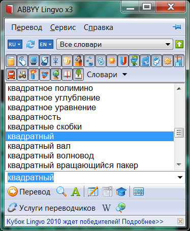
And even if circles or ellipses are used, this has little effect on the essence. These are just decorations, and not at all a new approach to creating interfaces.
Now let's get to the essence of the question and fractals. The main trouble of modern interfaces is their congestion and the difficulty of finding the right elements. That is navigation. They are trying to fight this in various ways. I will give a few examples.
1. In the Start menu in Windows, the most frequently launched programs are displayed, and to launch more rare programs, it is suggested to look at the “All Programs” tab.
2. In the new interface of Word 2007, a number of elements allow you to perform both a standard action and, if desired, allow you to refine the command.
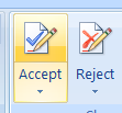
This means that it is artificially necessary to divide the elements according to the importance of their use. And the number of elements that should be displayed and hidden due to the font size and screen resolution. Working with a classic menu that has several nested levels is even more awful.
One of the properties of the fractal is a clear selection of large and small elements. And if in the “square” interfaces we have to artificially introduce the concept of large / small, visible / hidden elements, then in fractals this can happen by itself. In addition, each part of the fractal is similar and therefore the interface will be uniform, regardless of the depth of immersion, for example, in menu items or settings.
I find it difficult to draw a fractal interface, the more beautiful. I will try to only schematically display my idea. Take the abstract phone interface. It has a top-level menu, represented by icons. Clicking the icon opens a submenu and so on. With the fractal option, everything seems to be the same, but in it we can quickly navigate, approximately knowing the area in which the object of interest is located. That is, an element of a fractal, denoting a deep-lying submenu or a finite element, may not be visible on the screen at all, or it may be indicated by a set of colored dots. Knowing what we are looking for, we can quickly move to the area we need. Not knowing, we can move gradually.

I am sure that something like this already exists, but obviously not widely spread. Large objects are signed or have large icons. Smaller may appear as small icons. Quite small - just colored triangles. We can move deeper into the fractal gradually, by clicking for example the "games" section. And then we will be shown an enlarged part of the fractal:
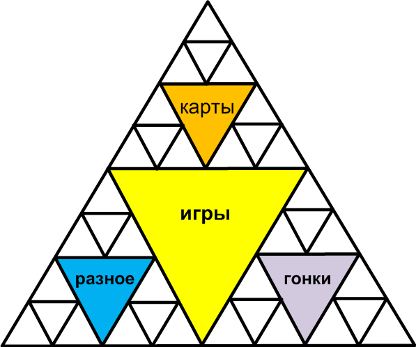
But what is great is that we can navigate much faster if we remember where the game we want is located. For example, we can immediately go from the main menu to the races by selecting the desired color triangle.
Since I depicted this, it may not look very comfortable, but I hope the idea is clear. And now another important advantage of this interface of choice. It scales easily for different resolutions! Simply, the smaller the screen, the less detailed we will see the fractal.
I hope my thoughts will seem interesting to someone and they will take them on board. If for typical applications, such an interface does not seem so useful, for example, for games that run on different devices, it can be very interesting.
Source: https://habr.com/ru/post/92064/
All Articles