About buttons, dialogs and the “Apply” button
In the topic "Aggressive" prickly "buttons against rounded" a small discussion has developed about the arrangement of standard buttons in dialog boxes ("Yes", "No", "OK", "Cancel"). In this article, I review the main mistakes that interface designers make regarding dialog boxes.
How often do you find yourself in a situation where, out of habit, you press a button, expecting to get one result, and instead you get the exact opposite? Or, let's say, they “hung up” over a dull, abstruse dialogue confirming the exit? Or maybe they met with questions from the “Do not save?” Series and the “Yes”, “No”, and “Cancel” buttons? The reason for this is the misunderstanding of the developers of the “unwritten code of design” - simple rules that no one invented, but it just so happened. This problem is common in the free software world and is almost absent in the products of large companies whose program interfaces are strictly standardized and carefully considered. Let's look at a few examples.
Microsoft Word
This is a good dialogue. It is simple, it has everything you need and there is nothing superfluous. Let's take it in order:, its mother, standard):
GNU Image Manipulation Program (GIMP)
This is a bad dialogue. It is complex, oversaturated with information. Go through the list:
')
What conclusions can be drawn from here:
The same problem occurs in the settings windows. Here is the correct window (o-pa, again MS):
Microsoft Word
Two buttons: "OK" and "Cancel". And "Cancel" on the right. So it was and will be. And rightly so, because everyone is used to it. If the user replaces something there and suddenly changes his mind to save the changes, he doesn’t look at the right lower key, because he is used to seeing cancellation there (and she is there in MS products). Linux is completely different. There are no hard and fast rules and standards, everyone here does what he wants.
Rhytmbox
Interesting, isn't it? Although the previous window has a normal button layout. What guided the developers - one hedgehog knows. Let us leave these blunders to the authors' conscience, and for ourselves we will conclude: the rightmost button is cancel (if this is not your special case).
Microsoft Windows
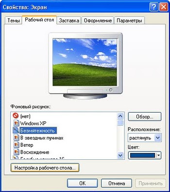
Another interesting option is the “Apply” button. Oh, what memories I have with her ... Before pressing "OK", click "Apply" on full automation. It is not clear why, but still :-)
A relic of the past, from which Microsoft for some reason does not want to give up. It is intended to save and apply changes without closing the dialog box. Changed the settings - please click "Apply". This was done due to the fact that in the days of Windows 95 computers were weak and the use of settings "on the fly" caused non-acidic PC sub-thinking. Now, in times of dohrena-nuclear machines and “office” horses with four gigs of brains on board, such a system is simply unnecessary.
Ubuntu linux

Gnome, for example, uses the on-the-fly settings system, i.e. poked the mouse into the picture and it immediately became the wallpaper of the desktop. No need to click "Apply" / "Save." There is only one button - “Close”. And nothing else is needed in non-critical dialogues.
Hence the conclusion: the use of the “Apply” button is small, so its use is in demand.
Here, in principle, and all on this topic. Do gentlemen, good, convenient interfaces. Yes, your users will rejoice!
Dialog boxes
How often do you find yourself in a situation where, out of habit, you press a button, expecting to get one result, and instead you get the exact opposite? Or, let's say, they “hung up” over a dull, abstruse dialogue confirming the exit? Or maybe they met with questions from the “Do not save?” Series and the “Yes”, “No”, and “Cancel” buttons? The reason for this is the misunderstanding of the developers of the “unwritten code of design” - simple rules that no one invented, but it just so happened. This problem is common in the free software world and is almost absent in the products of large companies whose program interfaces are strictly standardized and carefully considered. Let's look at a few examples.
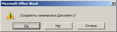
Microsoft Word
This is a good dialogue. It is simple, it has everything you need and there is nothing superfluous. Let's take it in order:
- Immediately put a direct and short question: "Save changes?".
- Short, instantly understandable and easily perceived answers: "Yes", "No", "Cancel".
- Answer options are arranged in the only correct and convenient order.
- The correct answer (in 90% of cases) is already highlighted - you can safely press a space and proceed to further work.
- Window title Much more correct to duplicate in it the essence of the question - “Save?”. But on the other hand, this is good, because this question can jump out at the moment when the user is working with another application. Although, again, from which fright Word will suddenly close without user intervention, especially when it works with another program? “For” more than “against”. Therefore, it is better to duplicate the question in the title or, as a compromise, indicate the name of the program with the question (“Save? Microsoft Word”).
- Icon. In Microsoft products, it is intended to set the tone for the dialogue, but often developers use not just a “tone” sign as an icon, but an action icon, if present. For example, this is done in the following example with the “Save” icon. I will not dwell on the question "Diskette or HDD with an arrow down", because it is beyond the scope of this topic.
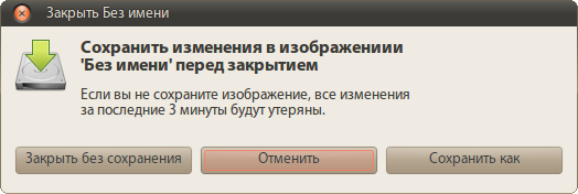
GNU Image Manipulation Program (GIMP)
This is a bad dialogue. It is complex, oversaturated with information. Go through the list:
- The question is presented in too long a form and for some reason added “before closing”. This question is asked only when closing a document, so why write “before closing”? Again, why do you need a clarification "in the image"? I'm in a graphics editor, the captain suggests that it works with images. It's all the same that 3D Max will ask me "Save changes to the set of three-dimensional models covered with% file_name% textures?"
- Too long answers, which also do not correspond to the question ( hello, bashorg! ). Buttons make the brain turn on to understand what they want from me.
- The response options are arranged in the same developers in a clear order. Why precisely “No”, “Cancel”, “Yes”? How would they allude to "Dude, your crafts are terrible, don't screw up the screw"?
- The wrong answer is highlighted. The default clause should perform some action in one user's movement. Imagine the software installation dialog in Windows, where instead of “Next” in each window, the focus will jump to “Cancel”. Stupid, isn't it?
- It is not clear why the phrase “If you do not save the image, all changes over the last 3 minutes will be lost.” Rejoice, gentlemen: I calculated the work of Captain Obvious.
- An informative icon that immediately makes it clear that this is about saving.
- Informative (in doubt) window title.
')
What conclusions can be drawn from here:
- The user should be asked the question as briefly as possible so as not to make him think about the question for half an hour.
- Do not use negative questions ("Do not save?" And "Yes", "No", "Cancel").
- Use only the generally accepted order of buttons (positive, negative, neutral)
- Answers must be simple and concise. This is a program that should work quickly, and not a linguistic workshop where you can talk for hours about anything.
- Do not write extra information. Of course, it's cool that you think how much time has passed since the last save, but the user is violet about it, but in a dialogue it will only distract and possibly put on a stupor or even make him angry.
- The window title should also be informative.
- Do not forget about the icon. It should reflect the essence of the issue as much as possible and be easily recognizable.
Modal windows and “Apply” button
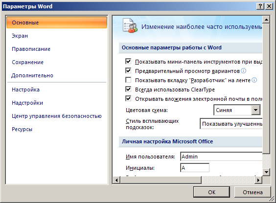
The same problem occurs in the settings windows. Here is the correct window (o-pa, again MS):
Microsoft Word
Two buttons: "OK" and "Cancel". And "Cancel" on the right. So it was and will be. And rightly so, because everyone is used to it. If the user replaces something there and suddenly changes his mind to save the changes, he doesn’t look at the right lower key, because he is used to seeing cancellation there (and she is there in MS products). Linux is completely different. There are no hard and fast rules and standards, everyone here does what he wants.
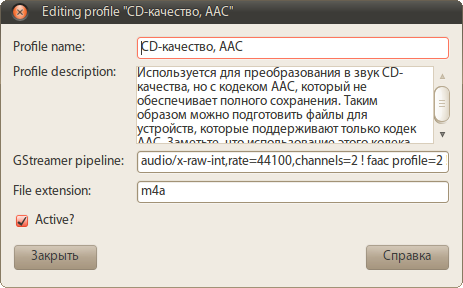
Rhytmbox
Interesting, isn't it? Although the previous window has a normal button layout. What guided the developers - one hedgehog knows. Let us leave these blunders to the authors' conscience, and for ourselves we will conclude: the rightmost button is cancel (if this is not your special case).
Microsoft Windows
Another interesting option is the “Apply” button. Oh, what memories I have with her ... Before pressing "OK", click "Apply" on full automation. It is not clear why, but still :-)
A relic of the past, from which Microsoft for some reason does not want to give up. It is intended to save and apply changes without closing the dialog box. Changed the settings - please click "Apply". This was done due to the fact that in the days of Windows 95 computers were weak and the use of settings "on the fly" caused non-acidic PC sub-thinking. Now, in times of dohrena-nuclear machines and “office” horses with four gigs of brains on board, such a system is simply unnecessary.
Ubuntu linux
Gnome, for example, uses the on-the-fly settings system, i.e. poked the mouse into the picture and it immediately became the wallpaper of the desktop. No need to click "Apply" / "Save." There is only one button - “Close”. And nothing else is needed in non-critical dialogues.
Hence the conclusion: the use of the “Apply” button is small, so its use is in demand.
Here, in principle, and all on this topic. Do gentlemen, good, convenient interfaces. Yes, your users will rejoice!
Source: https://habr.com/ru/post/90789/
All Articles