Little about design
Since I often visit the Krylatskoye metro station, I constantly wonder how it would be easy to improve this station if the designer had thought about the users and how they would use the product of his work.
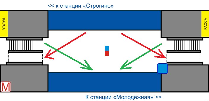
Take the station diagram from the official website of the Moscow subway www.mosmetro.ru
Draw the flow of people at the station. The red arrows show the path of people who have arrived from the center and are moving towards the elevator escalator to the exit. Green - the path of those who go down to the subway and goes to the center. These two routes are typical, since the station is located at the end of the metro line and not many people tend to leave Krylatskoye to Mitino or vice versa.
')
The result is that the main paths overlap, people dodge each other, pushing and thinking to themselves "Where are you going, stupid!" descent closer to the path towards the center. One stroke, and the work would be a decent master brush.
Hardly anyone will be interested, so I put in a personal blog.
Or advise where it might lie better?
Source: https://habr.com/ru/post/89714/
All Articles