Development of the Ribbon, the Dusty Museum of the Office's Past (Interface Why, Part 2)
Written by Jensen Haris, Director of Program Management for the Microsoft Windows User Experience Team. (Prompt adequate translation.)
Yes, the reason why I am translating these articles right now is the imminent release of the 2010 Office. I have been sitting on the beta for a long time - nothing special, but I was pleased with the tape in Van Note (for the sake of it I switched).
This is the second part in my series of eight articles, in which I will point out some of the reasons that prompted us to make the decision to create a new user interface in the 2007 Office.
')
Today I want to take you on a trip. A journey that begins in the harsh depression of the mid-1980s , in the days of the EGA , connected via the serial port of mice and the MS-DOS Executive shell .
Microsoft Word 1.0 for Windows went on sale in 1989 after a long development cycle and was designed to work on Windows 386. There is almost nothing in the program except what you see in the screenshot, but now you can imagine the path traveled by Word. The Berlin Wall between Word 1.0 and the modern one was still standing, but if you narrow your eyes, you can see that the core of today's Word user interface was already present. There is also the top menu of the application, which Vindouz improved by borrowing the ideas of the top menu of the Macintosh system and the bottom menu of DOS programs. Word 1.0 also includes something infrequently seen in user interfaces since PARC: the toolbar, which was first used in Microsoft Excel. It may seem that in Word 1.0 there are two toolbars, but in fact, only the top panel is called a toolbar. It is interesting that the bottom panel of buttons is called “Ribbon” - I did not know about this until I took a few screenshots a couple of months ago. The world is small.

(Word 1.0)
By the time Ward 2.0 entered the market in 1992, the basic structure of its user interface was already formed and was exactly the same as in Word 2003. File, Edit, Insert, Format, Tools, Table, Window, Help. Toolbars "Standard" and "Formatting". Here you have a program, on the design of which you have been working for more than fifteen years, and the core of the user interface has not changed all this time. (In the time of Word 1.0, I went to school and programmed on my Apple IIc .)
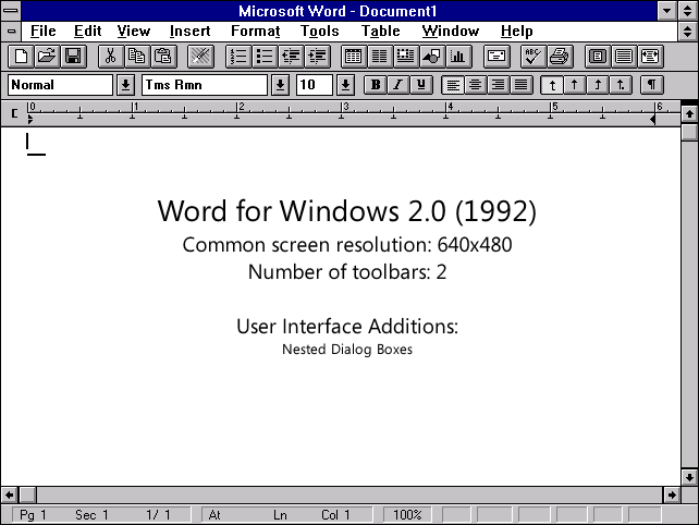
(Word 2.0)
And here's the thing: this interface worked well for a program like Word 2.0. It had less than a hundred teams, but because the Vord development team was able to design the ideal menu system for its program, the distribution of its items made sense. Toolbars were just effective doublers of the functionality presented in the menu - there were no options existing only on toolbars. Browsing the menu was straightforward and fast — most menu items had less than ten options, and there were no multi-level menus at all.
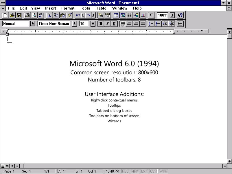
Word 6.0 was a hit. Borrowing the popularity of Windows 3.1, it went ahead in the fight against WordPerfect. Ward contributed to the evolution of the user interface by bringing up a context menu, tabbed dialog boxes, wizards and toolbars at the bottom of the screen. The number of toolbars has increased from two in the previous version of Word to eight in Word 6.0, the number of menu items also increased, because New options have been added to the program.
(Word 6.0)
Word 95 was the first 32-bit version of the program, burst onto the market on a wave of comforts from the launch of the Widows 95 in August 1995. Although it was mostly a direct port of Word 6.0, it had one small, innovative option, and most people would agree that no longer represents life without it: a red wavy line that underlines errors. Many people point out that Word 95 was the last generation of simple, stripped-down, pre-Internet word processors.

(Word 95)
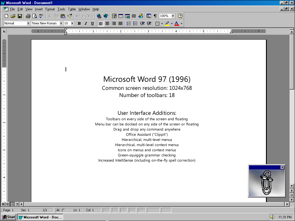
While the small team was working on porting the Office to a 32-bit OS and eventually creating the Office 95th, the team worked a lot more on the Office 97th. Office 97 was an absolute hit and set record for software sales. Loaded with new options, Word 97 marked the beginning of a new stage of super-rich Office applications.
(Word 97)
However, this super-sophistication led to an increase in complexity. In the 97 office, “command panels” appeared - a hyper-customizable user interface, in which the menus and toolbars were actually the same. Each menu and toolbar could be dragged to any side of the screen, undocked or docked. Designers of options in Microsoft used a new technology in full force, the number of toolbars soared to 18, the number of commands in the top menu almost doubled.
It is possible to argue, but the most important decision in interface design, made in Word 97, was simple: multi-level menus. In all previous versions of the Word, the menus were a simple list of options — easy to view, easy to use. Excel, having understood the hint of Lotus 1-2-3 with a labyrinthine interface, got the hierarchical menu earlier. Thus, despite the struggle between the Word development teams, this model won - Word 97 got its multi-level menus.
Why was this decision made? Well, the top menus in Word were completely full. Although an increasing number of options were implemented exclusively on toolbars, some options still needed menu items, which were nowhere to insert. Wrapping teams into a multi-level structure made it possible to make room for new teams. More space - more options.
The shortcomings, however, were clear and, ultimately, deadly - increased complexity. It is much more difficult for people to form the habit of working with multi-level menus: you need to constantly remember which levels you were on and which ones you didn't. Once simple, easily visualized, the structure became more complex, tree-like. The search for new options became less similar to viewing the shopping list, and began to resemble a crawling of a complex data structure .
Word 97 was the first version, in relation to which we noticed that people feel less control over it. 97 The office was very successful both among companies and individuals, but it also marked the beginning of a long list of articles in the press accusing its interface of “bloating”.
(Today, some people consider the 97 Office as very simple, and it is interesting how this view differs from the impression made by the 97 Office at the time of its appearance).
Next article: What was done with the Office to reduce the feeling of “bloatedness”.
Yes, the reason why I am translating these articles right now is the imminent release of the 2010 Office. I have been sitting on the beta for a long time - nothing special, but I was pleased with the tape in Van Note (for the sake of it I switched).
This is the second part in my series of eight articles, in which I will point out some of the reasons that prompted us to make the decision to create a new user interface in the 2007 Office.
')
Today I want to take you on a trip. A journey that begins in the harsh depression of the mid-1980s , in the days of the EGA , connected via the serial port of mice and the MS-DOS Executive shell .
Microsoft Word 1.0 for Windows went on sale in 1989 after a long development cycle and was designed to work on Windows 386. There is almost nothing in the program except what you see in the screenshot, but now you can imagine the path traveled by Word. The Berlin Wall between Word 1.0 and the modern one was still standing, but if you narrow your eyes, you can see that the core of today's Word user interface was already present. There is also the top menu of the application, which Vindouz improved by borrowing the ideas of the top menu of the Macintosh system and the bottom menu of DOS programs. Word 1.0 also includes something infrequently seen in user interfaces since PARC: the toolbar, which was first used in Microsoft Excel. It may seem that in Word 1.0 there are two toolbars, but in fact, only the top panel is called a toolbar. It is interesting that the bottom panel of buttons is called “Ribbon” - I did not know about this until I took a few screenshots a couple of months ago. The world is small.
(Word 1.0)
By the time Ward 2.0 entered the market in 1992, the basic structure of its user interface was already formed and was exactly the same as in Word 2003. File, Edit, Insert, Format, Tools, Table, Window, Help. Toolbars "Standard" and "Formatting". Here you have a program, on the design of which you have been working for more than fifteen years, and the core of the user interface has not changed all this time. (In the time of Word 1.0, I went to school and programmed on my Apple IIc .)
(Word 2.0)
And here's the thing: this interface worked well for a program like Word 2.0. It had less than a hundred teams, but because the Vord development team was able to design the ideal menu system for its program, the distribution of its items made sense. Toolbars were just effective doublers of the functionality presented in the menu - there were no options existing only on toolbars. Browsing the menu was straightforward and fast — most menu items had less than ten options, and there were no multi-level menus at all.
Word 6.0 was a hit. Borrowing the popularity of Windows 3.1, it went ahead in the fight against WordPerfect. Ward contributed to the evolution of the user interface by bringing up a context menu, tabbed dialog boxes, wizards and toolbars at the bottom of the screen. The number of toolbars has increased from two in the previous version of Word to eight in Word 6.0, the number of menu items also increased, because New options have been added to the program.
(Word 6.0)
Word 95 was the first 32-bit version of the program, burst onto the market on a wave of comforts from the launch of the Widows 95 in August 1995. Although it was mostly a direct port of Word 6.0, it had one small, innovative option, and most people would agree that no longer represents life without it: a red wavy line that underlines errors. Many people point out that Word 95 was the last generation of simple, stripped-down, pre-Internet word processors.
(Word 95)
While the small team was working on porting the Office to a 32-bit OS and eventually creating the Office 95th, the team worked a lot more on the Office 97th. Office 97 was an absolute hit and set record for software sales. Loaded with new options, Word 97 marked the beginning of a new stage of super-rich Office applications.
(Word 97)
However, this super-sophistication led to an increase in complexity. In the 97 office, “command panels” appeared - a hyper-customizable user interface, in which the menus and toolbars were actually the same. Each menu and toolbar could be dragged to any side of the screen, undocked or docked. Designers of options in Microsoft used a new technology in full force, the number of toolbars soared to 18, the number of commands in the top menu almost doubled.
It is possible to argue, but the most important decision in interface design, made in Word 97, was simple: multi-level menus. In all previous versions of the Word, the menus were a simple list of options — easy to view, easy to use. Excel, having understood the hint of Lotus 1-2-3 with a labyrinthine interface, got the hierarchical menu earlier. Thus, despite the struggle between the Word development teams, this model won - Word 97 got its multi-level menus.
Why was this decision made? Well, the top menus in Word were completely full. Although an increasing number of options were implemented exclusively on toolbars, some options still needed menu items, which were nowhere to insert. Wrapping teams into a multi-level structure made it possible to make room for new teams. More space - more options.
The shortcomings, however, were clear and, ultimately, deadly - increased complexity. It is much more difficult for people to form the habit of working with multi-level menus: you need to constantly remember which levels you were on and which ones you didn't. Once simple, easily visualized, the structure became more complex, tree-like. The search for new options became less similar to viewing the shopping list, and began to resemble a crawling of a complex data structure .
Word 97 was the first version, in relation to which we noticed that people feel less control over it. 97 The office was very successful both among companies and individuals, but it also marked the beginning of a long list of articles in the press accusing its interface of “bloating”.
(Today, some people consider the 97 Office as very simple, and it is interesting how this view differs from the impression made by the 97 Office at the time of its appearance).
Next article: What was done with the Office to reduce the feeling of “bloatedness”.
Source: https://habr.com/ru/post/86930/
All Articles