The interface of the program Kiwi for iPhone
Recently, crawling on the appstore, I came across a program of payments for Kiwi. I just managed to rejoice, as it turned out that the program was done terribly. It is strange that such a large company allowed herself to release such nonsense. So I redraw their interface :)
Secondly, stability. It terribly slows down, the buttons are pressed once, and the connections often occur from the third time.
')
And thirdly - the interface. Here are some screenshots of their current program:

The interface does not fit in any way with the guidelines, with the feeling of the iPhone, or even with the interface of the terminals itself, and it looks something symbianistic from the beginning of the 00s. The repeated main screen of the terminal has two permanent buttons - the payment and the cabinet, which essentially lead to the same place - to an additional payment, except that the LC shows the bill before that.
I started from scratch, and I realized that in fact there are several basic user cases:
1) Quickly pay for something from the LC (for example, I almost always keep it a couple of hundred rubles in reserve), which is usually added a long time ago to my favorites - a mobile phone or an Internet, for example.
2) See where the nearest terminal is to throw money.
3) Pay for something that is not saved in frequent payments (phone to a friend, money for Yandex, etc.).
4) Since they screwed up the dialer (terrible in the original prog), then call from the LC account if the money ran out.
5) View payment history.


The main screen is a personal account with an account in the form of money and a list of selected payments. Money is converted depending on the amount of funds.


If I need to pay, say, my mobile phone, then by clicking on its field, a payment window appears where the required amount fits into the check. Instead of an iPhone full keyboard with letters and symbols, custom digital is used here. After clicking "Pay" check arrives completely, and the payment is confirmed (or not confirmed :).


Not sure what to enter in the check, but the mass of options. You can even memorize the place of payment with jeepies and give out the area. Yes, even the weather at this time to add, so that later it was more interesting to check the checks :) And the check is crumpled, if an error occurs - then it is not needed.


If you need to pay for something that has not been added to a quick payment, then you need to go to all service providers. A list opens with the categories expanding to the right.

Part of the categories are not disclosed as much as in Qiwi - for example, cellular communication does not torment you with the choice of the operator, but defines it by code and number. In the long spix, on the right, there is a scrolling alphabetically. Well, naturally search.


Some payers give hints, like, for example, utilities. Before entering directly, a window will appear showing where the necessary code is on the incoming check. Then utilities paid in a standard way.


Unselected services are paid the same. The phones themselves are marked up (+7 and there is no need to drive the hyphens - the numbers “jump” further). Also numbers of contracts, aypishniki and so forth are marked.

The map shows where the nearest terminals are and prompts for their addresses.

Kiviv dialer now looks more like its own. Hanging reminder with fares.

The history is displayed in a list and loaded as you scroll. Selected payments go under your own name, and one-time payments include the number that was paid. And by the way, I would not give up the possibility of replenishing the LC with a credit card.


In the settings, you can log in to the LC and enable the password. I thought I'd add a couple of interesting chips to the settings, but I hadn't had time yet. During the week I’ll finish what I’ll finish, to the journal . At a minimum, it is necessary to complete the account replenishment system.


And finally - a piece of several sheets of drawing navigation:

This is a non-existent project. He is more likely to workout, and will not appear in the appstore. Much still needs to be done, clean shoals and think about improving convenience, but overall I am satisfied :)
Why is the program crap?
First, the animation. Starting, the program greets you with a meaningless slow animation that builds objects. All the animation is also eerie and senseless further - it feels like someone picked up the KFOR and riveted what they liked without playing enough. Although the main purpose of the animation in the iPhone is to let the user know where everything is on the screen and outside (therefore, the lists are opened to the right, scrolled down, and do not fly from all sides).Secondly, stability. It terribly slows down, the buttons are pressed once, and the connections often occur from the third time.
')
And thirdly - the interface. Here are some screenshots of their current program:
The interface does not fit in any way with the guidelines, with the feeling of the iPhone, or even with the interface of the terminals itself, and it looks something symbianistic from the beginning of the 00s. The repeated main screen of the terminal has two permanent buttons - the payment and the cabinet, which essentially lead to the same place - to an additional payment, except that the LC shows the bill before that.
I started from scratch, and I realized that in fact there are several basic user cases:
1) Quickly pay for something from the LC (for example, I almost always keep it a couple of hundred rubles in reserve), which is usually added a long time ago to my favorites - a mobile phone or an Internet, for example.
2) See where the nearest terminal is to throw money.
3) Pay for something that is not saved in frequent payments (phone to a friend, money for Yandex, etc.).
4) Since they screwed up the dialer (terrible in the original prog), then call from the LC account if the money ran out.
5) View payment history.
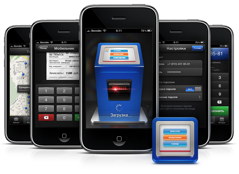
So, I'll start.
The program starts like this (if the input is password-protected in the settings, the picture pulls out letting in the keyboard and input fields):The main screen is a personal account with an account in the form of money and a list of selected payments. Money is converted depending on the amount of funds.
If I need to pay, say, my mobile phone, then by clicking on its field, a payment window appears where the required amount fits into the check. Instead of an iPhone full keyboard with letters and symbols, custom digital is used here. After clicking "Pay" check arrives completely, and the payment is confirmed (or not confirmed :).
Not sure what to enter in the check, but the mass of options. You can even memorize the place of payment with jeepies and give out the area. Yes, even the weather at this time to add, so that later it was more interesting to check the checks :) And the check is crumpled, if an error occurs - then it is not needed.
If you need to pay for something that has not been added to a quick payment, then you need to go to all service providers. A list opens with the categories expanding to the right.
Part of the categories are not disclosed as much as in Qiwi - for example, cellular communication does not torment you with the choice of the operator, but defines it by code and number. In the long spix, on the right, there is a scrolling alphabetically. Well, naturally search.
Some payers give hints, like, for example, utilities. Before entering directly, a window will appear showing where the necessary code is on the incoming check. Then utilities paid in a standard way.
Unselected services are paid the same. The phones themselves are marked up (+7 and there is no need to drive the hyphens - the numbers “jump” further). Also numbers of contracts, aypishniki and so forth are marked.
The map shows where the nearest terminals are and prompts for their addresses.
Kiviv dialer now looks more like its own. Hanging reminder with fares.
The history is displayed in a list and loaded as you scroll. Selected payments go under your own name, and one-time payments include the number that was paid. And by the way, I would not give up the possibility of replenishing the LC with a credit card.
In the settings, you can log in to the LC and enable the password. I thought I'd add a couple of interesting chips to the settings, but I hadn't had time yet. During the week I’ll finish what I’ll finish, to the journal . At a minimum, it is necessary to complete the account replenishment system.
And finally - a piece of several sheets of drawing navigation:
This is a non-existent project. He is more likely to workout, and will not appear in the appstore. Much still needs to be done, clean shoals and think about improving convenience, but overall I am satisfied :)
Source: https://habr.com/ru/post/85984/
All Articles