Say “No!” To stock cliché
I like stock photos. But we must leave in the past people in suits, shaking hands. It's time to do away with bland and polite photos.
Such photos do not carry meaning and do not have a positive emotional tone. Take for example the website below:

')
The image does not provide any information regarding the nature of the website. This is just a dummy in order to fill the space.
The only reason designers resort to such beaten cliches is laziness. On the Web, you can find literally millions of great images available for download. Or at worst take a photo or draw an illustration yourself.
This lazy approach can be seen on the website below. The designer was so lazy that he didn’t even buy the image (see Istockphoto watermark).

Do not misunderstand me. I do not write it with a sense of superiority. In the end, with limited time and budget, many do not have the means to photograph themselves.
Do not think that using stock photos is terrible. There are several methods that can help avoid trite practices, even with limited time and budget.
More and more websites use illustrations instead of photos. Illustrations give the site a character.
The style of the used illustrations speaks about the site itself. It does not have to be children's illustrations, as many customers fear.


Even if you choose ready-made pictures for use - there is no reason to put them in the box. Try to free the image from the background. This can give a new life, even relatively boring photos.


Of course, there are times when you have to work with bad photos. This usually happens when the image is provided by the client itself.
This is exactly the moment to be creative. Do not put up with poor image quality, but enhance it with simple techniques. Use Photoshop filters or make a collage.


If you have a choice, then make it in favor of images with a chip.
When you encounter a multi-thousand image library, it is easy to select the first suitable photo. However, remember that composition, color and style are of great importance.


Of course, there is no reason to constantly use photos. It is possible to create an incredibly powerful website using just the right typography.


My last tip is perhaps the most important of all. You do not have to be obvious.
The reason why so many websites do not deviate from stereotypes is that most organizations do not have strong images associated with their activities. When you think of a management consultant, PR agency or bookkeeper, you instinctively think of businessmen in business suits who shake hands. This is an obvious image of these and many other areas of business. After all, there are not many enterprises whose product can be seen or touched, but this is no reason to resort to trashed cliches
However, good images convey a sense of personality and character, rather than an obvious idea of what the company does. I think all potential site visitors understand where they are and they don’t need a picture to understand it. What they need to understand is the nature and personality of your organization.
Images that convey information and emotions are significantly more powerful. These images are addressed to the user and attract attention.


I ask you to be more creative in the selection of images. Do not settle for photos of the second grade. Instead, take an illustration, make a collage, use typography and style your images.
However, first of all I would like to urge you to avoid using obvious, literal symbols and images. Some of the most powerful images can also be the most abstract.
Free translation: Blog about design and computer graphics
Such photos do not carry meaning and do not have a positive emotional tone. Take for example the website below:
')
The image does not provide any information regarding the nature of the website. This is just a dummy in order to fill the space.
The only reason designers resort to such beaten cliches is laziness. On the Web, you can find literally millions of great images available for download. Or at worst take a photo or draw an illustration yourself.
This lazy approach can be seen on the website below. The designer was so lazy that he didn’t even buy the image (see Istockphoto watermark).
Alternative
Do not misunderstand me. I do not write it with a sense of superiority. In the end, with limited time and budget, many do not have the means to photograph themselves.
Do not think that using stock photos is terrible. There are several methods that can help avoid trite practices, even with limited time and budget.
Use of illustration
More and more websites use illustrations instead of photos. Illustrations give the site a character.
The style of the used illustrations speaks about the site itself. It does not have to be children's illustrations, as many customers fear.
Tighter integration
Even if you choose ready-made pictures for use - there is no reason to put them in the box. Try to free the image from the background. This can give a new life, even relatively boring photos.
Stylization
Of course, there are times when you have to work with bad photos. This usually happens when the image is provided by the client itself.
This is exactly the moment to be creative. Do not put up with poor image quality, but enhance it with simple techniques. Use Photoshop filters or make a collage.
Choose images with a twist
If you have a choice, then make it in favor of images with a chip.
When you encounter a multi-thousand image library, it is easy to select the first suitable photo. However, remember that composition, color and style are of great importance.
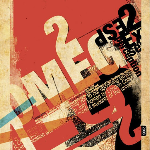
Replacement typography
Of course, there is no reason to constantly use photos. It is possible to create an incredibly powerful website using just the right typography.
Avoid the obvious
My last tip is perhaps the most important of all. You do not have to be obvious.
The reason why so many websites do not deviate from stereotypes is that most organizations do not have strong images associated with their activities. When you think of a management consultant, PR agency or bookkeeper, you instinctively think of businessmen in business suits who shake hands. This is an obvious image of these and many other areas of business. After all, there are not many enterprises whose product can be seen or touched, but this is no reason to resort to trashed cliches
However, good images convey a sense of personality and character, rather than an obvious idea of what the company does. I think all potential site visitors understand where they are and they don’t need a picture to understand it. What they need to understand is the nature and personality of your organization.
Images that convey information and emotions are significantly more powerful. These images are addressed to the user and attract attention.
Conclusion
I ask you to be more creative in the selection of images. Do not settle for photos of the second grade. Instead, take an illustration, make a collage, use typography and style your images.
However, first of all I would like to urge you to avoid using obvious, literal symbols and images. Some of the most powerful images can also be the most abstract.
Free translation: Blog about design and computer graphics
Source: https://habr.com/ru/post/82612/
All Articles