Create a volumetric block with shadow using CSS3
The day when the CSS3 standard will be approved, and all popular browsers will begin to display it will bring us, makers, closer to our “paradise of makers” several times. In the meantime, look into the future and find out how you can create a pseudo-3D block using only css and html.
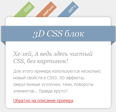
The block will look like this:
To create it, use 4 CSS3 properties:
')
I will not insert the entire html and css - below I will give a reference for an example, I’ll dwell on specific points.
Let's go from the top down.
In principle, standard, nothing unusual.
CSS for it:
As you can see on lines 7 and 8, we rotate each element of the list by 45 degrees
CSS:
For this element we use rounded corners and shadow.
CSS:
For the block-rectangle under the title, as well as the text of the title itself, we apply shadow casting.
The classes .triangle-l and .triangle-r are needed to create “triangles” of poses with a title on the left and right, respectively.
Since CSS3 now does not support all browsers, not all users will see the same picture.
So Mozilla Firefox, Google Chome and Apple Safari users will see it:
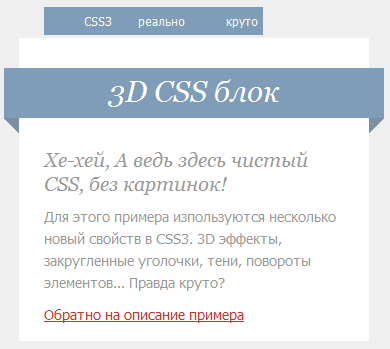
So users of the Opera (Checked at 9.64):
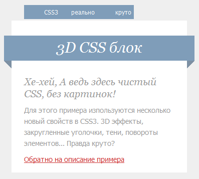
So IE8 users:
Link to a working example
Written using this article
The block will look like this:
To create it, use 4 CSS3 properties:
- box-shadow - the shadow of the element
- text-shadow - text shadow
- transform - turn
- background: rgba (0,0,0,0.65) - the ability to set the transparency of the background
')
I will not insert the entire html and css - below I will give a reference for an example, I’ll dwell on specific points.
Let's go from the top down.
Menu
<ul class="menu"> <li class="l1"><a href="#">CSS3</a></li> <li class="l2"><a href="#"></a></li> <li class="l3"><a href="#"></a></li> </ul> In principle, standard, nothing unusual.
CSS for it:
.menu { position: relative; top:7px; left: 50px; z-index: 80; /* */ } .menu li { -webkit-transform: rotate(-45deg); /* */ -moz-transform: rotate(-45deg); /* */ width: 50px; overflow: hidden; margin: 10px 0px; padding: 5px 5px 5px 18px; float: left; background: #7f9db9; text-align: right; } As you can see on lines 7 and 8, we rotate each element of the list by 45 degrees
Main container
<div class="bubble"></div> CSS:
.bubble { /* */ clear: both; margin: 0px auto; width: 350px; background: #fff; -moz-border-radius: 10px; -webkit-border-radius: 10px; -moz-box-shadow: 0px 0px 8px rgba(0, 0, 0, 0.3); -webkit-box-shadow: 0px 0px 8px rgba(0, 0, 0, 0.3); position: relative; z-index: 90; /* ( .rectangle, z-index: 100) */ } For this element we use rounded corners and shadow.
Headline
<div class="rectangle"> <h2>3D CSS </h2> </div> <div class="triangle-l"></div><!-- --> <div class="triangle-r"></div><!-- --> CSS:
.rectangle { background: #7f9db9; height: 50px; width: 380px; position: relative; left:-15px; top: 30px; float: left; -moz-box-shadow: 0px 0px 4px rgba(0, 0, 0, 0.55); -webkit-box-shadow: 0px 0px 4px rgba(0, 0, 0, 0.55); z-index: 100; /* */ } .rectangle h2 { font-size: 30px; color: #fff; padding-top: 6px; text-shadow: 1px 1px 2px rgba(0, 0, 0, 0.2); text-align: center; } .triangle-l { /* */ border-color: transparent #7d90a3 transparent transparent; border-style:solid; border-width:15px; height:0px; width:0px; position: relative; left: -30px; top: 65px; z-index: -1; /* */ } .triangle-r { /* */ border-color: transparent transparent transparent #7d90a3; border-style:solid; border-width:15px; height:0px; width:0px; position: relative; left: 350px; top: 35px; z-index: -1; /* */ } For the block-rectangle under the title, as well as the text of the title itself, we apply shadow casting.
The classes .triangle-l and .triangle-r are needed to create “triangles” of poses with a title on the left and right, respectively.
Underwater rocks
Since CSS3 now does not support all browsers, not all users will see the same picture.
So Mozilla Firefox, Google Chome and Apple Safari users will see it:
So users of the Opera (Checked at 9.64):
So IE8 users:
Links
Link to a working example
Written using this article
Source: https://habr.com/ru/post/81409/
All Articles