23 logos with hidden meanings
Logos are not always what they seem. Some of these logos can contain a lot of information about the brand, and all you need to do is look at the details. I chose twenty-three great logos that have such a “hidden message”. I am sure that earlier you saw some of these “hidden messages”, but I hope that I can show new ones.
Big Ten is an academic association established in 1896. Until 1990, this union consisted of 10 universities, but in June 1990 they were joined by the University of Pennsylvania. They did not want to change their name and just added the number 11 to their logo.
At first glance, this logo does not hide anything unusual, but it helps to understand the brand philosophy. First, the yellow arrow looks like a smile: Amazon.com wants their customers to be happy. The arrow also links the letters “A” and “Z”, hinting that this store has everything “from A to Z” (“from A to Z” in the original - for example, a translator).
')
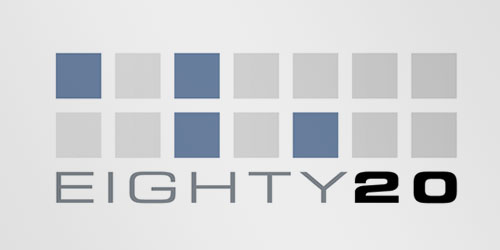
Eighty-20 is a small consulting firm. Many believe that the logo has nothing to do with the name. But if you imagine dark squares as units and as bright as zeros, the upper line reads 1010000, and the lower line as 0010100, which means 80 and 20 in binary calculus.

This is probably one of the best logos with hidden meaning. If you look closely, you will see an arrow that is obtained from the space between “E” and “x”. This arrow symbolizes speed and accuracy - the two basic principles of this company.
Continental is a tire manufacturer. And you can see one of them in the first two letters - they create a wheel in perspective.
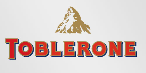
Toblerone is a chocolate manufacturing company from Bern, Switzerland. Bern is also called the City of Bears. Toblerone has included this name of the city in its logo and if you look closely, you will see the silhouette of a bear.
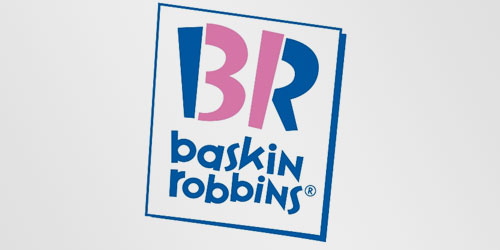
The old Baskin Robbins logo had the number 31 with an arch above it. The new logo takes this idea to a new level. The pink parts of the “BR” consist of the number 31, as a reference to thirty-one flavors of their ice cream.
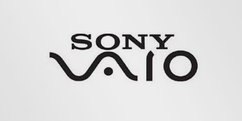
The brand Sony Vaio is known as a laptop manufacturer. But did you know that their logo also has a hidden meaning? The first two letters make up a wave symbolizing the analog signal, and the last two look like 1 and 0, symbolizing the digital signal.
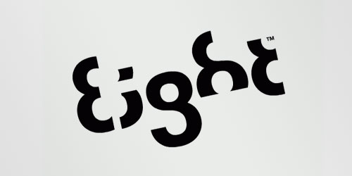
I really like this logo, each letter here is made of a number 8. By the way, I called it the logo of the week a few months ago.

Carrefour is one of the largest European retailers headquartered in France. Their logo symbolizes this world with two opposing arrows. The creators of this logo added the first letter of the company name there, if you look closely, you will see the letter “C” in the space between the arrows.
Roxy is a company specializing in clothing and accessories for girls who love snowboarding, surfing, and so on. Roxy is part of Quiksilver and their logo consists of two Quiksilver heart-shaped logos.
Unilever is one of the largest manufacturers of food, beverages, cleaning products and personal care products. They produce a huge range of different products and wanted to display this in their logo. Each part of this logo makes sense. For example, the heart means love, care and well-being, the bird symbolizes freedom, freedom from everyday worries, and enjoyment of life.
This simple, at first glance, logo contains more secrets than you think. First, you can see the letters "N" and "W", the letters from the word "northwest". But most overlook another secret - the compass, which points to the northwest (Northwest)
Milwaukee Brewers (Milwaukee Brewers) is a professional baseball team from Milwaukee, Wisconsin. Their logo is made of the letters “m” (above) and “b” (under “m”) and resemble a baseball glove.
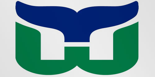
This logo uses free space to create the letter “H”. You can divide it into three parts: the letters “H” and “W” and the blue tail of the whale.
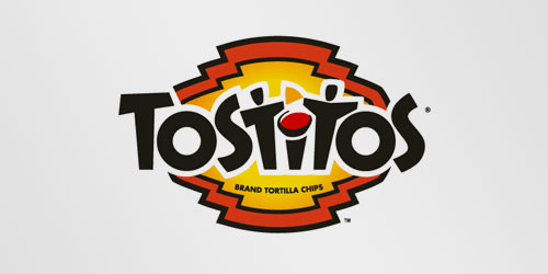
If you look at the center of the logo, you can see two people enjoying Tostitos chips with a cup of Salsa sauce. This logo presents us with the idea of bringing people together.

It seems that with this logo everything is clear right away, but if you look closely at the empty space between the letter “F” and the red stripes, you can see the number 1. By the way, I really like how this logo conveys a sense of speed.
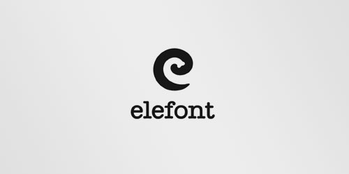
This logo looks like a regular letter, but do not be fooled: the empty space inside the letter “e” is very similar to a part of an elephant's trunk.
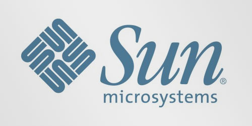
The Sun logo is one of the most famous ambigrams in the world. You can read the word "Sun" both horizontally and vertically. This logo was created by Stanford University professor Van Pratt.
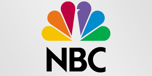
NBC (National Broadcasting Company) is one of the largest US broadcasters. I think many of you have already noticed the peacock in their logo. This peacock has six different tail feathers, which personify 6 departments of the company at the time of creating the logo. The peacock's head is turned to the right to emphasize that he is looking forward, not backward.
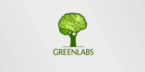
I know this logo looks like a normal, boring tree, but if you look at the tree crown, you will see that you can recognize the brain in it. The logo focuses on the great intellectual potential of the company's employees and reflects the words "green" (green) and "labs" (laboratories) from the name.

If you consider previous logos as good examples of hidden meaning, take a look at this. This is the seal of the Presbyterian Church, and it has several hidden messages. If you want to know about all of them, then you should read this article .
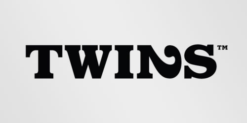
This is the Twins logo. Bold was chosen to show boldness (bold - bold / bold, boldness - boldness - approx. Translation.) Of their approaches. The number 2 was inserted instead of the letter “n” to show the creativity of their ideas.
PS from the translator : This is my first translation of the article, so criticism is welcome (preferably in habraposhta).
Big ten

Big Ten is an academic association established in 1896. Until 1990, this union consisted of 10 universities, but in June 1990 they were joined by the University of Pennsylvania. They did not want to change their name and just added the number 11 to their logo.
Amazon.com

At first glance, this logo does not hide anything unusual, but it helps to understand the brand philosophy. First, the yellow arrow looks like a smile: Amazon.com wants their customers to be happy. The arrow also links the letters “A” and “Z”, hinting that this store has everything “from A to Z” (“from A to Z” in the original - for example, a translator).
')
Eighty-20

Eighty-20 is a small consulting firm. Many believe that the logo has nothing to do with the name. But if you imagine dark squares as units and as bright as zeros, the upper line reads 1010000, and the lower line as 0010100, which means 80 and 20 in binary calculus.
FedEx

This is probably one of the best logos with hidden meaning. If you look closely, you will see an arrow that is obtained from the space between “E” and “x”. This arrow symbolizes speed and accuracy - the two basic principles of this company.
Continental

Continental is a tire manufacturer. And you can see one of them in the first two letters - they create a wheel in perspective.
Toblerone

Toblerone is a chocolate manufacturing company from Bern, Switzerland. Bern is also called the City of Bears. Toblerone has included this name of the city in its logo and if you look closely, you will see the silhouette of a bear.
Baskin robins

The old Baskin Robbins logo had the number 31 with an arch above it. The new logo takes this idea to a new level. The pink parts of the “BR” consist of the number 31, as a reference to thirty-one flavors of their ice cream.
Sony vaio

The brand Sony Vaio is known as a laptop manufacturer. But did you know that their logo also has a hidden meaning? The first two letters make up a wave symbolizing the analog signal, and the last two look like 1 and 0, symbolizing the digital signal.
Eight

I really like this logo, each letter here is made of a number 8. By the way, I called it the logo of the week a few months ago.
Carrefour

Carrefour is one of the largest European retailers headquartered in France. Their logo symbolizes this world with two opposing arrows. The creators of this logo added the first letter of the company name there, if you look closely, you will see the letter “C” in the space between the arrows.
Roxy

Roxy is a company specializing in clothing and accessories for girls who love snowboarding, surfing, and so on. Roxy is part of Quiksilver and their logo consists of two Quiksilver heart-shaped logos.
Unilever

Unilever is one of the largest manufacturers of food, beverages, cleaning products and personal care products. They produce a huge range of different products and wanted to display this in their logo. Each part of this logo makes sense. For example, the heart means love, care and well-being, the bird symbolizes freedom, freedom from everyday worries, and enjoyment of life.
Northwest airlines

This simple, at first glance, logo contains more secrets than you think. First, you can see the letters "N" and "W", the letters from the word "northwest". But most overlook another secret - the compass, which points to the northwest (Northwest)
Milwaukee brewers

Milwaukee Brewers (Milwaukee Brewers) is a professional baseball team from Milwaukee, Wisconsin. Their logo is made of the letters “m” (above) and “b” (under “m”) and resemble a baseball glove.
Hartford whalers

This logo uses free space to create the letter “H”. You can divide it into three parts: the letters “H” and “W” and the blue tail of the whale.
Tostitos

If you look at the center of the logo, you can see two people enjoying Tostitos chips with a cup of Salsa sauce. This logo presents us with the idea of bringing people together.
Formula 1

It seems that with this logo everything is clear right away, but if you look closely at the empty space between the letter “F” and the red stripes, you can see the number 1. By the way, I really like how this logo conveys a sense of speed.
Elefont

This logo looks like a regular letter, but do not be fooled: the empty space inside the letter “e” is very similar to a part of an elephant's trunk.
Sun microsystems

The Sun logo is one of the most famous ambigrams in the world. You can read the word "Sun" both horizontally and vertically. This logo was created by Stanford University professor Van Pratt.
NBC

NBC (National Broadcasting Company) is one of the largest US broadcasters. I think many of you have already noticed the peacock in their logo. This peacock has six different tail feathers, which personify 6 departments of the company at the time of creating the logo. The peacock's head is turned to the right to emphasize that he is looking forward, not backward.
Greenlabs

I know this logo looks like a normal, boring tree, but if you look at the tree crown, you will see that you can recognize the brain in it. The logo focuses on the great intellectual potential of the company's employees and reflects the words "green" (green) and "labs" (laboratories) from the name.
Presbyterian Church

If you consider previous logos as good examples of hidden meaning, take a look at this. This is the seal of the Presbyterian Church, and it has several hidden messages. If you want to know about all of them, then you should read this article .
Twins

This is the Twins logo. Bold was chosen to show boldness (bold - bold / bold, boldness - boldness - approx. Translation.) Of their approaches. The number 2 was inserted instead of the letter “n” to show the creativity of their ideas.
PS from the translator : This is my first translation of the article, so criticism is welcome (preferably in habraposhta).
Source: https://habr.com/ru/post/80961/
All Articles