New face of my brainchild. Thanks to everyone who contributed.
Dear friends!
A whole quarter has passed since the moment when I posted a philosophical and technical topic about how to make the interface more understandable for an age audience, say 45+.
Then my task was to formulate requirements for the future design of the site; it was necessary that not marco, not faded, but not "mega-youth." We needed a kind of, so to speak, consensus in graphics and interface.
And so, when the clock was at about 19:00 12/31/2009 a new design was bolted to my brainchild. It has been 11 days since the appearance of the update, as I gladly observe in the statistics of attendance an increase in the parameters “Depth of viewing” and “Length of stay on the site”.
')
Just now it was like this (standard, minimalistic and inconspicuous, IMHO):
I am also grateful to the ls.cgvault team and to the Vilz user separately for tweaking the design to LiveStreet 0.3 and a small refinement of it ...
A whole quarter has passed since the moment when I posted a philosophical and technical topic about how to make the interface more understandable for an age audience, say 45+.
Then my task was to formulate requirements for the future design of the site; it was necessary that not marco, not faded, but not "mega-youth." We needed a kind of, so to speak, consensus in graphics and interface.
And so, when the clock was at about 19:00 12/31/2009 a new design was bolted to my brainchild. It has been 11 days since the appearance of the update, as I gladly observe in the statistics of attendance an increase in the parameters “Depth of viewing” and “Length of stay on the site”.
')
Just now it was like this (standard, minimalistic and inconspicuous, IMHO):
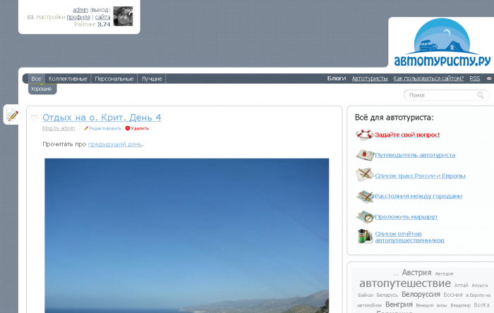
New design,
which today I would like to present to you for consideration and constructive criticism, I began to look like this: www.avtoturistu.ru . Sympathetic? I, if honest, as a parent of his brainchild and keen webmaster, however, does not have excellent aesthetic perception, very, very like! :)) The new look of the site as much as possible absorbed the important and necessary comments received from the habr-people in my post in the form of comments. Many thanks for the tips & trics !!!I am also grateful to the ls.cgvault team and to the Vilz user separately for tweaking the design to LiveStreet 0.3 and a small refinement of it ...
Source: https://habr.com/ru/post/80477/
All Articles