On the convenience of interfaces
Today, dear friends, I would like to talk about the pressing problem of universal obedience (author's comment: web 2.0) - the problem of good graphical interfaces on websites.
Many designers make some fairly common mistakes when designing user interfaces, and this leads to various inconveniences when using them by end users.
I would like to immediately explain for whom this article is written. This article is for those who are not the first day in design, and at least knows the basics of selecting colors, fonts, and their actual location on the site.
It is assumed that the designer who has read this article will not use pink on blue, or use a smoothed font for the main text. It is also believed that the designer understands the meaning of the phrase “prom. design ”,“ palette ”,“ gradation ”,“ natural stimulus ”,“ ergonomics ”. For those who by any circumstance do not know the meaning of these word readings - in the chapter “Glossary of terms” I will decipher them.
')
In the meantime, enjoy reading.
Grouping UI elements is generally a very important part of interface planning. The success of a combination of interaction elements often determines whether the user leaves the site or becomes his active user.
Remember, you need to correctly group interface elements. We will look at several ways to group:
a) Grouping by function
b) By the result of the action
c) Mixed type of grouping
Now we will start a detailed review of these methods.
a) By function
This is a relatively simple way to group interface elements, but many designers do not use it.
Break the elements of your interface into classes (groups, blocks - it is more convenient to call them) and place these blocks in descending order of importance to the user. By the way, it's not that easy. Track where your eye looks in the first place, remember the main points and draw a broken line. This is the “line of sight” of the user.
For example, take the interface of Google and follow the look:
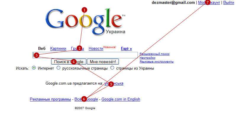
Elements that perform similar functions must be placed in a separate functional group.
b) By the result of the action
On the one hand, it is better to place controls in one place, but sometimes it is necessary to separate one group of elements from another. This method proposes to divide the functions into functional groups, the creation of which occurs according to the principle of the similarity of the result from the action of their elements.

Actions with images are located in one part of the page, the action with the text - in another.
c) Mixed
This method is the biggest mistake in the history of interface design. Why? Yes, if only because, looking at this grouping of elements, the user does not see the logic in their location and leaves the site. This also applies to prom. design.).
I highly recommend not using a mixed type of grouping and tend to use grouping by function, occasionally diluting it with grouping elements by type.
Strive to use the experience of other designers! Often, analyzing the interfaces of popular sites on the same subject avoids most of the mistakes in their work.
An example of using a mixed type of grouping:
Netz.ru portal and analogues. The design looks good, but it is uncomfortable.

But what about all the same to arrange the elements to work with the site was convenient for every user, even the most inexperienced?
Let's ponder which stimuli most strongly affect a person?
1. Sound
2. Touch
3. Color
4. Smell
Because technically touch and smells are not implemented on the sites, we consider the color and sound.
Personally, I categorically do not accept the sounds on the sites, they are misleading me and draw attention to themselves. So let's take advantage of the remaining natural irritant for humans - color.
By itself, the color can not affect the convenience of the page, but it can be used for auxiliary purposes.
Group the navigation elements by function or result, and mark each function with a color different from that used for other elements - for clarity of use.
Example: you can use one color for working with pictures, and another for working with text.
There is an excellent utility for the selection of successful colors. Color Schemer Studio + Color Pix
Now let's talk about the location of the elements in general and in general.
The first thing I would like to say about this - the important elements should have a fixed location. The user will not like it if the menu every time is in a new place, because every time it is wildly inconvenient to search for it on the screen. Less important interface elements can be moved but this is highly undesirable.
Even what may seem unimportant to the designer may be important to the user.
Before you do a full page design, engage in the development of block markup. Simply draw a white sheet into blocks, the color of which varies depending on the importance of the block on this page. Often this action helps to clearly separate the important content from the unimportant and lower the unimportant lower, raising higher the important one.
You can set the importance of content on the website www.crazyegg.com by setting up a tracking script for your users' clicks for several days. However, this is more likely to refer to sites that already had an old design, and you are processing it. If you are creating a design for a new site, better ask for advice from more experienced colleagues or a customer.
Quite often, they justify the importance of a particular block on the site.
After the division into blocks, we will need to check with public opinion: usually the right is the majority, not you.
Do not be afraid to ask advice and inexperienced Internet users, because often they are your target audience. Although working with a web page has its own specifics, it is useful to do a little research with a potential user — give him a piece of paper, lined up on blocks, and see where he wants to click, and where he doesn't even look.
In particular, thanks to CrazyEgg, I have repeatedly noticed that the news on the main page does not interest anyone, and it is better to put them in a special section.
I would like to note that your mission does not end with the division into blocks: these blocks also need to be properly positioned in the overall design composition and not at the expense of convenience.
Here are a few rules that would be nice to remember when creating a design layout:
1. Do not save space. Believe me - a nice looking background will help to distinguish the blocks well, while not annoying the user. An ordinary person needs to get a handy tool for work, and not to look for interface elements in porridge, because the designer decided to save some pixels.
2. Use small icons. You should not dwell only on the text and blocks - the user will have nothing to cling to when viewing the page. Yes, and to your followers, you will greatly simplify the work on redesign (in the future, site redesign will surely be because technologies are developing, and the design becomes obsolete). What icons help in the redesign? Will explain. The eyes of the user are not different from the eyes of the designer. The designer also reveals the belonging of one or another block by its graphic performance, and small icons help him in this. I will give an example in the figure below. Pictograms that are recognizable absolutely without words.
3. Use as few lines as possible on the site. This is how the human eye works - it needs quite a lot of empty space around important elements. Often around important elements of the designers produce a bunch of minor lines, trinkets and other things. Believe me - no one needs it.
4. Try not to use nested tables. Quite often you can find tables in tables, and many times I have seen that each table also has visible borders. The result - a mess in the user's head, the customer's displeasure, and as a result, the designer.
5. Use tabs. Tabs are a great thing. Another thing is that often designers can not properly arrange them. The active tab must be different from the one the cursor is pointing at and the others.
An example of proper use of tabs is shown in the figure below:
Let's look at the picture above.
1. Immediately see the active tab: it
- the same color as the content block
- raised above the rest
- has a more traced design
- visually more inactive tabs
2. Also immediately visible inactive tab: it
- differs in color from active
- lowered below active
- has a simpler design
- visually less active tab
I would like to clarify the meaning of the tabs. You can put all secondary functions in the tabs that load without reloading the page. Thus, you kill two birds with one stone at a time - giving the user the opportunity to choose the functions he needs and do not overload the page with functions that are not needed by the user at the moment.
a) Do not produce buttons wherever possible. It is better, if possible, to use regular links. The average user is simply confused in the abundance of buttons.
b) If the use of buttons is really important (sometimes this is ideology, you know), it is better to use grouping by function and position the buttons on the whole page in those places where they are most important. This will give the user a little confidence in the handling of your interface.
c) Better not use custom design buttons. This confuses the user and is lost when working with them. Use the standard browser buttons - so you do not scare away newbies, and even experienced users are more accustomed to working with them.
d) If you have already used a non-standard look of buttons, do not make non-contrast buttons. Do not place the white font on the light button or black - on the gray. Judging by the majority of reviews, it delivers some inconvenience - you have to read the inscription on the buttons, and this is too much time spent. As you know, the speed of work also greatly influences user satisfaction with the interface.
d) Make the buttons so that they are displayed even for those users who have disabled images in the browser.
Use checkboxes only in case you need to mark several elements for subsequent actions on all marked at once. In other cases, it is desirable to use options, because they characterize an unambiguous choice, and it is always easier to make it.
A good example is conducting a survey: if multiple answers can be selected at the same time, you need to use checkboxes. If you need to choose only one option, then options are used.

The methods of visual grouping are fairly well described here, but even here I will try to briefly and clearly describe the state of things. Look at this drawing:

The title of the text in the picture on the left is separated from the text to which it refers. This is the wrong approach. This also applies to forms: bind the field names to them themselves to avoid ambiguities. Look at the picture below:
By the way, a similar problem is often manifested in other places, for example, when displaying the voting results:
Since we are talking about voting, it is worth saying that next to the graphic display should be written the percentages and the number of voters in general and paragraph by point.
Each auxiliary element on the page should be located in the immediate vicinity of the element above it. Do not force the user to look for logic in your location.
Every person who has taken a book at least once knows that there are indents in the book in the pages.

Surely, many have guessed what I am leading. People are used to print publications, and in no case should you refuse to indent on your site.
Why are they so important? Because the eye of the user needs to relax while reading and just viewing the site. Empty white space will help them in this. Do not refuse indents.
Below is an example of an interface with and without the correct indentation. I think that you yourself, guess which one is correct:

Prom. design, it is industrial design - the design of all that surrounds us. Starting from the mouse, ending with furniture that stands next to you. In this branch of design, relatively few people are employed in relation to landscape, graphic or web design - the last three professions have been extremely popular lately. Nevertheless, industrial designers are a kind of elite that determines the look of what we use every day, be it pen, pencil, etc.
Palette - a selection of colors used to create the design of something. It is understood that the colors should be pleasing to the eye, visually interact and complement each other.
Graduations - change one color one step on the graphic palette.
Ergonomics is a science that studies the actions of a person in the process of work, the speed at which he learns new technology, the cost of his energy, performance and intensity in specific types of activity. Used in all branches of the design for research convenience of an interface, the location of the element.
On this note, we can finish the article.
I hope you like it, and I will try to write a sequel.
Good luck in creating good, user-friendly interfaces.
If you have any thoughts about my article, please write to me tuda.gde@lampochek.net (in that writing).
Sincerely, Birzul Yaroslav.
Many designers make some fairly common mistakes when designing user interfaces, and this leads to various inconveniences when using them by end users.
0. Introduction
I would like to immediately explain for whom this article is written. This article is for those who are not the first day in design, and at least knows the basics of selecting colors, fonts, and their actual location on the site.
It is assumed that the designer who has read this article will not use pink on blue, or use a smoothed font for the main text. It is also believed that the designer understands the meaning of the phrase “prom. design ”,“ palette ”,“ gradation ”,“ natural stimulus ”,“ ergonomics ”. For those who by any circumstance do not know the meaning of these word readings - in the chapter “Glossary of terms” I will decipher them.
')
In the meantime, enjoy reading.
1. Grouping items
Grouping UI elements is generally a very important part of interface planning. The success of a combination of interaction elements often determines whether the user leaves the site or becomes his active user.
Remember, you need to correctly group interface elements. We will look at several ways to group:
a) Grouping by function
b) By the result of the action
c) Mixed type of grouping
Now we will start a detailed review of these methods.
a) By function
This is a relatively simple way to group interface elements, but many designers do not use it.
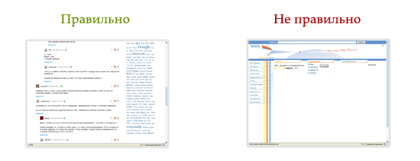
Break the elements of your interface into classes (groups, blocks - it is more convenient to call them) and place these blocks in descending order of importance to the user. By the way, it's not that easy. Track where your eye looks in the first place, remember the main points and draw a broken line. This is the “line of sight” of the user.
For example, take the interface of Google and follow the look:
Elements that perform similar functions must be placed in a separate functional group.
b) By the result of the action
On the one hand, it is better to place controls in one place, but sometimes it is necessary to separate one group of elements from another. This method proposes to divide the functions into functional groups, the creation of which occurs according to the principle of the similarity of the result from the action of their elements.
Actions with images are located in one part of the page, the action with the text - in another.
c) Mixed
This method is the biggest mistake in the history of interface design. Why? Yes, if only because, looking at this grouping of elements, the user does not see the logic in their location and leaves the site. This also applies to prom. design.).
I highly recommend not using a mixed type of grouping and tend to use grouping by function, occasionally diluting it with grouping elements by type.
Strive to use the experience of other designers! Often, analyzing the interfaces of popular sites on the same subject avoids most of the mistakes in their work.
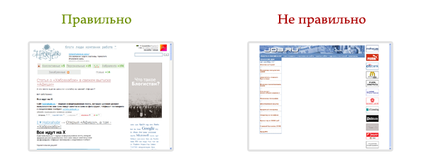
An example of using a mixed type of grouping:
Netz.ru portal and analogues. The design looks good, but it is uncomfortable.
2. The location of the elements
But what about all the same to arrange the elements to work with the site was convenient for every user, even the most inexperienced?
Let's ponder which stimuli most strongly affect a person?
1. Sound
2. Touch
3. Color
4. Smell
Because technically touch and smells are not implemented on the sites, we consider the color and sound.
Personally, I categorically do not accept the sounds on the sites, they are misleading me and draw attention to themselves. So let's take advantage of the remaining natural irritant for humans - color.
By itself, the color can not affect the convenience of the page, but it can be used for auxiliary purposes.
Group the navigation elements by function or result, and mark each function with a color different from that used for other elements - for clarity of use.
Example: you can use one color for working with pictures, and another for working with text.
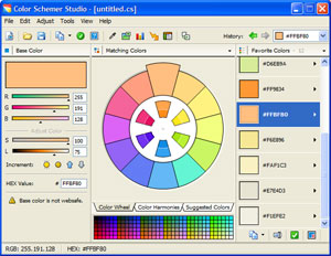
There is an excellent utility for the selection of successful colors. Color Schemer Studio + Color Pix
Now let's talk about the location of the elements in general and in general.
The first thing I would like to say about this - the important elements should have a fixed location. The user will not like it if the menu every time is in a new place, because every time it is wildly inconvenient to search for it on the screen. Less important interface elements can be moved but this is highly undesirable.
Even what may seem unimportant to the designer may be important to the user.
3. Division into blocks
Before you do a full page design, engage in the development of block markup. Simply draw a white sheet into blocks, the color of which varies depending on the importance of the block on this page. Often this action helps to clearly separate the important content from the unimportant and lower the unimportant lower, raising higher the important one.
You can set the importance of content on the website www.crazyegg.com by setting up a tracking script for your users' clicks for several days. However, this is more likely to refer to sites that already had an old design, and you are processing it. If you are creating a design for a new site, better ask for advice from more experienced colleagues or a customer.
Quite often, they justify the importance of a particular block on the site.
After the division into blocks, we will need to check with public opinion: usually the right is the majority, not you.
Do not be afraid to ask advice and inexperienced Internet users, because often they are your target audience. Although working with a web page has its own specifics, it is useful to do a little research with a potential user — give him a piece of paper, lined up on blocks, and see where he wants to click, and where he doesn't even look.
In particular, thanks to CrazyEgg, I have repeatedly noticed that the news on the main page does not interest anyone, and it is better to put them in a special section.
I would like to note that your mission does not end with the division into blocks: these blocks also need to be properly positioned in the overall design composition and not at the expense of convenience.
Here are a few rules that would be nice to remember when creating a design layout:
1. Do not save space. Believe me - a nice looking background will help to distinguish the blocks well, while not annoying the user. An ordinary person needs to get a handy tool for work, and not to look for interface elements in porridge, because the designer decided to save some pixels.
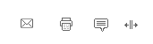
2. Use small icons. You should not dwell only on the text and blocks - the user will have nothing to cling to when viewing the page. Yes, and to your followers, you will greatly simplify the work on redesign (in the future, site redesign will surely be because technologies are developing, and the design becomes obsolete). What icons help in the redesign? Will explain. The eyes of the user are not different from the eyes of the designer. The designer also reveals the belonging of one or another block by its graphic performance, and small icons help him in this. I will give an example in the figure below. Pictograms that are recognizable absolutely without words.
3. Use as few lines as possible on the site. This is how the human eye works - it needs quite a lot of empty space around important elements. Often around important elements of the designers produce a bunch of minor lines, trinkets and other things. Believe me - no one needs it.
4. Try not to use nested tables. Quite often you can find tables in tables, and many times I have seen that each table also has visible borders. The result - a mess in the user's head, the customer's displeasure, and as a result, the designer.
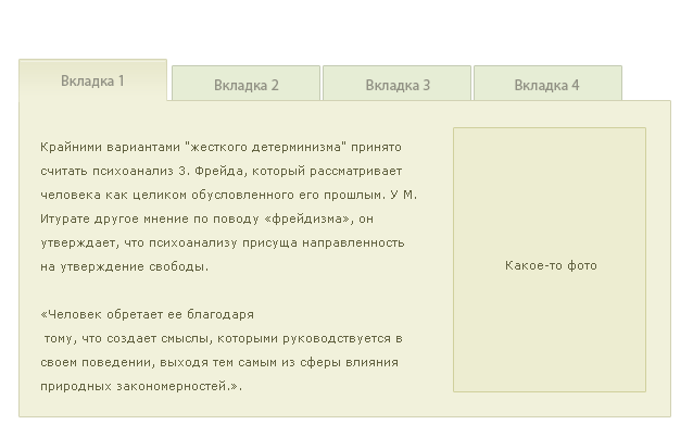
5. Use tabs. Tabs are a great thing. Another thing is that often designers can not properly arrange them. The active tab must be different from the one the cursor is pointing at and the others.
An example of proper use of tabs is shown in the figure below:
Let's look at the picture above.
1. Immediately see the active tab: it
- the same color as the content block
- raised above the rest
- has a more traced design
- visually more inactive tabs
2. Also immediately visible inactive tab: it
- differs in color from active
- lowered below active
- has a simpler design
- visually less active tab
I would like to clarify the meaning of the tabs. You can put all secondary functions in the tabs that load without reloading the page. Thus, you kill two birds with one stone at a time - giving the user the opportunity to choose the functions he needs and do not overload the page with functions that are not needed by the user at the moment.
4. Buttons
a) Do not produce buttons wherever possible. It is better, if possible, to use regular links. The average user is simply confused in the abundance of buttons.
b) If the use of buttons is really important (sometimes this is ideology, you know), it is better to use grouping by function and position the buttons on the whole page in those places where they are most important. This will give the user a little confidence in the handling of your interface.
c) Better not use custom design buttons. This confuses the user and is lost when working with them. Use the standard browser buttons - so you do not scare away newbies, and even experienced users are more accustomed to working with them.
d) If you have already used a non-standard look of buttons, do not make non-contrast buttons. Do not place the white font on the light button or black - on the gray. Judging by the majority of reviews, it delivers some inconvenience - you have to read the inscription on the buttons, and this is too much time spent. As you know, the speed of work also greatly influences user satisfaction with the interface.
d) Make the buttons so that they are displayed even for those users who have disabled images in the browser.
5. Checkboxes or options?
Use checkboxes only in case you need to mark several elements for subsequent actions on all marked at once. In other cases, it is desirable to use options, because they characterize an unambiguous choice, and it is always easier to make it.
A good example is conducting a survey: if multiple answers can be selected at the same time, you need to use checkboxes. If you need to choose only one option, then options are used.
6. Visual grouping
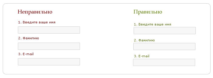
The methods of visual grouping are fairly well described here, but even here I will try to briefly and clearly describe the state of things. Look at this drawing:
The title of the text in the picture on the left is separated from the text to which it refers. This is the wrong approach. This also applies to forms: bind the field names to them themselves to avoid ambiguities. Look at the picture below:
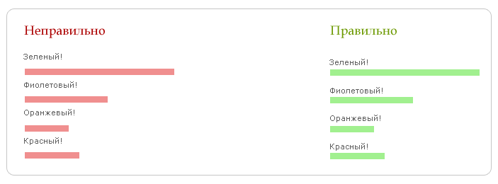
By the way, a similar problem is often manifested in other places, for example, when displaying the voting results:
Since we are talking about voting, it is worth saying that next to the graphic display should be written the percentages and the number of voters in general and paragraph by point.
Each auxiliary element on the page should be located in the immediate vicinity of the element above it. Do not force the user to look for logic in your location.
7. Styles and indents
Every person who has taken a book at least once knows that there are indents in the book in the pages.
Surely, many have guessed what I am leading. People are used to print publications, and in no case should you refuse to indent on your site.
Why are they so important? Because the eye of the user needs to relax while reading and just viewing the site. Empty white space will help them in this. Do not refuse indents.
Below is an example of an interface with and without the correct indentation. I think that you yourself, guess which one is correct:
8. Glossary
Prom. design, it is industrial design - the design of all that surrounds us. Starting from the mouse, ending with furniture that stands next to you. In this branch of design, relatively few people are employed in relation to landscape, graphic or web design - the last three professions have been extremely popular lately. Nevertheless, industrial designers are a kind of elite that determines the look of what we use every day, be it pen, pencil, etc.
Fundamentally, design is structural and functional binders that turn the system into a consistent, orderly unity, viewed equally from two sides: from the developer and from the user.
Palette - a selection of colors used to create the design of something. It is understood that the colors should be pleasing to the eye, visually interact and complement each other.
Also, the palette (in the figurative sense) is a selection of colors typical of a certain picture for the works of a certain artist or art school.
Graduations - change one color one step on the graphic palette.
Ergonomics is a science that studies the actions of a person in the process of work, the speed at which he learns new technology, the cost of his energy, performance and intensity in specific types of activity. Used in all branches of the design for research convenience of an interface, the location of the element.
On this note, we can finish the article.
I hope you like it, and I will try to write a sequel.
Good luck in creating good, user-friendly interfaces.
If you have any thoughts about my article, please write to me tuda.gde@lampochek.net (in that writing).
Sincerely, Birzul Yaroslav.
Source: https://habr.com/ru/post/7983/
All Articles