How to achieve a professional look with color

What makes a design look coordinated, planned and professional? Answer: ' color '.
Not every project needs to use a soft corporate blue in order to look professional. Planning color means creating a structure that describes which colors to use and how to use them. Color is the most resistant element of design. “Good” color is tightly connected with such elusive things as personal taste and intuition, and, at the same time, from a technical position with monitor calibration and contrast.
')
But color is a must for content. If you devote enough time to the website for its perfection, then readers will probably devote enough time to viewing it. Good color choices make this possible.
In this article we will review some techniques to achieve a beautiful color combination for your online projects.

The best way to make a website look unplanned is to choose its colors at random.
Even when visitors browse the website’s homepage for the first time, colors affect their attitude to content. Is this website exciting? Calming? Brave? Soft? Political? Official?
Color influences people's perception of what they see as well as words.
Finding the right colors is not easy, but this process can be systematized.
A good design strategy includes a color scheme (i.e., a color scale chosen to convey a mood or message) and the organization of this scheme.
Let's say you were asked to design a professional website. (And it can easily turn into a drunken game: a glass for every time a client uses the word “professional,” “high-quality” or “modern.” Double for “I like this (other) website. Do the same.”) .
The color scheme will depend on the specific orientation of the website. For example, both banks and florists may have professionally designed websites.
But people are unlikely to be prone to buying flowers on a website decorated with corporate blue and ocean gray. And imagine the Bank of America website in lilac and yellow green.
“Professional” design tells visitors that they have found a site that takes their content seriously, even if this content is actually just frivolous. Regardless of color and price, “professional” means coordinated, planned and thoughtful.
Refer to the Grayscale
The best way to work with color is to start from scratch.
Removing color from a project reveals the fundamental problems that need to be addressed before you start to worry about which shade chartre tint works best. If the project feels bad in black and white, time to make a change.
Does every page have a clear goal? Does the project have readers to the content? Is the content compelling, inspiring or informative? Do you understand the headlines? Links contrast with the rest of the text? Color enhances these effects, but the problems of layout, font, and general organization cannot be solved by color alone.
To make a re-design, first remove the color. Simple removal of supersaturation with basic colors will really show what the site is based on. (In fact, you actually have to start a re-design, re-evaluating your goals and content, but this is another story).
Sometimes the decision to remove colors comes by itself.
I once worked with a web design company to redesign their own website. The owners were personally interested in the project and were very worried that it would come out right. If you suddenly think that designing a design yourself is a difficult task, try to do it in a team. At the end, the three of us stared at a screenshot of the ninth sketch after a few hours of work and drinks.
And then suddenly I aligned the Photoshop layers and clicked “Desaturate”, which turns the bright copper-and-navy design into shades of gray. To everyone's surprise, it worked.
By the end of the week we had a “warm” gray design with red accents. We realized that we had not lost, when our former clients were showered with compliments by former clients and more calls began to come from potential clients.
Analyze your color scheme with Photoshop “squint” test:
1. Take screenshots of at least three pages from your site. Open them in Photoshop.
2. Copy the background layer in each screenshot (Layer → Duplicate Layer, or Command + J on a Mac, or Control + J on Windows).
3. Apply a Gaussian blur of approximately 10 pixels to the new layers.
4. Execute Image → Adjustments → Posterize. Use Level 8 to Level 12 or simply Filter → Pixellate → Mosaic. Apply 15-30 pixels.

This will show which colors are truly dominant. The more dominant colors, the harder the pattern for visitor perception.
As soon as the site structure was left without color, it was time to choose a palette. But which one? And how many colors to use?
We select colors

Color has three components: hue , saturation and level (sometimes called lightness).
Saturation indicates how rich the color :: neon colors are very saturated, while pastels are less saturated.
The level indicates how bright (that is, how close to black or white) the color is.
Hue indicates which part of the rainbow color belongs to, such as red or green; this is a feature on which people are confused.
Nothing destroys the color scheme as conflicting shades do. A design can have a hundred shades of a single shade, from pastels to neon, and still look planned. But if the shades are mixed wrong, the scheme will fall apart.
One way to avoid a conflict of colors is to separate them in a third color. The neighborhood of black, gray or white is the safest because of its neutral brightness scale: you can safely coordinate any part of the rainbow with these colors.
The second solution is to use shades in different proportions. If the color scheme is, say, purple and brown, then the design can have many shades of brown with a few bright purple highlights.
There is another way to change levels. Pure blue and bright blue create a combination of so-so, but dark blue (navy) and light blue (sky blue) are contrasted enough to distinguish each other. Red and purple may be different enough not to conflict, but close enough to not look too intense. Light red (pink) and dark violet will make a tangible difference.
Unfortunately, avoiding a bad color combination is not as good as choosing a good one. The color scheme is successful not when you are satisfied with it, but only if your audience feels comfortable.
Discovering cool schemes
Where do these cool color schemes come from? How to choose from hundreds of colors and thousands of combinations?
Designers of small static websites are easier to take color from content . This is usually a photo.
The eight-page site design that I recently did was based on a complex metal construction against an indigo-colored sky. Having installed the Photoshop pipette tool of size 5 × 5, I sampled the darkest and brightest parts of the sky and assigned these few colors to the sidebar, links, headers and footers at the bottom of the page.
When the client asked how we managed to make the design of the site so quickly, we simply answered - “This is our work.” Although the color was already there. And I just had to find him.
While ready-made photos work on fast sites, designers of larger and more dynamic sites should seek inspiration from the audience .
A great indicator of what colors will be appealing to your audience is daily wear. Find out what your visitors wear and you will find out which colors are more comfortable for them. If your site, for example, is about sports, then try to find out what people wear for the game, not their everyday clothes.
If you are lucky enough to get pictures of your potential customers, view them all together; You need an average crowd image. And if the photos are not available - go shopping.
Fashion designers who are able to stay in business have an excellent sense of color for every mood and lifestyle. Naturally, this is not high fashion from 5th Avenue. A Google search for “camping stories,” “baby clothes,” “skiing and bathing suits” and “everyday life” will show you many beautiful color combinations.
People wear clothes according to their tastes. If you use colors that they love, they will also feel more comfortable on your website.
Use textures
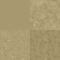
Small variations in hue, saturation, or level create textures.
Monochromatic textures (that is, textures with a single shade) and patterns provide a thin dimension to most sites without conflict.
Simple textural backgrounds, in particular, are easy to do:
o We take a photo of the inner wall, or something else, empty and with rough processing.
o Open the photo in Photoshop.
o Copy the background layer and call it “texture 1.”
o Fill the background layer with the colors of your color scheme.
o Set the “Soft Light” blending mode and 30% opacity on the “texture 1” layer.
o Try it on your site. If it doesn't look good, play with the layer opacity.
The name of the layer is intentionally selected. You can play with as many photos as you like, but try to avoid layer names like “wall texture” or “paper texture.” You need to focus on the effect for the site, not on where it came from.
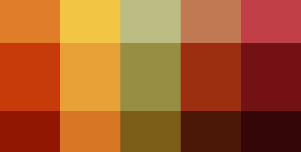
Create a Good Scheme
A good color scheme has certain features. Think of it as a basis or set of recommendations to keep the design logical. The scheme should:
o Have two to five colors that go well together
o Describe how far a design can deviate from these shades,
o Have shades of each color,
o Look good with black and white.
Examples:

The designer began by choosing mostly warm shades that felt good. No logic, just the vague goal of the "autumn" and its intuition.
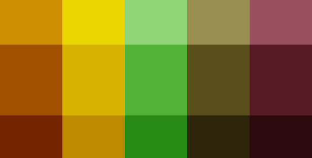
In Photoshop, two layers provided shades of black and white. The blend mode of each layer was set to “Soft Light.” Pure black was too dark for the rightmost color, so the opacity of the black level was corrected.
To combine the colors, a new layer with a pure red fill was created. His blending mode is set to “Color”, and the opacity is reduced to about 40%. (Note: the order of the layers is very important. The colors will change if the “color” layer is set under black and white).

This gave the designer 15 colors to choose from. She chose four, with a range of tones and shades. Here the colors are chosen against a white background.
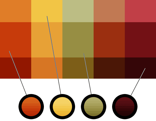
Changes are very important - in this way the designer experimented. What would colors look like against a black background? What happens if we shade them a little?

What if we changed them altogether? Using Image → Adjustments → Hue / Saturation on the “color” layer will not create an autumn feeling at all, but the colors are still coordinated.
Perhaps this palette can be used for Easter.
The result is a color scheme: recommendations that give different (but not too) colors and a range of shades that are perfectly combined.
Use the basics
Will tomorrow's graphics, photos and icons work with today's color scheme? What images will the site need in six days, six weeks, or six months? It's hard to say, but content is part of your color scheme.
It is possible to solve this problem by either forcing the images to follow the color scheme, or forcing the color scheme to follow the images.
Enforcing your color scheme, even with photos, is a great way to achieve a unified look at all pages.
The simplest solution is to find images that fit your scheme. Remember, the color scheme allows changes: as long as the main shades of the image match, the image is in its place. Many ready-made photo sites will allow you to search by color (colors are usually red, green and blue).
If the image does not match your color scheme, give it a shade:
1. Open the image in Photoshop.
2. Create a new layer. Blending mode "Color".
3. Fill this layer with one of the colors of your palette, preferably the one that most closely matches the image.
4. Set the opacity of the color layer to 50%.
5. We play with opacity to obtain a good balance between the original color of the image and the color palette of the site.
6. This technique works on photographs, illustrations, and icons — everything that is based on a pixel. (If you don’t own an image, be sure to get permission before changing it. You can improve its appearance relative to your site, but you still take liberties with someone else’s art).
Looks professional
No color set looks professional. You just have to follow the process in order to achieve a coordinated, planned feeling.
Regardless of what the site is about, the audience will take it seriously.
Tips
o If you think you have a good color scheme, try it for at least one week. Assessing color requires intuition, which is produced over time. Give yourself time to fully grasp the individuality of the scheme.
o If it seems that you have a good color scheme, do not let it rot. The tastes of your visitors, like yours, change over time. Create a reminder to review the colors after four months. Then ask, are they still appropriate? Otherwise, what has changed? What factors will affect your proofreading?
o Use sparingly bright colors. A splash of something iridescent will attract visitors, but if they see it everywhere, they will wander aimlessly.
o Some might think that the color scheme has a small spectrum. Allow a little drift to add depth to the design.
o Avoid clear basic choices — such as red, green, blue, and yellow. Give them a shade for a real symbol: red, but a little purple, blue with a slight green, “warm” yellow with an orange tint.
o Ensure good color compatibility during gradual changes. If you choose red, keep in mind that light red can be feminine and dark red can look like rust or blood. Yellow is taken from gradually changing sunlight to dark brown. Dark blue is mysterious, and light blue is calm, or electric, if you supersaturate it.
o Mac users, customize your screen. Open “System Preferences” and click “Universal Access.” Set the display to “Use grayscale.” This also comes in handy when you are in the mood for a movie.
o Regardless of the activity you want to transmit on the site, use a neutral background. Black, white and gray goes well with almost every shade.
o If you want small text (say, 14 or less font) corresponded to a large field of colors, make the text a few shades darker than normal. This will shift the meter in characters.
o Use more shades of fewer colors.

Source: https://habr.com/ru/post/79400/
All Articles