The problem of "flash non-text text"
The original title of the article, “Designing for the switch”, contains a play on words and talks a) about design development in an era of change - transition to normal support for loaded fonts for all users, and b) about the nuance of “blinking”, changing the font when loading it with
For a long time, creating designs for the web, we were typographically spoiled. Yes, you heard right. Just think: the fonts for the web have already been installed on our computers; These fonts were originally created for high-quality display in browsers, including small size; we could always be sure that other users have these fonts.
Yes, we were spoiled. To use Verdan, Georgia or Cumbria, we did not have to think.
')
However, designers for a long time thought that they needed more. We want to use any font that we need for our design. We have done a lot of bad things trying to achieve this goal - for example, we put the text in the picture. People smarter invented auxiliary tools such as sIFR or Cufón . Recently, most browsers support
In ancient times, before the advent of computer typing, if you wanted to type text in a specific font, you had to contact a coder. The typesetter, or typesetter, as they were called, was the person who took the written word and “typed” it from the letters of the selected font. The designer had to choose the font itself - as well as all the ligatures, italics, and everything else - and then clear the whole manuscript so that the typesetter could type the text with the right font.
Then the Computer Kit came, and any Vasya, Petya and Kolya could choose the font on his computer. The whole link in the typographic chain was dropped in just a few years. This is probably progress. That's how it was until half a year ago, the layout was not reborn on the web under the guise of Typekit font service.
Typekit and other similar services such as Typotheque , Kernest and the upcoming Fontdeck work as a typesetter used to work, only on the Web. You design the text as a web page, and they provide the JavaScript code that will show this page in the selected font — all you need to do is add the font name to the CSS file.
Thanks to such services, font manufacturers are now discussing various licensing options that will allow us to embed fonts into our web pages without breaking the law - which was a rather slippery moment earlier. So finally, we, designers, got what we wanted for a long time - the ability to use any fonts on the web.
Yes, but ... there are problems. One of them is the subject of this article.
Web fonts are different from regular ones. They differ in many different parameters: from wider letter gaps to increased growth of lower-case letters. But perhaps the most noticeable difference in practice is the file size. Consider, for example, one of the latest Typekit updates - the Meta headset from the FontFont library.
Meta Roman weighs 42 kilobytes. This is a fairly regular size for a single typeface of a good font. And now look at Verdun. Verdana weighs 186 kilobytes. On one typeface. The family of four styles already weighs 686 kilobytes. Four half a megabyte styles? Why so much?
Well, Verdana has a lot of information packed in these 186 kilobytes. It has the largest hinting table among all the fonts (this is information that allows minimizing the distortion of the shape of characters on the screen, thanks to the correct placement of the character in pixels). Being supplied with Microsoft products since 1996, she had enough time to grow to support a huge number of languages. Together with her sister Jordia (283 kilobytes), Verdana was from a new breed of fonts. Tolstoy and fattened.
If web typography really really starts - I mean fonts specifically designed for the screen - we will see more fonts growing in weight due to the inclusion of more data. So, if we include a font that weighs 100 kilobytes, what will happen?
We all remember the flash bug with non-stylized content in Internet Explorer, right? Annoying bug that caused the HTML page to be displayed for a moment without any styles applied. The same can happen when embedding a font using
When you turn on a font in CSS, the browser downloads this font. However, browsers deal with this procedure differently.
Firefox and Opera will display the text using the following font in the style definition until the first (embedded) font is loaded. Then they will change the font to downloaded.
Webkit implies that you still needed exactly the font that you specified, and therefore it will wait for the font to load completely, and only then will show the text.
In Opera and Firefox, you see a flash of non-stylized text. In Webkit there is no - you are stupidly waiting.
Stop stop stop. Didn't I say that good web fonts weigh much less than "regular" ones? And while the browser loads the font, the user has something to look at? Images, background colors and everything else - isn’t HTML? I believe that Webkit’s very careful method is destructive for embedding fonts. Why? Because we can take FOUT into account when designing web pages, but we can’t do anything to cope with the empty space that occurs during the font loading process.
Let's see how you can handle FOUT.
We all know that several fonts in the style definition in CSS are specified in order to solve the problem of the lack of user fonts. If the user on the computer does not have the first font in the
In practice, this leads to the fact that right in the process of reading a paragraph can change its appearance. And the word that the user was on at the moment will be three lines lower. This is an online analogue to the fact that someone will turn the page of the book at the moment when you least expect it. What can we do with the list of fonts to reduce this effect?
Two years ago, Richard Rutter wrote an article on the “24 ways” website about increasing the list of fonts . Increasing the lists (using the convenient matrix proposed by him), we can experiment with different fonts. But when we embed a font, we need to be very careful about all the fonts on the list and their interchangeability. Previously, a user saw either one font or another. Not both. Because of FOUT, he will see two fonts .
By carefully examining the characteristics of the fonts you select for the list, you can reduce the typographical “distance” between them. By doing this, you will significantly reduce the annoying effect of changing the font.
Consider this process in more detail.
Suppose I choose to embed the font Meta Serif Book on Typekit. My font list will start like this:
How to move on? To begin with, look at the Richard Rutter matrix in order to make out what fonts are available to different users. Then carefully consider the characters of the embedded font and compare them with different fonts from the matrix.
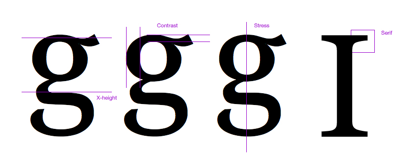
When I do this, I follow the coincidence of the growth of lowercase letters, the contrast (the difference between the thickness of the strokes), the inclination of the axes of the ovals (stress), and the serif shapes (if the font has serifs).
Even comparing this minimum number of characteristics, you can quickly find the best combinations. And remember, you don't need a perfect match. It is only necessary that the switching of the font was the least painful for the reader, and the font itself had characteristics similar to the embedded one in order not to overwhelm the design of the page as a whole.
Based on the selected embedded font, I compare the individual letters in several fonts.

And I choose the most appropriate fonts to make the list I need.
In CSS, it will look like this:
Following this process, we can level the error of “flash of non-stylized content” and be sure that our readers will not get negative experience on our pages.
@font-face . Generally speaking, in Russian there is not enough information about the experience and nuances of using @font-face , so with this translation I propose to start generating a more or less informative information field on this topic. HeathFor a long time, creating designs for the web, we were typographically spoiled. Yes, you heard right. Just think: the fonts for the web have already been installed on our computers; These fonts were originally created for high-quality display in browsers, including small size; we could always be sure that other users have these fonts.
Yes, we were spoiled. To use Verdan, Georgia or Cumbria, we did not have to think.
')
However, designers for a long time thought that they needed more. We want to use any font that we need for our design. We have done a lot of bad things trying to achieve this goal - for example, we put the text in the picture. People smarter invented auxiliary tools such as sIFR or Cufón . Recently, most browsers support
@font-face . The dam opens. This is the dawn of a new era of web typography, and we are obliged to step into it with care.New typesetters
In ancient times, before the advent of computer typing, if you wanted to type text in a specific font, you had to contact a coder. The typesetter, or typesetter, as they were called, was the person who took the written word and “typed” it from the letters of the selected font. The designer had to choose the font itself - as well as all the ligatures, italics, and everything else - and then clear the whole manuscript so that the typesetter could type the text with the right font.
Then the Computer Kit came, and any Vasya, Petya and Kolya could choose the font on his computer. The whole link in the typographic chain was dropped in just a few years. This is probably progress. That's how it was until half a year ago, the layout was not reborn on the web under the guise of Typekit font service.
Typekit and other similar services such as Typotheque , Kernest and the upcoming Fontdeck work as a typesetter used to work, only on the Web. You design the text as a web page, and they provide the JavaScript code that will show this page in the selected font — all you need to do is add the font name to the CSS file.
Thanks to such services, font manufacturers are now discussing various licensing options that will allow us to embed fonts into our web pages without breaking the law - which was a rather slippery moment earlier. So finally, we, designers, got what we wanted for a long time - the ability to use any fonts on the web.
Yes, but ... there are problems. One of them is the subject of this article.
Differences between web fonts and other fonts
Web fonts are different from regular ones. They differ in many different parameters: from wider letter gaps to increased growth of lower-case letters. But perhaps the most noticeable difference in practice is the file size. Consider, for example, one of the latest Typekit updates - the Meta headset from the FontFont library.
Meta Roman weighs 42 kilobytes. This is a fairly regular size for a single typeface of a good font. And now look at Verdun. Verdana weighs 186 kilobytes. On one typeface. The family of four styles already weighs 686 kilobytes. Four half a megabyte styles? Why so much?
Well, Verdana has a lot of information packed in these 186 kilobytes. It has the largest hinting table among all the fonts (this is information that allows minimizing the distortion of the shape of characters on the screen, thanks to the correct placement of the character in pixels). Being supplied with Microsoft products since 1996, she had enough time to grow to support a huge number of languages. Together with her sister Jordia (283 kilobytes), Verdana was from a new breed of fonts. Tolstoy and fattened.
If web typography really really starts - I mean fonts specifically designed for the screen - we will see more fonts growing in weight due to the inclusion of more data. So, if we include a font that weighs 100 kilobytes, what will happen?
Flash non-stylized text
We all remember the flash bug with non-stylized content in Internet Explorer, right? Annoying bug that caused the HTML page to be displayed for a moment without any styles applied. The same can happen when embedding a font using
@font-face . This effect, called the “Flash of Unstyled Text” (“The Flash of Unstyled Text”, abbreviated as “FOUT”), was first discovered by Paul Ayrish . Personally, I like the name “flash of text without text”, because styles are applied to the text, but not those that are needed.When you turn on a font in CSS, the browser downloads this font. However, browsers deal with this procedure differently.
Firefox and Opera will display the text using the following font in the style definition until the first (embedded) font is loaded. Then they will change the font to downloaded.
Webkit implies that you still needed exactly the font that you specified, and therefore it will wait for the font to load completely, and only then will show the text.
In Opera and Firefox, you see a flash of non-stylized text. In Webkit there is no - you are stupidly waiting.
Stop stop stop. Didn't I say that good web fonts weigh much less than "regular" ones? And while the browser loads the font, the user has something to look at? Images, background colors and everything else - isn’t HTML? I believe that Webkit’s very careful method is destructive for embedding fonts. Why? Because we can take FOUT into account when designing web pages, but we can’t do anything to cope with the empty space that occurs during the font loading process.
Let's see how you can handle FOUT.
A bit about font definition in CSS
We all know that several fonts in the style definition in CSS are specified in order to solve the problem of the lack of user fonts. If the user on the computer does not have the first font in the
font-family list, the browser will go to the next one. Adding an embeddable font to the list will cause the user to see the font change in Gecko and Opera (from the next font in the list to the previous one). And depending on the speed of the connection to the Internet, this change can occur at any time, including when the user reads stylized text.In practice, this leads to the fact that right in the process of reading a paragraph can change its appearance. And the word that the user was on at the moment will be three lines lower. This is an online analogue to the fact that someone will turn the page of the book at the moment when you least expect it. What can we do with the list of fonts to reduce this effect?
Two years ago, Richard Rutter wrote an article on the “24 ways” website about increasing the list of fonts . Increasing the lists (using the convenient matrix proposed by him), we can experiment with different fonts. But when we embed a font, we need to be very careful about all the fonts on the list and their interchangeability. Previously, a user saw either one font or another. Not both. Because of FOUT, he will see two fonts .
By carefully examining the characteristics of the fonts you select for the list, you can reduce the typographical “distance” between them. By doing this, you will significantly reduce the annoying effect of changing the font.
Consider this process in more detail.
Micro typography for the best font lists
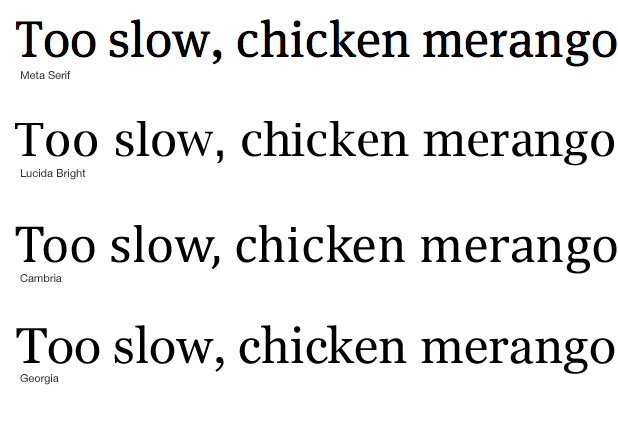
Suppose I choose to embed the font Meta Serif Book on Typekit. My font list will start like this:
font-family: 'Meta Serif Bold';
How to move on? To begin with, look at the Richard Rutter matrix in order to make out what fonts are available to different users. Then carefully consider the characters of the embedded font and compare them with different fonts from the matrix.
When I do this, I follow the coincidence of the growth of lowercase letters, the contrast (the difference between the thickness of the strokes), the inclination of the axes of the ovals (stress), and the serif shapes (if the font has serifs).
Even comparing this minimum number of characteristics, you can quickly find the best combinations. And remember, you don't need a perfect match. It is only necessary that the switching of the font was the least painful for the reader, and the font itself had characteristics similar to the embedded one in order not to overwhelm the design of the page as a whole.
Based on the selected embedded font, I compare the individual letters in several fonts.
And I choose the most appropriate fonts to make the list I need.
In CSS, it will look like this:
font-family: 'Meta Serif Bold', 'Lucida Bright', Cambria, Georgia, serif
Following this process, we can level the error of “flash of non-stylized content” and be sure that our readers will not get negative experience on our pages.
Source: https://habr.com/ru/post/78551/
All Articles