WPF4 and Taskbar in Windows 7: Thumbnail buttons
The Windows 7 taskbar has many ways for applications to provide unique information to make the UX even cooler. One of them is considered in this article - buttons of the preview panel on the taskbar.
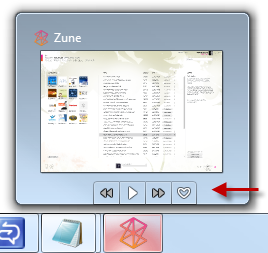
There is a possibility that you already use several applications using this functionality. Here is a screenshot of the Zune app with 4 preview buttons.
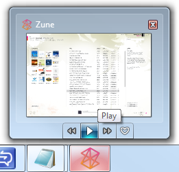
And this is how the application looks like with one of the buttons when you hover the mouse:
')
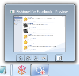
Here is another example. This time it's Fishbowl (client for Facebook)
Let's see how to implement preview buttons in our own WPF4 application.
Project Setup
Create a standard client WPF application. In my example, I called it WpfTaskbarThumbnailButtons. Once you have done this, open the XAML for the main window (this is where we will spend most of the time). Add the resources section and the usual TaskbarItemInfo, as we did in previous posts.
The next step is to create resources for the images of our buttons.
Button Images
Once you have decided which buttons you want - it’s time to create a graphic for them. The standard for the Windows 7 taskbar is 16x16 pixels (24x24 for high DPI), common in a black and white scheme. If you create larger images - they will be reduced to a suitable size, so if you are lazy (especially if you have vector graphics) - you can not reduce manually.
For this example, I'm going to create three buttons, each with a simple rounded square, in different colors.
I used vector graphics here, but, as I mentioned in my article about the overlay icons on the taskbar (overlay icon), you can also use raster graphics.
The next step is actually adding three buttons to the taskbar. This is done through the ThumButtonInfos collection of TaskbarItemInfo classes.
TaskbarItemInfo.ThumbButtonInfos
Once you have decided which buttons you want on the preview pane of your application (you have space for a maximum of 7 buttons in Windows 7), and you have images for them - you can create them in code or, as I like, in XAML- e. The buttons are instances of the TaskbarItemInfo class and are added to the ThumbButtonInfos collection.
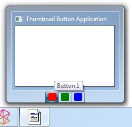
Here is the TaskbarItemInfo window property with our three simple buttons. Note that all I defined for them is a picture and description (hint)
And here is a screenshot of the result. Note that the order of the buttons is the same in which they are added to the collection. From left to right - from the first to the last.
ThumbButtonInfo Class
The ThumbButtonInfo class describes one button in the preview window on the taskbar. Since they must comply with the Windows 7 API, they are not the usual buttons that we are used to in WPF. In other words, you cannot apply patterns to them as you could get used to. However, they can assign a picture (raster or vector).
Command, CommandParameter, CommandTarget
This is support for the command infrastructure in WPF. Nothing out of the ordinary here. If you do not want to use commands, just hang up the handler on the Click event of the button.
Description
This is a tooltip button. It is advisable to specify it.
Isinteractive
This property determines whether the button is a regular button or just a picture with a hint. If True, then the button; if False, then the picture is displayed, but you cannot press it.
IsBackgroundVisible
This determines whether or not the border and background lighting around the button is visible. In both examples below, I took a screenshot when I hover the mouse over the middle Button 2 button.
Background Visible
Background Invisible
DismissWhenClicked
If true, click on the button to close the preview window. False will leave the preview window open so that the user can click on other buttons or see the changes in the preview window.
ImageSource
An ImageSource is anything that is cast to the System.Windows.Media.ImageSource type, usually a DrawingImage or BitmapSource. In our example, we used DrawingImage which contained a vector drawing.
Visibility
It works just like everywhere in WPF. Visible buttons are displayed, Hidden occupy space but not displayed, and Collapsed neither displays nor occupy space
Button 2 Visible
Button 2 Hidden
Notice that the button still takes up space.
Button 2 Collapsed
IsEnabled
When True - the button is active and drawn in normal colors. If False, the button is disabled and drawn in black and white colors.
Button 2 Enabled

Button 2 Disabled

Notice that the button turned black and white, just like the rewind buttons on the Zune screenshot at the beginning of this article.
Customize button behavior
There are several ways to customize the behavior of the buttons in the preview window. You can use either commands or event handlers. The method you choose depends on the architecture of your application and on your habits.
Given that these buttons are separated from most of the user interface, commands seem to be a more natural approach.
Event handling
For demonstration purposes, we will start with event handling. You can assign events in code or directly in XAML. I usually do this in code, but I'll show you another way, I will allow Visual Studio 2010 to create handlers based on the XAML markup.
Here is the corresponding XAML code:
But the source code:
Now let's try the command approach.
Teams
This requires a bit more tweaking, but more in line with the top that the real application will do. Often the buttons in the preview pane are just specialized copies of the buttons from your toolbar. Using the commands allows you to specify these buttons to use the same code that you implement for the main buttons from the toolbar. In addition to better structure and code reuse, you also receive additional bonuses, such as automatically setting the IsEnabled property.
Creation of Teams
First we will create three classes of teams in the Commands folder of our project. Our classes will not do anything very different, but we still create three different classes. In your own code, think over when it is better to use common commands with delegates, and when it is better to use more stable implementations of commands, such as were presented in Prism.

This is not the best way to use commands. I advise you to learn more about the teams before exploring them in your own application. Here are two videos that can help (video in English - approx. Lane.)
• How Do I: Use Command Binding in WPF
• How Do I: Create a Custom Command in WPF
Creating a ViewModel
First we need a place where they are located. ViewModel is the right place for these things. Create a new class called MainViewModel (yes, this is a terrible name) and fill it with the appropriate properties with our commands.
Linking ViewModel and View
Next we will provide an instance of ViewModel to our View. There are lots of ways to do this, including:
• Assigning View as a resource in a window in XAML
• Instantiating ViewModel as a DataContext for a view in XAML
• Assigning ViewModel to View in Code
• Using dependency injection to enable viewmodel in view
We are going to embed the ViewModel directly into our XAML code as the DataContext of our window. Due to this, we have improved the structure of the application, but we lose in testability. If you want to minimize connectivity, you need to use interfaces and a DI approach.
Notice that I also created xmlns: viewModels to indicate where I store the ViewModel. In most applications, you will have separate ViewModel and View folders, and sometimes separate assemblies.
There are better ways to use commands in WPF applications, especially if you follow the ViewModel template. An example is the very beginning, and I hope that it will give you a little more than the usual code for the demonstration.
Connecting buttons
This is the easiest part. Now that the entire infrastructure is set up, and our data context (DataContext) is configured for our ViewModel, all you need to do is use WPF binding to bind the ViewModel properties.
When you do this, launch the application and you will see message boxes appearing from the commands (again, this is not what the usual command will do, and not exactly what you usually do with the preview button, but this is not bad for a demonstration).

Instructions for your own applications.
As well as overlay icons (icon overlays) and showing progress on the taskbar, you need to be sensible about how to use these buttons. They should be part of the overall design of the user interface of the application, and not something that you stuck, because you can stick it. If your application has this feature that users need “at the first call”, without having to view the full-size version of the application, such buttons are quite suitable for you.
However, do not treat them as another toolbar. Do not put there such functions that are not available anywhere else. In addition, do not put there functions that require the application to be in focus or at least visible on the screen.
There is a possibility that you already use several applications using this functionality. Here is a screenshot of the Zune app with 4 preview buttons.
And this is how the application looks like with one of the buttons when you hover the mouse:
')
Here is another example. This time it's Fishbowl (client for Facebook)
Let's see how to implement preview buttons in our own WPF4 application.
Project Setup
Create a standard client WPF application. In my example, I called it WpfTaskbarThumbnailButtons. Once you have done this, open the XAML for the main window (this is where we will spend most of the time). Add the resources section and the usual TaskbarItemInfo, as we did in previous posts.
< Window x:Class ="WpfTaskbarThumbnailButtons.MainWindow"
xmlns ="http://schemas.microsoft.com/winfx/2006/xaml/presentation"
xmlns:x ="http://schemas.microsoft.com/winfx/2006/xaml"
Title ="Thumbnail Button Application" Height ="350" Width ="525" >
< Window.Resources >
</ Window.Resources >

< Window.TaskbarItemInfo >
</ Window.TaskbarItemInfo >

< Grid >
</ Grid >
</ Window >

* This source code was highlighted with Source Code Highlighter .
The next step is to create resources for the images of our buttons.
Button Images
Once you have decided which buttons you want - it’s time to create a graphic for them. The standard for the Windows 7 taskbar is 16x16 pixels (24x24 for high DPI), common in a black and white scheme. If you create larger images - they will be reduced to a suitable size, so if you are lazy (especially if you have vector graphics) - you can not reduce manually.
For this example, I'm going to create three buttons, each with a simple rounded square, in different colors.
< Window.Resources >
< DrawingImage x:Key ="Button1Image" >
< DrawingImage.Drawing >
< DrawingGroup >
< DrawingGroup.Children >
< GeometryDrawing Brush ="Red" >
< GeometryDrawing.Geometry >
< RectangleGeometry Rect ="0 0 24 24"
RadiusX ="4"
RadiusY ="4" />
</ GeometryDrawing.Geometry >
</ GeometryDrawing >
</ DrawingGroup.Children >
</ DrawingGroup >
</ DrawingImage.Drawing >
</ DrawingImage >
< DrawingImage x:Key ="Button2Image" >
< DrawingImage.Drawing >
< DrawingGroup >
< DrawingGroup.Children >
< GeometryDrawing Brush ="Green" >
< GeometryDrawing.Geometry >
< RectangleGeometry Rect ="0 0 24 24"
RadiusX ="4"
RadiusY ="4" />
</ GeometryDrawing.Geometry >
</ GeometryDrawing >
</ DrawingGroup.Children >
</ DrawingGroup >
</ DrawingImage.Drawing >
</ DrawingImage >
< DrawingImage x:Key ="Button3Image" >
< DrawingImage.Drawing >
< DrawingGroup >
< DrawingGroup.Children >
< GeometryDrawing Brush ="Blue" >
< GeometryDrawing.Geometry >
< RectangleGeometry Rect ="0 0 24 24"
RadiusX ="4"
RadiusY ="4" />
</ GeometryDrawing.Geometry >
</ GeometryDrawing >
</ DrawingGroup.Children >
</ DrawingGroup >
</ DrawingImage.Drawing >
</ DrawingImage >
</ Window.Resources >

* This source code was highlighted with Source Code Highlighter .
I used vector graphics here, but, as I mentioned in my article about the overlay icons on the taskbar (overlay icon), you can also use raster graphics.
The next step is actually adding three buttons to the taskbar. This is done through the ThumButtonInfos collection of TaskbarItemInfo classes.
TaskbarItemInfo.ThumbButtonInfos
Once you have decided which buttons you want on the preview pane of your application (you have space for a maximum of 7 buttons in Windows 7), and you have images for them - you can create them in code or, as I like, in XAML- e. The buttons are instances of the TaskbarItemInfo class and are added to the ThumbButtonInfos collection.
Here is the TaskbarItemInfo window property with our three simple buttons. Note that all I defined for them is a picture and description (hint)
< Window.TaskbarItemInfo >
< TaskbarItemInfo >
< TaskbarItemInfo.ThumbButtonInfos >
< ThumbButtonInfo ImageSource ="{StaticResource Button1Image}"
Description ="Button 1" />
< ThumbButtonInfo ImageSource ="{StaticResource Button2Image}"
Description ="Button 2" />
< ThumbButtonInfo ImageSource ="{StaticResource Button3Image}"
Description ="Button 3" />
</ TaskbarItemInfo.ThumbButtonInfos >
</ TaskbarItemInfo >
</ Window.TaskbarItemInfo >
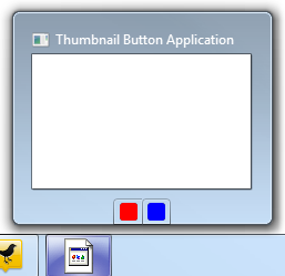
* This source code was highlighted with Source Code Highlighter .And here is a screenshot of the result. Note that the order of the buttons is the same in which they are added to the collection. From left to right - from the first to the last.
ThumbButtonInfo Class
The ThumbButtonInfo class describes one button in the preview window on the taskbar. Since they must comply with the Windows 7 API, they are not the usual buttons that we are used to in WPF. In other words, you cannot apply patterns to them as you could get used to. However, they can assign a picture (raster or vector).
Command, CommandParameter, CommandTarget
This is support for the command infrastructure in WPF. Nothing out of the ordinary here. If you do not want to use commands, just hang up the handler on the Click event of the button.
Description
This is a tooltip button. It is advisable to specify it.
Isinteractive
This property determines whether the button is a regular button or just a picture with a hint. If True, then the button; if False, then the picture is displayed, but you cannot press it.
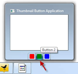
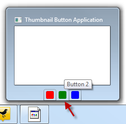
IsBackgroundVisible
This determines whether or not the border and background lighting around the button is visible. In both examples below, I took a screenshot when I hover the mouse over the middle Button 2 button.
Background Visible
< ThumbButtonInfo ImageSource ="{StaticResource Button2Image}"
Description ="Button 2"
IsBackgroundVisible ="True" />

* This source code was highlighted with Source Code Highlighter .
Background Invisible
< ThumbButtonInfo ImageSource ="{StaticResource Button2Image}"
Description ="Button 2"
IsBackgroundVisible ="False" />

* This source code was highlighted with Source Code Highlighter .
DismissWhenClicked
If true, click on the button to close the preview window. False will leave the preview window open so that the user can click on other buttons or see the changes in the preview window.
ImageSource
An ImageSource is anything that is cast to the System.Windows.Media.ImageSource type, usually a DrawingImage or BitmapSource. In our example, we used DrawingImage which contained a vector drawing.
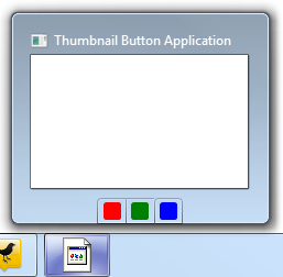
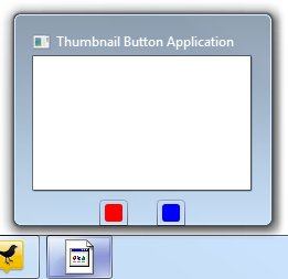
Visibility
It works just like everywhere in WPF. Visible buttons are displayed, Hidden occupy space but not displayed, and Collapsed neither displays nor occupy space
Button 2 Visible
< ThumbButtonInfo ImageSource ="{StaticResource Button2Image}"
Description ="Button 2"
IsBackgroundVisible ="True"
Visibility ="Visible" />

* This source code was highlighted with Source Code Highlighter .
Button 2 Hidden
< ThumbButtonInfo ImageSource ="{StaticResource Button2Image}"
Description ="Button 2"
IsBackgroundVisible ="True"
Visibility ="Hidden" />

* This source code was highlighted with Source Code Highlighter .
Notice that the button still takes up space.
Button 2 Collapsed
< ThumbButtonInfo ImageSource ="{StaticResource Button2Image}"
Description ="Button 2"
IsBackgroundVisible ="True"
Visibility ="Collapsed" />

* This source code was highlighted with Source Code Highlighter .
IsEnabled
When True - the button is active and drawn in normal colors. If False, the button is disabled and drawn in black and white colors.
Button 2 Enabled
< ThumbButtonInfo ImageSource ="{StaticResource Button2Image}"
Description ="Button 2"
IsEnabled ="True"
IsBackgroundVisible ="True"
Visibility ="Visible" />

* This source code was highlighted with Source Code Highlighter .
Button 2 Disabled
< ThumbButtonInfo ImageSource ="{StaticResource Button2Image}"
Description ="Button 2"
IsEnabled ="False"
IsBackgroundVisible ="True"
Visibility ="Visible" />

* This source code was highlighted with Source Code Highlighter .
Notice that the button turned black and white, just like the rewind buttons on the Zune screenshot at the beginning of this article.
Customize button behavior
There are several ways to customize the behavior of the buttons in the preview window. You can use either commands or event handlers. The method you choose depends on the architecture of your application and on your habits.
Given that these buttons are separated from most of the user interface, commands seem to be a more natural approach.
Event handling
For demonstration purposes, we will start with event handling. You can assign events in code or directly in XAML. I usually do this in code, but I'll show you another way, I will allow Visual Studio 2010 to create handlers based on the XAML markup.
Here is the corresponding XAML code:
< Window.TaskbarItemInfo >
< TaskbarItemInfo >
< TaskbarItemInfo.ThumbButtonInfos >
< ThumbButtonInfo ImageSource ="{StaticResource Button1Image}"
Click ="Button1_Click"
Description ="Button 1" />
< ThumbButtonInfo ImageSource ="{StaticResource Button2Image}"
Click ="Button2_Click"
Description ="Button 2"
IsEnabled ="False"
IsBackgroundVisible ="True"
Visibility ="Visible" />
< ThumbButtonInfo ImageSource ="{StaticResource Button3Image}"
Click ="Button3_Click"
Description ="Button 3" />
</ TaskbarItemInfo.ThumbButtonInfos >
</ TaskbarItemInfo >
</ Window.TaskbarItemInfo >

* This source code was highlighted with Source Code Highlighter .
But the source code:
public partial class MainWindow : Window
{
public MainWindow()
{
InitializeComponent();
}

private void Button1_Click( object sender, EventArgs e)
{
MessageBox.Show( "Button 1" );
}

private void Button2_Click( object sender, EventArgs e)
{
MessageBox.Show( "Button 2" );
}

private void Button3_Click( object sender, EventArgs e)
{
MessageBox.Show( "Button 3" );
}
}

* This source code was highlighted with Source Code Highlighter .
Now let's try the command approach.
Teams
This requires a bit more tweaking, but more in line with the top that the real application will do. Often the buttons in the preview pane are just specialized copies of the buttons from your toolbar. Using the commands allows you to specify these buttons to use the same code that you implement for the main buttons from the toolbar. In addition to better structure and code reuse, you also receive additional bonuses, such as automatically setting the IsEnabled property.
Creation of Teams
First we will create three classes of teams in the Commands folder of our project. Our classes will not do anything very different, but we still create three different classes. In your own code, think over when it is better to use common commands with delegates, and when it is better to use more stable implementations of commands, such as were presented in Prism.
class RedCommand : ICommand
{
public bool CanExecute( object parameter)
{
//
return true ;
}

public event EventHandler CanExecuteChanged;

public void Execute( object parameter)
{
//
MessageBox.Show( "Red Command." );
}
}

class GreenCommand : ICommand
{
public bool CanExecute( object parameter)
{
//
return false ;
}

public event EventHandler CanExecuteChanged;

public void Execute( object parameter)
{
//
MessageBox.Show( "Green Command." );
}
}

class BlueCommand : ICommand
{
public bool CanExecute( object parameter)
{
//
return true ;
}

public event EventHandler CanExecuteChanged;

public void Execute( object parameter)
{
//
MessageBox.Show( "Blue Command." );
}
}

* This source code was highlighted with Source Code Highlighter .
This is not the best way to use commands. I advise you to learn more about the teams before exploring them in your own application. Here are two videos that can help (video in English - approx. Lane.)
• How Do I: Use Command Binding in WPF
• How Do I: Create a Custom Command in WPF
Creating a ViewModel
First we need a place where they are located. ViewModel is the right place for these things. Create a new class called MainViewModel (yes, this is a terrible name) and fill it with the appropriate properties with our commands.
class MainViewModel
{
private RedCommand _redCommand = new RedCommand();
public ICommand RedCommand
{
get { return _redCommand; }
}

private GreenCommand _greenCommand = new GreenCommand();
public ICommand GreenCommand
{
get { return _greenCommand; }
}

private BlueCommand _blueCommand = new BlueCommand();
public ICommand BlueCommand
{
get { return _blueCommand; }
}

// VM
}

* This source code was highlighted with Source Code Highlighter .
Linking ViewModel and View
Next we will provide an instance of ViewModel to our View. There are lots of ways to do this, including:
• Assigning View as a resource in a window in XAML
• Instantiating ViewModel as a DataContext for a view in XAML
• Assigning ViewModel to View in Code
• Using dependency injection to enable viewmodel in view
We are going to embed the ViewModel directly into our XAML code as the DataContext of our window. Due to this, we have improved the structure of the application, but we lose in testability. If you want to minimize connectivity, you need to use interfaces and a DI approach.
< Window x:Class ="WpfTaskbarThumbnailButtons.MainWindow"
xmlns ="http://schemas.microsoft.com/winfx/2006/xaml/presentation"
xmlns:x ="http://schemas.microsoft.com/winfx/2006/xaml"
xmlns:viewModels ="clr-namespace:WpfTaskbarThumbnailButtons"
Title ="Thumbnail Button Application"
Height ="350"
Width ="525" >
< Window.DataContext >
< viewModels:MainViewModel />
</ Window.DataContext >


* This source code was highlighted with Source Code Highlighter .
Notice that I also created xmlns: viewModels to indicate where I store the ViewModel. In most applications, you will have separate ViewModel and View folders, and sometimes separate assemblies.
There are better ways to use commands in WPF applications, especially if you follow the ViewModel template. An example is the very beginning, and I hope that it will give you a little more than the usual code for the demonstration.
Connecting buttons
This is the easiest part. Now that the entire infrastructure is set up, and our data context (DataContext) is configured for our ViewModel, all you need to do is use WPF binding to bind the ViewModel properties.
< TaskbarItemInfo >
< TaskbarItemInfo.ThumbButtonInfos >
< ThumbButtonInfo ImageSource ="{StaticResource Button1Image}"
Command ="{Binding RedCommand}"
Description ="Button 1" />
< ThumbButtonInfo ImageSource ="{StaticResource Button2Image}"
Command ="{Binding GreenCommand}"
Description ="Button 2"
Visibility ="Visible" />
< ThumbButtonInfo ImageSource ="{StaticResource Button3Image}"
Command ="{Binding BlueCommand}"
Description ="Button 3" />
</ TaskbarItemInfo.ThumbButtonInfos >
</ TaskbarItemInfo >

* This source code was highlighted with Source Code Highlighter .
When you do this, launch the application and you will see message boxes appearing from the commands (again, this is not what the usual command will do, and not exactly what you usually do with the preview button, but this is not bad for a demonstration).
Instructions for your own applications.
As well as overlay icons (icon overlays) and showing progress on the taskbar, you need to be sensible about how to use these buttons. They should be part of the overall design of the user interface of the application, and not something that you stuck, because you can stick it. If your application has this feature that users need “at the first call”, without having to view the full-size version of the application, such buttons are quite suitable for you.
However, do not treat them as another toolbar. Do not put there such functions that are not available anywhere else. In addition, do not put there functions that require the application to be in focus or at least visible on the screen.
Source: https://habr.com/ru/post/78380/
All Articles