10 usability crimes that you should not commit
At the design and development stage, we need to take into account common truths and basic concepts to improve site usability. This article describes the classic, but unforgivable mistakes in the field of web design and how to solve them.
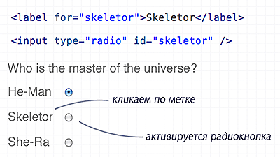
Using the "for" attribute will allow users to click on the label to select the appropriate form field. This is especially important for checkboxes and radio buttons - to increase the click area.
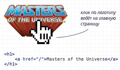
Creating such a link is a good tone, because most users expect to go to the root of the site when they click on a logo.
')

This is forgotten very often, but visitors need to know which links they have already clicked.
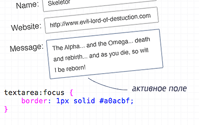
Use the pseudo-class ": focus" to add a frame to the input fields or change the background.
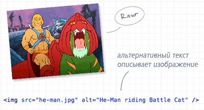
In the attribute "alt" specify the description of the image. And if the picture is decorative and decorative, leave it empty (but do not delete!). If this is a button-link, then indicate in the description where it leads.
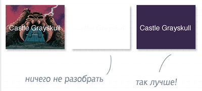
If the user has images disabled, the text may become unreadable. Use a background color similar to the picture.
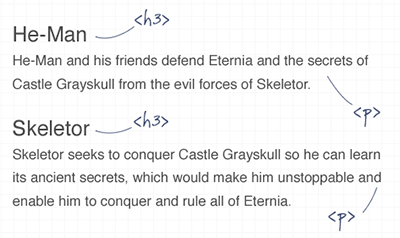
There is nothing worse than monotonous and continuous text. Insert pictures, headers and indents into content for more comfortable reading.
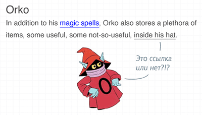
Do not underline the text where no getting! Users are accustomed to seeing links in this style - do not confuse them. Better make the necessary words in italics or bold .
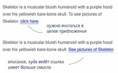
The use of the words "follow the link", "click here" and other similar "masterpieces" is unacceptable. Because forces the visitor to read a sentence for an understanding of where the link leads. Instead, use the description in the link text.

Try not to use "text-align: justify" . The text may look beautiful, but in fact it becomes difficult to read (especially for people with disabilities) because of the different distances between words.
PS: I have long wanted to write a similar compilation myself, but there was still no time ...
Crime # 1: In forms, tags are not associated with input fields.

Using the "for" attribute will allow users to click on the label to select the appropriate form field. This is especially important for checkboxes and radio buttons - to increase the click area.
Crime # 2: The logo does not lead to the main page

Creating such a link is a good tone, because most users expect to go to the root of the site when they click on a logo.
')
Crime # 3: Not visited links marked

This is forgotten very often, but visitors need to know which links they have already clicked.
Crime # 4: The active field is not highlighted in the form.

Use the pseudo-class ": focus" to add a frame to the input fields or change the background.
Crime # 5: Images without description

In the attribute "alt" specify the description of the image. And if the picture is decorative and decorative, leave it empty (but do not delete!). If this is a button-link, then indicate in the description where it leads.
Crime # 6: Background Images Without Background Color

If the user has images disabled, the text may become unreadable. Use a background color similar to the picture.
Crime # 7: Using long boring text paragraphs

There is nothing worse than monotonous and continuous text. Insert pictures, headers and indents into content for more comfortable reading.
Crime # 8: Underlining what is not a link

Do not underline the text where no getting! Users are accustomed to seeing links in this style - do not confuse them. Better make the necessary words in italics or bold .
Crime # 9: Encourage visitors to "click here"

The use of the words "follow the link", "click here" and other similar "masterpieces" is unacceptable. Because forces the visitor to read a sentence for an understanding of where the link leads. Instead, use the description in the link text.
Crime # 10: Align text to width

Try not to use "text-align: justify" . The text may look beautiful, but in fact it becomes difficult to read (especially for people with disabilities) because of the different distances between words.
PS: I have long wanted to write a similar compilation myself, but there was still no time ...
Source: https://habr.com/ru/post/76860/
All Articles