What I found interesting on the mail server meteorologists
Everyone, of course, heard about the archive of the metrological mail server leaked to the Internet, there was even a discussion on Habré.
When I finally got free evening, I decided to examine the contents of this archive, and I did not specifically look for similar studies so that they could not influence the course of my reasoning (and it wasn’t found, according to the results).
What is there inside just not, some pdf, programs on FORTRAN, unix ELF-executable files, Russian names / surnames and even Cyrillic comments inside some files. So curious I was not in any computer game.
')
The first thing I was interested in catalogs in the spirit of "yakutia", but I stopped at the archive mbh98-osborn.zip. Inside it there is a TREE catalog and already in it - VAGANOV, it sounds friendly, right? I was interested in them closely.
I will make a reservation right away that all sorts of far-reaching conclusions and the moral aspect of the issue are either postponed in a postscript or taken out of the article and are not considered at all. There are also made considerations about the tone of the correspondence and in general about its contents. Any curious trivia that I stumbled on along the way, I gathered at the end of the article so that they would not spoil the structure of the presentation.
So archive mbh98-osborn.zip, directory VAGANOV. In addition to some strange water files eof04.out (27 bytes), a couple of programs on Fortran and some kind of garbage there was a directory with the saying name ORIG, with something already more conscious inside.
File 1.txt.gz
It contains about the following:
Well this meteorologists, what comes first? Of course, this is the temperature data. Only it is not clear what: from 50 to 145, in Fahrenheit damn it? It would be strange for Vaganov. Each line clearly encoded data for a decade. There are from 1 to 61 files there, all end with the line about 1990, it cannot be anything other than a year, especially since it is written in Russian: “Chronology”.
It was strange that the data come from as early as 1700, something too early for annual observations of the temperature, and even in the 61st city. It is also not clear what kind of code: the names of Russian cities are not very similar: SCH, KHA, KHD, JAH, and so on. But there is a file sib.dat, in which for each file and the corresponding code the following is given:
So what is 69.17 66.49? It looks like latitude and longitude . Places most picturesque .
Actually, I don’t remember how, from some accompanying files in neighboring directories, I found references to trees, rings and the phrase "Dendroclimatic reconstruction". That is, apparently, this data is a measurement of the annual rings of trees, which may be a measure of temperature assessment in the past. This generally explains a lot of things, for example the fact that in some files there is data already in the 15th century.
I decided to postpone the conclusions on this score, because the thought has long been stuck in my head, spreading these data on a plane and see their dynamics, because the most interesting thing that only happens is statistics. I made the first attempts in Excel, from which it immediately followed, what would look at what. Therefore, I decided to still load all this data into the DBMS and build all sorts of graphs. Comrade Vaganov or his colleagues simplified, by the way, the task and specially prepared for downloading data in files like vag01.dat, where they are given in the form of year-value pairs, so it didn’t have to be bothered with parsing these matrices. Total records loaded: 26031.
Charts
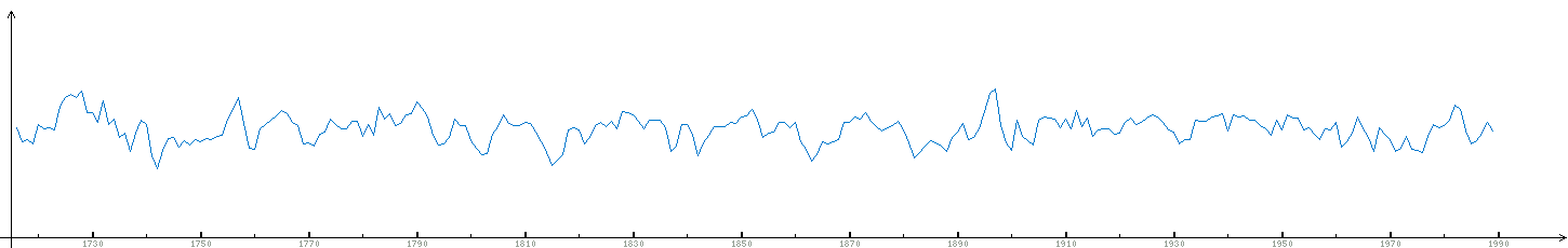
The first graph is just raw data from the first file (the link leads to the picture itself).

It looks a bit noisy, especially if you try to output data across several files, so I’m going to show the averaged values below.
Then I reduced the period of time only until the last century, it looks no less significant. Two graphics next:

The vertical shift between them is artificial, just to avoid a cloud of intersections, the order of values there is exactly the same. The second tree, by the way, was taken not far from the first (69.5, 67.12). The fact that the graphs are similar is obvious, but since the 1960s, they almost completely coincide. This means that the distances between the rings on different trees (hundreds of kilometers distant from each other) are very similar and depend on certain external conditions. Simplifying - from the climate, even simplifying - from the temperature.
We build a graph for a dozen trees, all approximately in the area:

Our tree is the first below, and further up. If you look at sib.dat, then the trees are collected at approximately the same latitude, with a consistent eastward movement from 69.17 (lower graph) to 93.5 (upper graph). Of course, there are different deviations, but there is also an obvious dependence between the graphs. The second and fourth are so similar that I wondered if this was a mistake. The top five graphs are remarkably similar to each other, especially if you remember what kind of data it is.
Then I added two more graphs to the picture, red is the average for the entire sample, green is the average for the displayed ten graphs.

As expected:
a) averaged graphs are calmer;
b) the average over the entire region is the most gentle and does not always reflect the fluctuations of individual graphs and even fluctuations of the mean in latitude.
Already in the process of writing a report, the idea came to take half of the sample from another part of the region, which I did:

Here are the first five trees, the lower ones, the same as in the previous figures, this is the longitude: 69.17 - 71.4. Other five from the eastern edge of the country: 130.5 - 160.46 .
Point one: it is noticeable that the first five graphs are similar to each other, as well as the second five. But there are almost no noticeable dependencies between the graphs of the first and second fives.
Point two: The average, built on this top ten graphs, is, firstly, much more gentle and, secondly, it has obvious features of the average over the entire sample.
One hundred one little thing
- in most archive files, the end of the line is 0x0a, which means some unixes;
- in the file with the description of collection sites (sib.dat), the data are given in FIG in general knows in what order, although in the end there is on all items;
- I changed the latitude and longitude, otherwise Africa, then the ocean, and there are no latitudes greater than 90 °;
- in several files there are intersections of values by dates, stumbled upon this when loading;
- data file №55 - is completely absent, although it is mentioned in sib.dat and points there ;
- The earliest entry dates from the 1325th year, two hundred years before Ivan the Terrible;
- it is very likely that similar data are available even in Canada;
- I was busy practically with the first thing that came to hand, there are 60 MB of data in the archive;
- The archive contains a pdf showing the assessment of temperature changes over the past several centuries ( one of the diagrams ).
Type conclusions
You can go back and look at the first and second drawings: there is no obvious tendency to rise or fall by sight. But it is perfectly clear that the spread of values within a hundred years can be so furious that even a clear tendency in one of the parties to the neighboring, say, 10-20 years, means absolutely nothing and there is always a decline following growth, and growth. In addition, if you look at the graph of five trees for 300 years ( picture ), then you can find the devil in a mortar. For example, if you wish, you can consider 10-20 or larger 50-year cycles, evidence of changes in the dynamics of temperature changes in the last century, anomalies in the year of the fall of the Tunguska meteorite and traces of the presence of Martians.
However, in the process of working with these data, I learned that with the age of the tree, the dynamics of dependence of the width of annual rings on temperature changes. In what direction and how - I have not figured it out yet. To remove this change, there is a certain data standardization procedure (Regional Curve Standardization), about which you can find something on the Internet. At least for this reason alone, it is abundantly clear that no significant conclusions regarding temperature and climate can be made on the basis of these data. Also, for example, we must understand that the size of the rings does not mean the average annual temperature, even the average temperature over the summer reflects somehow nonlinearly.
The main thing that I personally learned from this story: having access to the archive with such data, we must not study the correspondence, and certainly not the analysis of this correspondence on the forums, but look at the data itself, because this is much more interesting. 10-15 years ago no one could have such an opportunity, but today I can in the evening, so easily, look at the data from the 1400th year. It is even impossible to imagine how it was necessary to extract these data from those places (which, by the way, is mentioned in the correspondence). And this is today, and tomorrow, who else knows what is there who will extract it.
When I finally got free evening, I decided to examine the contents of this archive, and I did not specifically look for similar studies so that they could not influence the course of my reasoning (and it wasn’t found, according to the results).
What is there inside just not, some pdf, programs on FORTRAN, unix ELF-executable files, Russian names / surnames and even Cyrillic comments inside some files. So curious I was not in any computer game.
')
The first thing I was interested in catalogs in the spirit of "yakutia", but I stopped at the archive mbh98-osborn.zip. Inside it there is a TREE catalog and already in it - VAGANOV, it sounds friendly, right? I was interested in them closely.
I will make a reservation right away that all sorts of far-reaching conclusions and the moral aspect of the issue are either postponed in a postscript or taken out of the article and are not considered at all. There are also made considerations about the tone of the correspondence and in general about its contents. Any curious trivia that I stumbled on along the way, I gathered at the end of the article so that they would not spoil the structure of the presentation.
So archive mbh98-osborn.zip, directory VAGANOV. In addition to some strange water files eof04.out (27 bytes), a couple of programs on Fortran and some kind of garbage there was a directory with the saying name ORIG, with something already more conscious inside.
File 1.txt.gz
It contains about the following:
1 (SCH)
0 1 2 3 4 5 6 7 8 9
1710 00 00 00 00 59 125 90 90 85 98
1720 76 140 87 79 133 152 103 143 142 122
1730 84 140 96 145 72 111 94 86 60 143
<...>
1980 81 113 133 122 100 75 84 111 95 113
1990 88 00 00 00 00 00 00 00 00 00
Well this meteorologists, what comes first? Of course, this is the temperature data. Only it is not clear what: from 50 to 145, in Fahrenheit damn it? It would be strange for Vaganov. Each line clearly encoded data for a decade. There are from 1 to 61 files there, all end with the line about 1990, it cannot be anything other than a year, especially since it is written in Russian: “Chronology”.
It was strange that the data come from as early as 1700, something too early for annual observations of the temperature, and even in the 61st city. It is also not clear what kind of code: the names of Russian cities are not very similar: SCH, KHA, KHD, JAH, and so on. But there is a file sib.dat, in which for each file and the corresponding code the following is given:
1,SCH,69.17,66.49
2,KHA,69.5,67.12
3,KHD,69.54,67.07
4,JAH,70.58,67.25
…
So what is 69.17 66.49? It looks like latitude and longitude . Places most picturesque .
Actually, I don’t remember how, from some accompanying files in neighboring directories, I found references to trees, rings and the phrase "Dendroclimatic reconstruction". That is, apparently, this data is a measurement of the annual rings of trees, which may be a measure of temperature assessment in the past. This generally explains a lot of things, for example the fact that in some files there is data already in the 15th century.
I decided to postpone the conclusions on this score, because the thought has long been stuck in my head, spreading these data on a plane and see their dynamics, because the most interesting thing that only happens is statistics. I made the first attempts in Excel, from which it immediately followed, what would look at what. Therefore, I decided to still load all this data into the DBMS and build all sorts of graphs. Comrade Vaganov or his colleagues simplified, by the way, the task and specially prepared for downloading data in files like vag01.dat, where they are given in the form of year-value pairs, so it didn’t have to be bothered with parsing these matrices. Total records loaded: 26031.
Charts
The first graph is just raw data from the first file (the link leads to the picture itself).
It looks a bit noisy, especially if you try to output data across several files, so I’m going to show the averaged values below.
Then I reduced the period of time only until the last century, it looks no less significant. Two graphics next:
The vertical shift between them is artificial, just to avoid a cloud of intersections, the order of values there is exactly the same. The second tree, by the way, was taken not far from the first (69.5, 67.12). The fact that the graphs are similar is obvious, but since the 1960s, they almost completely coincide. This means that the distances between the rings on different trees (hundreds of kilometers distant from each other) are very similar and depend on certain external conditions. Simplifying - from the climate, even simplifying - from the temperature.
We build a graph for a dozen trees, all approximately in the area:
Our tree is the first below, and further up. If you look at sib.dat, then the trees are collected at approximately the same latitude, with a consistent eastward movement from 69.17 (lower graph) to 93.5 (upper graph). Of course, there are different deviations, but there is also an obvious dependence between the graphs. The second and fourth are so similar that I wondered if this was a mistake. The top five graphs are remarkably similar to each other, especially if you remember what kind of data it is.
Then I added two more graphs to the picture, red is the average for the entire sample, green is the average for the displayed ten graphs.
As expected:
a) averaged graphs are calmer;
b) the average over the entire region is the most gentle and does not always reflect the fluctuations of individual graphs and even fluctuations of the mean in latitude.
Already in the process of writing a report, the idea came to take half of the sample from another part of the region, which I did:
Here are the first five trees, the lower ones, the same as in the previous figures, this is the longitude: 69.17 - 71.4. Other five from the eastern edge of the country: 130.5 - 160.46 .
Point one: it is noticeable that the first five graphs are similar to each other, as well as the second five. But there are almost no noticeable dependencies between the graphs of the first and second fives.
Point two: The average, built on this top ten graphs, is, firstly, much more gentle and, secondly, it has obvious features of the average over the entire sample.
One hundred one little thing
- in most archive files, the end of the line is 0x0a, which means some unixes;
- in the file with the description of collection sites (sib.dat), the data are given in FIG in general knows in what order, although in the end there is on all items;
- I changed the latitude and longitude, otherwise Africa, then the ocean, and there are no latitudes greater than 90 °;
- in several files there are intersections of values by dates, stumbled upon this when loading;
- data file №55 - is completely absent, although it is mentioned in sib.dat and points there ;
- The earliest entry dates from the 1325th year, two hundred years before Ivan the Terrible;
- it is very likely that similar data are available even in Canada;
- I was busy practically with the first thing that came to hand, there are 60 MB of data in the archive;
- The archive contains a pdf showing the assessment of temperature changes over the past several centuries ( one of the diagrams ).
Type conclusions
You can go back and look at the first and second drawings: there is no obvious tendency to rise or fall by sight. But it is perfectly clear that the spread of values within a hundred years can be so furious that even a clear tendency in one of the parties to the neighboring, say, 10-20 years, means absolutely nothing and there is always a decline following growth, and growth. In addition, if you look at the graph of five trees for 300 years ( picture ), then you can find the devil in a mortar. For example, if you wish, you can consider 10-20 or larger 50-year cycles, evidence of changes in the dynamics of temperature changes in the last century, anomalies in the year of the fall of the Tunguska meteorite and traces of the presence of Martians.
However, in the process of working with these data, I learned that with the age of the tree, the dynamics of dependence of the width of annual rings on temperature changes. In what direction and how - I have not figured it out yet. To remove this change, there is a certain data standardization procedure (Regional Curve Standardization), about which you can find something on the Internet. At least for this reason alone, it is abundantly clear that no significant conclusions regarding temperature and climate can be made on the basis of these data. Also, for example, we must understand that the size of the rings does not mean the average annual temperature, even the average temperature over the summer reflects somehow nonlinearly.
The main thing that I personally learned from this story: having access to the archive with such data, we must not study the correspondence, and certainly not the analysis of this correspondence on the forums, but look at the data itself, because this is much more interesting. 10-15 years ago no one could have such an opportunity, but today I can in the evening, so easily, look at the data from the 1400th year. It is even impossible to imagine how it was necessary to extract these data from those places (which, by the way, is mentioned in the correspondence). And this is today, and tomorrow, who else knows what is there who will extract it.
Source: https://habr.com/ru/post/76482/
All Articles