How to develop a professional logo
 A professional logo can elevate a company or product. On the other hand, a non-professional logo can destroy a brand and spoil a portfolio of a good designer. Many people think that they can create a good logo, but simple knowledge of Photoshop is not enough here. With these tips and your creative brain, you can improve your logo creation skills.
 1. Design: sketch and brainstorm.
Many newcomers immediately sit at the computer and open a graphic editor. Although it is useful, it usually means that you do not fully understand what you want to portray. It is better to start with a blank sheet of paper and a pencil. Think of the sensations you want to convey to the viewer. What is this company? What do they do? Should their logo be simple or complex? Sketch all your ideas. Do not worry that they are imperfect. We are just brainstorming =) When you’ve finished the sketch, start crossing out the sketches that seem weak or inappropriate. And only when you are satisfied with your initial ideas, go to the computer. (Those who have graphic tablets can draw immediately on the computer. But try to stay away from the effects panel).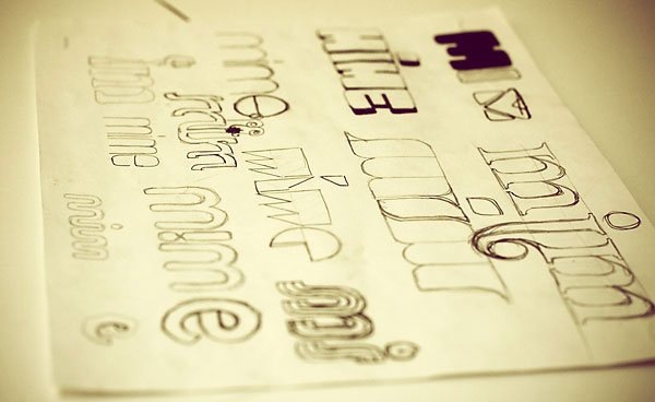
When designing a logo for customers, keep in mind that they may not appreciate all your suggestions. Therefore, before you spend time drawing each option on your computer, you can show several options that appeared during the development process. This will save a lot of time, especially if the client did not give you much of it.
2. Construction: vector graphics
Vector graphics. This is a topic in which many newbies get confused. In recent years, programs such as Photoshop, Paint Shop Pro, Fireworks have blurred the boundaries between vector and raster graphics. Common image formats such as GIF, JPEG, BMP, TIFF are raster formats. Digital photography is a good example of raster graphics. They are made of dots, which are also known as pixels. Bitmaps have a specific resolution. If you increase the digital photo, you will see individual pixels. You can, of course, reduce the scale of the bitmap, and get a decent result, but an increase in scale will certainly cause jambs. Photoshop , Pixelmator , Paint Shop Pro and Painter are good examples of applications that are designed primarily for creating bitmap graphics and editing photos. They are not intended to design a logo.
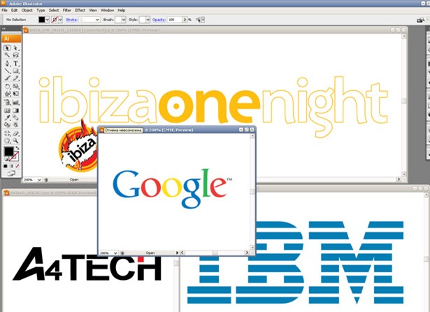
Unlike raster images - vector images are not made up of dots. They are mathematical formulas that describe shapes. Vector drawings can be enlarged or reduced to any size without loss of detail or sharpness. For example, lines and curves of vector graphics will look as sharp on a small business card as on a giant outdoor advertising billboard. Professional logos are made in vector so that they can be used for commercial printing, websites, television, and all other forms of media. Examples of vector formats: EPS (Encapsulated PostScript), PDF (portable document format) and AI (Adobe Illustrator).
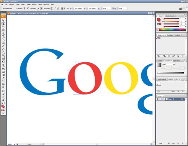
If you learn to use special software, then definitely get closer to professional logo creation. Good paid programs for working with vector graphics are: Adobe Illustrator , Lineform , FreeHand and Corel Draw . In addition, there is a great free alternative - Inkscape , which you can see below.
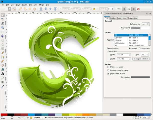
Focusing on pencil sketches, use these programs to translate your ideas into a vector. If you are new to using vector software, you need to select a few minutes (hours, days, years) to learn the basics of using pen to create Bezier lines and curves. Keep in mind that vector shapes may have a stroke and fill of varying thickness and color.

')
3. Decoration: Color schemes
When you choose a color scheme, try using color combinations that make sense for this logo. For example, it is not recommended to use bright orange and pink colors for a large investment bank. Help in choosing the color can service Adobe Kuler .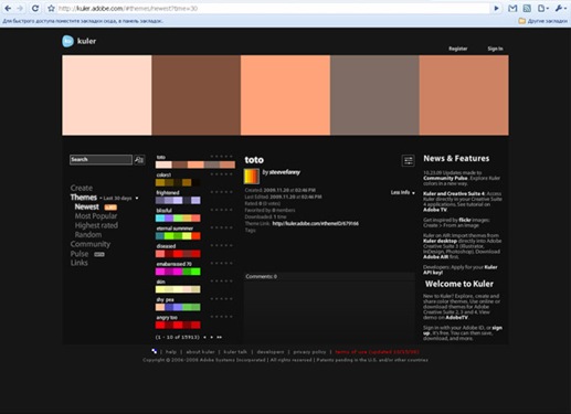
4. Options: black and white
After you have given life to your logo with color, think about how it will look when you make copies or fax. If it looks dirty and incomprehensible when converting to a black and white copying machine or fax, it's time to go back to the computer and make a separate (black and white) version of your logo. The black and white version may differ slightly from the original, but it should keep the overall look. You can find to turn the filled form into empty and vice versa.
5. Uses: media
When designing a logo, keep in mind its target audience. For example, if a logo is displayed only on a website, you can use a variety of colors, fading effects, and gradients. However, if the logo will also be used for commercial printing, it is necessary to consider the complexity of the logo and the additional costs that will have to be incurred when using a variety of colors. For some logos, you can create web versions and less complex print versions. Also do not forget about the effect of sticking. In the print shop, each color is applied separately. And as a rule, when printing occurs, the movement of mechanisms and paper. These slight movements can create gaps between colors the size of fine hair. This will adversely affect the overall style of the composition. This is equally important for colored pieces that are translated in black and white. When designing a logo, you can create overlaps between adjacent colors to reduce the chances that paper movement will be noticeable when printing. However, if you look at many professional logos, you will notice that different colors do not always touch each other and there is an empty space between the elements. Spaces are not only an important visual effect tool, but also eliminate printing problems.6. Revision: Typography
Words that are an integral part of the logo are just as important as the graphics. Many do not care about choosing the font. However, the style of the lettering, the font, and even the register in the logo are essential. Do not underestimate the need to use effective typography. In addition, if your logo uses a font, you must convert it into vector shapes. Because of this, you can distribute the source without worrying about installing the appropriate fonts.You can read about the types of logos in my blog in the article “ What is a logo ?”
Logo design is a very interesting and time-consuming process. Have you ever designed logos? Share your experiences and tips regarding this topic.
Source: https://habr.com/ru/post/76080/
All Articles