Visualization of social connections
 In the course of interaction on social sites, all members of the network communicate, write topics, respond to comments. The most interesting interlocutors are added to friends and their messages fall into a personal tape. At the same time, as the number of messages grows, it becomes more difficult to determine who you are communicating with. With someone you can quite actively correspond in different topics, but because of the large amount of information you simply don’t associate different messages with one person.
It has long been known that a person, regardless of his analytical skills, quickly and better perceives information in a graphical form. But now, in order to determine how close your own views are to the opinion of another community member, you must either analyze a lot of messages or act impulsively relying only on memory and an instant decision. Therefore, I propose to implement on Habrahabr the visualization of social connections between users. This will make it easier to find like-minded people and in a simple form to see what is happening here.
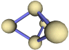
An example of how a graph might look like:
')
Naturally, it is best to analyze information both as a whole on the site and the personal relationships of the user. Ideally implement the dependence of the pictures on the ratings of comments and topics posted to other people.
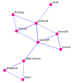
Additional information and implementation of the algorithm in Java in relation to the IRC network is available on the website PieSpy (Eng.)
Sorry if the text is like a stream of consciousness :)
Source: https://habr.com/ru/post/7498/
All Articles