ClearType-smoothing in Linux, or fonts as in Ubuntu
Good day, Habr. I recently saw a new Ubuntu and I became jealous that it has more beautiful fonts than in my Mandriva (GNOME). And I began to dig. I copied and experimented for a long time, but in the end I achieved the desired result. Now I want to tell you how I did it. I did this by rebuilding the libraries that are responsible for rendering fonts, with support for ClearType- smoothing. I don’t know if it’s more beautiful than Ubuntu or not, but I like it. So let's get started.
For drawing fonts such libraries are used:
Cairo is a library designed for rendering vector graphics.
Xft is a free library designed to use the Freetype rasterizer with the X-extension X Rendering Extension; This is usually necessary for using FreeType fonts with the X Window System.
FreeType is a library that is used to rasterize fonts and operations on them.
It was with the latest stable versions, today it is:
Cairo 1.8.8
Xft 2.1.14
FreeType 2.3.11
')
For patches, many thanks to the Arch Linux user community, for whom I have found them all.
Each patch does not do anything difficult, it just makes some changes to the source code of the libraries. To use them, you need the patch package, which you will find in the repositories. You can read about its use and its parameters and keys here . Codes of patches updated to work with new versions of libraries. If you look at the code of any of them, you can do it all manually by adding and replacing the code in the source code.
Cairo:
cairo-1.2.4-lcd-cleartype-like.diff - ClearType font rendering. Similar smoothing is applied in ubuntu (based on a comparison). Let me remind you that this method is registered by Microsoft.
Xft:
libXft-2.1.14-lcd-cleartype.patch is the same as for cairo. This influenced my fonts in Opera, Lotus Symphony.
FreeType:
bytecode.patch - includes font rendering, patented by Apple, so it is turned off initially. This is optional, you can not include it.
freetype-2.2.1-subpixel-disable-quantization.diff - the name speaks for itself, turns off quantization.
freetype-2.3.0-enable-spr.patch - enable subpixel rendering
freetype-2.2.1-enable-valid.patch
freetype-2.2.1-memcpy-fix.patch
They still have Canonical smoothing patches - freetype2-ubuntu, libxft-ubuntu, cairo-ubuntu, but they didn't help me much, they did even worse. Especially since they are not for new versions of libraries.
All the dependencies to compile install in the process, because I do not remember them all.
For starters let's collect Cairo. Go to the source folder cairo-1.8.8 /. We throw a patch there (it was more convenient for me), and in the console we execute:
Naturally, for the make install command, you will need root rights, so either do everything in the console from root or use sudo to make install.
If we restart X, we will see a significant difference in font rendering.
Further we collect Xft. We pack in libXft-2.1.14 /:
Now FreeType. If you want to use Apple's rendering, then apply bytecode.patch. freetype-2.3.11 /:
And additional changes that can be applied without bytecode. It is already necessary to look for yourself, whether it is better with them or not:
After that, you can restart X's.
I will give you my screenshots so that you can see the difference:
All the fonts of applications, documents, headers and robotshey table in my default settings - Sans.
This is how Firefox looked at me with “intact” libraries:
one.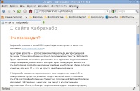
Firefox patched by Cairo:
Now it became like Ubuntu.
Full (Hinting) fonts (in the GNOME font settings):
2
Weak (Slight) refinement (Hinting) of fonts, which in Ubuntu is always the default:
3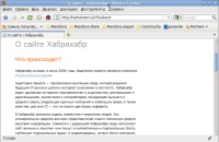
Opera patched Xft:
Weak (Slight) refinement (Hinting) of fonts:
four.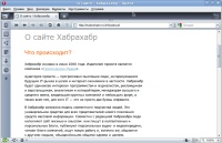
Firefox, patched FreeType with bytecode.patch:
Full (Hinting) fonts:
five.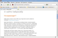
Weak (Slight) refinement (Hinting) of fonts:
By the way, this also looks like in Ubuntu.
6
Lastly, I recommend playing in the font settings in GNOME (or KDE), especially with dpi. You can still experiment with their patches, and achieve the best result.
I have it all. Thanks to everyone, I hope someone came in handy.
UPDATE:
Upon request, I post a summary picture of all 6 above shown screenshots:

I note that in the GNOME fonts settings, I always had anti-aliasing "Subpixel (LCD) monitors" turned on.
Also note that the screenshots show that in the Opera the fonts are slightly darker. But this is because Opera uses Xft, while Firefox (and the entire dwarf) use cairo. Hence the conclusion - there is a difference in the rendering of libxft-cleartype and cairo-cleartype.
still UPDATE:
I dug deeper in the source code of the patches. Compare patch for Cairo and patch Xft. I found very interesting and similar lines in them:
In the Xft patch:
In the patch Cairo:
From the comment for this line in Xft (/ * note: keep the filter symetric, or bad things will happen * /) I realized that it was like an array of sizes of some kind, frequencies or something like that. Well, how can I know something?)) But by the name of the array, you might think that the algorithm of this thing was used there. )) But still, how do I know? For a long time I did not think, and installed the same hexadecimal numbers (size, frequency?) In the patch for Cairo in the array as in the patch for Xft, I reassembled. And, oh, a miracle, I have everywhere now the same dark and distinct fonts as in Opera (Qt).
Firefox, all libraries patched, Full (Hinting) fonts:
7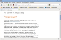
Compare with the 5th screen.
Firefox, patched only Cairo, weak (Slight) refinement (Hinting) of fonts:
eight.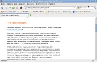

Compare with the 3rd screen and the 4th screen, where Opera.
Everything, now I am satisfied. =) Here is a modified patch for Cairo
Libraries
For drawing fonts such libraries are used:
Cairo is a library designed for rendering vector graphics.
Xft is a free library designed to use the Freetype rasterizer with the X-extension X Rendering Extension; This is usually necessary for using FreeType fonts with the X Window System.
FreeType is a library that is used to rasterize fonts and operations on them.
Library sources
It was with the latest stable versions, today it is:
Cairo 1.8.8
Xft 2.1.14
FreeType 2.3.11
')
Basic patches
For patches, many thanks to the Arch Linux user community, for whom I have found them all.
Each patch does not do anything difficult, it just makes some changes to the source code of the libraries. To use them, you need the patch package, which you will find in the repositories. You can read about its use and its parameters and keys here . Codes of patches updated to work with new versions of libraries. If you look at the code of any of them, you can do it all manually by adding and replacing the code in the source code.
Cairo:
cairo-1.2.4-lcd-cleartype-like.diff - ClearType font rendering. Similar smoothing is applied in ubuntu (based on a comparison). Let me remind you that this method is registered by Microsoft.
Xft:
libXft-2.1.14-lcd-cleartype.patch is the same as for cairo. This influenced my fonts in Opera, Lotus Symphony.
FreeType:
bytecode.patch - includes font rendering, patented by Apple, so it is turned off initially. This is optional, you can not include it.
freetype-2.2.1-subpixel-disable-quantization.diff - the name speaks for itself, turns off quantization.
freetype-2.3.0-enable-spr.patch - enable subpixel rendering
freetype-2.2.1-enable-valid.patch
freetype-2.2.1-memcpy-fix.patch
They still have Canonical smoothing patches - freetype2-ubuntu, libxft-ubuntu, cairo-ubuntu, but they didn't help me much, they did even worse. Especially since they are not for new versions of libraries.
Building libraries
All the dependencies to compile install in the process, because I do not remember them all.
For starters let's collect Cairo. Go to the source folder cairo-1.8.8 /. We throw a patch there (it was more convenient for me), and in the console we execute:
$ patch -Np1 -i cairo-1.2.4-lcd-cleartype-like.diff
$ ./configure --prefix=/usr
$ make && make install
Naturally, for the make install command, you will need root rights, so either do everything in the console from root or use sudo to make install.
If we restart X, we will see a significant difference in font rendering.
Further we collect Xft. We pack in libXft-2.1.14 /:
$ patch -Np1 -i libXft-2.1.14-lcd-cleartype.patch
$ ./configure --prefix=/usr
$ make && make install
Now FreeType. If you want to use Apple's rendering, then apply bytecode.patch. freetype-2.3.11 /:
$ patch -Np0 -i bytecode.patchAnd additional changes that can be applied without bytecode. It is already necessary to look for yourself, whether it is better with them or not:
$ patch -Np1 -i freetype-2.2.1-subpixel-disable-quantization.diff
$ patch -Np1 -i freetype-2.3.0-enable-spr.patch
$ patch -Np1 -i freetype-2.2.1-enable-valid.patch
$ patch -Np1 -i freetype-2.2.1-memcpy-fix.patch
$ ./configure --prefix=/usr
$ make && make install
After that, you can restart X's.
the end
I will give you my screenshots so that you can see the difference:
All the fonts of applications, documents, headers and robotshey table in my default settings - Sans.
This is how Firefox looked at me with “intact” libraries:
one.
Firefox patched by Cairo:
Now it became like Ubuntu.
Full (Hinting) fonts (in the GNOME font settings):
2
Weak (Slight) refinement (Hinting) of fonts, which in Ubuntu is always the default:
3
Opera patched Xft:
Weak (Slight) refinement (Hinting) of fonts:
four.
Firefox, patched FreeType with bytecode.patch:
Full (Hinting) fonts:
five.
Weak (Slight) refinement (Hinting) of fonts:
By the way, this also looks like in Ubuntu.
6
Lastly, I recommend playing in the font settings in GNOME (or KDE), especially with dpi. You can still experiment with their patches, and achieve the best result.
I have it all. Thanks to everyone, I hope someone came in handy.
UPDATE:
Upon request, I post a summary picture of all 6 above shown screenshots:
I note that in the GNOME fonts settings, I always had anti-aliasing "Subpixel (LCD) monitors" turned on.
Also note that the screenshots show that in the Opera the fonts are slightly darker. But this is because Opera uses Xft, while Firefox (and the entire dwarf) use cairo. Hence the conclusion - there is a difference in the rendering of libxft-cleartype and cairo-cleartype.
still UPDATE:
I dug deeper in the source code of the patches. Compare patch for Cairo and patch Xft. I found very interesting and similar lines in them:
In the Xft patch:
+static const int fir_filter[5] = { 0x10, 0x40, 0x70, 0x40, 0x10 };In the patch Cairo:
+static const int fir_filter[5] = { 0x1C, 0x38, 0x55, 0x38, 0x1C };From the comment for this line in Xft (/ * note: keep the filter symetric, or bad things will happen * /) I realized that it was like an array of sizes of some kind, frequencies or something like that. Well, how can I know something?)) But by the name of the array, you might think that the algorithm of this thing was used there. )) But still, how do I know? For a long time I did not think, and installed the same hexadecimal numbers (size, frequency?) In the patch for Cairo in the array as in the patch for Xft, I reassembled. And, oh, a miracle, I have everywhere now the same dark and distinct fonts as in Opera (Qt).
Firefox, all libraries patched, Full (Hinting) fonts:
7
Compare with the 5th screen.
Firefox, patched only Cairo, weak (Slight) refinement (Hinting) of fonts:
eight.
Compare with the 3rd screen and the 4th screen, where Opera.
Everything, now I am satisfied. =) Here is a modified patch for Cairo
Source: https://habr.com/ru/post/74227/
All Articles