More interesting features to improve comments on Habré
It’s a pity, I didn’t have the opportunity to participate in the discussions on improving comments on Habré in time ( topic 1 , topic 2 ). And I just have something to say. A bit, really, but in the case and with ready-made solutions and the opportunity to try.
I’ll say right away that the solution with dots mn was very surprised, because it added to the page a lot of visual elements (noise), and even those that are shown / hidden when you hover your mouse over the comment thread (some even had brakes). As a result, the problem was not solved.
')
DileSoft made a very correct conclusion about this solution here :
A few suggestions came up in the discussions :
- The “Improvement for Habr comments tree” script pops up (solution is redundant + adds a lot of noise)
- The idea of a gray strip to the left of homm (tears down the design of the page)
- Remove a large indent on the left (incompatibility with the new design)
- And there were several other proposals like “big avatar at the first”, “their flowers”, “remove all the first ones with the ends” (like science fiction) ...
As you can see, as a result, a solution was chosen that least changed the current design ... Logical :)
I was very surprised that the most excellent mdevils script “Folding / unfolding comment threads ” , which is recommended on each Habrafresht, did not come up.
He has the only flaw that he puts [-] only before root comments, which have at least one answer, which is why he cannot serve as a full-fledged indicator of root comments.
But if, after its installation, open the code and comment out just one line (# 155):
Then we get the following result:
(everything is beautiful, nothing superfluous, but without editing - the first [-] would not exist)
I believe that such a thing has long been worth it to implement on Habré (not the hover point), since it solves 2 problems at once :
I think that it was about such a decision that monaxide spoke , apparently not knowing about this wonderful expansion.
Many spoke about the indent on the left. I think everyone understands that they will not do anything with it, since it is part of the new design. So for those who got rid of it with the help of my Habrahabr - Inversion compact skin style, as well as for those who just want to get rid of the points (since the points conflict with the above described script, they are drawn over the markers), I laid out Patch v1. 2 for Inversion compact skin .
He does 2 things:
- removes points
- nesting of comments on the width of the avatar (a very good offer from 3fonov was here )
For good, this patch should be set after the main style and the first patch ( topic-instruction + topic about patch v1.1 ), but to solve only these two tasks, it can work separately.
I myself use this style to reduce left margin, get rid of points, and that script for marking root comments.
This is a small surprise from Inversion :)
When I started reading Habr, I was pleasantly surprised by the system of reading comments with these arrows, which make it possible to rise to the comment that sailed up, and then go back and continue reading.
But it took very little time, and I realized that it was not very convenient, as the context is slightly lost when traveling back and forth, and I don’t like that when I return, the comment aligns with the upper edge of the browser window (and I like to read in the center ).
That's when I wrote this small script "Answer to ..." .
Here is what he does:
I would be very happy if such a solution was implemented natively on Habré, or they explained why this should not be done.
I have been using this script for more than 3 months, but it’s only now that I’ve gotten to share it :(
But better late than never.
That's all I wanted to say.
I would be happy for comments and suggestions.
I’ll say right away that the solution with dots mn was very surprised, because it added to the page a lot of visual elements (noise), and even those that are shown / hidden when you hover your mouse over the comment thread (some even had brakes). As a result, the problem was not solved.
')
DileSoft made a very correct conclusion about this solution here :
There was a concrete simple problem - at first glance, the first level of comments is not visible.
Instead of solving it in a simple way, you came up with an intricate monstrous, meaningless system that does strange things that are loosely connected with the original problem.
And the original problem remained unresolved - at first glance, the first level of comments is not visible. Well done.
A few suggestions came up in the discussions :
- The “Improvement for Habr comments tree” script pops up (solution is redundant + adds a lot of noise)
- The idea of a gray strip to the left of homm (tears down the design of the page)
- Remove a large indent on the left (incompatibility with the new design)
- And there were several other proposals like “big avatar at the first”, “their flowers”, “remove all the first ones with the ends” (like science fiction) ...
As you can see, as a result, a solution was chosen that least changed the current design ... Logical :)
I can offer some compromise
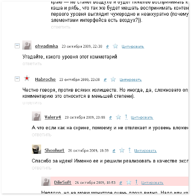
I was very surprised that the most excellent mdevils script “Folding / unfolding comment threads ” , which is recommended on each Habrafresht, did not come up.
He has the only flaw that he puts [-] only before root comments, which have at least one answer, which is why he cannot serve as a full-fledged indicator of root comments.
But if, after its installation, open the code and comment out just one line (# 155):
if (thread.getElements('li.comment_holder').length==0) return;Then we get the following result:
(everything is beautiful, nothing superfluous, but without editing - the first [-] would not exist)
I believe that such a thing has long been worth it to implement on Habré (not the hover point), since it solves 2 problems at once :
- Adds an indication of root comments.
- Adds the ability to hide threads of discussions, which often helps in large discussions (such as Habrafurshet)
I think that it was about such a decision that monaxide spoke , apparently not knowing about this wonderful expansion.
Indent left and point
Many spoke about the indent on the left. I think everyone understands that they will not do anything with it, since it is part of the new design. So for those who got rid of it with the help of my Habrahabr - Inversion compact skin style, as well as for those who just want to get rid of the points (since the points conflict with the above described script, they are drawn over the markers), I laid out Patch v1. 2 for Inversion compact skin .
He does 2 things:
- removes points
- nesting of comments on the width of the avatar (a very good offer from 3fonov was here )
For good, this patch should be set after the main style and the first patch ( topic-instruction + topic about patch v1.1 ), but to solve only these two tasks, it can work separately.
I myself use this style to reduce left margin, get rid of points, and that script for marking root comments.
And now, at the end, about the picture, which is at the beginning of the topic
This is a small surprise from Inversion :)
When I started reading Habr, I was pleasantly surprised by the system of reading comments with these arrows, which make it possible to rise to the comment that sailed up, and then go back and continue reading.
But it took very little time, and I realized that it was not very convenient, as the context is slightly lost when traveling back and forth, and I don’t like that when I return, the comment aligns with the upper edge of the browser window (and I like to read in the center ).
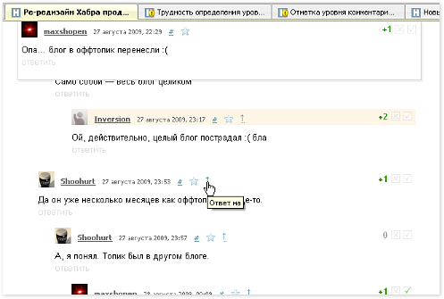
That's when I wrote this small script "Answer to ..." .
Here is what he does:
Gives you the opportunity to read the text of the comment to which this comment responds.In words it is difficult to describe. This is one of the best times to try ...
When you hover over the "Answer to" arrow, a window pops up at the top of the browser window with several lines of the comment to which this one responds. It helps when that comment went up behind the screen and you do not want to scroll to it in order to remember what it was about.
If those few lines are not enough, then you can always click on the arrow and refer to that comment for a complete reading (the usual behavior of the arrow).
I would be very happy if such a solution was implemented natively on Habré, or they explained why this should not be done.
I have been using this script for more than 3 months, but it’s only now that I’ve gotten to share it :(
But better late than never.
That's all I wanted to say.
I would be happy for comments and suggestions.
Source: https://habr.com/ru/post/73548/
All Articles