CSS3: Forever and ever!

Let's face it. Mozilla produces so many alpha, nightly builds , releases for developers, that if you didn’t pay attention to the recently released version of Firefox 3.6 alpha , then you can be completely understood.
Although, this time the grounds were very weighty to focus the attention of geeks . Since, among other positive innovations, the changes include:
- -moz-background-size property
- multiple background images
- new length unit rem
- CSS gradients
- improved display: table view
Now let's make an important point to clarify the situation - this is still the alpha release, which so far will be used only by the smallest percentage of the Firefox user base. Nevertheless, we have every chance to see these changes in a stable version of Firefox at the end of the year.
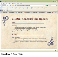
Multiple Background Images
Despite the hype, when Mozilla first introduced -moz-border-radius - allowing you to make rounded corners with a simple CSS property - I personally did not get excited about it.
On the contrary, I was always shocked by the opportunity offered by the concept of a plurality of background images — performed by means of several simply grand tricks over a model without any persistence in sophisticated markup.
')
The basic syntax is very simple. Instead of specifying just one image in the background-image property, you list up to four comma-separated images.
You can also specify up to four corresponding values for background-repeat and background-position :
#multi { background-image: url (paper.png), url (paper2.jpg);
background-repeat: no-repeat, no-repeat;
background-position: top left, bottom right;
}
I have to say that I discovered a somewhat unnatural sorting order. The second image to be listed is displayed below the first one, and so on. But as soon as you feel it and remember, there will be no problem.
So which browsers really support this property?
At the moment, multiple background images are fully supported by Safari 4.0, Chrome 3.0, and Firefox 3.6 alpha (Minefield). You can see my example in action if you go to one of the listed browsers at this URL:
http://www.sitepoint.com/examples/css3/multi.html
Well, is it worth using this property now?
One of the first problems I encountered when checking the display of code in different browsers was that they refuse to take only the first image in the list, ignoring the others. A comma is enough to kill the whole declaration in these browsers, leaving the background blank.
However, I found that if you first declared a background image according to all standards, Opera, old versions of Firefox and Safari simply ignore any newest CSS ads that may go further in the code.
The fact that Internet Explorer refuses to obey this rule is not a problem, since we are free to use comments with the condition to make simple, single-picture code execute in IE:
<! - [if IE]>
<style type = "text / css">
#multi { background-image: url (old-paper2.jpg);
background-repeat: no-repeat;
background-position: top left;
}
</ style>
<! [endif] ->
In general, I think that this property is practical and gives the result even today, although you need to be very careful to use it elegantly.
Be sure to make sure that your design works great with old browsers (after all, it will not make you any worse), but it will add extra luxurious gloss to your design to the ever-increasing mass of users of new browsers. So it's time to experiment.
Set the size of the background image
As you can imagine from the title, background-size allows you to scale an image that was added using CSS to the background.

In fact, the background-size property is currently lacking support everywhere except in its native CSS3 format, but Opera, Chrome / Safari, and Firefox 3.6 alpha support it, although each with its own markup.
The markup looks like this:
body { background-image: url (background_image.jpg);
background-size: 50% 50%; / * w3c specification * /
-moz-background-size: 50% 50%; / * firefox css * /
-webkit-background-size: 50% 50%; / * safari / chrome * /
-o-background-size: 50% 50%; / * opera css * /
}
If you use one of these browsers, you can see this code in action here .
So can we use it right now?
Again, the short answer is yes. Anyway, such narrowly targeted declarations will simply be ignored by other browsers, so there are no technical obstacles to using this property.
For me personally, it seems less clear where exactly I would like to apply this property, since few images are suitable for free scaling.
So, if you risk creating a wonderful example of using this property, I would like to look at your work.
CSS gradients
Background CSS gradients - a property that seems to me the most viable of the innovations, even though at the moment it is supported only in Firefox alpha, Safari 4, and Chrome 3.
Just like the background-size property code, the background gradient code also depends on the browser, although each command represents a new value for the background-image standard rather than creating a completely new CSS property.
The easiest thing is that this property looks like this:
div # cssgradient2 { background-image: -moz-linear-gradient (top, bottom, from (# A1D004), to (# 6B9A00));
background-image: -webkit-gradient (linear, left top, left bottom, color-stop (0.00, # A1D004), color-stop (1.00, # 6B9A00));
}
As you can see above, the code for Mozilla (Firefox) and WebKit (Safari / Chrome) are similar but not identical. Both require color-start and color-stop for your gradient, as well as direction coordinates (top, left, right, bottom, etc.).
Although both WebKit and Mozilla can display both radial and linear gradients, they follow different paths. If Mozilla prefers to use two different property values (such as, -moz-linear-gradient () and -moz-radial-gradient ()), then WebKit uses a single value, but with a specific parameter (for example, -webkit-gradient (radial ...))
To make it even easier, I created a test page where you can review everything yourself .
Since CSS gradients require at least two colors to display, both methods provide us with the ability to use a variety of colors to create complex gradients on a page.
So, the syntax for creating a rainbow gradient will be as follows:
/ * fallback * /
background: # F66 url (rainbow-gradient.jpg);
/ * mozilla gradient * /
background-image: -moz-linear-gradient (left, right,
from (red),
color-stop (16%, orange)
color-stop (32%, yellow),
color-stop (48%, green)
color-stop (60%, blue)
color-stop (76%, indigo)
to (violet));
/ * webkit gradient * /
background-image: -webkit-gradient (linear,
left top, left bottom,
color-stop (0.00, red)
color-stop (16%, orange)
color-stop (32%, yellow),
color-stop (48%, green)
color-stop (60%, blue)
color-stop (76%, indigo)
color-stop (1.00, violet));

What is interesting is that IE can also display such simple gradients (including rainbows) using the filter property that has been present since IE5.
So, IE-friendly code looks like this:
filter: progid: DXImageTransform. Microsoft. gradient (
enabled = 'true',
startColorstr = # A1D004,
endColorstr = # 6B9A00,
GradientType = 0
);
There are two things you need to know about this code.
First, although it is ugly, you can see where the starting and ending colors are set.
Second, believe it or not, the little-known GradientType parameter actually sets the direction of your gradient. Set it to 0 for a vertical gradient and to 1 for a horizontal one. As far as I know, in IE it is impossible to set a diagonal gradient or intermediate colors.
As I see it, there are three advantages to using CSS gradients.
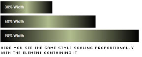
- Unlike images, CSS gradients scale in proportion to the element containing them, allowing them to expand and contract according to the behavior of the content on the page.
- CSS gradients are very efficient, allowing you to generate large, flexible, structured areas of needed tones with just a few lines of code. This greatly affects the page loading speed for your users.
- There are many situations where images can be blocked by the user for security reasons or for the bandwidth issues of their Internet channel. CSS gradients are likely to give you complex colors that images cannot give you — for example, in Safari on the iPhone.
So can we use this property right now?
Again, as far as you can reasonably use it, I will answer yes.
Clearly, the newest versions of Safari, Chrome, and Firefox will support this feature well. IE provides fairly decent support for gradients. And this is roughly half the browsers, not to mention the moment when the stable version of Firefox will be released.
The remaining browsers always have the opportunity to set the gradient in the same way as you set it by conventional means.
Total
It is enough to pile up a bunch of arguments against the use of these properties and innovations - they are still too premature and the technology is still raw. However, you should play around with these tools to use them competently, since both gradients and multiple background images will surely become “bread and butter” for leading developers in the future.
I guess the time for the games is now.
Note:
A / I apologize for my imperfect translation. If anyone notices an error, please write in the comments, I will immediately correct it.
B / Since the article can be read even by beginners, I want to give a brief reference on selectors and declarations. We define the terms:
p {
font-family: Arial, Helvetica, sans-serif;
}
here the selector is - p
all that is between curly braces {} is a block of declarations
the declaration is font-family: Arial, Helvetica, sans-serif;
the declaration itself consists of the property - font-family and values - Arial, Helvetica, sans-serif
Source: https://habr.com/ru/post/71835/
All Articles