About ampersand
 Ampersand is a thing mainly in Latin typography, but nevertheless the thing is beautiful. In this short essay, I will discuss how the ampersand can be used on web pages in both textual and pre-rendered form.
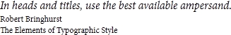
If the designer cares about the visibility of the written text by search engines, he will probably use the
amp element and try to select a more or less secure headset.')
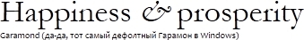
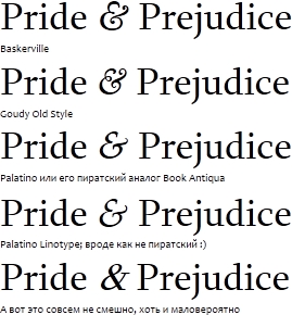
Here and further examples come with a very large size. Using the same ampersands at 12pt looks much less impressive.
For beauty, usually italic ampersand is used. It so happens that in most headsets it is an italic ampersand that is more colorful.
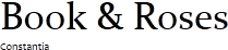
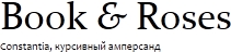
Often antiqua ampersand is used with chopped headsets (the opposite was not observed by the author).

Good ampersands are even where you do not expect them at all.
For web typography, fonts with beautiful ampersands are really small. The author for a beautiful ampersand on a web page uses something like this:
 .amp
 {
  font-family: Baskerville, "Goudy Old Style", "Palatino", "Book Antiqua", serif;
  font-style: italic;
  font-weight: normal;
  line-height: inherit;
 }
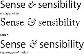
This, by the way, is a very famous style, and many sites use it. Here is a rough illustration of what this style can turn into:
Web designers are not stupid people, and they have long been cut to hang this class for each ampersand by hand - this is nonsense. For such a routine task there is an automated solution .
There are not so many fonts to use “the best ampersand in the world,” so you have to be content with what you have. The only alternative is of course to generate a picture. For example, you are now reading a post where all ampersands are pictures, and the headlines too.
If you, for example, generate server-side headers as PNGs, or use another replacement technology (sIFR, SVG, exotic), then you can use absolutely any ampersand that you have. Here you can create something presentable, even without much imagination:
Naturally, in this case, you need to experiment, and see what comes up to what. For example, if you are writing something medical, you can take an ampersand that forms a “heart”, and if something is esoteric, you can take an ampersand that looks like “something” and let everyone guess.
You can read about what ampersand is and why it is not needed in our native typography at Lebedev . This topic is also covered by the Adobe site. The topic is often found in typographic smoking rooms — you can find many interesting links, for example, here . In general, I recommend to google. For example, here is a good list of beautiful ampersands, incl. and in free fonts. The author himself took a couple of himself - as a reserve.
That's all for now. My editor seems to have coped with the autogeneration of images. Cheers, comrades!
Source: https://habr.com/ru/post/71112/
All Articles