Using a gradient as a page background.
During the existence of web 2.0, some techniques of so-called web 2.0 design have appeared in the network, one of which is a gradient .
Creating a similar effect, if you do not take into account elements with a fixed height, gives the coder a lot of difficulties. The key point of the implementation is the optimization of graphics, but on the other hand too-pinched the file loses quality, which is especially noticeable when using such an element with non-fixed height. And what if the gradient effect should be used in the background of the page?
Task: consider two ways to use a gradient as a page background.
')
I would like to consider the implementation of not just a gradient background, but a background with any graphic elements that smoothly change their color from the beginning of the page to its end.

This is the background of the page.
So, the overall presentation of the implementation is the splitting of the entire background into several layers.
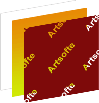
The first layer is a pattern with the name of our beautiful studio.
The second layer is the gradient itself.
The third is the body of the document.
In the illustration, another layer is missed; this is the layer with the content of the site; it is the topmost layer, but we are not interested.
When there is a general idea of implementation, you can go to the details.
The first step is to prepare the graphics for the first layer. Just save it in photoshop in png-24 format, and then optimize the image using the punypng service. In my case, the source file shrank by 47 % . Now I will say a little about IE6, the fact is that if you use an optimized file for it, then the translucent pixels in the picture will be cut off, leaving the "broken" edges of the label. Third-party scripts did not give me the desired result, so I prepared a separate image without an alpha channel. For the second implementation example, it is not needed.
This step is general, the next is the creation of a gradient, the implementation from this point on has two options.
It consists in using raster graphics for the implementation of the second layer. In this example, I prepared a png8 file with a size of 1x100 pixels with the desired gradient (from orange to light green). File size was 465 bytes.
Once the graphics are prepared, you need to collect everything in a test page.
- in the end, it turned out 4 files without making styles in a separate file.
Unfortunately, it was not possible to create without hacks for IE 6, I will be grateful if someone from the readers, interested, will express their interest in proposing a simpler way.
In the meantime, from the solution I proposed, it is clear that the task is not simple.
I would also like to recall one of the filters for IE, which allows you to fill the layer with a gradient using DirectX.
Example:
Of course, we don’t have to consider the validity of this property, since we can no longer talk about 100% validation when using expression for IE, but it’s worth talking about performance, because A filter always requires more resources. Using the filter in my example increased the memory used by 4 MB. And resizing the browser window loaded the CPU 10% more than with a picture.
Notes
In the course of implementation, I encountered many unpleasant moments, which I will talk about in a row.
- the first thing I encountered was the "drag" of the browser, this is due to the stretching of the image with the gradient, since The browser smoothes the stretched image of 1x100. If you increase the size of the picture, then you can notice an increase in speed, but the "brakes" will still be.
- The second is the behavior of IE6, I had to draw a separate image, and use css exspression.
- Another unpleasant moment in my opinion is the ability to highlight the background of the page.
- The most critical in this implementation of the gradient is the order of loading images, because if the gradient loads faster, then the user will see only the gradient for a moment, the effect is very unpleasant, the gradients can be very bright and the constant page blinking creates the impression of a buggy website. True, if we are talking about using only the gradient, then we can assume that such a problem will not arise.
Despite the fact that the final goal was achieved, a similar effect demanded relatively large costs, you should not forget that this is only a blank page, with only one effect, I think these costs are justified, I think it depends on the specific case, in general everything turned out.
So, stumbling upon the pitfalls of the implementation of a gradient background using a picture and a layer, I would like to draw your attention to the fact that he himself recently began to use in projects - vector graphics.
I will dwell on two languages for describing vector graphics, this is SVG (Scalable Vector Graphics) and VML (Vector Markup Language),I want to immediately say that the VML language developed by Microsoft in the development of VML was attended by several companies: Microsoft, Macromedia, Autodesk, Hewlett- Packard, Visio Corporation., It has been supported by IE since version 5. SVG is not supported in IE without an additional plug-in from Adobe, but we don’t need a plug-in to implement.
Connecting vector graphics for IE
In order for the browser to determine how to transfer data to the VML processor, it is necessary to define the namespace and parameters for displaying graphics, the namespace for IE6-7 is determined by connecting the next line to the head section.
This information tells the browser that it is necessary to use the namespace "urn: schemas-microsoft-com: vml" by analyzing xml elements with the prefix v: for their further transfer and processing to the vml processor.
To connect the namespace in IE8, you need to add this line
Next, we describe the display options, just by adding a line to css, I got a separate file vml.css in which it is necessary to describe all the vml primitives used, in my example I limited myself to this line only
for ye6
In IE, vml is a standard add-in. In order for all the above code to work only in IE, use conditional comments.
In order to avoid conflicts with SVG, add to css a line that hides all elements related to it.
Drawing
I will not dwell on the vml elements in detail, all the necessary information can be taken in the specification. The code below should be saved in vectors.vml
To the note: VML seemed to me a convenient language, since all vector drawings can be stored in one file, and if necessary, indicate, using a unique identifier, which of the drawings should be displayed.
Now, when the drawing is ready, it is necessary to connect it, this can be done with the help of the element v: vmlframe , I think everyone understood its purpose by its name, we will also introduce conditional comments on the page using conditional comments. Such a connection may seem convenient, but unfortunately only in this case, looking ahead, I will say that in the next article this method of connection will not work.
Connect vector graphics for Mozilla, Opera, Safari, Chrome, Arora, Avant ..
Connecting SVG is much simpler. To do this, you need to connect an external file with a description of graphics using the object element:
with the specified MIME type.
During testing of this example in different browsers, I came across a feature in Safari. If, for example, when the page was loaded, the window size was 800x600, then when the window was resized, say 1024x768, the background size would remain the same, so I had to find a solution for Safari, and it was found quickly enough.
Because SVG elements can be controlled by JavaScript, then a small Safari script could easily change the size of the background when the window is resized. In order for the script to work only in this browser, you need to check the support of the window object of the devicePixelRatio property.
Below is the entire code of the background.svg file:
SVG was based on the VML language, so there is some similarity between them, I want to note that all properties of objects are described not in the objects themselves, unlike VML, but in the special section <defs>, and their subsequent use is done through their identifier.
After describing the vector drawings, you can mark the test page
So, in the end, 4 files without making css styles in a separate file.
Advantages and disadvantages:
- There is a minus in IE, it is possible to select the background completely.
- Large file size, because graphics are described in XML format. The SVG format exists in compressed form, but, unfortunately, the question for me has so far remained open. The truth is that in this variant the size of the files is no longer so.
- Using the script for Safari.
+ This method is easy to transfer to another project, just as easy to change the gradient itself, all this can be done without using a graphic editor.
+ There will be no page blinking, unlike the first option, since SVG file is not displayed until it is fully read. In some cases this can be attributed to the minuses.
+ There is no need to prepare a picture for alpha6 without an alpha channel, since VML understands transparency, plus got rid of css expressions.
+ This option is fully valid.
+ Use of three elements on the page (in the first 4)
... I think and the pros and cons can still be added.
I think the difference in the results is visible without any comments. A lot of work has been done, but still I didn’t cover some aspects of using SVG and VML. For example, when using VML, Internet Explorer blocks the page, it confuses someone. The topic of browser performance is not fully disclosed, depending on the first and second options. Of course, there are problem areas in the implementation in both cases, but, in my opinion, the use of the second option has justified itself to a greater extent.
It is interesting to see comments on the topic of not only any improvements, but also about the significance of this effect in design.
Ready exampleswill soon be laid out ( once ) ( two ) on the server
Creating a similar effect, if you do not take into account elements with a fixed height, gives the coder a lot of difficulties. The key point of the implementation is the optimization of graphics, but on the other hand too-pinched the file loses quality, which is especially noticeable when using such an element with non-fixed height. And what if the gradient effect should be used in the background of the page?
Task: consider two ways to use a gradient as a page background.
')
I would like to consider the implementation of not just a gradient background, but a background with any graphic elements that smoothly change their color from the beginning of the page to its end.
This is the background of the page.
So, the overall presentation of the implementation is the splitting of the entire background into several layers.
The first layer is a pattern with the name of our beautiful studio.
The second layer is the gradient itself.
The third is the body of the document.
In the illustration, another layer is missed; this is the layer with the content of the site; it is the topmost layer, but we are not interested.
When there is a general idea of implementation, you can go to the details.
The first step is to prepare the graphics for the first layer. Just save it in photoshop in png-24 format, and then optimize the image using the punypng service. In my case, the source file shrank by 47 % . Now I will say a little about IE6, the fact is that if you use an optimized file for it, then the translucent pixels in the picture will be cut off, leaving the "broken" edges of the label. Third-party scripts did not give me the desired result, so I prepared a separate image without an alpha channel. For the second implementation example, it is not needed.
This step is general, the next is the creation of a gradient, the implementation from this point on has two options.
Option 1
It consists in using raster graphics for the implementation of the second layer. In this example, I prepared a png8 file with a size of 1x100 pixels with the desired gradient (from orange to light green). File size was 465 bytes.
Once the graphics are prepared, you need to collect everything in a test page.
<! DOCTYPE html PUBLIC "-//W3C//DTD XHTML 1.0 Transitional//EN"
"http://www.w3.org/TR/xhtml1/DTD/xhtml1-transitional.dtd" >
< html xmlns ="http://www.w3.org/1999/xhtml" lang ="ru" >
< head >
< meta content ="text/html; charset=utf-8" http-equiv ="Content-Type" />

< style type ="text/css" >
* { margin: 0; padding: 0; }
html { height: 100%; }
body { height: 100%; color: #fff; }
.all, .content { position: relative; z-index: 1; }
.gradient { position: absolute; top: 0; left: 0; z-index: 0 }
.filter { position: absolute; z-index: 0; width: 100%; height: 100%; background: transparent url(artsofte.png) repeat scroll top left; }
</ style >

<!--[if IE 6]>
<style type="text/css">
.filter { background: transparent url(artsofte2.png) repeat scroll top left; }
.gradient, .filter { height: expression( parseFloat(this.parentNode.offsetHeight)); }
</style>
<![endif]-->

< title ></ title >
</ head >
< body >
< div class ="all" >
< img class ="gradient" src ="background.png" width ="100%" height ="100%" alt ="" />
< div class ="filter" ></ div >
< div class ="content" >

<!-- -->

</ div >
</ div >
</ body >
</ html >

* This source code was highlighted with Source Code Highlighter .- in the end, it turned out 4 files without making styles in a separate file.
Unfortunately, it was not possible to create without hacks for IE 6, I will be grateful if someone from the readers, interested, will express their interest in proposing a simpler way.
In the meantime, from the solution I proposed, it is clear that the task is not simple.
I would also like to recall one of the filters for IE, which allows you to fill the layer with a gradient using DirectX.
Example:
filter:progid:DXImageTransform.Microsoft.gradient(GradientType=1, enabled='true', startColorStr='#00458E', endColorStr='#DA251D')

* This source code was highlighted with Source Code Highlighter .
Of course, we don’t have to consider the validity of this property, since we can no longer talk about 100% validation when using expression for IE, but it’s worth talking about performance, because A filter always requires more resources. Using the filter in my example increased the memory used by 4 MB. And resizing the browser window loaded the CPU 10% more than with a picture.
Notes
In the course of implementation, I encountered many unpleasant moments, which I will talk about in a row.
- the first thing I encountered was the "drag" of the browser, this is due to the stretching of the image with the gradient, since The browser smoothes the stretched image of 1x100. If you increase the size of the picture, then you can notice an increase in speed, but the "brakes" will still be.
- The second is the behavior of IE6, I had to draw a separate image, and use css exspression.
- Another unpleasant moment in my opinion is the ability to highlight the background of the page.
- The most critical in this implementation of the gradient is the order of loading images, because if the gradient loads faster, then the user will see only the gradient for a moment, the effect is very unpleasant, the gradients can be very bright and the constant page blinking creates the impression of a buggy website. True, if we are talking about using only the gradient, then we can assume that such a problem will not arise.
Despite the fact that the final goal was achieved, a similar effect demanded relatively large costs, you should not forget that this is only a blank page, with only one effect, I think these costs are justified, I think it depends on the specific case, in general everything turned out.
Option 2
So, stumbling upon the pitfalls of the implementation of a gradient background using a picture and a layer, I would like to draw your attention to the fact that he himself recently began to use in projects - vector graphics.
I will dwell on two languages for describing vector graphics, this is SVG (Scalable Vector Graphics) and VML (Vector Markup Language),
Connecting vector graphics for IE
In order for the browser to determine how to transfer data to the VML processor, it is necessary to define the namespace and parameters for displaying graphics, the namespace for IE6-7 is determined by connecting the next line to the head section.
< xml:namespace ns ="urn:schemas-microsoft-com:vml" prefix ="v" />

* This source code was highlighted with Source Code Highlighter .
This information tells the browser that it is necessary to use the namespace "urn: schemas-microsoft-com: vml" by analyzing xml elements with the prefix v: for their further transfer and processing to the vml processor.
To connect the namespace in IE8, you need to add this line
<? import namespace ="v" implementation ="#default#VML" ? >

* This source code was highlighted with Source Code Highlighter .
Next, we describe the display options, just by adding a line to css, I got a separate file vml.css in which it is necessary to describe all the vml primitives used, in my example I limited myself to this line only
v\:vmlframe { behavior:url(#default#VML); display: block; width: 100%; min-height: 100%; position: absolute; }

* This source code was highlighted with Source Code Highlighter .
for ye6
v\:vmlframe { height: 100%; }

* This source code was highlighted with Source Code Highlighter .
In IE, vml is a standard add-in. In order for all the above code to work only in IE, use conditional comments.
In order to avoid conflicts with SVG, add to css a line that hides all elements related to it.
.svg { display: none; }

* This source code was highlighted with Source Code Highlighter .
Drawing
I will not dwell on the vml elements in detail, all the necessary information can be taken in the specification. The code below should be saved in vectors.vml
< xml xmlns:v ="urn:schemas-microsoft-com:vml" >

<!-- group -->
< v:group id ="bg" style ="width: 100%; height: 100%" >

<!-- -->
< v:rect style ="position: absolute; width: 100%; height: 100%;" >
< v:fill type ="gradient" angle ="0" color ="#D0E805" color2 ="#E88A05" ></ v:fill >
</ v:rect >

<!-- -->
< v:rect style ="position: absolute; width: 100%; height: 100%;" >
< v:fill type ="tile" src ="artsofte.png" ></ v:fill >
</ v:rect >

</ v:group >

</ xml >

* This source code was highlighted with Source Code Highlighter .
To the note: VML seemed to me a convenient language, since all vector drawings can be stored in one file, and if necessary, indicate, using a unique identifier, which of the drawings should be displayed.
Now, when the drawing is ready, it is necessary to connect it, this can be done with the help of the element v: vmlframe , I think everyone understood its purpose by its name, we will also introduce conditional comments on the page using conditional comments. Such a connection may seem convenient, but unfortunately only in this case, looking ahead, I will say that in the next article this method of connection will not work.
<!--[if IE]><v:vmlframe clip="true" src="vct/background.vml#bg" class="vml"><![endif]-->

< div class ="content" >

</ div >

<!--[if IE]></v:vmlframe><![endif]-->

* This source code was highlighted with Source Code Highlighter .Connect vector graphics for Mozilla, Opera, Safari, Chrome, Arora, Avant ..
Connecting SVG is much simpler. To do this, you need to connect an external file with a description of graphics using the object element:
< object class ="svg" type ="image/svg+xml" data ="background.svg" width ="100%" height ="100%" ></ object >

* This source code was highlighted with Source Code Highlighter .
with the specified MIME type.
During testing of this example in different browsers, I came across a feature in Safari. If, for example, when the page was loaded, the window size was 800x600, then when the window was resized, say 1024x768, the background size would remain the same, so I had to find a solution for Safari, and it was found quickly enough.
Because SVG elements can be controlled by JavaScript, then a small Safari script could easily change the size of the background when the window is resized. In order for the script to work only in this browser, you need to check the support of the window object of the devicePixelRatio property.
Below is the entire code of the background.svg file:
<? xml version ="1.0" encoding ="utf-8" standalone ="yes" ? >
< svg version = "1.1"
baseProfile ="full"
xmlns = "http://www.w3.org/2000/svg"
xmlns:xlink = "http://www.w3.org/1999/xlink"
xmlns:ev = "http://www.w3.org/2001/xml-events"
height ="100%" width ="100%" >

< script type ="text/ecmascript" ><! [CDATA[
function resize() {
document.getElementById('rect').setAttribute("width", "100%");
document.getElementById('rect').setAttribute("height", "100%");
document.getElementById('rect2').setAttribute("width", "100%");
document.getElementById('rect2').setAttribute("height", "100%");
}
if(window.devicePixelRatio) { window.onresize = resize }
]] ></ script >

< defs >

< linearGradient id ="OrangeToGreen" x1 ="0%" y1 ="0%" x2 ="0%" y2 ="100%" >
< stop offset ="0%" style ="stop-color: #E88A05" ></ stop >
< stop offset ="100%" style ="stop-color: #D0E805" ></ stop >
</ linearGradient >

< pattern id ="artsofte" patternUnits ="userSpaceOnUse" x ="0" y ="0" width ="200" height ="200" >
< image x ="0" y ="0" width ="200" height ="200" xlink:href ="artsofte.png" />
</ pattern >

</ defs >

< rect id ="rect" rx ="0" ry ="0" x ="0" y ="0" width ="100%" height ="100%" fill ="url(#OrangeToGreen)" style ="fill-opacity: 1; stroke: #E4E4E4; stroke-width: 1;" />
< rect id ="rect2" rx ="0" ry ="0" x ="0" y ="0" width ="100%" height ="100%" fill ="url(#artsofte)" style ="fill-opacity: 1; stroke: #E4E4E4; stroke-width: 1;" />
</ svg >

* This source code was highlighted with Source Code Highlighter .
SVG was based on the VML language, so there is some similarity between them, I want to note that all properties of objects are described not in the objects themselves, unlike VML, but in the special section <defs>, and their subsequent use is done through their identifier.
After describing the vector drawings, you can mark the test page
<! DOCTYPE html PUBLIC "-//W3C//DTD XHTML 1.0 Transitional//EN"
"http://www.w3.org/TR/xhtml1/DTD/xhtml1-transitional.dtd" >
< html xmlns ="http://www.w3.org/1999/xhtml" lang ="ru" >
< head >
< meta http-equiv ="Content-Type" content ="text/html; charset=UTF-8" />

< title > </ title >

< style type ="text/css" >
* { margin: 0; padding: 0; }
html { height: 100%; }
body { position: relative; background-color: #7E0A0A; color: #808080; min-height: 100%; _height: 100% }
body:after { display: block; content: "."; clear: both; font-size: 0; } /* */
.content { position: relative; /* */ }
.svg { position: absolute; z-index: -1; }
</ style >

<!--[if IE]>
<xml:namespace ns="urn:schemas-microsoft-com:vml" prefix="v" />
<?import namespace="v" implementation="#default#VML" ?>
<style type="text/css">
/*<!CDATA[[*/
v\:vmlframe { behavior:url(#default#VML); display: block; width: 100%; min-height: 100%; _height: 100%; position: absolute; }
.svg { display: none; }
/*]]>*/
</style>
<![endif]-->

</ head >
< body >

< object class ="svg" type ="image/svg+xml" data ="background.svg" width ="100%" height ="100%" ></ object >
<!--[if IE]><v:vmlframe clip="true" src="vectors.vml#bg" class="vml"><![endif]-->
< div class ="content" >

<!-- -->

</ div >
<!--[if IE]></v:vmlframe><![endif]-->

</ body >
</ html >

* This source code was highlighted with Source Code Highlighter .
So, in the end, 4 files without making css styles in a separate file.
Advantages and disadvantages:
- There is a minus in IE, it is possible to select the background completely.
- Large file size, because graphics are described in XML format. The SVG format exists in compressed form, but, unfortunately, the question for me has so far remained open. The truth is that in this variant the size of the files is no longer so.
- Using the script for Safari.
+ This method is easy to transfer to another project, just as easy to change the gradient itself, all this can be done without using a graphic editor.
+ There will be no page blinking, unlike the first option, since SVG file is not displayed until it is fully read. In some cases this can be attributed to the minuses.
+ There is no need to prepare a picture for alpha6 without an alpha channel, since VML understands transparency, plus got rid of css expressions.
+ This option is fully valid.
+ Use of three elements on the page (in the first 4)
... I think and the pros and cons can still be added.
In custody
I think the difference in the results is visible without any comments. A lot of work has been done, but still I didn’t cover some aspects of using SVG and VML. For example, when using VML, Internet Explorer blocks the page, it confuses someone. The topic of browser performance is not fully disclosed, depending on the first and second options. Of course, there are problem areas in the implementation in both cases, but, in my opinion, the use of the second option has justified itself to a greater extent.
It is interesting to see comments on the topic of not only any improvements, but also about the significance of this effect in design.
Ready examples
Source: https://habr.com/ru/post/69327/
All Articles