World Typography Trends
Even a relatively limited set of CSS capabilities gives us a lot of typography opportunities that can be implemented using cascading style sheets. Antiqua or grotesque? Large or small font? Leading, aprosh, font size and all kinds of indents ... The list goes on and on.
We conducted extensive research on 50 popular sites for which typography is more important than usual, in order to highlight some common solutions and find answers to known problems in the design of texts. To study were selected popular newspapers, magazines, blogs and other resources, one way or another connected with the printing house. We carefully analyzed their typography and style sheets in search of similarities and differences. Also, we built a comparative table in which various parameters of websites are displayed (for example, the relationship between leading and line length).
Ultimately, we identified 13 common problems and questions related to typographic projects, and tried to find answers to them in our study:
At the end of the study, we collected a large amount of data that we evaluated and prepared for this article. Based on statistics, we outlined a few rough recommendations for working with the kit. Please note that the rules obtained, although often, can not always be perceived as an immutable law.
Should designers use serif or sans serif fonts for body text? This is one of the most discussed, but never having a clear answer questions. Some prefer to use serifs (such short decorative touches on the ends of the letters, they probably saw) in the headlines, thus giving them a greater appeal. The main reason that you choose antiqua for the title is that with large font sizes, the title is easy to read and looks great. Plus, the contrast between the title antiqua and the main text grotesque can be attractive.
')
Among designers, there is also an opinion that serifs make it easier to read the main text, as if taking a look at the line. Thus, reading the text becomes more simple and convenient.
Based on our research, grotesque headings are still more popular than antiqua, despite the fact that the popularity of the former seems to have fallen in recent years.
Two thirds of the sites we reviewed use grotesque for the main text. The main reason for this, apparently, is that, despite the growing popularity of font replacement technologies, such as, for example, Cufón , most designers still tend to main fonts. And here, in fact, they have only two options: Georgia and Times New Roman. Moreover, due to the reputation of Times New Roman (which seems to make your modern website design obsolete), of all the variety of available fonts, only Georgia remains. At the same time, grotesques offer an incomparably larger selection of styles for use on the web.
Surprisingly, despite the growing popularity of font replacement methods and the growing availability of new pre-installed fonts (for example, installed fonts in Windows Vista and fonts for Mac), the resources studied by us used mostly traditional, web-based fonts. Except, perhaps, only Lucida Grande (which is pre-installed on Macs only), Helvetica and Baskerville.

As expected, for the main text most currently used are Arial, Georgia and Verdana. According to data from our study, about 80% of the sites used any of these three fonts. For the remaining 20%, Helvetica has become a favorite - a popular choice among designers, as, indeed, Lucida Grande.
Taking advantage of Verdana and Arial as a backup, the designer is really free to use non-standard fonts to achieve the best effect. For more information on advanced cascading table technology, see Nathan Ford in his Better CSS Font Stacks and Build Better CSS Font Stacks article from CodeStyle.
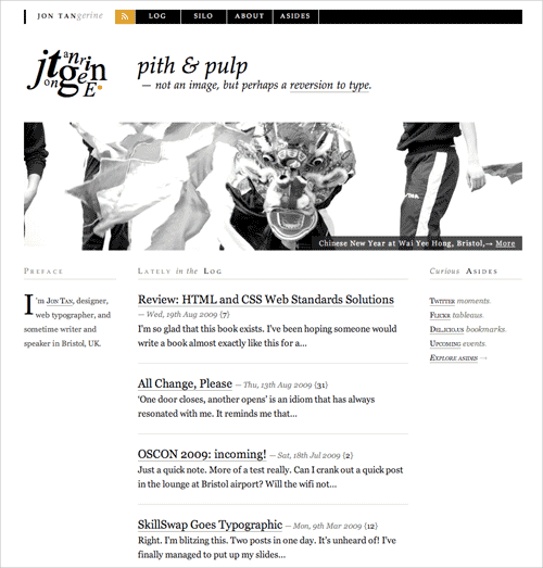
Jon Tan uses Baskerville antiques for headlines and Georgia for main text.
Verdana is used for the least headers. Only 10 sites use it as the beginning of the main text and only four for headlines. The reason for this is that Verdana leaves too much space between the characters, which makes text on large pins untidy. If you are going to use it for the title, then you might want to use the letter-spacing CSS property. As you can see, Georgia and Arial are the most popular fonts for headings.
Finally, we note that “alternative” fonts are used much more for headings than for body copy. Designers seem to be willing to experiment more with headings than with the main text ( from the editor: it is understandable - the text header is significantly smaller than in the main block ). Therefore, if you want to make some typographical changes to your next project, the headlines are probably the most acceptable place.
We wondered if the designers are ready to experiment with a dark background. To our surprise, we could not find a single typographical site using a dark color scheme.

The New Yorker uses a light palette, with Times New Roman for headlines and body text.
Pure white background was definitely the most popular. However, many of the designs avoid high-contrast pure black for completely white; the color of the text is often made a little lighter than pure black ( as amended, for example, I usually use # 272727 for text and completely white for the background ). Designers clearly focus on clarity and avoid experimenting with background colors. The contrast of black and white is light and easy to read, and therefore is the most used.
Of course, the choice of the font size of the header depends on the font used in the project. Anyway, in our study, the most popular font sizes are located in the range from 18 to 29 pixels, while the peaks of popularity fall in the intervals from 18 to 20 and from 24 to 26 pixels.
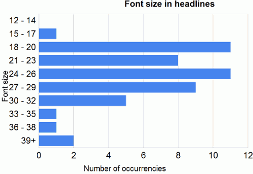
Our study did not reveal clear winners. The average font size for headings is 25.6 pixels. But note that any size between 18 and 29 pixels could be effective; it depends, after all, on how your headers relate to the design of the entire project.
We should also highlight Wilson Miner (Wilson Miner, screenshot below), using a massive font size of 48 pixels for its headings. His website is a special case, because the headers of his posts are extremely short, they consist of just a few words.

Do you remember the times about seven years ago when very small, hard-to-read elements were used in website design, and the main text was typed in the eighth pin in Tahoma? Small fonts have sunk into oblivion, and more and more designers are looking towards large fonts. Based on our research, we can distinguish a clear tendency for fonts of size from 12 to 14 pixels. The most popular font size (38%) is 13 pixels, the fourteenth point size is slightly more popular than the twelfth. Total, on average, the font size for the main text is 13 pixels.
We also noted more and more attention paid to small typographical details. In particular, dashes, quotes, footnotes, authors' names, introductory texts and others are very carefully set.
Typographica uses a large font for introductory text to the article, and the text of the article itself is of normal size.
To better understand the relationship between the font size of the header and the main text, for each site we took the font header relationship for the main text font and then averaged the values obtained. Thus, we obtained a certain generalized rule, which states that the ratio of the font size of the header to the font size of the main text is 1.96 . Thus, if you have already selected a size for the main text, you just need to multiply the value by two to get the size of the header text. Of course, it depends on your style; This rule will probably not give you a better ratio between the pins for the title and the main text. On the other hand, you can use the standard values (6, 7, 8, 9, 10, 11, 12, 14, 16, 18, 21, 24, 36, 48, 60, 72) or use the Fibonacci ratio (for example, 16 - 24 - 40 - 64 - 104) to obtain the most successful typographic result.
Leading (or line height) always depends on the font size you choose and the type format. Accordingly, the longer the line, the greater should be the leading. Therefore, it makes no sense to give here the most popular dimensions of the leading value in pixels. It will be much more useful to use some relative value, such as em or percentages, which are related to the length of the line and font size.
Based on our experience, we can draw the following conclusions:
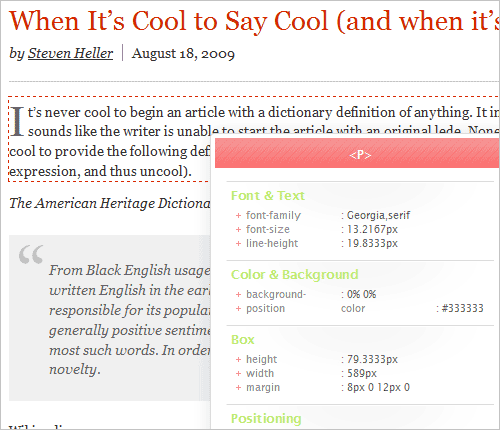
AIGA is a great example of optimal leading. Here, the font size is 13.21 pixels (translating from em), leading is 19.833 (translating from em). We calculate: 19.8333 ÷ 13.2167 = 1.5011.
So, as soon as you have solved the issue with the font size for the main text, then by multiplying this number by 1.5 you will get the best leading value. Further, multiplying the newly obtained value also by 27.8, you will get the optimal string length. Do not forget that your text will also need indents to give it “breathing”.

The New Scientist uses a distance of 20 pixels between paragraphs.
Based on the classic web typography rule, 55 to 75 characters per line are ideal. Surprisingly, our research shows that most sites use more value. We calculated how many characters can fit in a line using the standard font set by the designer. The maximum average result for one site is 88.74 characters per line, which is an incredible amount. Of course, the largest value differs from the average, which generally varies from 75 to 85. But even this value is much greater than the optimal one.
Among designers, the most popular are 73 to 90 characters per line, but we also found out of the ordinary examples: Monocle (47 characters per line) and Boxes and Arrows (125 characters per line). In order to get the clearest picture for each site, you will need to take the average number of characters for multiple lines.
The data obtained allow us to distinguish some principles for the rules of recruitment in web design. Note also that these data are not scientifically based and can only serve as guides:
Of course, these rules are not the law. However, they may well serve as a base, which you will form the basis of your design. Each site is unique, and you can change something at any of the stages for maximum results. You can also familiarize yourself with the comparative data table and independently use its data for further research.
( dated my debut translation, please report any inaccuracies found, I will try to fix them as quickly as possible )
We conducted extensive research on 50 popular sites for which typography is more important than usual, in order to highlight some common solutions and find answers to known problems in the design of texts. To study were selected popular newspapers, magazines, blogs and other resources, one way or another connected with the printing house. We carefully analyzed their typography and style sheets in search of similarities and differences. Also, we built a comparative table in which various parameters of websites are displayed (for example, the relationship between leading and line length).
Ultimately, we identified 13 common problems and questions related to typographic projects, and tried to find answers to them in our study:
- How popular are serif and sans serif fonts in headlines and body text?
- What fonts are used most often?
- What is the average font size?
- What is, on average, the ratio between the font size in the title and in the main text?
- What is the average leading value for the main text?
- What is the average ratio between the leading value and the font size for the main text?
- What is the average value of the ratio between leading and line length?
- What are the average indents between paragraphs?
- What is the average ratio of the indentation between paragraphs and leading?
- How are links stylistically highlighted?
- How many characters are usually used in a string?
- How often are links underlined?
- How often is font substitution used (sIFR and others)?
At the end of the study, we collected a large amount of data that we evaluated and prepared for this article. Based on statistics, we outlined a few rough recommendations for working with the kit. Please note that the rules obtained, although often, can not always be perceived as an immutable law.
Serif be?
Should designers use serif or sans serif fonts for body text? This is one of the most discussed, but never having a clear answer questions. Some prefer to use serifs (such short decorative touches on the ends of the letters, they probably saw) in the headlines, thus giving them a greater appeal. The main reason that you choose antiqua for the title is that with large font sizes, the title is easy to read and looks great. Plus, the contrast between the title antiqua and the main text grotesque can be attractive.
')
Among designers, there is also an opinion that serifs make it easier to read the main text, as if taking a look at the line. Thus, reading the text becomes more simple and convenient.
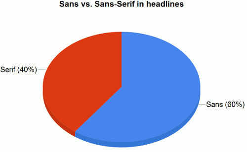
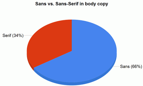
Based on our research, grotesque headings are still more popular than antiqua, despite the fact that the popularity of the former seems to have fallen in recent years.
- 60% of sites use grotesques for headlines, mostly Arial, Verdana, Lucida Grande and Helvetica. Among them: CNN , ArsTechnica , Slate , BBC and NewScientist .
- Only 34% of sites use antiqua for the main text. Among them: New York Times , Typographica , Time , AIGA and Newsweek .
- The most popular serif fonts for headlines are Georgia (28%) and Baskerville (4%).
- The most popular serif fonts for the main text are Georgia (32%) and Times New Roman (4%).
- The most popular sans serif fonts for headlines are Arial (28%), Helvetica (20%) and Verdana (8%).
- The most popular sans serif fonts for the main text are Arial (28%), Verdana (20%) and Lucida Grande (10%).
Two thirds of the sites we reviewed use grotesque for the main text. The main reason for this, apparently, is that, despite the growing popularity of font replacement technologies, such as, for example, Cufón , most designers still tend to main fonts. And here, in fact, they have only two options: Georgia and Times New Roman. Moreover, due to the reputation of Times New Roman (which seems to make your modern website design obsolete), of all the variety of available fonts, only Georgia remains. At the same time, grotesques offer an incomparably larger selection of styles for use on the web.
What is the most popular style?
Surprisingly, despite the growing popularity of font replacement methods and the growing availability of new pre-installed fonts (for example, installed fonts in Windows Vista and fonts for Mac), the resources studied by us used mostly traditional, web-based fonts. Except, perhaps, only Lucida Grande (which is pre-installed on Macs only), Helvetica and Baskerville.
As expected, for the main text most currently used are Arial, Georgia and Verdana. According to data from our study, about 80% of the sites used any of these three fonts. For the remaining 20%, Helvetica has become a favorite - a popular choice among designers, as, indeed, Lucida Grande.
Taking advantage of Verdana and Arial as a backup, the designer is really free to use non-standard fonts to achieve the best effect. For more information on advanced cascading table technology, see Nathan Ford in his Better CSS Font Stacks and Build Better CSS Font Stacks article from CodeStyle.
Jon Tan uses Baskerville antiques for headlines and Georgia for main text.
Verdana is used for the least headers. Only 10 sites use it as the beginning of the main text and only four for headlines. The reason for this is that Verdana leaves too much space between the characters, which makes text on large pins untidy. If you are going to use it for the title, then you might want to use the letter-spacing CSS property. As you can see, Georgia and Arial are the most popular fonts for headings.
Finally, we note that “alternative” fonts are used much more for headings than for body copy. Designers seem to be willing to experiment more with headings than with the main text ( from the editor: it is understandable - the text header is significantly smaller than in the main block ). Therefore, if you want to make some typographical changes to your next project, the headlines are probably the most acceptable place.
Light or dark background?
We wondered if the designers are ready to experiment with a dark background. To our surprise, we could not find a single typographical site using a dark color scheme.
The New Yorker uses a light palette, with Times New Roman for headlines and body text.
Pure white background was definitely the most popular. However, many of the designs avoid high-contrast pure black for completely white; the color of the text is often made a little lighter than pure black ( as amended, for example, I usually use # 272727 for text and completely white for the background ). Designers clearly focus on clarity and avoid experimenting with background colors. The contrast of black and white is light and easy to read, and therefore is the most used.
Average font size for headings
Of course, the choice of the font size of the header depends on the font used in the project. Anyway, in our study, the most popular font sizes are located in the range from 18 to 29 pixels, while the peaks of popularity fall in the intervals from 18 to 20 and from 24 to 26 pixels.
Our study did not reveal clear winners. The average font size for headings is 25.6 pixels. But note that any size between 18 and 29 pixels could be effective; it depends, after all, on how your headers relate to the design of the entire project.
We should also highlight Wilson Miner (Wilson Miner, screenshot below), using a massive font size of 48 pixels for its headings. His website is a special case, because the headers of his posts are extremely short, they consist of just a few words.
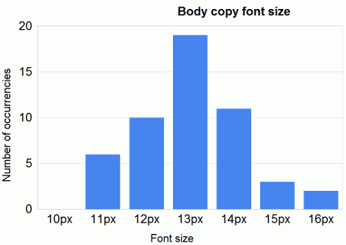
Average font size for body text
Do you remember the times about seven years ago when very small, hard-to-read elements were used in website design, and the main text was typed in the eighth pin in Tahoma? Small fonts have sunk into oblivion, and more and more designers are looking towards large fonts. Based on our research, we can distinguish a clear tendency for fonts of size from 12 to 14 pixels. The most popular font size (38%) is 13 pixels, the fourteenth point size is slightly more popular than the twelfth. Total, on average, the font size for the main text is 13 pixels.
We also noted more and more attention paid to small typographical details. In particular, dashes, quotes, footnotes, authors' names, introductory texts and others are very carefully set.
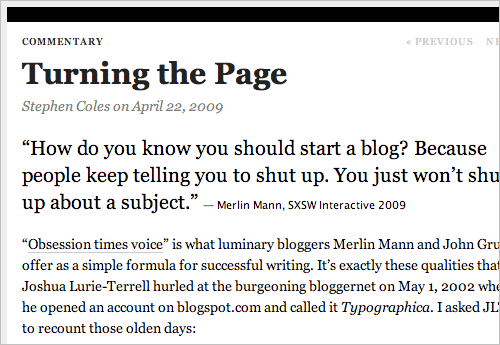
Typographica uses a large font for introductory text to the article, and the text of the article itself is of normal size.
The ratio between the size of the font in the title and in the main text
To better understand the relationship between the font size of the header and the main text, for each site we took the font header relationship for the main text font and then averaged the values obtained. Thus, we obtained a certain generalized rule, which states that the ratio of the font size of the header to the font size of the main text is 1.96 . Thus, if you have already selected a size for the main text, you just need to multiply the value by two to get the size of the header text. Of course, it depends on your style; This rule will probably not give you a better ratio between the pins for the title and the main text. On the other hand, you can use the standard values (6, 7, 8, 9, 10, 11, 12, 14, 16, 18, 21, 24, 36, 48, 60, 72) or use the Fibonacci ratio (for example, 16 - 24 - 40 - 64 - 104) to obtain the most successful typographic result.
Optimum leading for the main text
Leading (or line height) always depends on the font size you choose and the type format. Accordingly, the longer the line, the greater should be the leading. Therefore, it makes no sense to give here the most popular dimensions of the leading value in pixels. It will be much more useful to use some relative value, such as em or percentages, which are related to the length of the line and font size.
Based on our experience, we can draw the following conclusions:
- The ratio of leading to the font size of the main text is 1.48
Note that a value of 1.5 is a value that is usually recommended in classic typography books. Very few sites use values less than one and a half. Accordingly, the number of sites using a higher value decreases, depending on the distance from 1.5. - The ratio of the length of the line to leading is equal to 27.8
On average, the length of the line is 538.64 pixels (not counting the external and internal indents), which is quite a lot, because most sites use the twelfth or thirteenth pin for the main text. - The ratio of the distance between paragraphs to be equal to 0.754
We were surprised by this result. It turns out that the distance between paragraphs (that is, the distance between the last line of the first paragraph and the first line of the second) is rarely equal to the height of the line (which is the best from the point of view of an ideal vertical rhythm). Much more often, the distance between paragraphs is only 75% of leading. The reason for this may be that leading includes distance for descenders, and since most characters do not have descenders, an extra distance is created below the line.
AIGA is a great example of optimal leading. Here, the font size is 13.21 pixels (translating from em), leading is 19.833 (translating from em). We calculate: 19.8333 ÷ 13.2167 = 1.5011.
So, as soon as you have solved the issue with the font size for the main text, then by multiplying this number by 1.5 you will get the best leading value. Further, multiplying the newly obtained value also by 27.8, you will get the optimal string length. Do not forget that your text will also need indents to give it “breathing”.
The New Scientist uses a distance of 20 pixels between paragraphs.
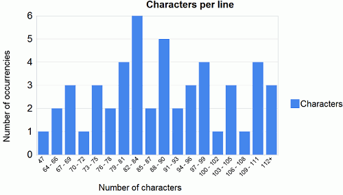
How many characters to use per line?
Based on the classic web typography rule, 55 to 75 characters per line are ideal. Surprisingly, our research shows that most sites use more value. We calculated how many characters can fit in a line using the standard font set by the designer. The maximum average result for one site is 88.74 characters per line, which is an incredible amount. Of course, the largest value differs from the average, which generally varies from 75 to 85. But even this value is much greater than the optimal one.
Among designers, the most popular are 73 to 90 characters per line, but we also found out of the ordinary examples: Monocle (47 characters per line) and Boxes and Arrows (125 characters per line). In order to get the clearest picture for each site, you will need to take the average number of characters for multiple lines.
Addition
- 46% of sites emphasize links in the main text, while others only highlighted them with excellent font color or bold.
- 6% of sites in one way or another used pictures for headlines or main texts (for example, Monocle , New Yorker , Newsweek ).
- 96% of sites do not align text width.
- On the text sites, the left margin is set to an average of 11.7 pixels, counting from the left border of the area.
findings
The data obtained allow us to distinguish some principles for the rules of recruitment in web design. Note also that these data are not scientifically based and can only serve as guides:
- For the main text and headings, you can use a serif font with or without serifs, but grotesques are still more popular for headlines and for plain text.
- Typically, Georgia, Arial or Helvetica fonts are chosen for headings.
- Georgia, Arial, Verdana and Lucida Grande are usually chosen for the main text.
- The most popular font sizes for headings range from 18 to 29 pixels.
- Most often, for the main text, pins from 12th to 14th are used.
- Leading refers to the font size of the main text as 1.48.
- The ratio of the length of the line to leading is equal to 27.8.
- Indent between paragraphs refers to line leading as 0.754.
- The best is from 55 to 75 characters per line, but in practice from 75 to 85 characters are most popular.
- The body text is usually left justified; it is rarely replaced with images; Links are usually highlighted either underlined, or in color, or in bold.
Of course, these rules are not the law. However, they may well serve as a base, which you will form the basis of your design. Each site is unique, and you can change something at any of the stages for maximum results. You can also familiarize yourself with the comparative data table and independently use its data for further research.
( dated my debut translation, please report any inaccuracies found, I will try to fix them as quickly as possible )
Source: https://habr.com/ru/post/67671/
All Articles