22 things you didn’t know about your customers
This is a translation of an article from an English-language blog. I, as a translator, cannot unconditionally agree with all the statements of the author, but found it necessary to translate this article so that we can think about all these things when testing. Only testing will tell how these statements are true in each case.
It is also quite funny to observe the difference in technical data for Russian and American audiences. So read.
You do not know something about your customers. It's not about you, but about them. But you need to know it. Here are some hard lessons that I have learned over the years - they relate to usability, favorite blisters and other funny things. Learn these lessons and get more satisfied customers, visitors, readers, and fans:
The main principle of usability: people find it difficult to read online. Much harder than typing. Remember this. Write it on your forehead. The fine print, the weird page layout and the abnormal color schemes may look great, but they will negatively affect your business in the long run.
')
The oldest marketing rule that has come since when we printed on paper and used mail and other things: write paragraphs no longer than 4-5 lines. Read the My Life in Advertising and Scientific Advertising (Advertising Age Classics Library) book to find out how little has changed in the rules of the game since that time.
Reading from the screen is hard. An ordinary person at best can read 10-20 words per line. Not more. If you use microscopic fonts to cram a bunch of words on a line, correct it.
Long line spacing improves text readability. Fields shorten lines, and fewer words remain on the line (see above).
People really read faster if the line spacing is very small, but they understand less and remember less. Wichita University's excellent study proves it.
We are accustomed to read dark text on a light background. We are used to it. so what is it:
Eat more of these soft French buns and drink poison
read better than

Dark background really attracts attention, but fill it in the whole page and get a headache.
Do you hate your audience? Not? Then use dark text on a light background.
With comfortable scroll wheels, people stopped being upset about scrolling - it's no longer a usability problem, unless, of course, you place text on 5,000 words. It is not necessary to cram the home page, or any other page of your site, into one window. Long pages - is OK!
You can write the text in one line, and the colors will look like red, green, blue.
Or, you can list the list so that the colors look like this:
Read the excellent article by Jacob Nielsen on the user's eye movement .
Put the most important on this path and get good results.
Seriously. No one ever memorizes website addresses. Of course, if you mts.ru or mail.ru, you remember. But if you are drom.ru or autocadabra.ru, good luck.
Give people plenty of opportunities to subscribe, bookmark or memorize the site. And reserve addresses similar to yours to protect the name.
Do not make them login to place an order. Let them just click on “checkout”. Be sure to give them the opportunity to save their information and create an account. At the end of the checkout process . At this point, the lulling feeling that accompanies the process of parting with the hard-earned banknotes is strong enough to trust you.
I know what you think: “Great, I’ll just place the login form on the left and add a little button on the right that says you can enter as a guest.”
Not. It:
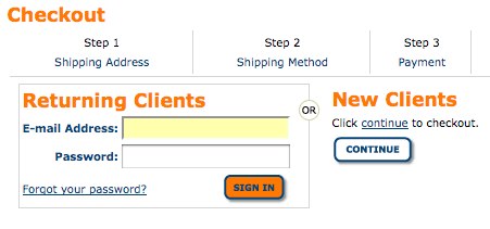
tells me the buyer: “You do not belong to our exclusive club. Click on the button "Continue" and buy, but you are a loser . "
In all seriousness, consumers do not believe the Internet. The probability that a credit card is stolen from them in a restaurant is 10 times more, but it doesn't matter. They see the web as a huge interconnected haven of thieves. If you even hint that you are going to retain their information, you lose their trust. Do not do this.
Just let them place an order. In the name of reasonable, good and eternal. Can you just forget about it?
The words of Jacob Nielsen are immortal: "Most people just want to get in, get and leave."
Adding dynamic “webbolant things” (shuddering) just because “that guy” has them is stupid. Anything that makes me click twice instead of once will impress me for the first time and cool me down in the future. Examples include:
Do not believe my words. Take a look at the website of the super-advanced design company: Apple.com. Are there many special effects?
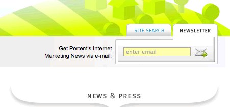
It's hard to believe after all this hysteria about spam, but a significant part of your audience still wants to receive the newsletter. So make it easily accessible.
I was the main fighter against this idea. On our corporate website, we had a small icon of a subscription to an e-mail in the form of a letter, buried a third deep into the page.
We made the simplest change by adding a subscription form to each page next to the icon, and in a week we saw the increase in the number of subscribers:
If you can say “AFK Sistema is discussing the purchase of Infineon,” just say it. Do not say "macroelectronics showed up to microelectronics". The first simply reports the facts. The second sounds funny, but does not help in this.
Your online audience is seduced by clarity, great product, good story and the like. They are not at all tempted by secrets.
Therefore, a headline like “Unsubscribe in Receipt” does not help as much as “Yushchenko responded to Medvedev's message,” and “Laski Show” is meaningless compared to “Obama's visit to Moscow took place in a surprisingly benevolent atmosphere.”
It's easy for a site visitor to get lost. Broken link here, missing button there, and bam, they are confused and angry.
Get a friendly 404 error page, a good search tool on the site and really clear navigation. Then, follow the user's requests and 404 errors - they will say where your visitors want and do not go.
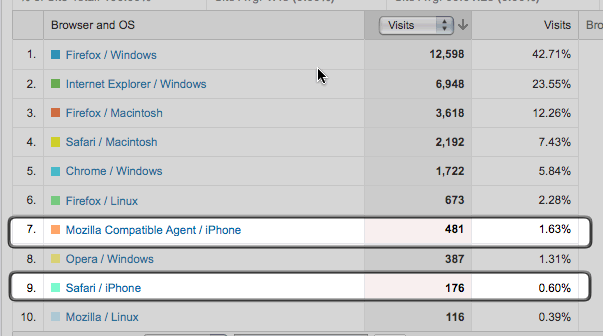
If you are doing business in North America, it is likely that your customers do not go to your website from a cell phone. Even in the blog where this article is posted, in which the share of advanced techies is higher, there are very few views from a mobile phone:
Plan a mobile version. Learn to create mobile CSS. But do not rebuild the entire project and do not double its cost just for the sake of compatibility with mobile phones.
Your audience does not know you. They are not looking for a name. They are looking for an answer to their question and will find you if you give an answer to it. Therefore, although it is great to be in the first position in search engines by your name, it will not affect your income.
Not everyone understands that Firefox is a great revelation. Most of the audience obviously still uses IE:
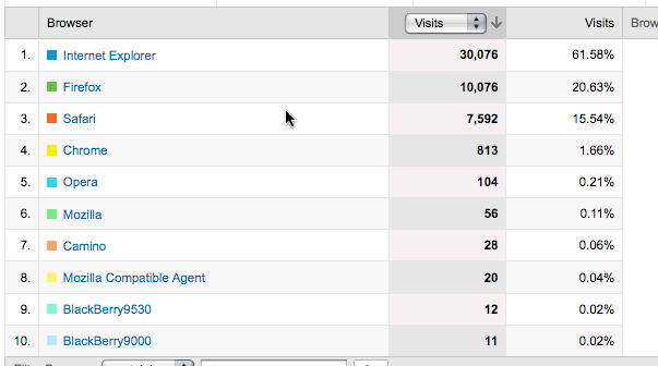
And many of them still use (barely audible) its sixth version:
Design, develop and plan according to this fact.
On the other hand, most of your audience is sitting behind new monitors. Feel free to design a 900px wide page:
Check your site statistics before making changes!
People buy what they want, not what they need. We all need auto insurance. We all want an iPhone or other shiny things.
I don’t know about you, but I don’t have the same feeling of joyful anticipation that I get at the thought of HTC Hero when I am looking for an insurance company for a car.
We can all cry about it, but we can use it. Consumer need to want. A really cool marketer explains why you want what you need.
(I borrowed the principle of desire and need from some great marketer, whom I cannot remember. I myself am not smart enough to come to this)
The list is being extended all the time. Look at the analytics system report. Learn from how your audience responds to changes on the site. Use the brain and never stop asking questions why everything is going the way it is.
It is also quite funny to observe the difference in technical data for Russian and American audiences. So read.
You do not know something about your customers. It's not about you, but about them. But you need to know it. Here are some hard lessons that I have learned over the years - they relate to usability, favorite blisters and other funny things. Learn these lessons and get more satisfied customers, visitors, readers, and fans:
1. Reading from the screen is hard for everyone.
The main principle of usability: people find it difficult to read online. Much harder than typing. Remember this. Write it on your forehead. The fine print, the weird page layout and the abnormal color schemes may look great, but they will negatively affect your business in the long run.
')
2. They love short paragraphs.
The oldest marketing rule that has come since when we printed on paper and used mail and other things: write paragraphs no longer than 4-5 lines. Read the My Life in Advertising and Scientific Advertising (Advertising Age Classics Library) book to find out how little has changed in the rules of the game since that time.
3. They love short strings.
Reading from the screen is hard. An ordinary person at best can read 10-20 words per line. Not more. If you use microscopic fonts to cram a bunch of words on a line, correct it.
4. They love large line spacing and and margins.
Long line spacing improves text readability. Fields shorten lines, and fewer words remain on the line (see above).
People really read faster if the line spacing is very small, but they understand less and remember less. Wichita University's excellent study proves it.
5. They love dark text on a light background.
We are accustomed to read dark text on a light background. We are used to it. so what is it:
Eat more of these soft French buns and drink poison
read better than
Dark background really attracts attention, but fill it in the whole page and get a headache.
Do you hate your audience? Not? Then use dark text on a light background.
6. They are not against vertical scrolling.
With comfortable scroll wheels, people stopped being upset about scrolling - it's no longer a usability problem, unless, of course, you place text on 5,000 words. It is not necessary to cram the home page, or any other page of your site, into one window. Long pages - is OK!
7. Lists make life easier for them.
You can write the text in one line, and the colors will look like red, green, blue.
Or, you can list the list so that the colors look like this:
- Red;
- Green;
- Blue.
8. The user's gaze describes the F-shaped path when viewing the page.
Read the excellent article by Jacob Nielsen on the user's eye movement .
Put the most important on this path and get good results.
9. They do not remember the address of your site.
Seriously. No one ever memorizes website addresses. Of course, if you mts.ru or mail.ru, you remember. But if you are drom.ru or autocadabra.ru, good luck.
Give people plenty of opportunities to subscribe, bookmark or memorize the site. And reserve addresses similar to yours to protect the name.
10. They do not want to enter the site.
Do not make them login to place an order. Let them just click on “checkout”. Be sure to give them the opportunity to save their information and create an account. At the end of the checkout process . At this point, the lulling feeling that accompanies the process of parting with the hard-earned banknotes is strong enough to trust you.
11. They don't even want to think that they need to log in.
.I know what you think: “Great, I’ll just place the login form on the left and add a little button on the right that says you can enter as a guest.”
Not. It:
tells me the buyer: “You do not belong to our exclusive club. Click on the button "Continue" and buy, but you are a loser . "
In all seriousness, consumers do not believe the Internet. The probability that a credit card is stolen from them in a restaurant is 10 times more, but it doesn't matter. They see the web as a huge interconnected haven of thieves. If you even hint that you are going to retain their information, you lose their trust. Do not do this.
12. They do not want even a small hint that at some point in the future they will have to log in.
Just let them place an order. In the name of reasonable, good and eternal. Can you just forget about it?
13. They do not want "interaction."
The words of Jacob Nielsen are immortal: "Most people just want to get in, get and leave."
Adding dynamic “webbolant things” (shuddering) just because “that guy” has them is stupid. Anything that makes me click twice instead of once will impress me for the first time and cool me down in the future. Examples include:
- Shopping baskets with drag and drop. It's easier to click.
- Screensavers in front of the main page. Clicking on “skip screensaver” is an extra job.
- The effects of slow ascent, manifestation or approach. Every time you make them, you make the buyer wait. What for?
Do not believe my words. Take a look at the website of the super-advanced design company: Apple.com. Are there many special effects?
14. They really want your newsletter.
It's hard to believe after all this hysteria about spam, but a significant part of your audience still wants to receive the newsletter. So make it easily accessible.
I was the main fighter against this idea. On our corporate website, we had a small icon of a subscription to an e-mail in the form of a letter, buried a third deep into the page.
We made the simplest change by adding a subscription form to each page next to the icon, and in a week we saw the increase in the number of subscribers:
15. They don't care how smart you are.
If you can say “AFK Sistema is discussing the purchase of Infineon,” just say it. Do not say "macroelectronics showed up to microelectronics". The first simply reports the facts. The second sounds funny, but does not help in this.
16 They are not lured by secrets.
Your online audience is seduced by clarity, great product, good story and the like. They are not at all tempted by secrets.
Therefore, a headline like “Unsubscribe in Receipt” does not help as much as “Yushchenko responded to Medvedev's message,” and “Laski Show” is meaningless compared to “Obama's visit to Moscow took place in a surprisingly benevolent atmosphere.”
17 They are often lost.
It's easy for a site visitor to get lost. Broken link here, missing button there, and bam, they are confused and angry.
Get a friendly 404 error page, a good search tool on the site and really clear navigation. Then, follow the user's requests and 404 errors - they will say where your visitors want and do not go.
18 They do not use cell phones. For now.
If you are doing business in North America, it is likely that your customers do not go to your website from a cell phone. Even in the blog where this article is posted, in which the share of advanced techies is higher, there are very few views from a mobile phone:
Plan a mobile version. Learn to create mobile CSS. But do not rebuild the entire project and do not double its cost just for the sake of compatibility with mobile phones.
19 They are not looking for your name.
Your audience does not know you. They are not looking for a name. They are looking for an answer to their question and will find you if you give an answer to it. Therefore, although it is great to be in the first position in search engines by your name, it will not affect your income.
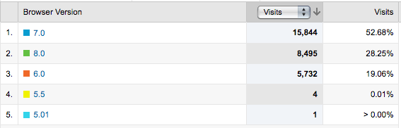
20 They still use Internet Explorer.
Not everyone understands that Firefox is a great revelation. Most of the audience obviously still uses IE:
And many of them still use (barely audible) its sixth version:
Design, develop and plan according to this fact.
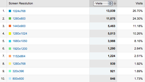
21. They buy cool monitors (and computers).
On the other hand, most of your audience is sitting behind new monitors. Feel free to design a 900px wide page:
Check your site statistics before making changes!
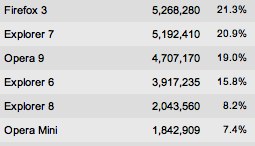
Note: although in general the same can be said about our audience, there are nuances:
Opera Mini has a tangible share, according to Liveinternet statistics on the sites of the RuNet. A significant percentage of mobile screen resolutions are also related to this:
You can also rejoice at the fact that alternative browsers have spread more and more, but IE6 cannot be dismissed for at least another 9 months.

22. They want to
People buy what they want, not what they need. We all need auto insurance. We all want an iPhone or other shiny things.
I don’t know about you, but I don’t have the same feeling of joyful anticipation that I get at the thought of HTC Hero when I am looking for an insurance company for a car.
We can all cry about it, but we can use it. Consumer need to want. A really cool marketer explains why you want what you need.
(I borrowed the principle of desire and need from some great marketer, whom I cannot remember. I myself am not smart enough to come to this)
That's the problem...
The list is being extended all the time. Look at the analytics system report. Learn from how your audience responds to changes on the site. Use the brain and never stop asking questions why everything is going the way it is.
Source: https://habr.com/ru/post/67056/
All Articles