JQuery Animated Menus
 I recently came across the Dragon Interactive website (dragoninteractive.com). This site is pretty solidly made in terms of design. And the highlight can be called their animated menu. Well, if it was done in Adobe Flash, I would not even mention this. But on closer inspection, it turned out that their menus are a combination of simple XHTML, CSS, and Javascript. In this article, I'm going to demonstrate how to create menus (very close to Dragon Interactive's menu).
Watch the demo
Download PSD
We design sprite
To get started, you need to create a sprite with your own design in Adobe Photoshop or in another graphic editor. I also quickly created a repeating nice background for the buttons:

')
XHTML markup
Here is the XHTML markup that is used in the demo:
< ul id ="menu" >
< li >< a href ="#" class ="home" >< span ></ span ></ a ></ li >
< li >< a href ="#" class ="portfolio" >< span ></ span ></ a ></ li >
</ ul >

* This source code was highlighted with Source Code Highlighter .
As you can see, an unordered list is used for the menu structure. In this article I'm going to create only 2 menu items. You can add as you wish. Please note that each item has its own class assigned to it. We will need this division when creating the CSS.
CSS
For the demo, I assigned a repeating image as a background for the <ul> element. Also assigned height and width:
ul#menu {
width:80%;
height:102px;
background:url(bg.png) repeat-x;
list-style:none;
margin:0;
padding:0;
padding-top:20px;
padding-left:20%;
}
Now use the float property to align the <li> elements horizontally:
ul#menu li {
float:left;
}
Well, that got to the most interesting! We need to add a sprite as a background image for each menu item. Since we need to display only a certain part of the sprite for each menu, we limit the drawing to the height and width, and the desired part is obtained by shifting the image. Let's look at the next sprite:

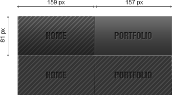
Each column represents a separate menu item. In our case there are 2 columns, since we only make 2 menu items. The bottom row represents the appearance of the menu when the mouse cursor is hovering over it.
Now we set the height of the menu button 81px and the width 159px. If we align the image to the upper left corner, we will see only the “Home” button:

This is because the “Home” button was drawn with exactly this height and width. Since the background image is positioned in the upper left corner - it will be the only thing that fits inside the menu item - which we actually sought.
How do we describe this in CSS? First you need to understand that in many cases we will need more than just 1 menu item (in our case, 2 buttons). Therefore, it would be easier if we wrote some common CSS for all buttons (for example, CSS that will be inherited by each menu item). We will also be able to add (or modify) these common CSS attributes by writing separate guidelines for individual classes for each individual button (see XHTML markup). Here is the general CSS used in the demo:
ul#menu li a {
background:url(sprite.png) no-repeat scroll top left;
display:block;
height:81px;
position:relative;
}
In this code, we aligned the background image to the upper left corner. For the “Home” button, everything will be fine. But for the Portfolio button, we need to rewrite the image positioning attribute using a separate class (see XHTML markup).
Also note that we set the height here, since all the buttons have the same height. Since the default buttons are displayed with the inline property, we must use “display: block” to use the specified height. And at the end we have to specify the relative positioning. Later it will become clear why we need it.
Now we need to write the CSS for each individual button. To do this, we use separate classes for buttons (see markup). In our example, only 2 buttons. The “Home” button is assigned the “home” class. The “Portfolio” button is “portfolio”. Thus, it became possible to assign separate CSS properties for each button:
ul#menu li a.home {
width:159px;
}

ul#menu li a.portfolio {
width:157px;
background-position:-159px 0px;
}
Here we set the width of each button, since each of them can have its own width depending on the design. Also here we rewrite the background-position attribute if necessary. You do not need to do this for the “Home” button, since the desired value is set in the general CSS properties (“top left”).
For the Portfolio button, we need to set new coordinates inside the sprite. Since the “Home” button is 159px wide, we will need to move the background image 159px to the left to display the area for the “Portfolio”. This is achieved by setting “background-position: -159px 0px;”. We tell the browser that we need to shift the background image 159 pixels to the left and 0 pixels down.
Now we have to set the hovering behavior (state of "hover"). The animation should make a smooth transition between 2 button states. To set the state of "hover" we will use the <span> tag. Next, we use CSS in such a way that the span tag completely fills the entire button (it becomes exactly the same size). We need to move the image down for the span tag to display the “hover” area of the sprite. As before, we will use common CSS:
ul#menu li a span {
background:url(sprite.png) no-repeat scroll bottom left;
display:block;
position:absolute;
top:0;
left:0;
height:100%;
width:100%;
z-index:100;
}
Notice that here we again use “display: block”, since by default the <span> tag is displayed as inline. Now, when it is displayed as a block, we can set the height and width to 100% - to completely fill the button and make them the same size. Also note that we assign the span tag “position: absolute” so that you can specify a z-index. By setting a higher z-index, we are guaranteed to get the background image of the span tag over the background image of the button. All that is left to do now is to align the background image for the <span> tag:
ul#menu li a.home span {
background-position:0px -81px;
}
ul#menu li a.portfolio span {
background-position:-159px -81px;
}
We shift the background image of each span tag by 81 pixels down (since the height of the “Home” button is 81px). This will display the “hover” status via the span tag. As before, we will also shift the background to the left by 159px for the Portfolio button.
Use jQuery to animate
It will be extremely easy to achieve animation here. We will use jQuery to animate the transparency of the span tag. Remember that the span tag characterizes the “hover” state. Therefore, the state when the span is visible should be displayed when the mouse is hovered. Thus, we need to hide this state at the time of loading the page. To do this, we set the transparency of the span tag to "0":
$( function () {
// set opacity to nill on page load
$( "ul#menu span" ).css( "opacity" , "0" );
// the rest of the code will go here
});

* This source code was highlighted with Source Code Highlighter .
Placing the code inside "$ (function () {...});" we tell the browser to execute the code only when the page has loaded.
To add animation, we use the following code:
// on mouse over
$( "ul#menu span" ).hover( function () {
// animate opacity to full
$( this ).stop().animate({
opacity: 1
}, 'slow' );
},
// on mouse out
function () {
// animate opacity to nill
$( this ).stop().animate({
opacity: 0
}, 'slow' );
});

* This source code was highlighted with Source Code Highlighter .
Combining all Javascript together, we get the following:
<!-- Include jQuery Library -->
<script src= "jquery-1.2.2.pack.js" type= "text/javascript" ></script>
<!-- Let's do the animation -->
<script type= "text/javascript" >
$( function () {
// set opacity to nill on page load
$( "ul#menu span" ).css( "opacity" , "0" );
// on mouse over
$( "ul#menu span" ).hover( function () {
// animate opacity to full
$( this ).stop().animate({
opacity: 1
}, "slow" );
},
// on mouse out
function () {
// animate opacity to nill
$( this ).stop().animate({
opacity: 0
}, "slow" );
});
});
</script>

* This source code was highlighted with Source Code Highlighter .
First we include the jQuery library. You can read more about animation in jQuery in the documentation . We need one final touch in CSS to make sure that the cursor is displayed as a pointer at the time of mouseover:
ul#menu li a span:hover {
cursor:pointer;
}
The complete source code is available on the demo page . It remains only to add that the code works stably with Firefox and IE7, but IE6 can and will most likely be a completely different story.
PS
at the time of this writing, the author used jQuery version 1.2.2, currently the current release is 1.3.2 .
Source: https://habr.com/ru/post/65917/
All Articles