Charts.HoHli.com service update

At the end of 2007, I launched the service charts.hohli.com , this service is based on the Google Charts API and allows generating graphs. And now, after a year and a half, I decided to upgrade the service ...
')
And what made me take this step? Quite recently, I had to use my own service - and there was a feeling that the project was not divided, but my own, my own, it became sad - I got into the code, and there ...
And there my first steps in learning JavaScript (no, of course, I had previously written form validators, etc., etc., but this project was completely in JS). I then used Prototype.js + Script.Aculo.Us , but somehow so timidly that I decided not to pull at my old code, but to write everything from scratch using jQuery.
For starters, I googled on the topic of ready-made jQuery plugins - I found two: jQuery Google Charts and gChart , but to my regret, the first one was damp, and the second was mediocre with jQuery, and was extremely inconvenient for my purposes. As a result, I decided to write my own solution, which I will soon try to upload as a jQuery plugin. In addition to this “plugin”, the script charts.dom.js was also written - it is he who is responsible for manipulating DOM on the page and updating the preview.
Functionality
In addition to fixing minor bugs, the following features were also added:
- Parsing the URL of the image - in order to give users the opportunity to further change the already created schedule
- New parameter "Max Data Value" - allows you to raise the "ceiling" of the chart
- Added the ability to "fill" line charts (option "fillarea")
- Grid support added (with fine tuning)
- Added bar graphs settings (width, distance)
- More possibilities for changing the background of images (gradient and zebra added)
Appearance
The service was redesigned - after all, minimalism should not be clumsy ... The design was taken as a basis from the HoHli.com website, and all controls were adjusted to it:
Selecting the type of graphics - got rid of radio-buttons and chose more presentable images, compare:

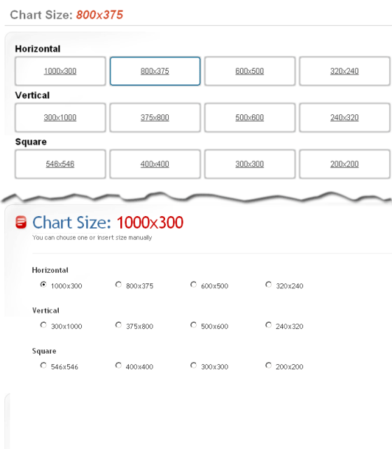
The choice of chart size was also updated:

Color-picker did not stand aside:

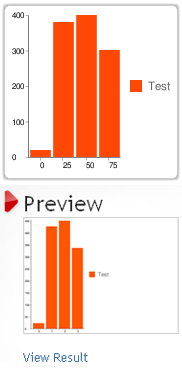
Redid the preview graphics:

Added tooltips - although the service interface is intuitive, but some details are still worth clarifying:

Future plans
- Add Russian interface language
- Add marker support
- Add the ability to change line styles
- Add translucency support for background
- Write jQuery plugin
About monetization
For monetization, Google AdSense was chosen, for a year and a half its figures were:
- impressions - 38 167
- clicks - 3 609
- CTR - 9.46%
- Profit - $ 218.66
Alternative monetization through SAPE (ref. Link) brought me ~ $ 200 per year (only 3 links on the main one).
Practically it was not engaged in promotion of a service - there was only a post on Habré , yes the link in Google Groups was left. At the same time, Google PR jumped to 5 and slid a little to 2 ...
About time spent
It took me about 16-20 hours to create the first version, about 24 hours was spent on updating the service. On the basis of returns, one can say that one hour of my work on the first version brought me $ 20. Now I will wait and hope for a return on the “renewal” ...
As a conclusion, we can say that services "for the people" bring both moral and material benefits, do not be lazy to create them ...
PS Old service continues to work at: http://charts.hohli.com/old/
Source: https://habr.com/ru/post/63496/
All Articles