Design audit on the example of the famous portal
Almost every designer at least once in his practice faced the following problem: everything seemed to be working out well, but something was wrong somewhere, there is a feeling of some sort of undoing and untidiness. Someone in this case, habitually waving his hand and, hoping for the incompetence of the client, will display the unfinished site on the Web. Someone will start a series of searches for solutions to the problem and go into the deep jungle of endless rework and refinement. And almost no one will turn for help to specialists who deal directly with this category of problems - design auditors. And in vain. The audit of sites as a whole only relatively recently began to arouse interest in our country, experts in the field of site usability, promotion and promotion appeared. But only a few are engaged in directly improving the appearance, and very few people know about them.
Of course, in large and reputable studios there are qualified art directors who will bring any website to gloss. But, first, not always and everywhere there is such a person. For example, the site was ordered from a freelancer who did everything well, but made a number of minor mistakes and shortcomings from the point of view of professional design. And secondly, even after the diligent work of a high-class art director, there may well remain a field of activity for a design auditor with a keen eye.
In this article I would like to take a practical example of a well-known western portal to analyze practical methods of visual improvement of a site.
')
ATTENTION: the article has a large number of large images.
_________________________________________________________________________________
So, for examples, we will not go far. Take the two famous portals of the largest football associations: UEFA and FIFA .
One can argue about the expediency and modernity of this kind of design; arrange a debate about which design school is better: European or American; dilute the long controversy about the old-fashioned portal style design. We will not do this. Just take it for granted: since such sites exist on the Web (and you will find thousands of similar portals with very well-known logos in caps), it means someone makes them, gets paid for it, and many other people consume it every day. What is important to us is that such portals consist of a set of text blocks somehow arranged, which allows us to analyze each region separately.
FIFA site compared with UEFA looks much better. The point here is not the very style of design and some frills. Simply, there is much less untidiness, mistakes and inaccuracies in the placement and interaction of blocks. In short, at FIFA visible work art director. However, in this case, as mentioned above, you can find and eliminate a considerable number of small glitches.
And for the site UEFA try to make a finalization of the design.
It should be noted that in design audit there are three main methods:
- Re-color, repainting. Let's say you need to make the whole site brighter or softer, eliminate the feeling of dirt and heavyness, shift the scale to warmer or cooler colors, etc. Typically, this method is applied to some separate blocks, but can be applied to the entire site as a whole.
- Re-layout, re-layout. From the relocation of the terms of the sum in the design often changes. Because sometimes you need to shuffle the blocks, resize, align the columns to fit the layout to a more balanced look. For otherwise one column may be too short, while the other will hang a “sheet” on several screens.
- Details tuning, tuning details. Actually, the most popular and important method. Here, indents from bullets are aligned, typography is customized, icons, logos, bullets, tickers and other design elements are being finalized.
Repainting and rearranging is most often not required or prohibited by the client: he wants to leave it as it is (he likes the color scheme and the location of the blocks). In this case, we also will not change almost anything, only slightly correct the color in a couple of places and move blocks a little. But the detailed tuning will do the maximum.
The UEFA portal changes almost every hour, blocks are rebuilt, information changes, etc. But we are interested in some specific static state of the site.
At the time of this writing, the appearance of the portal was like this .
Since there is almost no green on the UEFA website, I will make all the correction frames and footnotes in this color.
_________________________________________________________________________________
Reassembly of blocks
First of all, consider the entire layout in its entirety in a reduced form. In Photoshop, it’s convenient to do this on a scale of 25% - a sufficiently large site layout fits on the screen, and on this scale, text and graphics are best smoothed, while on most other scales, the view is somewhat sloppy.
Sadly, this site should have been stabilized by slightly shuffling the blocks at the bottom. The client needs to be convinced that, in this form, the site “collapses” on the right side, because on this side there is an impressive emptiness that destabilizes the whole structure. There are also irrational voids in other places:

After a little re-layout, you can get something like this:

All voids are filled, the blocks are stabilized relative to each other. Perhaps it will not come out immediately to take such steps. Some areas are tightly connected with each other, and it will not be possible to transfer them to another column, shrink or expand. You may need to add some additional block. Here, there should always be solutions that have been developed. For example, you can offer the client to include a block with surveys (if there isn’t already), or something like “Photo of the Day”. Well, either pull heels or other headers from the forum, implement informers from other sites, or simply increase the number of news in the previous block by a few lines. It is much harder to convince a client to abandon a block or shrink it, to reduce the number of links or headers.
In any case, the redesign of blocks is important at an early stage, because it allows you to get a more capacious and balanced design.
I can argue fans of "empty space". Say, do not touch the vast voids, everything is fine. Yes, the "white space" is very important, and we will return to this issue. But these voids must always be justified. If they do not emphasize anything, do not serve as a means of attracting attention, and are formed spontaneously due to flaws in the layout, then these are parasitic phenomena, and they certainly need to get rid of. Because on small screens with smooth scrolling, sooner or later, one single long narrow column is found in absolutely empty space, and this does not at all contribute to a better perception of information. In addition, this kind of portals should save space, cherish space and not waste around dozens or even hundreds of pixels. It is necessary to remember an important postulate: in a professionally executed design every block, every detail is justified and carries a certain semantic load. Even if it is a nondescript piece of white field.
At the end, when we sum up, we will try to add and trim something, so that this layout is balanced.
_________________________________________________________________________________
Intercolumn and line spacing
Another hypostasis re-layaut, which requires maximum attention from the layout designer. As a rule, HTML coders neglect the values of vertical and horizontal indents, and then very carelessly arranged blocks are obtained.
From personal experience, I will say that indents that are multiples of 10 or 5 pixels are the most convenient. In rare cases, you can use values like 12 or 27 points, but still round them to the nearest values (10 or 15, 25 or 30) - it will be much easier to make calculations in the future with the layout of the layout. The designer should arrange the guides in advance in order to correctly set the distance between the columns that are convenient for work. You also need to make sure that the indents of the text from the frames are the same size everywhere.
On the UEFA website we are expected by a colorful zoo of various indents (between columns, from edges to frames and from frames to objects):

In general, the uttermost mess. Obviously, such a difference in indentation values (from 1 to 12 and from 15 to 18 all values are found!) Is striking even to an uninitiated visitor, and inaccurately aligned information is perceived worse, plus a subconscious feeling of slight discomfort remains. For many years of existence of strict basics of typography and text design (thanks to the Swiss and Chehold), people have become accustomed that the concept of “smooth text” is equivalent to the words “professional” and “beautiful”.
The impression is aggravated by approximately the same orgy reigning in horizontal indents. Which, however, already go out of the re-layout area, since the interline distances with multi-column layout play a slightly different role and are easily modified without requiring turning the whole site as a whole.
And in the case of these uneven verticals, there can be only one conclusion: immediately redo the entire layout. We'll have to sweat a bit, putting in order the attributes in the style sheets.
What should be done? The total width of the layout is 1000 pixels. The layout is divided into three equal-sized columns (to allow for on-the-fly column shuffling) 320 pixels wide. Then the column spacing should be 10 pixels: 10 + 320 + 10 + 320 + 10 + 320 + 10 = 1000.
We will need four types of vertical indents:
- The distances between the frames of the two columns, the column spacing. Now they range from 16 to 18 pixels. But judging by the above calculations, they should be equal to 10 points. Indent the same for the text and graphic objects from the frames, as well as from the vertical borders of the dark plates.
- The gaps between the photos will be 3 pixels.
- Indents in tabular cells, distances from photos to accompanying text - 5 pixels.
- In certain cases we can use jigs in 30, 20 and 15 points.
Approximately the same will be done with horizontal indents.
So global changes have been made, and the layout has been redesigned properly. One should pay close attention to each unit separately.
_________________________________________________________________________________
Top of the cap
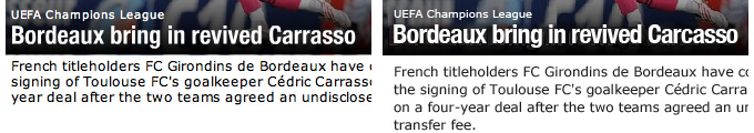
For some reason, UEFA did not place their easily recognizable logo in the usual upper left corner. Obviously, because of the small height of the uppermost dark plate, it was decided to limit the spelling of the domain name.
On an enlarged scale, artifacts of excessive JPEG compression and strongly blurred smoothing in letters are clearly visible. Clearing the rubbish plate and interrupting the label (Europe font), setting anti-aliasing on Crisp. At the same time, we slightly modify the kerning so that the inscription looks more modern and neat:

The next step can cause a lot of controversy, therefore I cite it as optional and optional.
On the right side of the header there is a language selector. European languages are marked with HTML-text (I have it smoothed, see the cycle of previous articles on anti-aliasing ), and Asian languages - with graphics. Moreover, the hieroglyphs are made pixel and substantially larger than the adjacent text. Current technologies allow using these characters directly in Unicode-encoding directly in HTML. In extreme cases, you can leave the graphics, but it is better to smooth the lines and make the hieroglyphs of the same size as the text next to it. In addition, you will have to clean the plate a bit from JPEG artifacts and move the entire block to the right 11 pixels so that instead of a ridiculous indentation of 31 points a distance of 20 pixels is formed (like the domain name on the left):

_________________________________________________________________________________
Menu
As it turned out, the upper part of the menu (NEWS, PHOTOS, etc.) is made with plain HTML text. Whereas the lower part (UEFA CHAMPIONS LEAGUE, etc.) is graphics. The Helvetica font was used with a size of 10.5 points and tracking of 80 units. Let's keep this style and apply to the top menu: let all items be graphical for uniformity. Set the vertical indent to the left of 20 pixels. Adjust the horizontal indents so that the text does not stick to the upper border. In addition, we place the vertical separators between menu items at distances of 10 pixels from each label. You’ll get this menu option:

This is followed by some nonsense. The Login button in this form is quite logical, but why is the search field executed exactly in the same style? Among other things, both of these elements are slightly displaced relative to each other vertically. Yes, and the style of convexity came out somehow sloppy and old-fashioned. We fix:

_________________________________________________________________________________
Bottom of the cap
Here you could leave everything as it is, but it will be very curious to try to modify this part a bit.
First, adjust the indents. Between the bottom edge of the menu and this block, reduce the indent to 5 pixels. Let us release the dark blue plate from the top edge of the block to 9 pixels (not 10 because we consider the lateral indents together with the one-pixel border, and the white outline around the dark blue plate should be uniform).
Then we align all the text blocks: the inscriptions should be made more readable, they should be peeled off from the lower and upper edges
dies, increase leading and split the last fragment into two lines for a more balanced look.
Here's what happened in the end:

On the left side of the layout we see the UEFA logo. However, it is not well rasterized, besides some kind of smallish. We clean the artifact dirt on the plate, find a suitable option in the search engine, invert and paste it in the appropriate size, not forgetting the indents:

_________________________________________________________________________________
News block
We align all the indents according to the accepted scheme: between the blocks, the indent is 10 pixels, and the distance from the photo to the accompanying text is 5 pixels. We arrange the text more smoothly, adjusting the size and leading. The news ticker and the logo next to it are raised above and aligned with the guides. We put a smaller and neat RSS icon. Due to a small rise of all these elements and an increase in the line spacing in the text under the main news, we get rid of parasitic emptiness:

_________________________________________________________________________________
Photo gallery block
To begin with it is necessary to finish a little with a title. All other similar dies are much darker, because the white text on them reads much better. And in this case (and on some other similar dice) gray turns out to be too pale for the title to be well perceived. Therefore, we will hold a small re-color and add richness to this element. You should also increase the height of the plate by one pixel (20 vs. 19 previous).
Of course, align the indents. Between photos should be put on 5 pixels, but then they start to look too detached from each other, besides they do not fit in their current sizes into the column of the width already formed. Therefore, we make here a distance of 3 pixels. Looks more organic.
At the bottom of the block there is a light gray gradient. This technique is not used on all blocks, and its purpose is doubtful. But we leave this element, making it the background for the lower links. Before the correction, the gradient seemed to form a frame in the lower part of the block, while the entire upper part of the photo gallery, due to the lack of gray color, created the impression of ugly alignment with the title plate. We eliminate this problem by adding a thin gray frame around the entire perimeter of the block:

_________________________________________________________________________________
Set of text blocks
Further in the content part, we continue to make similar corrections.
For a block with a calendar, we allocate more empty space: here it is necessary so that this small fragment does not seem too crushed.
All dies (blue and gray) align and make a height of 20 pixels. We also align with all text and photo guides. In places where there is a light gray gradient, add a thin frame. We select a more optimal version of leading for plain text and for a list of links. We make all sub-block links (More news, etc.) with the same size and type of alignment.
In general, we bring everything to a single style.
For greater integrity of the entire area move the block with logos in the left column, which allows you to remove the notorious parasitic voids.
In the lower block we also customize all the elements, saving precious pixels.
As a result, the entire content part becomes as follows:

_________________________________________________________________________________
Side column
The first problem is found when looking at the headers. All of them are typed in different fonts, and it hurts the eyes.
You can, of course, leave everything as it is, but we already have enough fonts in the layout (Europe, Helvetica, Verdana, Arial). On gray dies we leave the HTML Verdana font, and fix all other headers with Helvetica:

In the pink column dub indents, soften the dark dice under the names of matches and add light dice under the date. Intermediate headers (FINAL, etc.) for contrast, paint in red, set lowercase and discharge. We make the button with the arrow clearer and closer in style to the buttons that we put in the cap. In the resulting void at the bottom of the column, add a couple of blocks borrowed from the internal pages of the UEFA site.
After all these manipulations, the column looks more natural and strict:

Well, the bottom of the site with a lot of links, perhaps, should not be touched - there is more or less everything is in order.
_________________________________________________________________________________
Conclusion
So, the result was a somewhat more balanced layout, in which all the blocks are exactly and do not generate unnecessary holes. Of course, all the applied methods are hardly suitable for the UEFA site, since all semantic areas are automatically generated using scripts, and while this article was being written, the appearance of the main page was changed several times. But on this particular example (which turned out to be suitable from the point of view of the abundance of minor flaws), we looked at how to improve ordinary pages on such sites.
We added an additional block, but at the same time we saved 140 pixels in height. This is what happened in comparison with what was (reduced scale, full version HERE ):

On the same scale, what was originally:

A design audit is just beginning to gain momentum in RuNet, and I want to believe that in the near future there will be more intelligent and competent specialists in this field. I hope that my article will be useful both for beginners in the field of design, and for those who are seriously engaged in art directors or design audits.
UPD: On the UEFA website by this time there have been significant changes, and now many of the blocks are repacked more logically, although the indents still leave much to be desired. But parasitic voids disappeared, and now the site looks somewhat better (full-scale sketch HERE ):

Source: https://habr.com/ru/post/63358/
All Articles