Logo rasterization

Briefly and in the case of rasterization of logos.
Probably every designer engaged in logos, prefers vector graphics, because it makes further work with the object at times more convenient and less demanding of computer resources.
When creating polygraphy, it is enough just to copy the vector logo into the layout and it will be printed smooth and sharp. When using it in computer graphics (for example, on websites), in order to achieve clarity, you will have to resort to manual rasterization .
Immediately I would like to note that Vector Markup Language (VML), Scalable Vector Graphics (SVG) and HTML Canvas will not save us, because to display them, anti-aliasing will still be used, blurring the boundaries of the form. Maybe in the future, when monitors like the IBM T220 / 221 stand in every home, these technologies will not only become necessary, but their use will ensure a clear result.
')
In manual rasterization (in the global sense), the following regularity acts: “The complexity of rasterization increases with decreasing image size and its detail” . This means that the Unsharp mask (Filter → Sharpen) and the Sharpen Tool in Photoshop may well be enough to manually rasterize a photo. If you need to get a clear logo in a small size, then in addition to expanding the range of tools you will need to show skill and resourcefulness.
Practical part
As an example, I will use my old logo of one agency. I did not choose this logo accidentally, as it uses a font with a rather non-standard inclination of the main strokes.
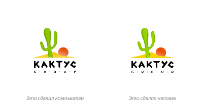
The logo on the left is “zamylen”: the boundaries of the fuzzy sign, T completely blurred, and G and R in the word “GROUP” turned into a pap, in addition, the logo “suppressed tsmikom.” Let's save him.
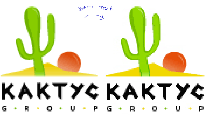
What was done (Photoshop):
- increase the clarity of the character and font using the Sharpen Tool;
- "finishing" of horizontals and verticals using the Pencil Tool;
- Manual anti-aliasing for font strokes with a slope greater than or less than 45 °;
- manual antialiasing of the word “GROUP”;
- increased contrast and brightness.
Observations that can be made:
- the stronger the lines of the pattern are inclined from the angle of 45 °, the more difficult the rasterization is;
- when rasterizing small characters, it is impossible to do without the appearance of anti-aliasing, otherwise the letters will not seem to be completely smoothed;
- a slight change in the grapheme of letters in favor of clarity during their rasterization is permissible;
- in the process there may be color grains or peresharp, which must be removed.
Important note:
With manual anti-aliasing, the use of “straight color” should be avoided. This means that to get color # 808080, you will need to apply the Eraser Tool with Opacity = 50% to black, rather than just draw a pixel using the Pencil Tool. First, it is a rule of good tone and professionalism. Secondly, it is convenient if you need to change the background in the future.
Rasterization mentions
10 mistakes in icon design
Preparing a layout for the client. Part I. Ironing or not?
Preparing a layout for the client. Part II. If ironing, how?
Thanks for attention. Later I will supplement this post with additional examples.
Source: https://habr.com/ru/post/63100/
All Articles