As we came up with the name, and then painted the logo for Ikonzy
 We decided to make a useful web application that would contain a collection of free icons and allow these icons to change as they wish. Any project needs a cool name and a catchy logo. We decided to start with naming ...
A successful name is half the success of the project. It must be original, reflect the essence, not be too long and pronounced in most languages. A very important factor was that we had an Internet project and we had to register a domain name for it, which was supposed to be free.
We started brainstorming. To begin with, we selected the key characteristics of our project: color, repaint, changeable, translucent, flexible. Long remembered all sorts of animals and other creatures. They remembered the chameleon, but they immediately rejected it, if not the original one. Then translucent reptiles came to mind. For example, jellyfish. We discarded the English word jellyfish as unpronounceable for a Russian person. But the word meduza seemed to us interesting, but we turned it into a meduzer . This was the first working version.
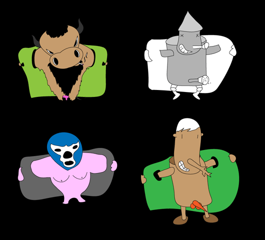
Further, the imagination of our employees began to give birth to "monsters".
')
Here are the ideas of Igor Korolyuk:
I remembered the following words about coloring / repainting: color / color, tint, kaleidoscope, nuance, tinge, spectrum . And thematic words to them in a pair: power, invaders, squids, space, lasers, ufo, technicolor (juicy, bright), rgb, dope, itchy, funky . Then he made a pair. Steep colors like colorpower and tintorama , of course, were busy. But I found more (checked in the .com zone): colorsquid, tintpower, rgbufo (I am dragged from a six-letter abbreviation), itchycolors, colordope ...
Valera Namazov showed a systematic approach:
And I decided to completely ignore the topic of repainting and touch on the topic of kinship with Turbomilk. It was such a sign.
Atomic Syyrup and FireLemonade are the most attractive combinations. They are free in all zones.

I also thought a lot and suggested my name:
Kefir is the brother of Turbolomk. Then word for word from kefir passed to bacteria and microb. They are translucent when you look at them under a microscope! And lo and behold! What I found! Bacillus !
bacilla.com is completely free. The fact is that it is correct to write bacilli or bacillius . But if you write bacilla in English, it will be like slang. Type killa, kinda and masta. There is even a picture in wikipedia . You can draw an evil, but funny character and generally arrange everything in a microbial theme. Indeed, the icons are small and the microbes are small. And the colonies of bacteria in such round plastic pieces. Pipette again!
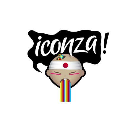
Stas Smolyakov was brief and just suggested the name Iconza .
Next was a vote among employees Turbomilka. Here are the results of the first round:
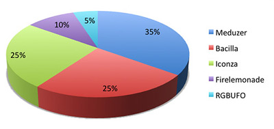
Then there was the second round, which shuffled all the cards and marked the new leader:

This is how we came up with a name for our project. By the way, Iconza is a rather bad name from the point of view of the logo - it is neutral and does not set a topic that can be beaten. There is no specific metaphor for the word "icon". But it even pleased us, as it did not limit the choice of the visual image.
The first was a variant from Valera, who beats the hint of Japanese themes in the title:
Dmitry Zhukov presented four sketches on various topics:
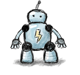
Robot Iconza . A kind and very shy helper of turbomilkers in icon making with the hands of Bender.

Being Useless as a pokemon Creature. By its appearance, it resembles part of the icons from the set, those that are in circles.
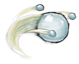
Comet . A cool comet is a gift to turbomilkers from far corners of the universe. Glitters and shines, thus reporting its unearthly (in the truest sense of the word) coolness.

Turbulitka . Character, personifies all our projects. When there is kerosene - figachim that there are forces, the rest of the time, barely dragging.
Yevgeny Artsebasov decided not to draw a logo, he came up with a character. According to his idea, it was supposed to be an illegal street vendor who hides small items in the floor of his coat. But somehow, unexpectedly, Eugene "jumped" on the topic of flashers .
We really liked the fourth version of its naturalness and bright, fresh flowers. But we decided to focus on the main point and discard the redundant parts. Plus, the logo just needed a mustache as a symbol of beauty and masculinity. After minor improvements, we got the following logo:

By the way, did you know that eating carrots has a very good effect on color vision ?! And this is exactly what you need to enjoy the rich palette of icons on the Icon. But we will not be distracted. Next, we came up with a cool writing, which can be attached to the carrots from the bottom or from the right.

This usually ends the work on the logo. But we liked it so much that we decided to make a carrot costume and dress a live person in it. No sooner said than done.

Source: https://habr.com/ru/post/61241/
All Articles