Tract on the power of color
What is the power of color perception?
Let's talk about the power of color perception. In previous posts I have already said that some color tones are perceived by the mind as stronger and brighter than others.
Technically, this is due to the strength of the signal entering the brain from the S, M and L cones: tones close to yellow are perceived simultaneously by the S and M receptors, and tones close to red-violet (magenta) are perceived by M and L.
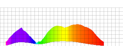
The brightest tone of perception is red-orange, yellow-green and red-violet hues are perceived a little less vividly. The clear outsiders are blue and azure tones: they are 3.5 and 5 times weaker in intensity than the brightest tone.
I created a diagram illustrating the power of color perception:
')
In the diagram to the left are brighter colors, on the right - less bright. To emphasize the level of perception, less bright tones are specially darkened.
Naturally, when the color vision is impaired, the brightness of the color perception changes. Here is what happens in the case of protanopia (violation of red perception):
In case of deitanopia (green deficiency):
And tritanopia (indistinguishability of blue):


How is it used in design? Triad scheme for selecting a color palette.
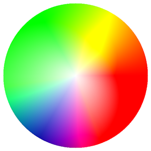
To create color schemes for sites (and indeed in life) the approach of " process colors" is widely used. The essence of what: takes the color wheel (obtained using the HSL model )

And an equilateral triangle is placed on it. When this triangle rotates around its center, its vertices indicate harmonious colors. In theory, the sum of these three colors, taken in equal proportion should give white.

Two triad colors of the same brightness, located one on the other in theory should have the same power of perception. Therefore, if we place a rectangle of one triad color against the background of another, then one eye at a time will see either a frame or a figure.
As a result, it is an excellent opportunity to make frames for photographs or objects on a page such that the photo is perceived without a frame, and not as a whole with it, as happens when a frame is made from a neutral color.
Two more examples of frames from triad flowers.

Traid selection problems
But let's analyze this color wheel in terms of the power of color perception! Take a round color target and highlight the colors on it in order to see if the colors taken with an equilateral triangle will make up a harmonious triad:


On the left - the original color wheel, on the right - the result of processing. On the right circle for stronger colors, the saturation (color intensity) is artificially increased. Click to view larger images; here you can see a few more color targets .
Mentally arrange an equilateral triangle so that one of its vertices falls to a maximum of yellow. And what do we see? - That the colors on the ends of the triangle, taken in equal proportions, do not add up to white color! Or rather, the sum of these colors will be perceived as milky-yellow, with a pink slant. And in order to get a truly harmonious triad, you need to make the yellow and magenta a little less pronounced (remove the saturation by about 6% for yellow and 2% for magenta).
And, importantly, the triad selection of colors, in principle, not bad working on bright, pronounced colors does not work well on light and dark colors. The lighter or darker the color, the greater the harmonic error will give triad selection for the standard color circle.
Complementary colors
Another method of selecting a color palette is the method of complementary colors: the same color wheel is taken and a segment is drawn through its center, at different ends of which will be colors, which in total should again give white.
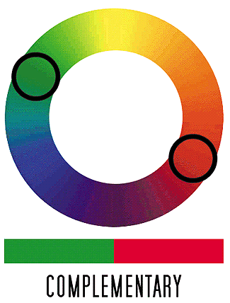
A feature of the complementary colors is the ability to reinforce each other: say, yellow and blue are located at different ends of the diameter. Blue against a yellow background will look visually brighter than the same gray brightness, located on the same background.
By the way, if the photo frame is made from a color that is complementary to the overall tone of the photo, then everything that will be inside this frame will look brighter.

And again, the problem of the standard color wheel is visible: the color strength of different tones at the ends of the diameter can differ significantly for light and dark colors. The sum of the tones chosen in this way will not be perceived as a result, as a gradation of gray.
Palette selection and color blindness
Now that the theoretical foundations of the palette selection methods are known, you can finally take a look at what the color wheel looks like at 60% loss of color vision:


presented "highlighted" in accordance with the perception of the image
I will not comment on the presented diagrams, to the question of how they were received, to look here .
How can designers take into account the color perception of color blindness?
Designers and yuzabelistam thinking about color blind people recommend reading the article "Effective color contrast"
I hope that I have quite fully covered the theme of color blindness in design, for this the next post will be about the distribution of attention in the picture. :)
Source: https://habr.com/ru/post/60426/
All Articles