About color blindness and color perception modeling
As it turned out in the discussion of the previous post about color blindness, the model of vision with a lack of red and green cones was not too accurate.
Over the past three weeks, I have three times rewritten the algorithm that simulates the impairment of color vision, each time checking the results on real deatanope (lack of green cones) and protanopes (lack of red cones). And now I am ready to share with you the results of my research. :)
And so, the purpose of modeling was actually not even a picture-result, but the creation of an algorithm that allows you to say how much, say, red color is perceived more than blue. Along the way, it was found that some services that simulate the loss of color vision actually simply offset the ab coefficients in the CIE Lab model and checking for real color blind people showed that the result they give is far from positive :)
')
Because of this, we had to return to the theory and carry out detailed work on modeling the work of the retina in the perception of colors.
The confusion in determining color adds two more factors:
The first factor. The ability of the brain to adjust its sense of yellow in order to get the correct colors (this is what we know as the “white point” or “white balance”)
The second factor. As you know, the image on the monitors is obtained by radiating three types of light beams of red, blue and green light. But the trouble is, the characteristics of these beams from monitor to monitor can vary significantly:

The width and intensity of the color beams do not match the width of the cone perception zone, and the resulting image is calibrated for people with normal color vision, so it’s damn difficult to predict how a picture on a cheap monitor with a small color gamut will be perceived by a color blind. One can even say with confidence that in most cases, in a photo shown by a cheap monitor, the color blind will see more colors than in real life. :)
To simulate color perception, I took modern data on the cone's photosensitivity. And that's what I did.
(for perception of Magenta, the red cones are shifted to the minimum yellow level)
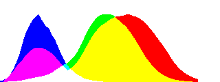
The bar below shows the level of lightness, the height of the column above the bar - the power of color perception. Thus, red is perceived a little more strongly than green, while the peak of perception falls on red-orange. The minimum power of perception is somewhere in the azure region.
What happens in the case of protanopia? The size of the signal from the red cones decreases, while the white point remains in place, but the relative white level decreases in the red region (the model is given in 10% increments):
The case of deitanopia (reduced perception of green):


And the most difficult case to model is tritanopia. The difficulty lies in shifting red to get magenta:


Naturally, all these are beautiful pictures, but how does this fit in with the real world? The models were tested on two protanopes (converged on coefficients for the reduction of sensitivity of M cones to 34% and 52%), one deitanope (converged on a coefficient of reduction of sensitivity of S by 43%) and two tritanopes (78% and 92%).
Testing of models was made on the basis of an assessment of two color targets:
linear and round
Satisfactory was considered the result of almost complete compliance and discrepancies only in the area of mazhenta (immediately after the red color). A piece with magenta - alas - I haven’t managed to overcome it so far: (It’s difficult to model :)
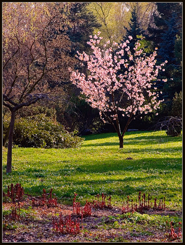
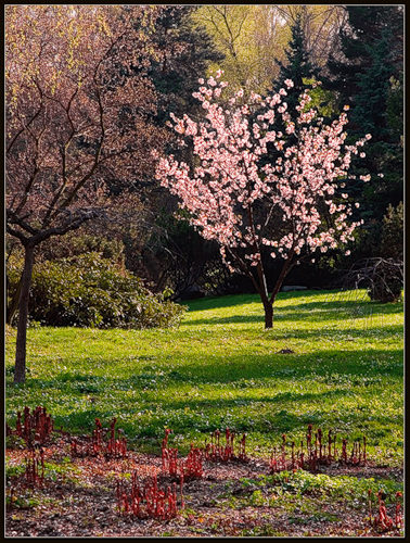
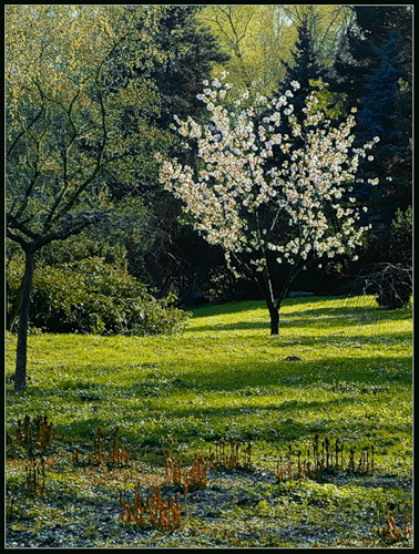
I prepared several pictures obtained as a result of modeling. In the simulation, a loss coefficient of 60% was used. In order not to overload the post with pictures, I quote one set, the rest you can see here (the original, tritanopia, deitanopia and protanopia are presented sequentially):

The article used illustrations from Wikipedia and NGI Book , examples for tests were found here and here .
And in the next post I will talk about the results that I could get with the help of the model (the test will be more about the design than about the modeling)
Over the past three weeks, I have three times rewritten the algorithm that simulates the impairment of color vision, each time checking the results on real deatanope (lack of green cones) and protanopes (lack of red cones). And now I am ready to share with you the results of my research. :)
And so, the purpose of modeling was actually not even a picture-result, but the creation of an algorithm that allows you to say how much, say, red color is perceived more than blue. Along the way, it was found that some services that simulate the loss of color vision actually simply offset the ab coefficients in the CIE Lab model and checking for real color blind people showed that the result they give is far from positive :)
')
Because of this, we had to return to the theory and carry out detailed work on modeling the work of the retina in the perception of colors.
Insert the first. How color is perceived
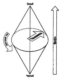
The sensation of color depends on the level of the signal entering the brain from the S , M and L cones (S, M and L are, respectively, “green”, “red” and “blue (purple)” cones).
Yellow color (hereinafter - YY ) is perceived as the average level of M and L cones
Green is perceived as the signal strength from S cones minus the power of perception of yellow
Red is perceived as green as a signal from M cones minus YY
With blue, cyan and violet same flowers trouble. Let's start with the fact that the maximum perception of L cones falls on purple:
For this reason, the actual blue color is perceived by man as the difference between the signals from L cones and the power of perception of yellow.
But cyan and magenta are perceived as the average between the perception of blue-green (for azure) and blue-red (for magenta), where blue is L-YY , and green and red, in turn, are S-YY and M -Yy
Thus, the reference color that determines all color perception is yellow, which is confirmed in various experiments :
“Volunteers were asked to independently adjust the color of the light flux, getting pure yellow light, devoid of red and green impurities.
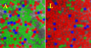
As expected, each subject picked up for the “perfect yellow” light with almost the same wavelength. The surprise was that the number of cones capable of distinguishing yellow from, say, red, was very different for all participants in the experiment, and in polar cases, the spread was forty times. That is, the perception of color obviously depends not so much on the receptors, as on the brain processing the signals received by the receptor.
These pictures clearly show the variation in the proportion of cones responsible for the perception of different colors. Cones that are responsible for the perception of shades of red predominate in the right picture (images of a living retina of two different people on the left and right). ”


The confusion in determining color adds two more factors:
The first factor. The ability of the brain to adjust its sense of yellow in order to get the correct colors (this is what we know as the “white point” or “white balance”)
The second factor. As you know, the image on the monitors is obtained by radiating three types of light beams of red, blue and green light. But the trouble is, the characteristics of these beams from monitor to monitor can vary significantly:
The width and intensity of the color beams do not match the width of the cone perception zone, and the resulting image is calibrated for people with normal color vision, so it’s damn difficult to predict how a picture on a cheap monitor with a small color gamut will be perceived by a color blind. One can even say with confidence that in most cases, in a photo shown by a cheap monitor, the color blind will see more colors than in real life. :)
Box two. How color is coded
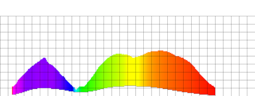
In order to somehow resolve the situation with color perception, as early as 1931, the French committee CIE had invented a color scheme based on the mixing of three primary colors - red, blue and green. The scheme was called XYZ (http://ru.wikipedia.org/wiki/XYZ) and as a result of experiments with three searchlights and 200 people with normal color perception, some average graphs were obtained that are valid for a white point of around 4300K. Later, in 1964, a similar series of experiments and graphs (called the “standard observer color model”) were carried out. At the moment they have the following standard view:
Putting the values of RG and B on three axes (corresponding to X, Y and Z in the title of the scheme), a certain color diagram was obtained, including in theory all the colors perceived by human vision. It is on the basis of the CIE XYZ scheme that modern CIE Lab and Hunter Lab color schemes were subsequently created.
The CIE XYZ model has known disadvantages. First of all, you need to take into account the fact that the scheme is valid only near the white point of 4300K. In addition, when lighting is lowered or increased, the color coverage of a person decreases, and disproportionately: the colors close to azure disappear first, then the red-violet ones are shifted either to red or to blue, etc.
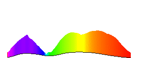
And finally, the standard model of the observer differs from modern data on the light sensitivity of cones (see the graph above).


To simulate color perception, I took modern data on the cone's photosensitivity. And that's what I did.
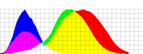
Basic color sensitivity:
The perception of color depending on the type of cones:
(for perception of Magenta, the red cones are shifted to the minimum yellow level)
The bar below shows the level of lightness, the height of the column above the bar - the power of color perception. Thus, red is perceived a little more strongly than green, while the peak of perception falls on red-orange. The minimum power of perception is somewhere in the azure region.
Modeling
What happens in the case of protanopia? The size of the signal from the red cones decreases, while the white point remains in place, but the relative white level decreases in the red region (the model is given in 10% increments):
The case of deitanopia (reduced perception of green):
And the most difficult case to model is tritanopia. The difficulty lies in shifting red to get magenta:
Real life
Naturally, all these are beautiful pictures, but how does this fit in with the real world? The models were tested on two protanopes (converged on coefficients for the reduction of sensitivity of M cones to 34% and 52%), one deitanope (converged on a coefficient of reduction of sensitivity of S by 43%) and two tritanopes (78% and 92%).
Testing of models was made on the basis of an assessment of two color targets:
linear and round
Satisfactory was considered the result of almost complete compliance and discrepancies only in the area of mazhenta (immediately after the red color). A piece with magenta - alas - I haven’t managed to overcome it so far: (It’s difficult to model :)
And the pictures?
I prepared several pictures obtained as a result of modeling. In the simulation, a loss coefficient of 60% was used. In order not to overload the post with pictures, I quote one set, the rest you can see here (the original, tritanopia, deitanopia and protanopia are presented sequentially):
The article used illustrations from Wikipedia and NGI Book , examples for tests were found here and here .
And in the next post I will talk about the results that I could get with the help of the model (the test will be more about the design than about the modeling)
Source: https://habr.com/ru/post/60362/
All Articles