Results of the first week
So, over the past week, habrauser tried the idea of a calendar-pinarika . Let us summarize here.
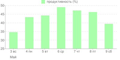
The first graph shows the change in the ratio of the number of users who marked the day for themselves as "productive" to the number of users who marked the same day as "unproductive." Let's call this ratio "productivity." As you can see, the most productive day was Wednesday. On this day, about 49%, i.e. almost half of the users worked productively. The result, of course, is quite predictable: it is intuitively clear that at the beginning of the week we begin to work with reluctance, by the middle we reach the peak of our productivity, and by the end of the week there is a decline. But, all the same, it is interesting to observe it on real data. In addition, it is clear that on May 9th everyone was well rested :)

This pie chart displays the ratio of productive and unproductive days. As you can see, the number of unproductive days prevails. But. So, the pinarik is still needed.
All graphics, including your personal one, can be viewed here: worktrek.ru/stat
So far there is not much data, because A week has passed. Next week it will be possible to group the data by week and compare how the productivity has changed.
')

By the way, now you can add comments to the days, indicate what you did or why the day was not very effective. I also slightly updated the design, added the ability to customize the colors themselves, added the English version, demo access, and started twitter for updates.
Have a productive week :)
UPD: forgot to indicate that the blog title idea belongs to Ockonal :)
Source: https://habr.com/ru/post/59272/
All Articles