Sergey Spivak. Life after click-2 (THEY are back)

At the eTarget-2007 conference, Sergey Spivak, the director of the Internet agency PRIOR.ru, presented his own method of analyzing the effectiveness of the pages of the site called “Spivak's Chart”. The method, which will soon be patented, makes it possible to understand whether a single page fulfills its function within the scope of the project’s objectives. The “diagram” is addressed, first of all, to large sites (more than 100 pages) with the goal of selling something.
If a resource is focused on making a transaction, it, when receiving a visitor, must in some way change its consumer behavior. Technically, it is necessary to lead a person to given pages, the so-called “corridor”, having convinced that you need to purchase something on the site. However, it is possible that there are “wrong” pages - such that repel the visitor, instead of holding and leading to action. "Spivak diagram", according to the author of the method, allows you to identify problem pages.
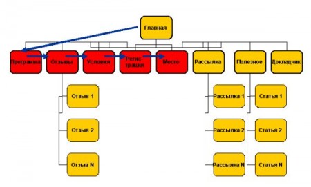
To demonstrate the method, Sergey “dissected” the website of his seminar . He singled out a corridor - pages that lead the visitor to action. In this case, the desired result - registration for the seminar. The corridor is highlighted in red.
')
A corridor can consist of two, three, four pages - the smaller, the better. But the pages on the sites much more. Therefore, correctly made “non-corridor” pages should return the person back to the corridor.
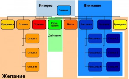
For convenience of analysis, all pages of the site are divided into four types according to the AIDA model: Attention , Interest , Desire , Action . Pages close to purchase are painted in warm colors: Wishes pages are yellow and red, Actions are green. Pages farther from the purchase have received cold colors: Attention - blue, Interest - blue.
Attention Pages (site map, useful links) and Interests (main pages, articles on the topic, newsletters, company information, news, voting results, forums, blogs) should move users to Desire pages (product characteristics, list of advantages when choosing, cards goods, price list, terms of delivery and payment, FAQ) . On the pages of the Wish, the purchase decision is made, from here users have to go to the Action pages (order forms, registration, printout of the map, baskets in the electronic store) .
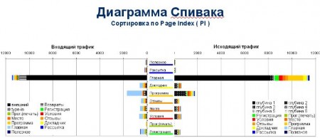
Next, each page is assigned some Page Index value. The more a page affects the visitor’s performance of the final action, the closer it is to the top of the Page Index list. The page closest to the action gets the maximum Page Index value.
After that, for each page, the statistics of the visitors who came to it is formed. The bars on the left and right illustrate incoming and outgoing traffic. A column of outgoing traffic is not black, because people leaving the site managed to visit several internal pages (which are understandable by color).

The complete Spivak diagram looks like this. It also shows the depth of browsing pages (the greater the depth of viewing, the brighter the color of traffic):

If you cut the graph of the main page, you get a picture of the movement of internal traffic.

Chart-based analysis may be:
Relying on the idea that the correct page should heat the traffic, we see that the “Home” is functioning well - it warms up the cold traffic falling on it.
To understand how optimally organized the navigation is on the page, you can overlay these diagrams onto it:

Further, Sergey Spivak noted that his site was in trouble with the “Useful” section containing all sorts of articles. Warm traffic arrives on the page, but it doesn’t heat up there. Moreover, often this page from the “Useful” section becomes the last one for the user. The author of the report concludes that this is the wrong page, it must somehow be redone. Or even remove the entire section "Useful".
Sorting by Page Index shows how traffic hits the site, to which point it flows. The visitor comes to the main page, but this is a rather cold Interest page. Conclusion: perhaps it would be better to send traffic immediately to the warm “Program” page, saving the user from an extra click.
After the speech of Sergey Spivak, who, according to the conference participants, received the largest citation index on the sidelines, we interviewed him a little :

How exactly can consumers use your method? Maybe the solution will be released in the form of software?
I do not see this as a software. The method is only presented, and now negotiations will begin. Implementers of the technique can make CMS-system - "Bitrix" , for example. As well as analyzers such as SpyLOG and HotLog . These companies can implement the technique as a ready-made solution.
To whom will the Spivak Chart be useful in the first place ?
Initially, the method was created specifically for trading sites. But an hour after the presentation, it became clear that you need to make a version for portals - it is very important for them to understand how traffic flows from page to page. We will probably prepare a specialized solution for the portals. But it is possible that the model will lie one to one. After all, in fact, the difference between corporate sites and portals is in the placement of the Page Index coefficient. And this is a purely intellectual work, here you can twist, somehow. In general, we have plans to test the methodology on some large site. Already two projects have given their consent, and I think this is just the beginning.
Surely there are other systems that make it clear how the user runs through the site right up to the final goal - actions ...
All statisticians have such a thing as “Site Ways”. But it does not give an overall picture, the opportunity to look at the site from above and find small problem pages. It was when I suffered from the paths on the site that this method was born. That is, he was born as a result of the fact that I used existing methods and realized that they are not enough for me.
The corridor, as you said, should include as few links as possible ...
Yes. The average depth of viewing the site - 2.6 pages. In a good way, the length of the corridor should vary between two or three pages. Or, suppose, the ideal corridor is 4 pages. But take a corporate website and count how many pages there are. They will be 150-200. That is, we give 150 pages at the entrance and say, they say, here's the navigation system - go! Well, people go as they like. Our task is to inspect three correct pages and take action.
Thus, this system is designed for sites with multiple pages.
Yes, first of all. If your site has 10 pages, your intuition will tell you what and how to organize. And if pages 350? A page, say, 286 is good, and page 287 is bad. How to find out? How to look at 350 pages above and understand which ones are problematic? That's what the method was designed for.
It turns out that many large sites and portals are now far from optimal?
Absolutely. Of course, you can see where people come from, how they leave. It is clear that from the first page go on the news - the first, second, etc. But is the news page arranged correctly in the archive? “Maybe no one knows.” The page lies, people go to it, but does it work correctly? Maybe it should transfer traffic somewhere - to some right places where it can be resold to an advertiser, for example.
And the philosophy of this method is that each pixel should work.
Yes, but in our case, the discretization goes up to the page, which should be made in such a way that the links placed on it, its design, the blocks work for a given goal. Now often analyzed the site as a whole. Very rarely do they analyze specific pages. And we are changing the pages, not the sites.
Source: https://habr.com/ru/post/5919/
All Articles