The dynamics of the form and site design
The design of many sites is an ordinary static elements utilitarianly placed on a conventional static canvas. However, it is known that, for example, the transmitted dynamics, movement, and the effect of external forces are valued in photography and graphics.
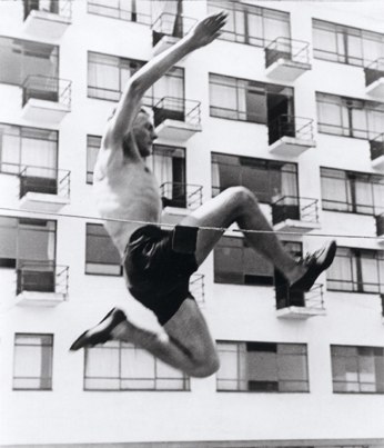
(Hajo Rose, Highjumping, 1930)
It became interesting to me, as usual, in the form of objects that the influence on them of the physical processes that we experience every day. If you "declare" on the page of the site the presence of a chill, wind, resistance and other forces, you can on this basis try to draw an interesting composition.
')
The most basic force that acts on us always is the power of the world wide. In the form, it can be expressed by asymmetry about the horizontal axis - the grip causes the mass of the object to move down to the ground. Also, the presence of the object is evidence of the presence of the object. The viewer should feel that if you remove it, the object will fall.
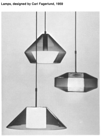
These plafonds beat this law. Two of them are asymmetrical, and the third is symmetric from which it seems to hang in the air.
Continued under the cut.
You can be inspired by this example and try to draw something based on it.

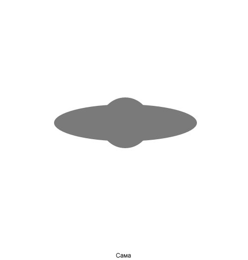
UFO denies gravity,% username%.
The idea of looking for inspiration in industrial subjects can be very successful. First, their form is often determined by external influence. Secondly, designers have long been playing with it, for example, like in these salt shakers. One of them is bursting, and the second is probably a vacuum.

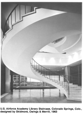
All spirals create a sense of speed. The look runs along them in an upward or downward direction, twisting and accelerating.
Inspiration can be drawn from the graphic works of famous artists.
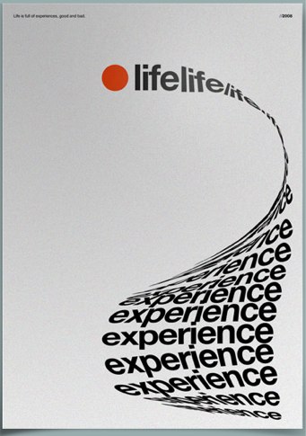
(Life Experience, Rob Morris, 2008)
Sometimes they seem like frames cut from an animated film.
(Spring Fair + Building and Transport, Otto Treumann, 1965)
But what about site designers? Are there any sites whose composition echoes
with physical processes in real life?
To be honest, the most vivid example I found is the first version of Yandex.

It is not very clear why this is applied here, but at least all parts of the page create the feeling of one vector of direction of forces, which is interesting simply from the point of view of our topic.
Most of the sites quoted "physics" only partially.
Here, the developing hair creates some space and movement with the wave of the head.

(www.vlourenco.com/work)
Here is more interesting. The wind tilting the branches of the tree and carrying the squares of photos, like leaves, blows away the same graphic element of the logo.
(www.sangerinitiative.com)
The flying rocket complements the advertising text, but that’s what it ends up with.
(www.wishingsky.com)
Using a spiral sets an extra speed for a running man.
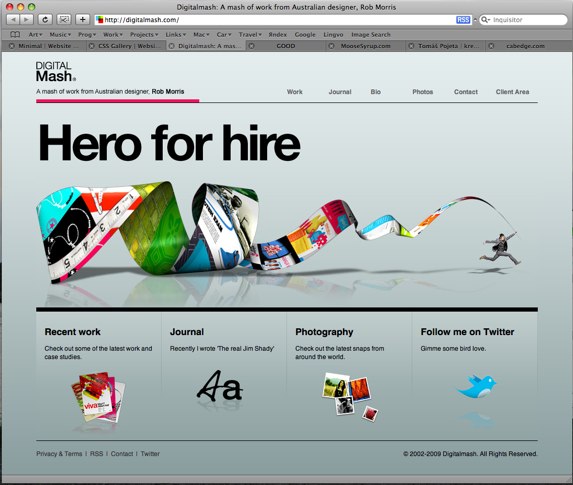
(www.digitalmash.com)
It’s hard to see in this screenshot, but the dies here are not just hanging in the air or standing on some surface, but hanging from the ceiling, attached by a string. In this way, the tattered vebdvanol reflection becomes somewhat more convincing.
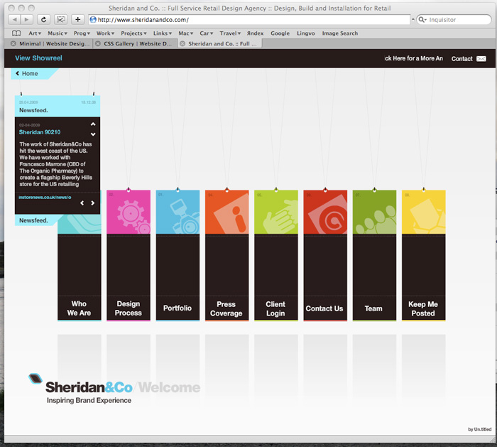
(www.sheridanandco.com)
Finally, this bird seemed set to take off.
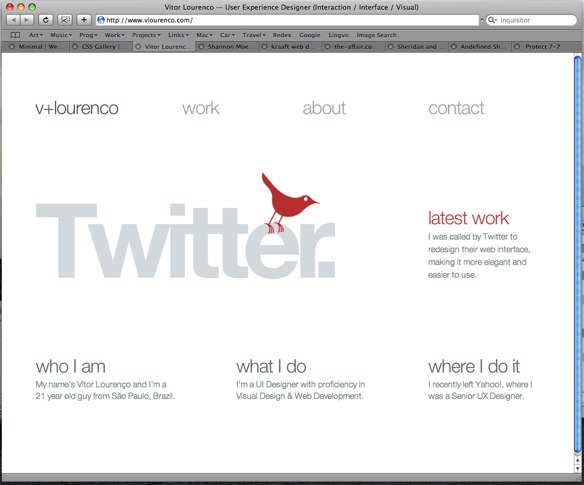
(www.vlourenco.com)
So, as a design idea, hints of physical forces and processes from the real world in a static graphic have the right to life. It seems to me that if the viewer sees the presence of a site on the site, the wind, the resistance, the volume, it will become more interesting for him to look at this site.
It is a pity that the designers do not often use frills, similar to those described, paying maximum attention to the correct location of the shadows. I would like to see interesting examples on this topic that readers can bring.
(Hajo Rose, Highjumping, 1930)
It became interesting to me, as usual, in the form of objects that the influence on them of the physical processes that we experience every day. If you "declare" on the page of the site the presence of a chill, wind, resistance and other forces, you can on this basis try to draw an interesting composition.
')
The most basic force that acts on us always is the power of the world wide. In the form, it can be expressed by asymmetry about the horizontal axis - the grip causes the mass of the object to move down to the ground. Also, the presence of the object is evidence of the presence of the object. The viewer should feel that if you remove it, the object will fall.
These plafonds beat this law. Two of them are asymmetrical, and the third is symmetric from which it seems to hang in the air.
Continued under the cut.
You can be inspired by this example and try to draw something based on it.
UFO denies gravity,% username%.
The idea of looking for inspiration in industrial subjects can be very successful. First, their form is often determined by external influence. Secondly, designers have long been playing with it, for example, like in these salt shakers. One of them is bursting, and the second is probably a vacuum.
All spirals create a sense of speed. The look runs along them in an upward or downward direction, twisting and accelerating.
Inspiration can be drawn from the graphic works of famous artists.
(Life Experience, Rob Morris, 2008)
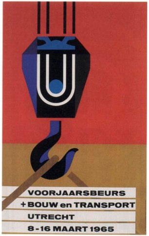
Sometimes they seem like frames cut from an animated film.
(Spring Fair + Building and Transport, Otto Treumann, 1965)
But what about site designers? Are there any sites whose composition echoes
with physical processes in real life?
To be honest, the most vivid example I found is the first version of Yandex.
It is not very clear why this is applied here, but at least all parts of the page create the feeling of one vector of direction of forces, which is interesting simply from the point of view of our topic.
Most of the sites quoted "physics" only partially.
Here, the developing hair creates some space and movement with the wave of the head.
(www.vlourenco.com/work)
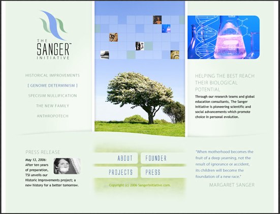
Here is more interesting. The wind tilting the branches of the tree and carrying the squares of photos, like leaves, blows away the same graphic element of the logo.
(www.sangerinitiative.com)
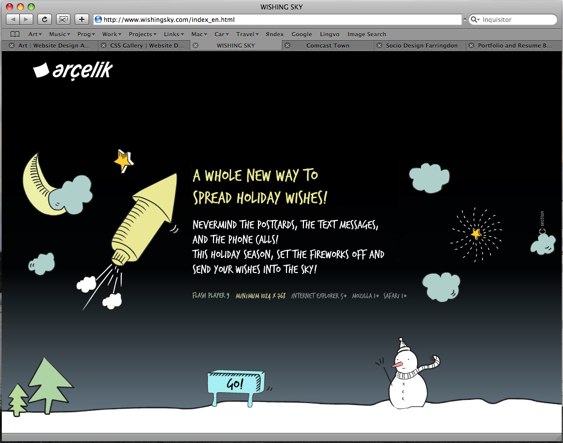
The flying rocket complements the advertising text, but that’s what it ends up with.
(www.wishingsky.com)
Using a spiral sets an extra speed for a running man.
(www.digitalmash.com)
It’s hard to see in this screenshot, but the dies here are not just hanging in the air or standing on some surface, but hanging from the ceiling, attached by a string. In this way, the tattered vebdvanol reflection becomes somewhat more convincing.
(www.sheridanandco.com)
Finally, this bird seemed set to take off.
(www.vlourenco.com)
So, as a design idea, hints of physical forces and processes from the real world in a static graphic have the right to life. It seems to me that if the viewer sees the presence of a site on the site, the wind, the resistance, the volume, it will become more interesting for him to look at this site.
It is a pity that the designers do not often use frills, similar to those described, paying maximum attention to the correct location of the shadows. I would like to see interesting examples on this topic that readers can bring.
Source: https://habr.com/ru/post/58634/
All Articles