Black Square Click Cards published
Alexey Tutubalin published a map of clicks on his well-known black square , each pixel of which is a separate site in the RU and SU zones. Information was collected for the year about 220 thousand user clicks.
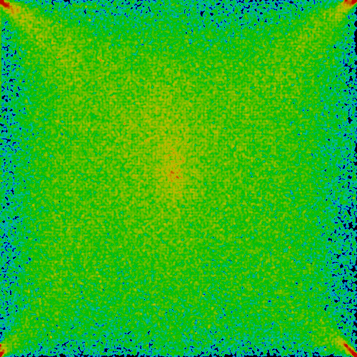
Let me remind you that each point in the square corresponds to a separate Web site from those who responded to the request on March 14, 2007. The total number of such sites at the moment is 606469, 606062 of them are shown on the square.
')
© Alexey Tutubalin , he's lexa .
Let me remind you that each point in the square corresponds to a separate Web site from those who responded to the request on March 14, 2007. The total number of such sites at the moment is 606469, 606062 of them are shown on the square.
')
Most click in the singular points (angles). Not everyone can get there, but almost everyone tries.
The second most popular area is the center, there are many who click there, but everyone has their own center. For the average user, the center is slightly to the left and higher than the geometric center of the square.
Besides:
- the top of the square is more popular than the bottom (57% of clicks in the upper half)
- the left side of the square is more popular than the right (54.5% of clicks occur in the left half)
- Left upper quadrant collected, respectively, almost a third of all clicks.
Most interesting is the inclination to the left. It turns out that the navigation elements of the site should be placed more correctly on the left, because we want the user's attention for them. So, in fact, in recent years, they mostly did it, but the standard templates of popular blog engines offer navigation on the right, which always surprised me. It seems that the standard argument - “the mouse is usually on the right, because there is a scrollbar” - is not very consistent.
© Alexey Tutubalin , he's lexa .
Source: https://habr.com/ru/post/5827/
All Articles