"Rubber" (fluid grids)
This year I did a website redesign with a lot of content . Design requirements were simple: the client asked to keep the existing company logo, improve print density and increase readability. So, at the very beginning of the design, I spent a significant amount of time planning a well-structured grid for a library of information blocks.
The past few years, this way of thinking has become more common. Thanks to Mark Boulton, Khoi Vinh, and others, we are seeing a resurgence of interest in the typographic grid, and how to use it on the web. And, frankly, the idea was a smash hit: millions of CSS frameworks bloomed with a variety of complementary tools , each of which was created to make grid-based design even more accessible to the average designer / layout maker. And why not? After a few minutes of thinking in terms of the grid, the advantages become obvious: designers get a rational, structured framework for building information structure and users get well-structured, readable websites.
Meanwhile, our client put forward another, destructive, requirement: the design must be stretched and resized along with the browser window. Usually it would make me noisy and embarrassed to rejoice. “Rubber” is an underestimated paradigm in web design. It puts control of the design in the hands of users and their web browsing habits. And its capabilities are absolutely not consistent with the fantasy of web designers.
Minimum screen resolution: a little innocent lie.
Instead of exploring the virtues of "rubber", we rely on a small innocent lie: "the minimum screen resolution." These three words contain powerful magic, under the cover of which we create designs with a fixed width, one after the other, perhaps only increasing the width of the design every few years when it becomes safe. "Minimum screen resolution" allows a limited subset of users to see the site as God and Photoshop assume. These users always browse sites with the browser window maximized at 1024x768 and never use, say, the OLPC laptop , or monitors older than four years old. If the user does not meet the requirements of the "minimum screen resolution", well, for them there is a scroll bar, right?
Of course, when I coded the site, I had no time for the luxury of writing sharp, accusatory speeches on the subject of design flaws with a fixed width. Instead, I was left alone with the sobering fact: while we were developing a complex enough mesh to satisfy the client’s content requests, the client — and in addition to all the users — wanted “rubber.” Almost all grid-based designs that I can enumerate had a fixed width, and I was left with a difficult question: how to make “rubber”?
As it turned out, this is just a matter of context.
')
Do I really have to be grateful for IE?
Faced with an insurmountable problem, I did what I do best: bypassing it. Temporarily putting aside the question of "how" to make the grid behave like "rubber", I did what I knew: first, the styles for the color and the background, then I determined the font.
You may already be aware of the well-documented IE problem with resizing fonts if the size is specified in pixels - or rather, it decisively refuses to do so . Set the font size to 16 pixels Georgia and, no matter how the user tries to increase or decrease the size of the text, in IE it will remain the size of 16 pixels. IE7 and later allows the user to scale the entire page, but simply changing the font size, which is defined in pixels, is still taboo in IE. So, in order to give users more flexibility, we, standard-minded designers, prefer to completely dispense with pixels, and use relative units, whether keywords , percentages or my favorites, em to determine font size.
If you have ever worked with relative units of measure , such as em, you understand that this is all about context: in other words, the actual size of em is calculated relative to the font size of the parent element. For example, let's say we work with the following layout:
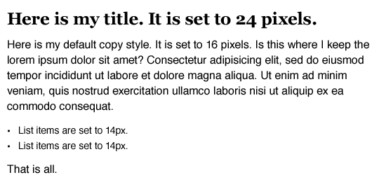
An example of a simple definition of text size using pixels.
Nothing funny: paragraphs are defined as 16px Helvetica, the unsorted list is slightly reduced to 14px and h1 is increased to 24px Georgia. Sexually? Not?
And what's doubly sexy is that one simple rule allows us to get it all at once :
- body {
- font: normal 100% Helvetica, Arial, sans-serif;
- }
With a font size of 100%, the size of all elements on our page is determined relative to the default font size in the browser, which in most cases is 16px. Thanks to the browser-style table, h1 is big, bold, beautiful - but still Helvetica and too big. In order to solve the problem, it is rather simple to remove Helvetica using font-family, but how to change the font size of the text to 24px? Or exactly reduce the font size of the list?
With em it's easy to do. We take the target font-size value for each element and divide it by the font-size of its container (this is its context). As a result, we get the desired font size (font-size) expressed in relative units (em). Or, in short:
target ÷ context = resultIf we assume that the font size of the body tag is 16px by default, we can use this formula to describe any font-size value we need. So, to get the required header size match for our calculations, we divide the target value (24px) by the font size (font-size) of the container (16px):
24 ÷ 16 = 1.5The title is 1.5 times the size of the body font, or 1.5em, and we can add this value to the style sheet.
- h1 {
- font-family: Georgia, serif;
- font-size: 1.5em; / * 24px / 16px = 1.5em * /
- }
To convert the list size to the em equivalent of 14px, we can use the same formula. Assuming that the font-size is strictly 16px, we simply divide the target value into its context.
14 ÷ 16 = 0.875And we get the value of 0.875em, which, again, can be added to CSS.
- ul {
- font-size: 0.875em; / * 14px / 16px = 0.875em * /
- }
With these two rules , the example page looks a lot closer to the planned one and will be almost perfect after simple additions . And all this with the help of the
target ÷ context = result. formula target ÷ context = result.So after a few hours spent on digging the size, I realized that I was stumbling over the answer. If we can consider the font size not as pixels, but as a proportion calculated relative to the container, then the same can be applied to other grid elements.
At the end-ends, it is not a "Golden Pixel"
As before, let's start with clear
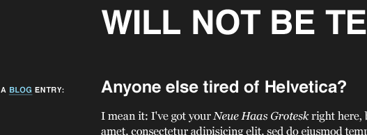
Our basic markup
Of course, our "design" is quite modest. But simple styles are superimposed on a well-defined grid: more precisely, seven columns of 124px each, separated by 20px whitespace, and all this together has a width of 988px. But let's forget about these vile pixels. Proportions are our everything, yes? Give the "rubber", baby!
Our base layout is overlaid with a grid
To begin with, let's consider our layout as an arbitrary layout, fixed or stretching: before we start writing code, let's look at the design and define the information blocks . Fortunately, they are not many.
We define information blocks.
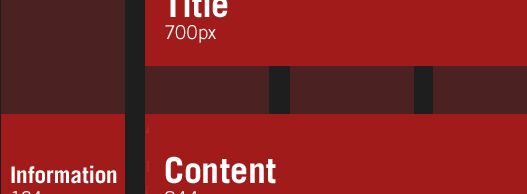
At the highest level , we have the title at the top of the page, the information area, which is stretched into six columns and some context-dependent information in the leftmost column. From this scheme, we can distinguish the skeleton markup, which corresponds to our information set both in terms of structure and in terms of semantics:
- < div id = "page">
- < h1 > The Ratio Revolution Will Not Be Televised </ h1 >
- < div class = "entry">
- < h2 > Anyone else tired of Helvetica? </ h2 >
- < h3 class = "info"> A <a href = "#"> Blog </ a > Entry: </ h3 >
- < div class = "content">
- < div class = "main">
- < p > Main content goes here. Lorem ipsum etc., etc.. </ P >
- </ div > <! - / end .main ->
- < div class = "meta">
- < p > Posted on etc., etc. </ p >
- </ div > <! - / end .meta ->
- </ div > <! - / end .content ->
- </ div > <! - / end .entry ->
- </ div > <! - / end #page ->
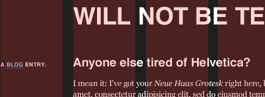
And by applying some typography rules, we get a decent looking reference point . However, the container (#page) does not contain any restrictions, so our content will be formed in such a way as to fit the width of the browser window. Let's try to control the length of the lines:
- #page {
- margin: 40px auto;
- padding: 0 1em;
- max-width: 61.75em; / * 988px / 16px = 61.75em * /
- }
We used margin and padding to make restrictions and get whitespace between the content and the borders of the window. But the last line of our rule uses a variation of our formula (to calculate the font-size) to determine the maximum width of our design. By dividing the width of the layout (988px) by the base font size (font-size) (16px), we can set the maximum size to em to determine the approximate pixel width of our layout, which will prevent an increase in the size of the layout beyond the ideal 988px. But since we use em to determine the maximum size, the maximum width (max-width) will be scaled if the user increases the font size in the browser — a trendy little trick that works even in older versions of IE, if you apply a small CSS hack .
Now that our design is properly limited, let's work on each element of our design separately, starting with the title of the page. In the layout, it occupies five columns and four whites, with a total width of 700px. It is also separated from the left border of the page by one pair of column / white space material, which gives a nice indent of 144px. And, if we worked with a fixed-width design, our work would be fairly straightforward:
- h1 {
- margin-left: 144px;
- width: 700px;
- }
But, since we work with "rubber", fixed units do not quite fit. And, since I worked with relative sizes, it dawned on me: each mesh element — and the elements that are located on it — can be expressed as a proportion relative to their container . In other words, as in our task with changing the font size, we consider not only the size of the element we need, but also the ratio of this size to the size of the container. This will allow us to convert elements based on pixels to percentages and preserve the proportions of the grid even when its size is changed.
In short, we will have "rubber".
Everything is new - well forgotten old
So where to start then?
target ÷ context = resultThat's right: back to our font size calculation formula. We can use the same proportion to convert column widths to pixels in percent-specific, flexible values. So we, starting from the target 700px, to get the size of the header in percent - but the container of the header has a size of 988px;
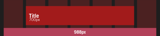
Convert the header size value in pixels to percents.
As a result, we simply divide 700px (our target value) by 988 (its context (the size of the header container)) like this:
700 ÷ 988 = 0.7085And here: 0.7085 turns into 70.85%, the width that can be entered into the style sheet:
- h1 {
- width: 70.85%; / * 700px / 988px = 0.7085 * /
- }
Can I also make it indented at 144px? I love the leading questions:
144 ÷ 988 = 0.14575Again, we take 0.14575, or 14.575%, and add to our style sheet as the margin-left value for the heading:
- h1 {
- margin-left: 14.575%; / * 144px / 988px = 0.14575 * /
- width: 70.85%; / * 700px / 988px = 0.7085 * /
- }
And voilà . By measuring the indentation of the header and the width relative to the container, we have successfully converted the proportion of our grid to percentages. Header proportions will always remain true, even if it is scaled to fit the size of the browser window.
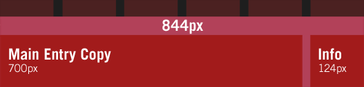
We can apply an equally simple transformation to determine the relative size of the block containing the main content, it has a size of 844px and a left indent 124px wide. I.e:
844 ÷ 988 = 0.85425And for the informational column:
124 ÷ 988 = 0.12551These two transformations give us the percentage values that we can add to the style sheet and make our markup even more flexible.
- .entry h2,
- .entry .content {
- float: right;
- width: 85.425%; / * 844px / 988px = 0.85425 * /
- }
- .entry .info {
- float: left;
- width: 12.551%; / * 124px / 988px = 0.12551 * /
- }
And so we are moving a step further in obtaining the "rubber" .
Change context
So far, we have positioned the main information blocks, but their contents did not touch. Now the elements of filling the blog occupy the entire width and are located one above the other. But we planned that the main filling element takes up only five columns and additional information should be located in the rightmost column.
Attentive readers noticed that the current width of the information container in the main block is the same as the header width (700px), and the shift is the same as that of the leftmost column, the styles for which we prepared earlier (124px). So we continue to work with sizes that have already been calculated, but we cannot use the same formulas: the context has changed.
Since we are working in a new container, we should use its width as a context.
While we previously calculated the percentage relative to the width of 988 px of the #page container, we are now working with the .entry .content container, which is much smaller. As a result, we need to change our context and use the width of the .entry .content as the starting point. So, to determine the percent-based width of the “main copy” element, we take its width (700px) and divide it by the width of the parent container (844px)
700 ÷ 844 = 0.82938And for our right column, 124 pixels wide, we can use the same reference point.
124 ÷ 844 = 0.14692Now we can take the results of these calculations and add them to CSS:
- .entry .main {
- float: left;
- width: 82.938%; / * 700px / 844px = 0.82938 * /
- }
- .entry .meta {
- float: right;
- width: 14.692%; / * 124px / 844px = 0.14692 * /
- }
Actually, this work is over, "rubber" is over .
Conclusion
As you can imagine from the lack of hacks in CSS, I had almost no problems with cross-browser. I highly recommend John Resig's article on sub-pixel issues in CSS . It explains how different browsers handle the width specified in percent and the mechanism by which sub-pixel measurements are coordinated.
As John explains in his article, if modern browsers work with four 25% width elements in a 50px wide container, they can't draw elements that are 12.5 pixels wide; instead, most browsers will round the width of the column to a larger or smaller integer to best fit the markup. Internet Explorer, as always, simply rounds to a larger integer that breaks the markup.
If you are working with fairly common padding in your grid, this is not a problem. But if IE causes unwanted gaps in the markup, transferring columns with a width specified in percent can help reduce the target width by one pixel. So, for example, if our left margin is too large for IE, you can change the calculation from:
124 ÷ 988 = 0.12551123px smaller width:
123 ÷ 988 = 0.12449Enter a width of 12.449% into the style sheet specific to IE and everything will be fine.
Grid for all occasions
All of the above, of course, is just a starting point: there are a myriad of problems that await a “rubber” typesetter, most of which arise when working with fixed-width content (Images, Flash, etc.) in the context of “rubber”. I experimented with possible solutions in my blog , but there are no ideal solutions yet.
And finally, I don’t say that layout is simple, no matter, fixed markup or “rubber”. But after examining what we have achieved over the past few years - the abandonment of the tables, the construction of our companies and the general professional standards to the level of a shrine, we achieve the best standardization of browsers and I would like us to apply some of our resourcefulness to break the dependence on screen resolution. After all, our users' web browsing habits are not as predictable as we can imagine. I hope the possibility of "rubber" lit your imagination, I am happy to look at your application of this technique. Just like our users.
additional literature
How do you mo
Source: https://habr.com/ru/post/58254/
All Articles